 Your best scrapbook pages reflect a visual storytelling style–your preference for certain kinds of stories and your way of telling them both visually and with words. We defined and illustrated 10 different story styles in the Story Styles LookBook that’s a part of the Get It Scrapped membership.
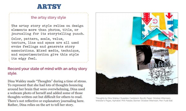
One of those styles is the Artsy Story Style. The artsy story style relies on design elements more than photos, title, or journaling for its storytelling punch. Color, pattern, scale, value, texture, line and space are all used evoke feelings and generate story associations. Mixed media, technique, and experimentation give this style its edgy feel.
See our team’s examples of this style, and give it a try yourself.
[hr]
Marie-Pierre Capistran, “This page is about the word I chose to help me focus on what I want to achieve this year. That word is harmony, and I wanted a page that evokes a feeling of harmony.”
“I achieved a feeling of harmony by using light washes and drops of watercolor in only two colors on a white background and a very soft picture backed with velum. One of the colors I used for the watercolor, lavender, is very calming. The other color, lime green, is a little bit more energetic so I used it in smaller doses. I also added touches of gold with the title and the ribbon stitched at page top because gold is a color that makes me feel good when I look at it. For the journaling I went simple and wrote the things that happened during the first week of the year that made me feel the harmony in my life.”
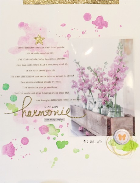
Harmony by Marie-Pierre Capistran | Supplies: Cardstock: Bazzill, Recollections; Velum: Neenah; Flair: Ali Edwards; Other: Silhouette Cameo, watercolor paint, golden thread.
[hr]
Terry Billman says, “My husband and I took our dog, Rex, swimming on the Frio River. He loved the water! Loved swimming!”
“I digitally enhanced a not-so-great photo using the Photoshop hard light blending mode layered over the original photo. In order to provide movement, as if he were swimming downstream, I blended the river to follow the shape of the shore. Warm glows and black framing highlight the photo of Rex. Art strokes direct movement, and tissue textures add dimension. I layered the canvas texture on the photo to give the water a ripple effect.”
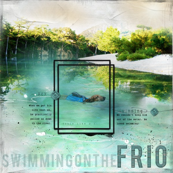
Swimming on the Frio created by Terry Billman| Anna Aspnes: Art Play H2O, Art Play Autumn Crisp, Art Play Christmas Magic, Art Play Sea Life, Art Play Vintage Rose, Art Play Infatuated, Art Play Adventure, Art Play Beautiful Day, Art Play Radiant, Warm Glows 2, Canvas Textures 1, TissueTextures 2, 12 X 12 Scratched Overlay 1
[hr]
Michelle Houghton says “My youngest Lori is quite the cook! We bake regularly together and she is at the point that she can do it all and I can stand back and watch. You can imagine, however, when a 10 year old that tends to be on the messy side takes over the spoon and mixer, the kitchen ends up a little worse for wear.”
“I wanted to show a little of how the experience of cooking with Lori feels: fun, bright, and a little on the messy side. By creating a layered mixed media background with swipes of modeling paint and splashes of ink I worked to capture the experience visually.”
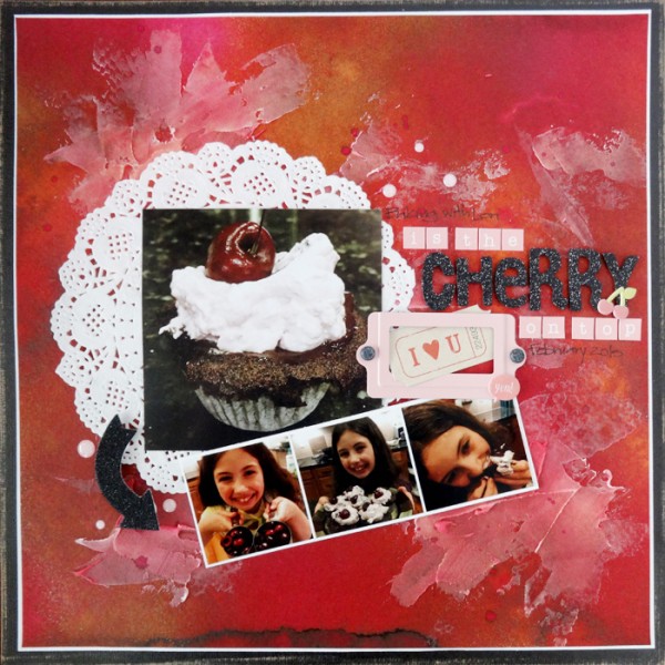
The Cherry On Top by Michelle Houghton | Supplies: cardstock; Colorbok and Core’dinations, watercolor paper; Strathmore, spray ink; Dylusions and Adanorak, modeling paste; Golden, acrylic dots, puffy stickers and chipboard arrow; Freckled Fawn, sticker letters; My Mind’s Eye, chipboard letters; American Crafts, doily; Bo Bunny, ink; Copic and Sharpie, book plate, ticket and brads; unknown.
[hr]
Audrey Tan says, “This page is about my son’s birthday. He came home from school to a table of presents.”
Audrey added artsy design touches to represent to the element of surprise in the story. The photo is revealed behind a pulled-back curtain and a bold, artsy background has a celebratory feel.
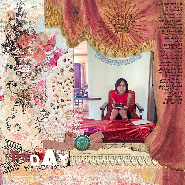
The Day You Were Born by Audrey Tan |Supplies: Rebecca Mcmeen: Prudie, Carys; Anna Aspnes: Birthday WordArt No2; Font: Carte Postale Bold
[hr]
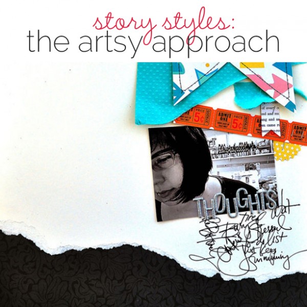
Dina Wakley made “Thoughts” during a time of stress. To represent that she had lots of thoughts bouncing around her brain that were overwhelming, Dina used a webcam photo of herself and added some of those thoughts written out but difficult for others to read. There’s not reflective or explanatory journaling here. Rather, Dina relies on the art to tell her story. This is one of the 60+ layouts in the Get It Scrapped member‘s Story Styles eBook and interactive class.
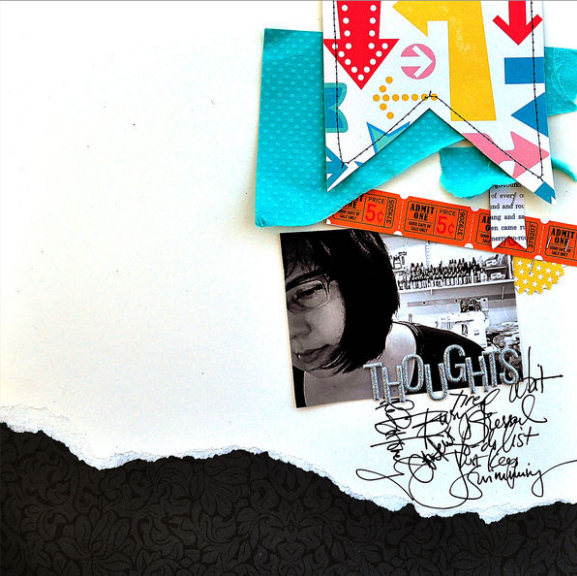
Thoughts by Dina Wakley | Supplies: Cardstock: Bazzill, Paper: October Afternoon,Webster’s Pages, Alphabet: Pink Paislee, Banner: October Afternoon, Pen: Fude Ball
[hr]
Anna Aspnes tells a story of being in the moment with a photo of herself and another of her family playing in the backyard. The photos are digitally layered and blended along with Anna’s own digital FotoGlows and MagicSparkles products. Anna used the glows and sparkles to enhance and ignite the colors already on the page — and to “instill the page with energy in the form of vibrant light reflecting my mood. This is one of the 60+ layouts in the Get It Scrapped member‘s Story Styles eBook and interactive class.
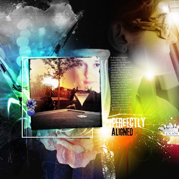
Perfectly Aligned by Anna Aspnes | Supplies: ArtPlay Palette Socialize, WarmGlows No. 1; Fonts: 3rd Man, Garamond

