 by Anna Aspnes
This lesson originally appeared in the Get It Scrapped Membership class Tension. Click here to get all the lessons on this topic with an all access pass.
Visual balance, focal point emphasis, and flow are all important to a successful visual design. They contribute to the magic of a clever layout. Incorporation of these classic design principles makes a layout pleasing–harmonious even.
I’ve found that design principles are as fundamental to a well-designed artsy scrapbook page as they are to a traditional or graphic look.
The artsy page, though, offers new opportunities for working with classic design principles, and I’m sharing five ways I grab hold of these opportunities on my artsy pages here.
leverage opacity differences and make multiple visual triangles
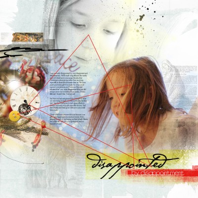 Uniting three distinct points on a layout to create an invisible triangle is a classic approach for creating flow and balance.
The visual triangle juxtaposes diagonal and horizontal/vertical lines and incorporates three points that both stand out and are united with one another.
You can use photos, individual elements, element clusters, titlework, text-based elements (like wordart), brushes, transfers and more at each point of a triangle.
I use a combination of elements, varying opacities and color saturation, and with the aim of creating multiple visual triangles. Multiple triangles increase the visual complexity of the page.
In “Disappointed” variation in color and opacity of two blended photos define two triangles.
Disappointed by Anna Aspnes | ArtPlay Palette Nativity, LabelTransfer Clipping Masks No. 1, DifferentStrokes No. 2 by Anna Aspnes at www.oscraps.com; Fonts are Hannibal Lecter, LD Elementary, Garamond.
use color to achieve visual balance
Create interest and intrigue the eye by using small bursts of the same bright color. The eye connects the bursts, adding flow, but also balance to a design.
The bursts of color can come from your photos and they can be added behind or on top of these images with your embellishing and titlework.
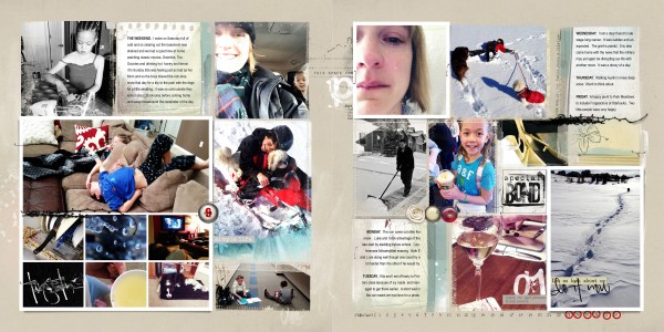
This Project Life Week 9 layout includes photos with multiple colors which could have created visual chaos without careful arrangement of the images and the addition of color-supporting elements.
Notice how the two photos displaying yellows are placed diagonally on opposing pages to create balance. Two red button embellishments are placed in relationship to the reds in photos on both sides of the spread to create their own visual triangles.
Project 365/Life Week 9 by Anna Aspnes | FotoInspired Template Pack No. 2A and No. 2B, AnnaStyle Drop Shadows No.1, ArtPlay Palette Siblings (background paper, elements, brushes), ArtPlay Siblings BrushSet, ArtPlay Palette Infatuated (brushes), UrbanStitchez No. 2, FotoInspired Masks No. 1, FotoInspired Masks No. 2, FotoInspired Frames No. 1, 6 X 6 ArtsyKardz Siblings, 4 X 6 ArtsyKardz Siblings, DistressedLetters No. 1, ArtPlay Palette Simplicity (simple life LabeledWord), ArtsyPaint No. 2, 52 Weeks No. 1 NumberSet by Anna Aspnes at www.oscraps.com; Font is Arial Narrow.
you don’t have to leave your empty space empty
Playing with opposing forces to get asymmetrical balance on your page adds energy.
Abut one or more images with a page edge (top, bottom, left or right side). You’ll have a resulting empty (or “white”) space on the opposing side that balances the heavier but smaller image.
Now use technique and product to add an image with an unexpected lightness of weight to this empty space. Blend a photo or use a transfer technique. Tone it down with a top layer of paint of gesso. Be sure that the focal image remains dominant.
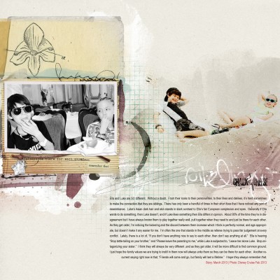
Siblings by Anna Aspnes | ArtPlay Palette Siblings, ArtPlay Siblings BrushSet, FotoInspired Frames No. 3, UrbanStitchez No. 1 by Anna Aspnes at www.oscraps.com; Fonts is Arial Narrow
create flow with gradual transitions
The manner in which photos and elements are arranged should create motion (or flow) that gently guides the eye through a piece.
Graphic design lessons talk about achieving flow by creating a visual hierarchy–by emphasizing elements in decreasing importance. On my artsy pages, I achieve flow with a gradual transition of elements on the page. It can be a result of blended or overlapping elements, as well as components that diminish/increase in size or opacity.
On “Love You,” the eye is drawn first to the tension in the color contrast between the 2 blended images and then drawn downwards to a subtle bokeh followed bytext. Notice how the use of bright colors and creative title purposefully guides the eye. Try also incorporating lines of stitching, hand drawn strokes or arrows to amplify the motion and flow on your page.
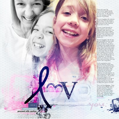
Love You by Anna Aspnes | ArtPlay Palette Social Network, Social Network No. 1, WordLabeled Social Network No. 1, CoolGlows No. 2, Stitched by Anna Bitz White No. 1, Glitter Alpha and NumberSet No. 2 by Anna Aspnes at www.oscraps.com; Fonts are Hula Skirt Girl, Smarty Pants BTN and Garamond.
grab the eye with dimensional contrast
Creating a cluster by layering and grouping multiple elements together draws the eye to a particular spot on the page and can create a focal point.
Don’t just use dimensional elements like buttons, frames, and leaves in your clusters. Get flat elements in, too. Add brushwork and blended images. Work with blending modes and layer styles. The result will be a cluster with strong dimensional contrast.
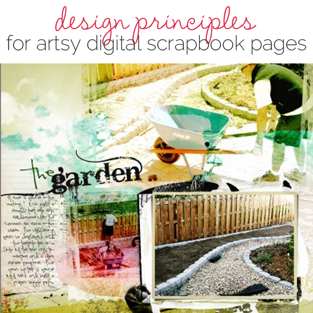
The garden layout showcases multiple brightly colored photos blended to create a montage style background. A focal point is provided and tension created by framing a less vibrant photo arranged on a transfer-style mat.
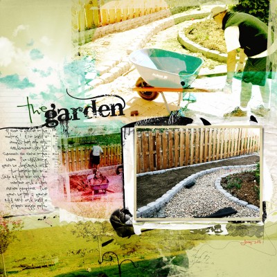
The Garden by Anna Aspnes | ArtPlay Palette Blossom, ArtPlay Blossom BrushSet, FotoTransfers No. 1 by Anna Aspnes at www.oscraps.com; Fonts are Pea Kadee and Bleeding Cowboys.
Using artsy approaches to classic design principles gives unexpected interest, charm and tension to a page. Give it a try, yourself.

