 Something we’re calling “flat geometry” is popular now in illustration, home decor, and print patterns. (Check out examples on our Pinterest Board of “Flat Geometry.”) In “flat geometric” works, the designs are rendered with geometric shapes on flat surfaces in a way that conveys depth and dimension. Color, value, and shape all combine to create the illusion of dimension
Several of the Get It Scrapped Creative Team members recently took the challenge to create their own “flat geometric” designs in service of scrapbook page storytelling.
[hr]
Kristy T says, “This page documents our tradition of going to our local Baskin Robbins for ice-cream to celebrate events, special days and sometimes just for fun.”
“I cut an ice-cream shape with my Cricut cutter. I then added triangular shapes with colored pencils. At first, I struggled with giving the appearance of dimension. Success came with a mix of techniques that follow.”
Kristy’s techniques:
- use light and dark shades of the same color next to each other
- use similar size triangles next to each other (almost like a mirror image) and color them in the light and dark shades of the same color
- radiate triangles from a center point and then repeat this idea in different areas.
Kristy adds, “When incorporating a striking element like this flat geometric shape, use colorful photographs and pops of black to ground and bring balance to the page.”
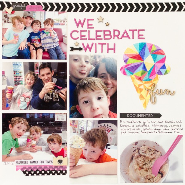
We Celebrate with Icecream (fun) by Kristy T | Supplies: Card: Artee; Washi Tape: Unknown, Scalloped Washi tape: Hazel and Ruby; Alphas: Heidi Swapp; Wood Veneer/Shapes: Studio Calico, Freckled Fawn; Cricut Cartridge: Once upon a princess; Stickers: Kaisercraft; Pencils: Prismacolour.
[hr]
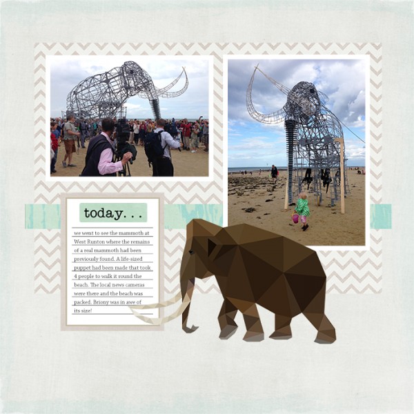
Vicki Hibbins says, “This layout is about is about seeing a life-sized mammoth puppet walking about on the beach where mammoth remains had been previously found. The puppet usually has ‘skin,’ but on this day it was quite windy and the covering had been removed so the triangular was visible.”
“I made a mammoth embellishment of geometric shapes with a “low poly” technique I found explained on youtube: How to Create Low Polygon Images from Photos.”
“It easier than I expected. Occasionally, the colors next to each other were too similar so–while the shape was still selected–I clicked on it with the eyedropper tool, changed this color slightly darker or lighter, then filled the selected shape using the paint bucket tool. I kept the rest of the layout simple and without shadowing to emphasize the mammoth and retain the flat look.”
[hr]
Christy Strickler says, “I snapped these photos of my son at the zoo with elephant statues.”
“I liked the idea of using paper piecing to create my own flat geometric landscape. However, I still wanted there to be texture and pattern.”
“I used washi tape to build the base of the landscape. It’s easy to cut it into rectangles and built the design. I looked at Pinterest for my inspiration and modeled the elephant based on one of the designs in the GIS Flat Geometry Board. With both the elephant and the landscape, I paid careful attention to color, often using four or five shades of the same color. Using my circle punches made building the elephant and tree simple. I allowed a few organic shapes around my photo but used color to link it back into the overall design.”
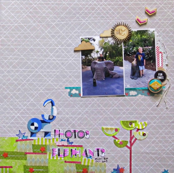
Photos With Elephants by Christy Strickler |Supplies Patterned Paper: Studio Calico; Tape: Amy Tangerine, My Mind’s Eye, Bella Blvd.; Tag: Fancy Pants; Wood Veneer: PinkFresh Studio, Studio Calico, Jillibean Soup; Sequins, Stickers: Studio Calico; Die Cut: Chic Tags; Ink: Tsukienko, Ranger; Stamps: Studio Calico, PinkFresh Studio; Other: Tape, Doily
[hr]
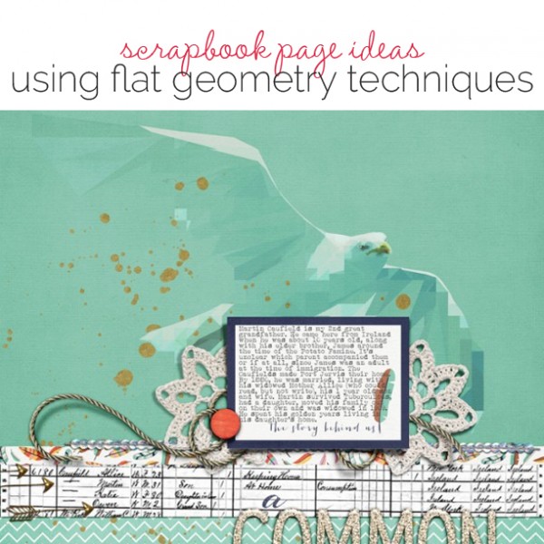
Carrie Arick says, “This page is about my 2nd great grandfather’s immigration to and life in America.”
“I created a geometric image of a seagull using a Photoshop tutorial on youtube: How to Create Low Polygon Images from Photos (the same tutorial Vicki used).
“Once I’d created my illustration, I placed it on my background paper, duplicated it, and used blending modes and opacity setting to achieve a more abstract look.”
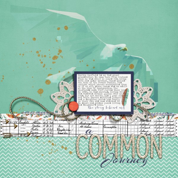
A Common Journey by Carrie Arick | Supplies: My Tribe, Now Trending Alpha by Gennifer Bursett; Fonts: Arizona, Albertsthal Typewriter; Photo: Flying Herring Gull in the Baltic Sea by Arnold Paul
[hr]
Michelle Houghton says, “A day of sending model rockets into the sky inspired this layout.”
“To create my rocket embellishment I colored strips of cardstock with Copic markers, cut them into small geometric shapes, then glued them to a rocket shape that I drew.”
“Coloring my own paper with Copic markers allowed me to create a nice value range that gives a hint of volume to my flat shape. You could get a similar effect using a die cut as a base with varying shades of cardstock or patterned paper.”
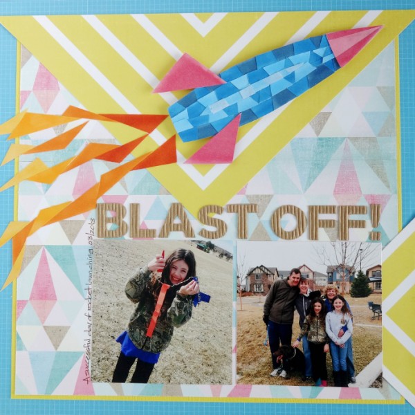
Blast Off by Michelle Houghton | Supplies: cardstock; American Crafts, patterned paper; Pink Paislee, Heidi Swapp and SEI, letters; Pebbles, ink; Zig and Copic

