 If you’ve got a Silhouette Electronic Die-Cutter, you have a new way to use scrapbook page “sketches.” Here’s an example of a full page die-cut mat made by Kim Watson for Fancy Pants.
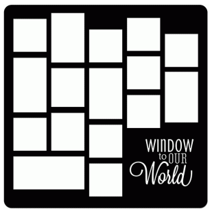
Chat-Matte by Fancy Pants/Kim Watson in the Silhouette Store.
Cut it from a paper that goes with your subject and fill the openings with photos and other page elements. See how the Get It Scrapped Creative Team has used full-page die-cut page templates below.
Find more full page templates by searching for “photo mat” in the Silhouette Store.[hr]
Marcia Fortunato says, “As part of a year-long project involving my husband and kids and getting photos from them, this layout is a window into their lives on one day in November.”
“I used a the Fancy Pants template, “Window to Our World” from the Silhouette store. I changed the mat slightly to accommodate one photo that couldn’t be cropped to fit. Because I was using nine photos, I looked for a template with at least that many openings. This gave me a framework to display the photos and made an easy starting point for my layout.”
TIP: If the openings are not the exact sizes you need, you can always span a photo across two (or more) openings by laying the photo over the top (as I did on the top right) or by allowing a photo to show through multiple openings (as I did with the other two photos on the right). Then fill any unused openings with patterned paper and/or embellishments.
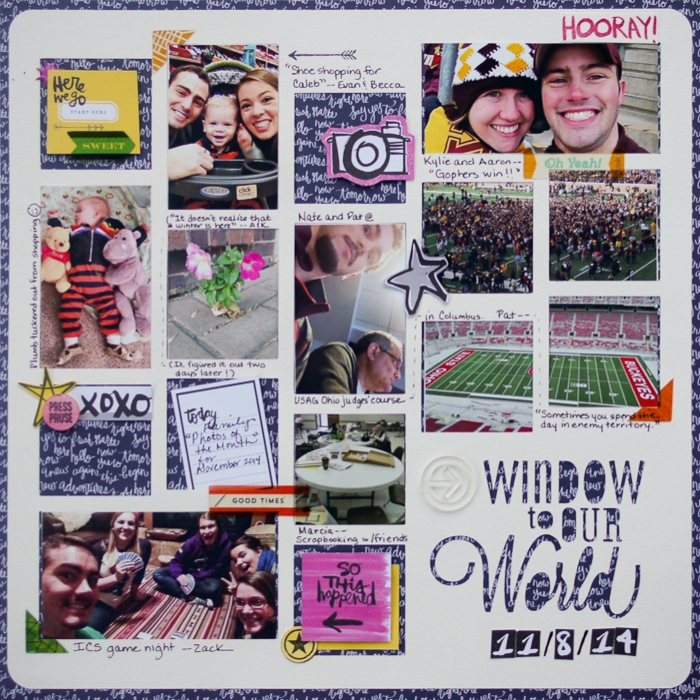
Window To Our World by Marcia Fortunato | Supplies: Full page photo mat: Canson watercolor paper, Fancy Pants chat-matte design #48372 (Silhouette store); Patterned Paper: Paislee Press for Studio Calico; Word stickers/embellishments: Amy Tangerine “Plus One” 6×6 paper pad (American Crafts), Basic Grey, Heidi Swapp, We R Memory Keepers; Stamps: Heidi Swapp, Studio Calico; Ink: Heidi Swapp, Memento (Tsukineko); Pen: LePen (Marvy), Other: Tiny Attacher (Tim Holtz), 3M foam tape, Tombow adhesive.
[hr]
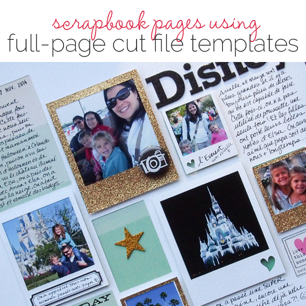
Marie-Pierre Capistran says, “This page is a summary of our latest trip to Disney World.”
I love the simplicity of the spaces that are already there when I start to create. Click here for a full-page cut file I created and used here. I cut the template once in gold and once in white. I printed my pictures to fit in the frames, and when I was ready to finish the page it all came together in 30 minutes! I just had to chose one patterned paper to go under the template and to decide if I’d go with a white or a golden frame.
TIP: Don’t choose too many photos. I did get carried away and printed way too many pictures. The page is breathing more when some spots are open, like the empty window containing only a star.
TIP: You can build ON the page, and not just under the page. For example, here, I added a frame (with the palm trees) on top of my page even if the template was not dictating one over there. A template is like a sketch, you can follow it, but you don’t have to stick with it 100%.
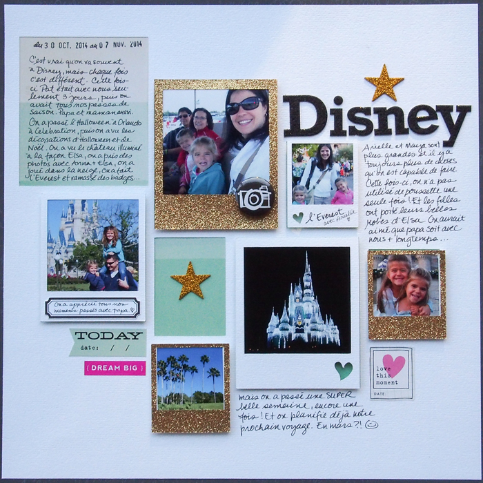
Disney by Marie-Pierre Capistran | Supplies: Cardstock: Bazzill, Recollections; Patterned Pater: American Crafts; Alphas: Me And My Big Ideas; Stars: Studio Calico; Stickers: Me And My Big Ideas, Heidi Swapp; Flair: American Crafts; Labels: Marie-pierre Capistran; Cut file: Marie-Pierre Capistran; Others: Silhouette, date stamp.
[hr]
Kiki Kougioumtzi says, “On this layout I recorded little details around the house during the Christmas holiday season.”
“I used a Fancy Pants template (“Window to Our World“) with my Silhouette Cameo for the starting point of my layout. Because I wanted to include many little photographs, the template was perfect. It already has places for the photos, and a title that matches my story. This helped me make the layout quickly. I used all the little cutout pieces as templates to cut my photos to size.”
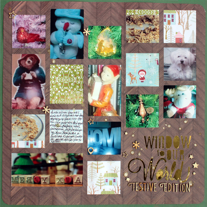
Window to Our World by Kiki Kougioumtzi | Supplies: Cardstock: DCWV; Patterned paper: Studio Calico, Basic Grey; Other: Silhouette Cameo, Studio Calico wood veneer.
[hr]
Sue Althouse says, “This page is about our favorite ice cream place at the beach.”
“I used a basic photo template from the Silhouette online store. I enjoyed how quickly this page came together with photo sizes and placement pre-determined, much like using a sketch.”
TIP: When working with a full page cut template in the Silhouette software, I suggest ungrouping the template, then selecting each individual photo spot to see the exact measurements. Crop your photos about 1/2″ larger to fit easily behind the template.
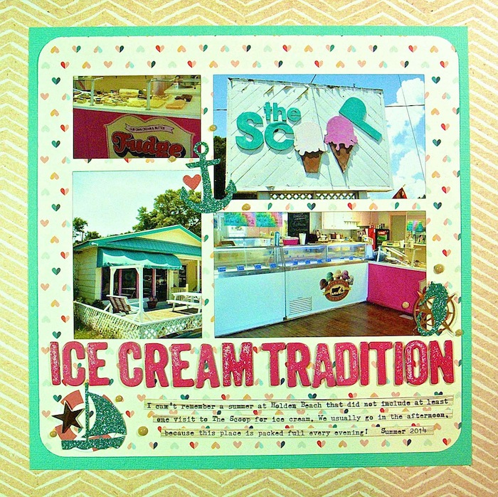
Ice Cream Tradition by Sue Althouse |Supplies: Cardstock: Bazzill; Patterned Paper: JBS Mercantile, Pink Paislee, Webster’s Pages; Alphabets: American Crafts; Template: Photo Mat by Silhouette; Ephemera: Pink Paislee; Enamel Dots: Queen & Co.
[hr]

