This lesson originally appeared in the Get It Scrapped Membership class Oomph & Polish. Click here to get all the lessons on this topic with an all access pass.
Color, Texture, Pattern & Shine
One of my favorite television shows is What Not to Wear on TLC. The hosts, Stacy London and Clinton Kelly, are masterminds at combining the clothing pieces and accessories to create the perfect outfit.
One of their fashion mantras is that an outfit should incorporate the four elements of color, texture, pattern and shine.
While I love to use this rule when I’m planning what to wear, I’ve also found it to be invaluable in my scrapbooking!
Most scrapbook pages immediately get color, texture and pattern through the use of basic supplies like cardstock, patterned paper and stickers.
Push your design to the next level, but getting all four elements. It might sounds challenging, but I promise it’s easy once you train your eye to look.
Here’s how I’ve used the four elements of color, texture, pattern and shine on three projects.
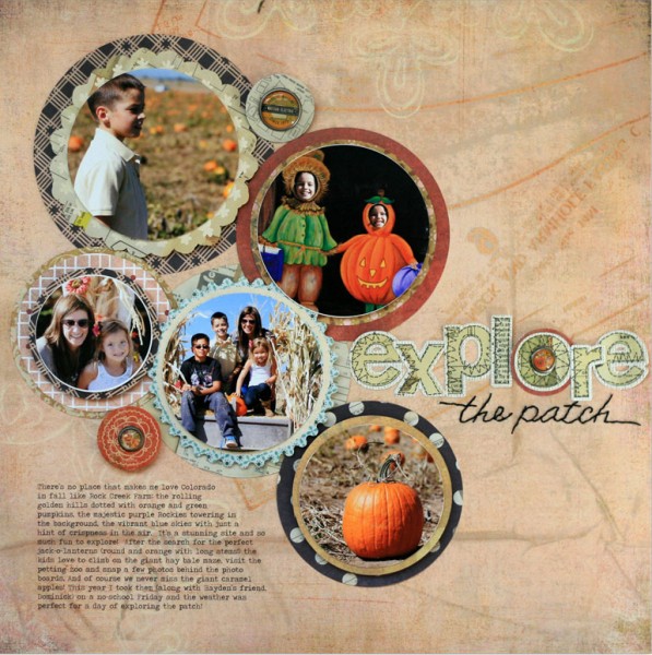
Color, Texture, Pattern & Shine on “Explore the Patch.”
color and pattern. Both the papers and my photos contain a variety of colors and patterns, and I’ve layered them all on a background that also contains a subtle pattern. I could almost stop with just my photos, papers, and a bit of typed journaling, but to truly “polish” this page, I want to add texture and shine.
texture. By finishing the edges of some of my circles with a pinked or scalloped edge, I add texture. I’ve also selected letter stickers for my title that feature a stitched detail printed on the edges. While not actual texture, the stitching appears tactile and adds visual texture.
My subtitle, “the patch” was stitched with embroidery thread, adding dimension and tying the text back to the letter stickers.
shine. Now the pages just needs a bit of sparkle. To add that without going too glitzy, I added three epoxy brads in a triangle. The slight shine of the epoxy contrasts with the rougher textures and patterns–and all four elements have been represented!
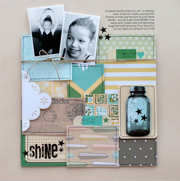
Color, Texture, Pattern & Shine on “Shine.”
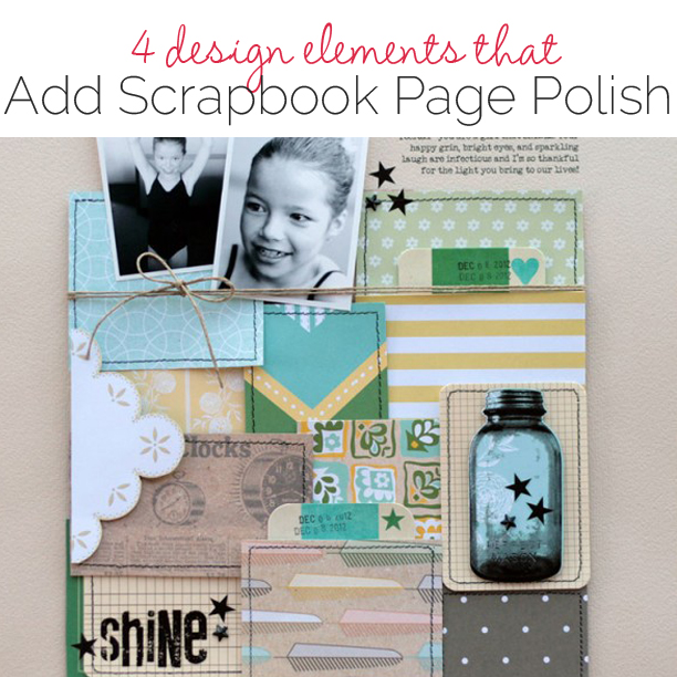
color and pattern. On this page, I converted my photos to black and white because they were taken with my phone camera in less than ideal conditions. The color versions didn’t look great.
Because I couldn’t rely on my photos to bring color to the page, I used an assortment of papers to do it instead. Arranging them in a patchwork grid helped me evenly distribute both pattern and color through the bulk of my page.
texture. To add in texture, I selected heavier-weight journaling cards (printed with small grid lines) and positioned them into the patchwork. Then I stitched around each square in the patchwork with black thread. A final bit of texture was added with the jute twine, tied across my “quilt” and photos.
shine. I normally leave the “shine” aspect to the last step. Here I incorporated several black elements to balance the black-and-white photos. The title and mason jar are rub-ons that when applied, give a slight sheen and gloss to the page. And tiny black rhinestone stars add just the touch of sparkle that I need to complete the page.
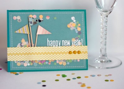
Color, Texture, Pattern & Shine on Happy New Year card.

Card by Lisa Dickinson.
Polishing with color, texture, pattern and shine isn’t just for layouts. It’s effective on cards as well.
color. On this festive card, I’ve added colorful confetti (punched with a hole punch and mini stars) to a bright teal background.
pattern and texture. The confetti not only meets my color requirement, but it also serves as pattern and texture as well!
I secured the confetti with a sheet of vellum, stitched around the edges to contain it. The vellum and stitching add a nice element of texture as well.
Atop the vellum, I’ve added three flags, which contribute to my color and pattern, and the wooden sticks add another element of texture.
shine. Finally, three epoxy dots under my sentiment add a touch of shine and sparkle.


