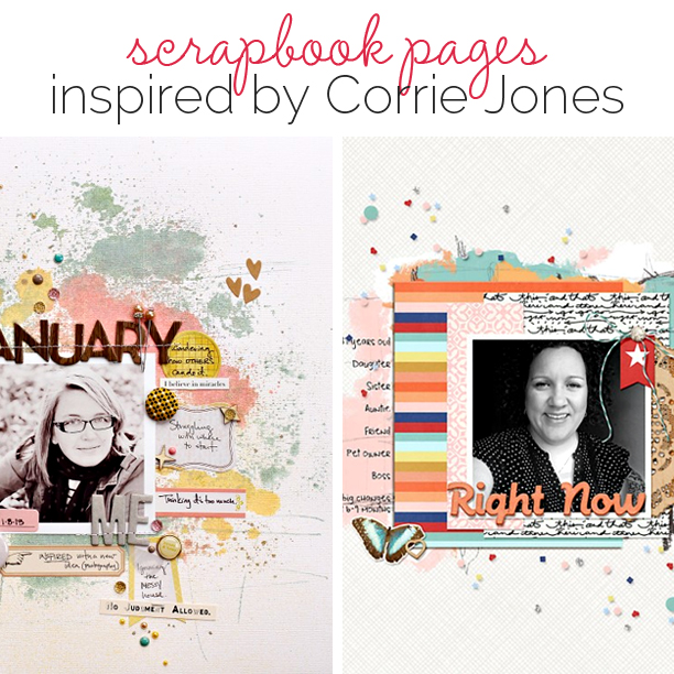
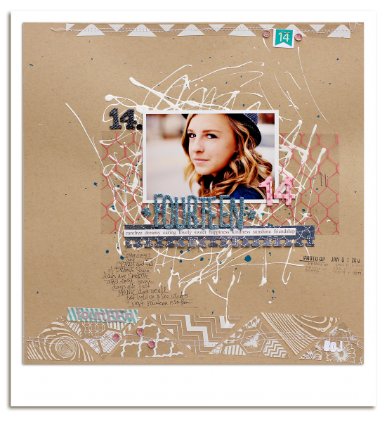
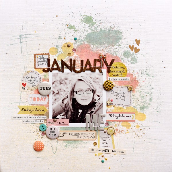
Studying scrapbook pages by others is a great way to get scrapbooking ideas for growing your own style. In this “study” look at how a scrapbooker has used product and design principles and how she’s handled the 5 parts of a scrapbook page (canvas, photos, title, journaling, embellishments).
Our creative team studied pages by Corrie Jones and made their own pages incorporating aspects of those pages. This is not a LIFT of one page. Rather they made pages inspired and instructed by what you they saw in a collection of her work. Corrie’s no longer blogging about scrapbooking but you can see a collection of her pages on our Pinterest board and you can find her blogging about photography.
see some of Corrie’s pages.
[toggle title_open=”Hide” title_closed=”See Corrie’s pages yourself” hide=”yes” border=”yes” ]
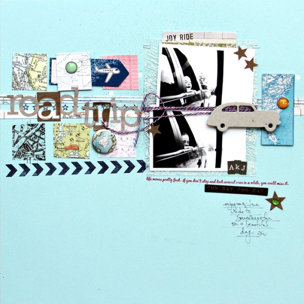
Road Trip by Corrie Jones | Supplies:Cardstock – Bazzill; Mist – Studio Calico; Patterned Papers – Crate Paper, October Afternoon, Pink Paislee; Rub Ons – October Afternoon; Die Cuts – American Crafts, My Minds Eye; Ink – Jenni Bowlin; Stamps – Studio Calico; Chipboard – October Afternoon; Flair – Evalicious; Alpha – Studio Calico; Bling – Queen & Co; Brads – American Crafts; Pen – Kuretake; Other – Paint, Twine
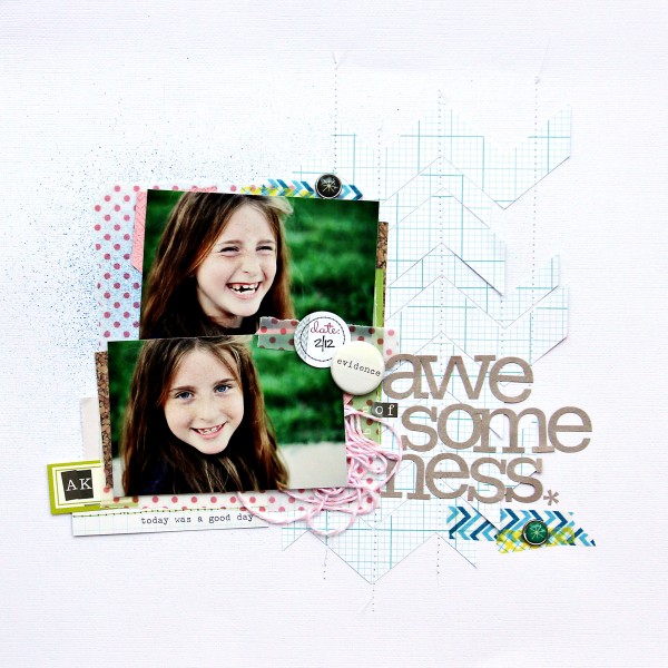
Evidence of Awesomeness by Corrie Jones | Supplies:Cardstock – Basic Grey; Patterned Papers – American Crafts, Echo Park, Crate Paper, Kesi Art; Brads – American Crafts; Tag – Ormolu, Evalicious, Kesi Art; Twine – Doodlebug; Alpha – Studio Calico, Kesi Art; Other – Washi Tape
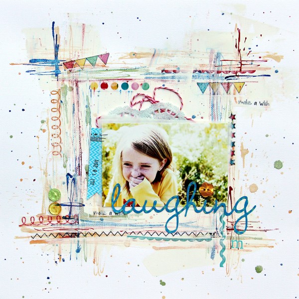
Laughing by Corrie Jones | Supplies:Cardstock – American Crafts; Stickers – SRM Stickers; Tag – Elle’s Studio; Buttons: Doodlebug; Twine – Jillibean Soup; Rub On – Jenni Bowlin; Mists – Studio Calico, October Afternoon; Other – Patterned Paper, Doily, Gesso
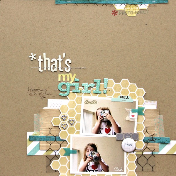
That’s My Girl by Corrie Jones | Supplies:Cardstock – American Crafts; Patterned Papers – My Minds Eye, Studio Calico; Transparency – Hambly; Clips – K & Company; Stapler – Tim Holtz; Flair – Hello Forever; Rub Ons – Martha Stewart, Studio Calico, My Minds Eye; Twine – The Twinery; Alphas – American Crafts, Sassafras Lass; Pen – Martha Stewart; Other – Dies Cuts, Washi Tape, Packaging materials
[/toggle]
art mediums plus white space and lots of embellishments
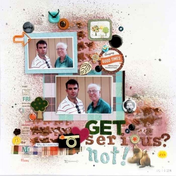
Get Serious, Not! by Karen Poirier-Brode | Supplies: gesso and light molding paste – Liquitex; stencil – Crafter’s Workshop: houndstooth; ink spray – Ranger; Dylusions, melted chocolate; felt embellishment- AC: Amy Tangerine, camera; rain dots – Cloud 9; glimmer glaze – Tattered Angels, sassy silver; alphas – AC Thickers: LAX, Pebbles ABC, Dear lizzy glitter; markers – Tim Holtz, Distress Markers, Ranger; wood veneer – Prima; sticker – Basic Grey: Pops; flair – October Afternoon; sticker – Basic Grey: Herbs & Honey; stickers – Freckled Fawn: August Kit, clear doodle; arrow paper clip – Two Peas in a Bucket; font – Avenir; date stamp – Sparko; ink – Staz On; stickers, buttons, flair, brads, washi tape, epoxy flower, ribbon, enamel dot, wood veneer – stash
Karen Poirier-Brode says, “The story of this page is the inevitable goofiness of my husband and son (actually, pretty much all our sons) when I try to take a photo.”
Aspects of Corrie Jones’ designs that Karen noted include:
- page elements clustered in a band
- frequent use of black and white photos
- lots of tiny embellishments
- dimensional elements like brads, flair, chipboard, veneer
- art mediums like gesso, molding paste, stencils, watercolors, etc.
- washi tape or strips of patterned paper
- white card stock or kraft backgrounds
- titles are part of the design cluster, not set apart
- mostly pastel colors with touches of brights and darks
- generous white space
- little, if any, journaling
- grids or lines for base elements
- stitching
My page began with a layer of gesso and three spots of light molding paste applied through a stencil. I spritzed Dylusions ink and spots of Glimmer Glaze. I paired my use of art mediums with plenty of white space, washi tape, minimal journaling and lots of little embellishments to channel Corrie.”
[hr]
repetitions of shape and itty-bitty embellishments
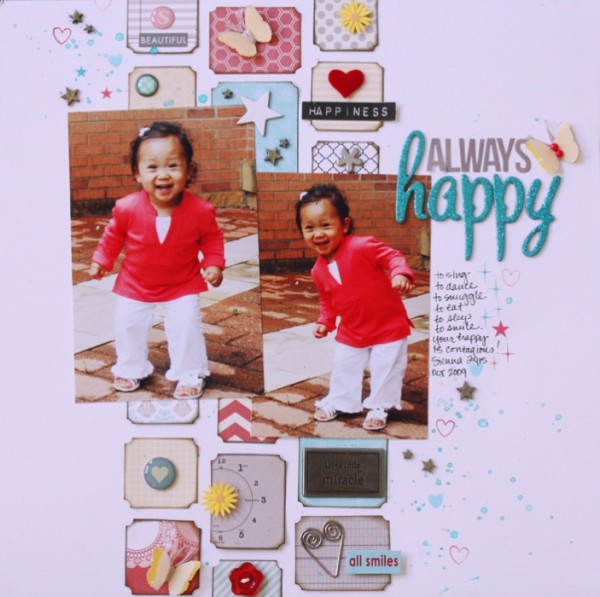
Always Happy by Jett Hampton | Supplies: Cardstock: American Crafts; Patterned Paper: Teresa Collins; Vellum: Paper Studio; Stickers: Bella Blvd; Buttons: Bella Blvd; Brads: Making Memories and Basic Grey; Alphas: AC Thickers; Punch: Martha Stewart; Enamel Dots: Basic Grey; Wood Veneer: Studio Calico; Chipboard: Heidi Swapp; Stamps: Papertrey Ink; Metal embellishments, felt heart and watercolor: Stash.
Jett Hampton says, “This layout captures the joy that radiates from my niece Sienna. She can brighten anyone’s day with her happy energy.”
“I love Corrie’s use of repetition of shapes, small pieces of pattern papers, her use of two photos and lots of itty-bitty embellishments. Those elements were incorporated into my layout. A vertical band creates the foundation and contains most of the little embellishments, which fits my more linear style.”
[hr]
gesso background and neutrals with pops of color
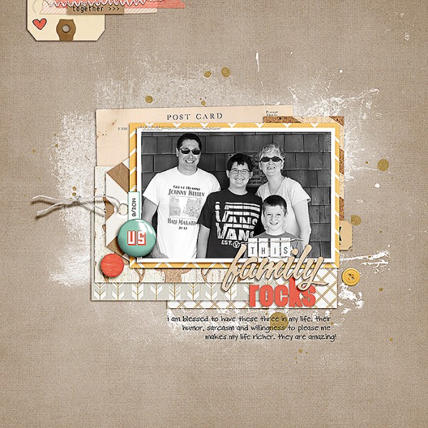
This Family Rocks by Celeste Smith | One Little Bird: Carson Park; Mommyish: Flair Builder; Pink Reptile Designs: Gesso It; Paislee Press: On My Desk; Little Butterfly Wings: Butterfly Basics Travel Edition; Sahlin Studio: At Sea; Allison Pennington: Stuck Alpha, Y&M; Amy Martin: Blanc Stitches; Gennifer Bursett: In My Tribe; Font: DBJ Celeste.
Celeste Smith says, “Corrie’s style is playful. She uses mostly neutral backgrounds with pops of color and bits of kraft. She incorporates mist, paint and gesso into her designs. She tends to layer papers around her photo. She uses embellishments, buttons and flair to move the eye around the page. Sometimes she doodles or adds stamps. She likes to use mixed titles and her own handwriting. She finishes her pages with stiching and fasteners.”
“I decided to use gesso on the background of my page after seeing a couple of pages where Corrie did that. I like how it softens the edges of my block. I stuck to mostly neutrals including my kraft background with pops of color in an attempt to mimic her techniques. I did something I normally don’t: I used a mixed alpha title. It was fun to pick out the different fonts and materials. As a finishing touch, I added stitching. The upper left corner is very similar to one of the pages in Corrie’s gallery. I added the doodled heart at the very end as an homage to her stamping and doodles, something I rarely use on my page. I also used my own handwriting font.”
[hr]
mixed media backgrounds and limited patterned paper
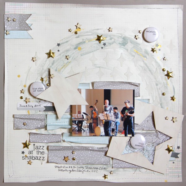
Jazz at the Shabazz by Gretchen Henninger | Supplies: Paper: BasicGrey (Capture), Studio Calico; Alphas, Wood Veneer, Stickers: Studio Calico; Ink: Tim Holtz Distress Ink (pumice stone); Spray Ink: Heidi Swapp Color Shine (tinsel, gold); Stencil:The Crafter’s Workshop (Ronda Palazarri); Flair: FindingNana; Punch: EK Success (banner)
Gretchen Henninger says, “This is a layout of my husband playing jazz at the Malcolm X and Dr. Betty Shabazz Center in Washington Heights, New York City.”
“I am inspired by Corrie Jone’s playful and artistic style. She uses little patterned paper, instead building a page with painted and stenciled backgrounds and embellishments. For this layout, I created a background with gesso, spray ink, and a stencil. I used small pieces of patterned paper to add texture to the page. Ten I scattered a variety of star embellishments throughout the circular design.”
[hr]
paint on a white background with framed photos

Right Now by Heather Awsumb | August Storyteller kit by Just Jaimee; Haunted Woods Solid Paper Pack, Artsy Layered Paints No 1, Away We Go Element Pack by Katie Pertiet; Forever Young, Day Tripper, Hopscotch by One Little Bird; Shadow Styles by Mommyish
Heather Awsumb says, “This page is a quick a simple list of the things that make me, me right now.”
“When I looked at inspiration by Corrie Jones, there were a few things that stood out to me about her style: she primarily uses white or neutral backgrounds and also frequently adds white frames to her photos. These aspects of her design allow her photos and elements to take center stage. She grounds her design to the page by using paint and layering of patterned papers and elements. On my page I started by using a digital paint element on a solid white cardstock as the base. I then designed by layering items up from there.”
[hr]
paper strips
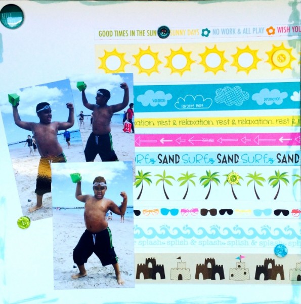
Hello Summer by Rosann Santos-Elliott | Supplies: Bella Blvd: Sand & Surf Borders; Outdoors Buttons Market; Mr. Huey Ink Dauber – Spring Sky
Rosann Santos-Elliott says, “When I looked at Corrie Jones’ body of work, I am inspired by her repetitions and combining of opposites – symmetry and asymmetry. Though at first glance, the pages seem busy, they really are quite simple and fun. The same is true of this page of mine. Though it appears to have many elements, it really is a very simple layout – strips of paper and buttons with some inking around the edge of the cardstock.”
[hr]
vertical column design
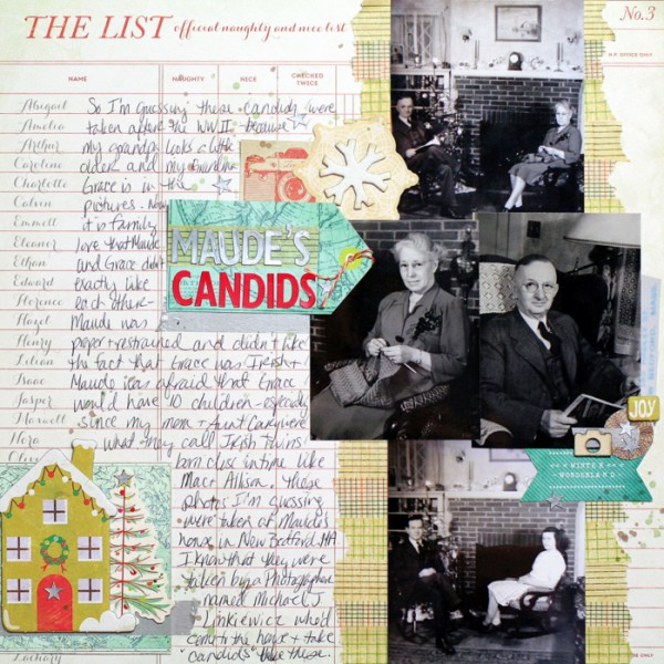
Maude’s Candids by Katie Scott | Supplies: Crate Paper patterened paper; Crate Paper, Studio Calico, and Cosmo Cricket embellishments; 7 Gypsies washi tape; Jenni Bowlin letter stickers; Sharpie; baker’s twine.
Katie Scott says, “Sometime in the 1940s, my great-grandmother, Maude, had a photographer come to the house to take ‘candid’ Christmas photos of the family, including her new daughter-in-law, my grandma, Grace. This page is about Maude and Grace’s somewhat strained mother-in-law/daughter-in-law relationship.”
“I noticed that Corrie often uses a page design that includes a vertical column of photos. I wanted to use that type of design to create a scrapbook layout that would give me plenty of room for photos, embellishments, and journaling.”
[hr]

