“Curating” is a word being used frequently nowadays — bloggers are advised to curate content their readers are interested in, and home decorators are “curating” or collecting pieces that give their home a unified look. Lovers of music can now “curate” their own playlists with a new speed and lower cost that ever before.
How about “curating” a unified look for your scrapbook page that pulls from vintage images and prints that are readily available in an age of scanners and accelerated sharing (i.e., free vintage printables)?
Our creative team made pages here with a “curated natural history style,” pages that incorporate scientific illustrations of botanicals, birds, and animals as well colors, values, and combinations that support a certain look–think of Dr DooLittle’s library, and you get the idea.
[hr]
choose earthy tones, wood-grain elements, and desaturated photos

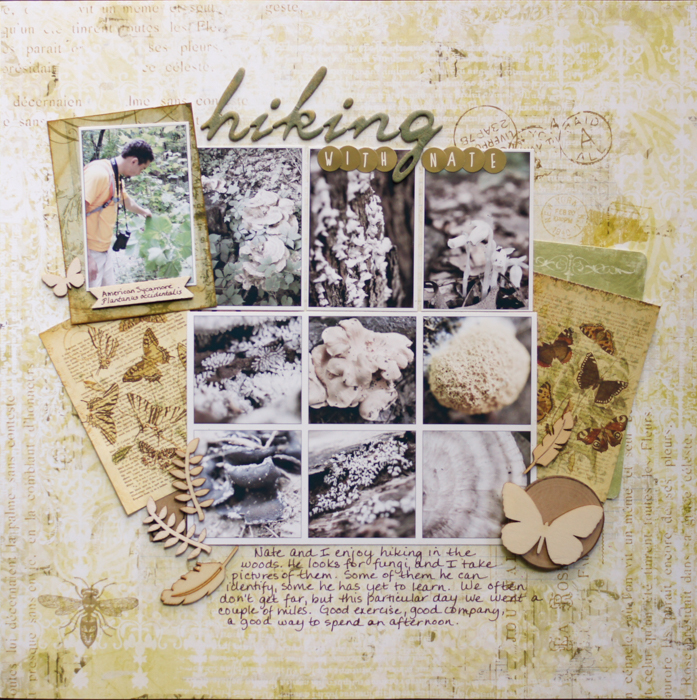
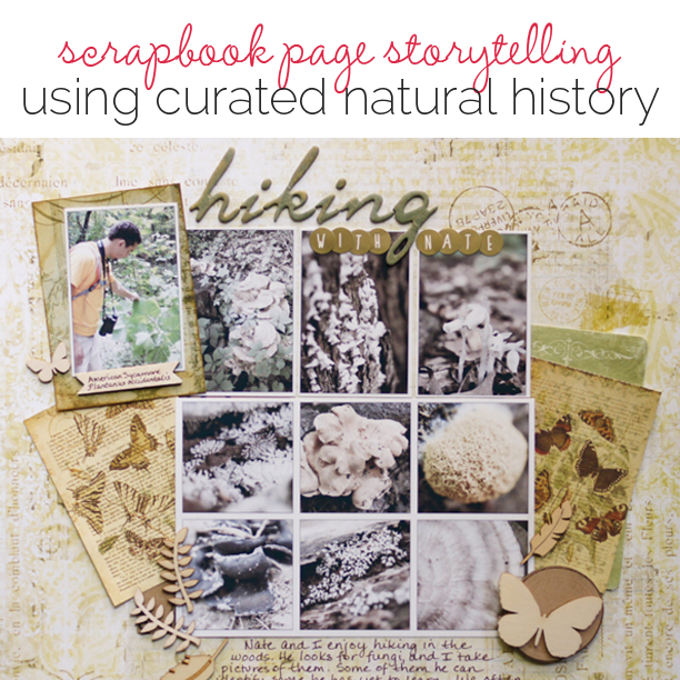
Hiking With Nate… by Marcia Fortunato | Supplies: Patterned Paper: Pink Paislee (Butterfly Garden collection); Letter stickers: American Crafts (Thickers colored with Hero Arts ink), Target; Wood veneer: Studio Calico; Pen: Marvy (Le Pen); Ink: Hero Arts (Field Green and Gold), Distress Ink.
Marcia Fortunato says, “This page is about hiking and searching for cool fungi with my son Nathan.”
“To achieve this look, I used older Pink Paislee papers with muted, earthy tones – one was used for the background and one had blocks that I cut up to use as embellishments. I reduced the saturation on my nature photos to almost black and white and added a white frame around each one, then displayed them in a formal grid. Wood veneer embellishments in nature motifs further supported the look and subject of my page.”
Tip: To unify photos of differing intensities and colors, turn them black and white or reduce the saturation until they have approximately the same tone. In my case, the fungi in two of my photos were deep yellow, making them stand out more than the others, which were mainly black, brown, or white. Reducing the saturation more in the brighter photos resulted in a block of photos of equal visual importance.
[hr]
start a curated look with framed elements: photos, images, word art all work

A Curious Mind by Kristy T | Supplies: Paper: Kaisercraft, Bo Bunny; Collectables: Kaisercraft; Chipboard: Memory Maze; Flower: Unknown: Epoxy stickers: Prima; Metal Flower: Prima; Brad: Prima; Ink: Distress/Ranger, Stazon; Memento; Alphas: Prima, American Crafts; Stencil: Tim Holtz.
Kristy T says, “My daughter has loved looking at and collecting bugs for years. This page shows just a few of those bugs and illustrates her personality at the same time.”
“My photo subjects, crops and editing work with vintage style papers, neutral tones, metal and distressed frames lay the groundwork for a “curated natural history” look. In addition, a UTEE-dipped flower, a dimensional butterfly stamped with Stazon onto transparency, and distressed inked edges continue the look. A quick and easy way to create an embellishment in this style is to layer an epoxy stickers over a circle-punched image–it’s got that feeling of a collected specimen.”[hr]
embellish with stamped botanicals, vintage illustrations, and dimensional foliage

Great expectations by Stefanie Semple. Supplies: Studio Viva Artistry: Field Journal (kit), Anita Designs: Captured Moments (kit); Mye De Leon: Back to Nature (kit); Debbie Hodge : In a band (Template); Libby Weifenbach Designs: Basic Stitches – in a line (stitching).
Stefanie Semple says, “This page is about how I bought Hyacinth bulbs to welcome Spring in, as I was feeling cold and tired of Winter.”
“I started with a neutral background, and a layer of realistic floral brushes then added a band foundation. The band holds a photo and nature inspired art cards. A bird die-cut, butterfiles and dimensional foliage and florals are all a nod to my zoology and botany studies from the 1980s.”
[hr]
use vintage illustrations with softened tones and edges

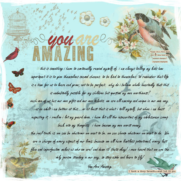
You Are Amazing by Summer Christiansen | Supplies: SuLu Digital Designs: You Are Vol.1 Word Art and Stamps; Edged Grunge Brushes | Studio Crafty Button: Free Bird Elements 5
Summer Christiansen‘s art journaling page explores her ability to understand her own inherent worthiness. For a curated natural history look, she repeated vintage zoological illustrations of butterflies and birds and she softened up edges and lighted the background paper.
[hr]
combine scientific illustrations with map-print patterned paper

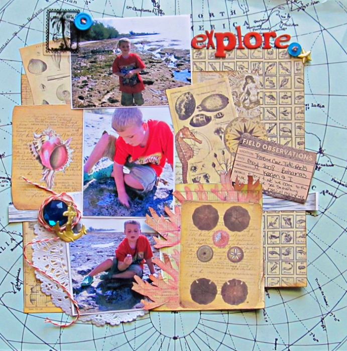
Explore by Christy Strickler |Supplies Patterned Paper: Webster’s Pages, 7 Gypsies; Letters: American Crafts; Buttons: My Mind’s Eye, Jillibean Soup; Twine: True Hemp; German Foil: JBS Mercantile; Other; Doily
Christy Strickler says, “Every time we visit our local tide pools we find something new, and this page shows photos of my son playing there.”
“To achieve a curated natural history look, I collected a series of patterned papers with vintage scientific prints. I layered these around my photos. I find that maps pair well with scientific prints, and, in this case, I chose a blue map that contrasted with the brown and cream paper.”
[hr]


