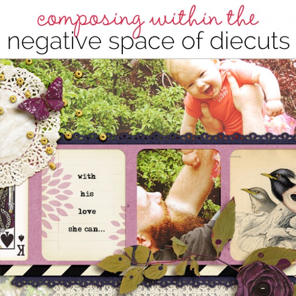
 Cutouts are trendy, and that negative space they make provides a perfect home for eye-catching elements. What can you do within that negative space created by a cutout? Here are a few ideas for you ranging from using that space to house basic scrapbook page elements like journaling and photos to getting clever with layers, dimension, and composition.[hr]
layer a large photo behind your cutout and let one opening frame a key part of your story

Learn to Fly by Amy Kingsford | Supplies: Stolen Moments Design: Blackbird, Set Me Free, September Template Freebie.
Amy Kingsford‘s page is about the relationship between a daddy and his baby girl. She says, “I used a band of frame-sized cutouts across page and then composed within each. One houses my journaling, two house ephemera with motifs reinforcing page theme, and one actually holds a key part of the larger photo over which the frames are layered: the father’s face looking up at his baby.”[hr]
cut a negative from one paper and a positive from another, and then layer selected pieces back into the cutout
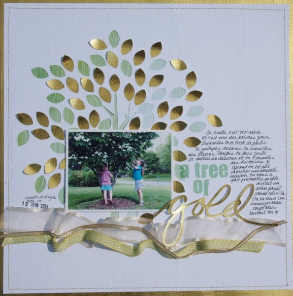
A Tree of Gold by Marie-Pierre Capistran | Supplies: Cardstock: Recollection, Bazzill; Patterned Paper: from my stash; Letters: Vellum letter stickers from Pretty Little Studio, “Gold” cut out made by myself; Ribbons: from my stash.
Marie-Pierre Capistran says, “This page tells the story of the tree my daughter loved climbing and her sadness to leave it behind now with our move.”
Marie described this technique as imbricating, which means to arrange scales or plates so that they overlap like roof tiles. She says, “I cut a tree from the background canvas with a cut purchased in the Silhouette store and then transformed it to be grander with many more leaves. I backed up all the leaves with green patterned paper. Then I cut the same tree from gold cardstock and layered gold leaves into some of the cutouts, gluing only one end of the golden leaves so that the green patterned paper showed a bit, which gives dimension and interest.” [hr]
mount a mat with negative space with pop-dots and then build stacked clusters within the cutouts

Content by Christy Strickler | Supplies Patterned Paper: Pink Paislee, Carta Bella; Tape: Glitz Designs; Letters, Die Cuts: Snap; Stickers: Snap,Sassafrass, My Little Shoebox; Ink: Ranger; Stamps: Pebbles, October Afternoon, Freckled Fawn; Sequins: Jenni Bowlin
Christy Strickler‘s page features a photo of her cat looking content and smug. A mat with cutout circles provides the foundation for her photo. Christy composed fun and pretty stacked embellishments clusters within selected circles. She gets unexpected and appealing dimension by mounting her diecut circles mat with pop dots–thus, the embellishment stacks start at a lower level than the mat and then build up to sit above it.”[hr]
fill your cutouts with bits of journaling
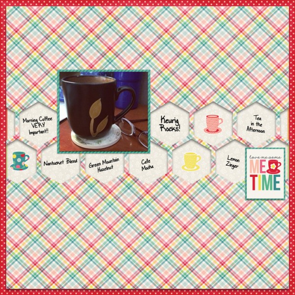
Me Time by Jennifer Kellogg | Supplies: Wishing Well Creations: Punched Out Templates Vol 2 #02; Wishing Well Creations: For the Love of … Solitude Mini Kit.
Jennifer Kellogg‘s page is about how much she loves her Keurig coffee maker. She used a honeycombed template of hexagons and cut the shapes away from her patterned paper background. She then used those openings as homes for her journaling. She thought of each cutout as a “sticky-note” and put short thoughts and pieces of information in each.[hr]
fill your cutouts with motifs that tell your story
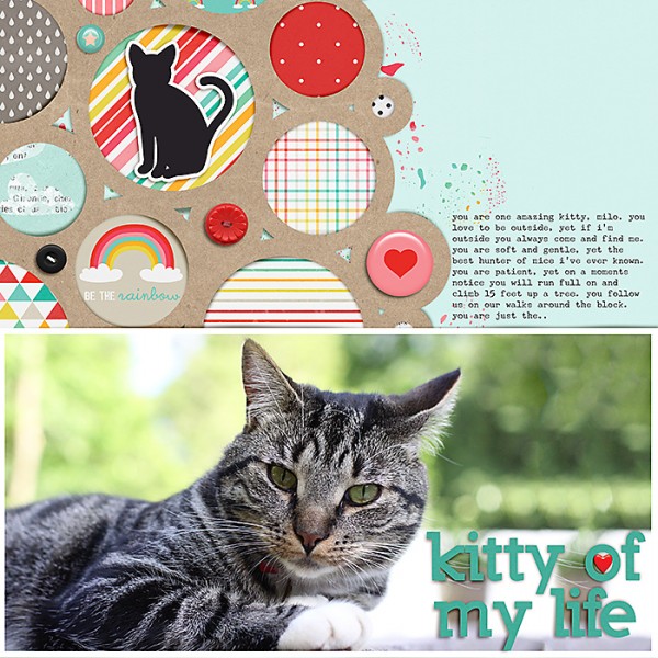
kitty of my life by Celeste Smith | Supplies:Little Butterfly Wings: All Cats Go to Heaven; Lauren Grier: Be Someone Else’s Rainbow; Karla Dudley: Life 265; Miss Mint: Chainlink Mats 1; Font: Underwood Champion, Nilland Black.
Celeste Smith’s page about her cat features an eye-catching photo and a circle-cut mat. She’s filled the cutouts with motifs that tell her story from the straight-forward image of a cat to a fluffly cloud and a rainbow with a positive message.[hr]
fill your cutouts with stenciled misting
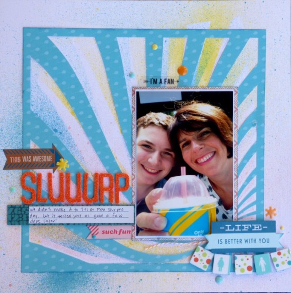
Sluuurp by Devra Hunt | Supplies: CS and Alpha-American Crafts, PP and Twine-Doodlebug Designs, Fancy Pants, Mist-Heidi Swapp, Studio Calico, Sticker, Pre-made Die Cuts, & Chipboard- Basic Grey, American Crafts, Washi Tape-My Minds Eye, Freckled Fawn, Enamel Dots-My Minds Eye, Epoxy Stickers-Freckled Fawn, Ink-Colorbox, Sideburst Die Cut-Brenshevia Baker, Pena nd Adhesive-EK Success
Devra Hunt‘s page is about keeping a promise to her son: she took him out for Slurpees after missing out on Free Slurpee Day.
She used a burst die cut by Brenshevia Baker as a foundation. Before placing it, though, she used the negative space as a stencil, spraying multiple colors of mist into the openings while rotating it. She says, “the result was color as well as white in the negative space of the die cut. This look imitated the pattern on the Slurpee cup.”[hr]
fill your cutouts with perfectly framed photos
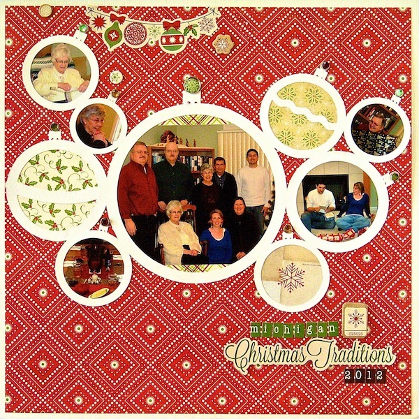
Michigan Christmas Traditions | Supplies: Cardstock: Bazzill, Patterned Paper, Alphabet Stickers, Stickers, Brads, Chipboard: Echo Park, Die Cut: Silhouette (Christmas Ornament Frame)
Sue Althouse’s Christmas page benefits from a diecut mat of circles because it echoes the idea of decorative Christmas balls. She’s filled some of the cutouts with circular photos.

