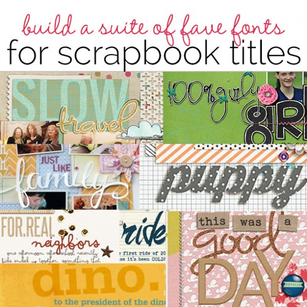
 Text is a great tool for telling stories on the scrapbook page–both because of the content you can include and because the typeface used to render it can tell a story. A typeface has a personality. With a change in typeface, you can go from formal to casual, from serious to funny, from stylish to conservative, from modern to old-fashioned.
Having a “suite” of favorite fonts to turn to for making titles and text embellishments is a good idea. Start by choosing one or two fonts for each of the listed categories. See the font choices our creative team and guest teachers turn to again and again. And check out your own pages. Which fonts are you using frequently and well? Are there any holes in your line-up?
Start building your own suite of display fonts with these categories. And then tell us what other categories you use and what your favorite fonts are.
- slab serif
- sans serif
- script
- novelty
Slab Serif
Slab serif fonts are bold, square cut fonts that work will for titles and display type. The serifs are cut with right angles rather than brackets and the serifs are as thick as the horizontal strokes. Favorites shown used here are:
slab serif: Rockwell
Debbie Hodge says, “These are photos of waiting for the kindergarten bus on my oldest son’s first day of school 12 years ago. The title was made with the Rockwell font (free with Microsoft products). I put each letter of ‘kindergarten’ on its own layer in Photoshop so that I could stagger the baselines and get the look of alphas. Once place, I merged all font layers and applied a chipboard style (made by Just Jaimee).”
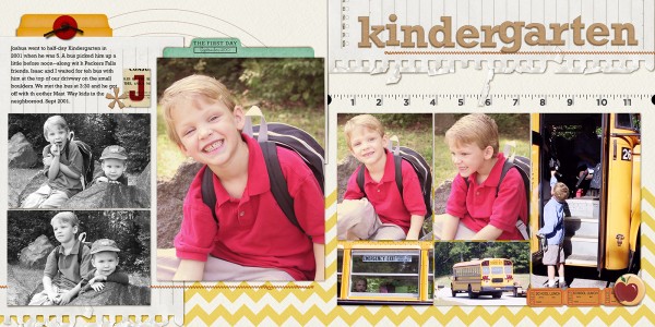
Kindergarten by Debbie Hodge | Supplies: Old School by Mye de Leon; Storyteller Feb 2014 Styles by Just Jaimie; Straight Stitched, Artplay Santa Nicholas by Anna Aspnes; School Edition by Little Butterfly Wings; Schooled Stamp Press by Karla Dudley; Half There by Kaye Winiecki; Rockwell, Bohemian Typewriter
slab serif: Serifa BT Bold
Tiffany used her long-standing title favorite, Serifa BT Bold here. She says, “It’s a slab serif–a square typeface with thick block-like serifs–and, thus, it pairs well with mono-spaced serif fonts (a.k.a. typewriter fonts).” She’s rendered this thick and blocky serif in two shades and placed it with a slight tilt that is erfect for a page about childhood play.
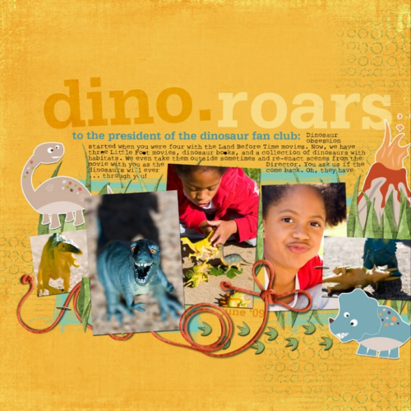
Dinoroars by Tiffany Tillman | Supplies: Digital Paper: Michelle Coleman. Elements: Dino Dig by Kitty Chen. Digital Stickers: Stomp by Mindy Terasawa. Fonts: Serifa BT; Bold and Rough Typewriter.
slab serif: Chunk Five (an ultrabold slab serif) | script: Lobster (a bold condensed script)
Sue Althouse says, “This page is about our day trip to Kelleys Island on Lake Erie last summer. Based on the sign welcoming us to the island, I chose similar font styles and colors to create the title for this layout. Using the offset feature on my Silhouette, I created custom mats for the letters to help them pop off the page. The script font is Lobster and the serif font is ChunkFiveEx. Both are free and available at Dafont.com
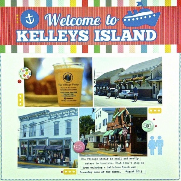
Welcome to Kelly’s Island by Sue Althouse | Supplies: Cardstock: Bazzill; Patterned Paper, Flair, Enamel Dots: American Crafts; Alphabets: Silhouette (Lobster, ChunkFiveEx); Stamps: Teresa Collins; Inks: Hero Arts; Twine: Doodlebug; Die Cuts: Silhouette (travel icons, tugboat)
Script
Script typefaces are built on the look of handwriting, and there’s a great deal of variation in what script faces look like, ranging from casual to formal. The script fonts we’re showing you here are:
And see in layouts in other sections of this article:
script: Thirsty Script | handwriting: DBJ Celeste
Celeste Smith says, “This story is about how adorable our neighbor’s new puppy is. We are all in love! Here I’ve used two of my favorite fonts Thirsty Script and DBJ Celeste. I enjoy using chunky script fonts as titles and clipping paper to them. I’m going for a die cut look on my page. I think using patterned paper to create the title makes it more playful and fun as well.”
“The handwriting font is a font of my own handwriting. As a digital scrapper, one element I was missing on my pages was my handwriting. I was so excited when Darcy Baldwin approached me about making a font of my handwriting! I use it a lot and it just makes my pages feel a little more personal. Bonus: I don’t have to line up my writing on a physical page! Unfortunately Darcy Baldwin is retired, but Heather Joyce at the LilyPad will make you your own custom font.”
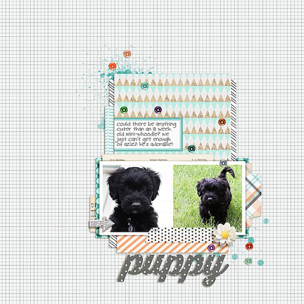
puppy by Celeste Smith | Supplies: Make a Wish by Alison Pennington; Front Porch Basics by Laurie Ann; Guppy by One Little Bird; Drift Away by Sahlin Studio; For Cute by Splendid Fiins; Sprinkles v24 by Valorie Wibbens; Thirsty Script and DJB Celeste fonts.
script: Pea Mily Mix
Stefanie Semple says, “I created this page to document my daughter’s personality on and off the hockey field. I paired the alpha in the kit with my current favourite curly type font, called Pea Mily Mix. I love making the font look sticker-like by adding a white stroke and drop shadows. I added some stitching so my font wouldn’t be floating loosely on the page and I threaded it through the alpha. For my journaling I used Another TypeWriter, an easy to read standby.”
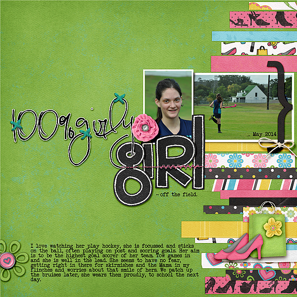
100% Girly girl by Stefanie Semple | Supplies: Gennifer Bursett (template): BluePrint no.11, Chelle’s Creations (kit): Girlfriend, Valorie Wibbens: Sprinkles v9 (cross stitches)
script: Great Vibes
Lisa Dickinson frequently uses script fonts with her Silhouette Cameo for custom titles. She customizes the look of her text by placing her letters on separate layers in Illustrator and tweaking ligatures and angles of each letter and the grouping as a whole. This page is about how important her pets are to her family and “family” is cut big to span her photo cluster from the font Great Vibes.
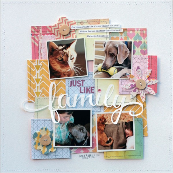
Just Like Family by Lisa Dickinson | Supplies: cardstock (Bazzill Basics); patterned
paper,stickers, flowers, buttons (Basic Grey); die cut machine (Silhouette);
fonts (Great Vibes, Typist); twine; date stamp, machine stitching
brush script: Art Brewery
Debbie Hodge says, “I enjoy following trends and when the brush script look became popular I went looking for some free fonts to get this look on my own pages. I found two I’ve been using: Art Brewery and ReMachine.” On this page, Art Brewery is used to render “ride” for a bold and current look.
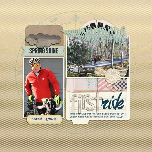
First Ride by Debbie Hodge | Supplies: Kate and Co paper by Karla Dudley from Pixels & Co collab; Today’s Story, Shine by Laurie Ann; Jane by Rebecca Wagler; Feb 2014 Storyteller by Just Jaimee; Chippers Alpha by Robyn Meirotto; Art Brewery, Bohemian Typewriter fonts
crabbed script: Arsenale White
Debbie Hodge says, “I have few fonts in my suite that I think of as script written by someone with arthritis. They give a very casual look to the page and provide instant contrast on my pages since things are usually much tidier than this font’s rendering. Here is Arsenale White (which I found out about from Anna Aspnes). Other recent faves in this category are Soymilk and Wintermelon.”
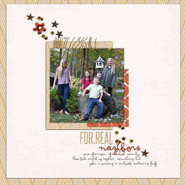
Neighbors by Debbie Hodge | Supplies: Revealed by Taylor Made; Reflection by Sahlin Studio; Pocket Fillers by Valerie Wibbens; Stargazer by One Little Bird; Arsenale White font
Sans Serif for Display
Sans-serif fonts do not have serifs, those projections at the end of strokes. If you’re going to go with an all-caps title, they are usually the easiest to read. Fonts shown here are:
sans serif: Raleway
Debbie Hodge says, “Raleway is a great free sans-serif font available in several weights. It provides nice contrast within a title when paired with a script font. This page is about a day of skiing and movies with teen boys, and the title is a simple description: This was a Good Day.” “Day” is in Raleway, “good” is in a purchased script font Dominique is a purchased font (you might be able to find a free version), and “this was a” is in Debbie’s favorite typewriter font, Bohemian Typewriter. To render “day” here, Debbie put each character on its own layer in Photoshop, merged the layers, and added a chipboard style from Just Jaimee.
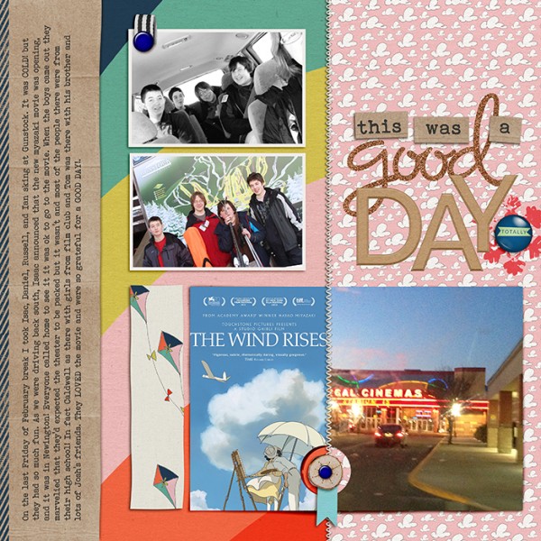
This Was a Good Day | Supplies: Legacy by Valerie Wibbens and Ardent Sparrow, Hey Handsome by Paislee Press, Storyteller Styles by Just Jaimee, Woodlets by Valerie Wibbens, Brad Bonanza by Pattie Knox, Fig by Sara Gleason, Dominique, Raleway, Bohemian Typewriter fonts.
sans serif: Bebas Neue
Summer Christiansen says, “This page shows pics of my husband holding our daughter’s hand, from the time she could walk, on hikes. Bebas Neue available at Font Squirrel is a great all caps san-serif font for titles. I used it in two sizes for my title, rendering the word “my” smaller. The small word between two larger words echoes the hands clasped between two larger bodies.
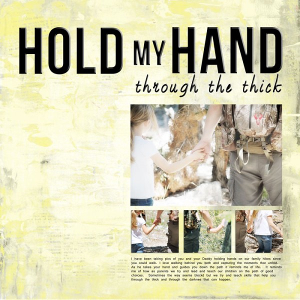
This is “Hold My Hand” by Summer Christiansen | Supplies: SuLu Designs: Square It Up Templates Vol.1, Twisted Tornado Papers, and Through the Thicket Words.
san serif: Oswald
Debbie Hodges says, “Oswald (bold) is sans serif that works great for two-part titles in which the second part is a script font for contrast.” Here she typed the word “SLOW” onto a layer in Photoshop above the patterned paper. She applied a glitter style (from Just Jaimee) and then lowered the opacity. Finally, the word is just a bit bigger than the paper behind and it is digitally clipped to the paper so it bleeds off the edges — as if stamped. “Travel” is in a script font (Dominique) and given a “stickerized” treatment (in which a layer just slightly bigger and filled with white lies below).
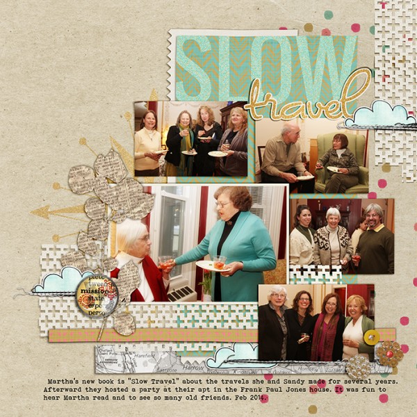
Slow Travel by Debbie Hodge | Plus One Stencil Cut by Jenni Bowlin, Legacy by Valerie Wibbens and Ardent Sparrow, Day in the Life by Ya Yeah, Mixed Stitches Black and White, Artplay Palette No 3, Find My Way Brad Pack, Find My Way Brush Set by Anna Aspnes, Far Away from Here by Ju Kneipp, Oswald, Dominique, Bohemian Typewriter fonts.
Novelty fonts
Novelty typefaces are great for illustrating your subject decoratively and come in a range of looks. Here are just a couple of examples.
Bloody Impact has blown-out openings for distressed look
Audrey Tan says, “This page is about my son being excited about his dog costume which he specifically wanted to use for his school’s sponsored walk. The font I’ve chosen is Bloody Impact and it’s a free font from Dafont.com I used it as a title. I applied an outline to it and turned it into a sticker and added shadowing to it.”
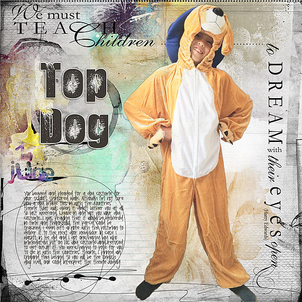
Top Dog by Audrey Tan |Supplies: Anna Aspnes: ArtPlay Palette Delightful, Journal Transfers No2, Children Quote No2, 12×12 Textured Overlays No6, Distressed Months No2, Artsy Cameras No2, Distressed Dates No1; Fonts: Pea Dana Anne, Bloody Impact
novelty: blackout
Debbie Hodge suggests finding chucking and filled fonts for punching your title from papers and paper elements. Here she used Blackout to punch “Stop By” from a piece of patterned paper. The centers of the letters are already filled for a hand-cut blocky look.
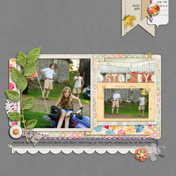
Chin Up, You Were Here by Allison Pennington; Retro Spring by Reverie Atelier; Notebook Journalers, Postcard Journalers, Flossy Stitches Yellow, Vintage Frames No 26 by Katie Pertiet; Worn Edges 4 by Lynn Grieveson; Embroidery Yarns Retro by Sahlin Studio; Embroider Me by Pink Reptile Designs; Banner Journalers by Robyn Meierotto; Vellum Ellies by Snips and Snails; Kraft Essentials by Karla Dudley; Stitched by Anna White by Anna Aspnes; Brad Bonanza 2 by Pattie Knox; Blackout, Bohemian Typewriter Fonts
Premade alphas and finding their look-alike fonts
An alpha is made with a typeface and quite often those typefaces are available as fonts. Susanne’s page uses Thickers Rainboots which is very similar to the Freestyle Script font that comes with Microsoft products. Check out a BIG LIST of American Crafts Thickers alphas and corresponding fonts from the Scrapbook.com message board.
Thickers Rainboots
Susanne Brauer says, “This May my daughter graduated high school and shortly thereafter I was in Florida for a few days vacation. Because of the timing, those days were filled with contemplation about the changes to come for both of us.”
“I used Thickers Rainboots in gold for my title, it is a flowing script font which reminds me of handwriting. It’s made by American Crafts but unfortunately it is discontinued. I paired it with Dancing Script for my journaling, which is available via Google Fonts. The design of the page is simple but each element, title, photos (done by superimposing vacation images in Picasa and applying their Cinemascope effect) and journaling are all very impactful.
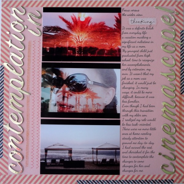
Contemplation in Cinemascope by Susanne Brauer | Supplies: Cardstock, Stampin Up; Alphabet, American Crafts; Journal font, Dancing Script; Tape, 2 Berry Creative; Rub-ons, K & Company and American Crafts.
Do you already have a suite of favorite fonts for scrapbook page titles?
Tell us what they are — and what categories you use? Are you collecting script, slab serif, novelty, or something else?

