 The “cross” or “t” foundation is found in art and graphic design, and it offers a strong starting place for making scrapbook page layouts.
The “cross” composition incorporates both opposition and union: two strong lines run in different directions and yet meet, crossing over at an intersection. The arms of the cross guide element placement with the intersection providing a sweet spot for your focal point.
We’ve shared ideas for this cross layout foundation previously and one of the Scrapbook Coach classes in the Get It Scrapped membership covers it in detail. Below are more examples. Take a look at the different ways to make a cross including where the intersection sits on the page and what the arms of the cross are made of.
Vicki Hibbins says, “This page is about our visit to the Elephant Trail. I first drew two long thin rectangles (later deleted) a third of the way down the page and a third of the way across. I placed the focal photo on the intersection and used these rectangles to help place the other items. This made it easy to decide where the elements should go.”
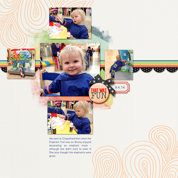
Elephant Trail created by Vicki Hibbins| Supplies: Just Jaimee: Storyteller Dec 2013, Storyteller April 2014
Ronnie Crowley says, “It’s amazing how fast a dog can feel at home. Paisley had been with us less than 24 hours when this photo was taken and she was totally at ease and we were totally in love. The criss cross design I chose to use is based on no.4 in the Scrapbook Coach Criss Cross class. This is a design I use often on my pages. I used the lines of paper and the line of the title to form the base of the cross. The visual triangle of embellishment clusters re-enforces the focal point picture and the intersection point of the criss cross.
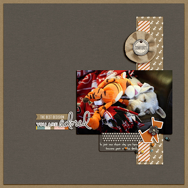
You Are Adored by Ronnie Crowley | Supplies: One Little Bird: Heart Beat; Anna Aspnes: Art Play Palette Ablaze
Marcia Fortunato says, “The photo on this layout shows my son reading his Bible and his son looking on (as much as he could at that age!). I wanted to make the layout as a reminder to him to be diligent in training his own children. The photo lent itself well to a criss-cross design since the two people were already forming that pattern. I lined my long title/message up with my son to form the vertical part of the cross and used the photo and journaling block to form the horizontal bar. I used my grandson to help guide the placement of embellishments that further reinforced the horizontal.”
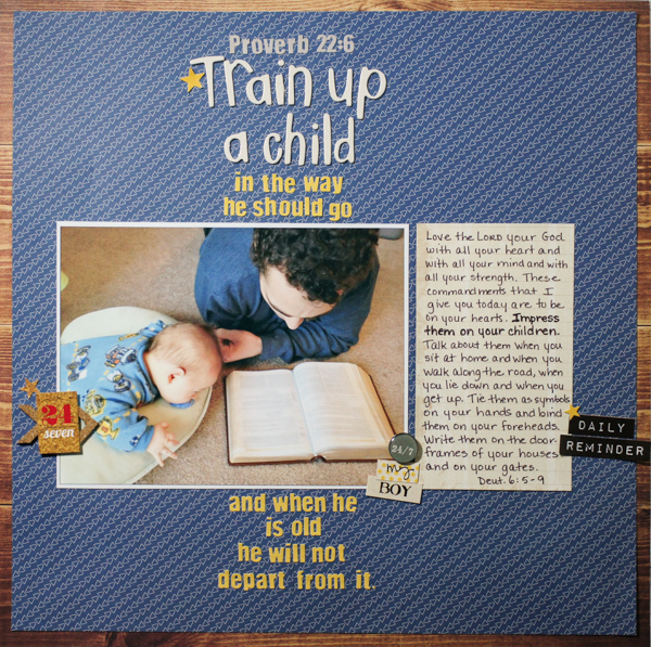
Train Up a Child… by Marcia Fortunato | Supplies: Patterned Papers: October Afternoon, Studio Calico, Little Yellow Bicycle (journal block); Letters: American Crafts Thickers, Fancy Pants Designs; Embellishments: Word stickers and stars: Simple Stories, Fancy Pants Designs; Cork arrows: Studio Calico; Acrylic bubble cap: Epiphany Crafts; Pen: LePen (Marvy).
Stefanie Semple says, “For his 21st, my son got a new leather jacket, which (apparently) could not be worn until he had black leather shoes. This page documents our hunt. I was inspired by Debbie Hodge’s Criss Cross Scrapbook Coach, lesson 1. Even though I used the same striped paper in three of the spots, I rotated the one 90 degrees, adding repetition through variety. My vertical band is implied through the embellishment and journaling placement. A few spots of blue add a fun masculine vibe.”
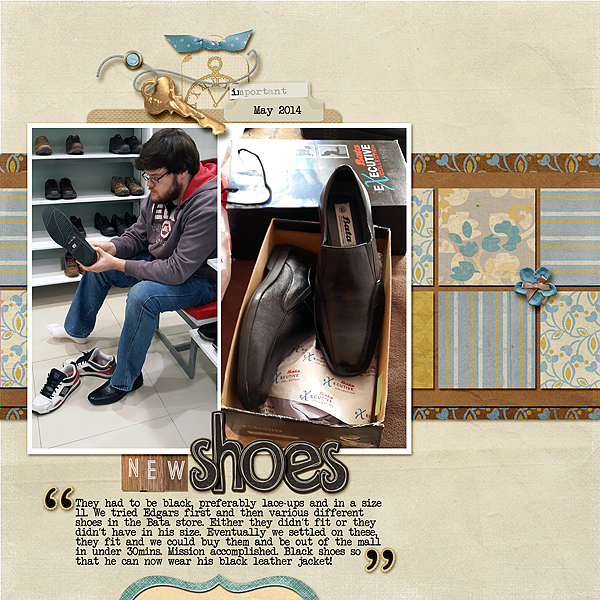
New Shoes by Stefanie Semple. Supplies: Forever Joy Designs: lessons (kit), Amy Wolff: Itsy Bitsy Alphas; Shabby Miss Jenn Designs: Dark brown Alpha
Kiki Kougioumtzi says, “While preparing the kite, my daughter thought wearing the kite tail for a wig was a great idea. Choosing to use the criss cross design as a base for my layout made building the page easier. The place where horizontal and vertical lines intersect gives you immediately a place for the focal point of the page. I made my design base with ink and build everything over it.”
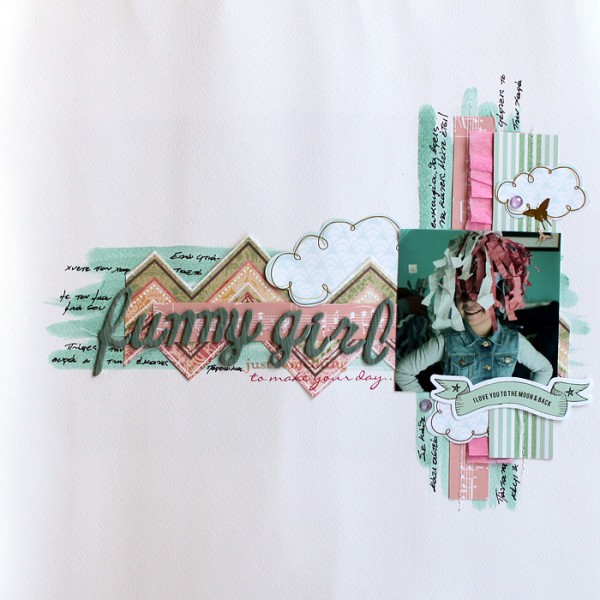
Funny girl by Kiki Kougioumtzi | Supplies: Cardstock:Canson;Pattern paper:American Crafts,Basic Grey;Rub ons,alphas:American Crafts;Ink dauber,die cuts,gems:Studio Calico;Other:crepe paper.
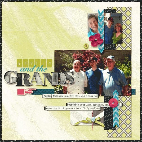
Karen Poirier-Brode says, “The page is about how pleased we grandparents are with our young man grandson. I followed the class prompts pretty much from the fourth video of the Scrapbook Coach Criss Cross class. This was a good way to work multiple photos of an event into a page. I stole the photo of the ex from my granddaughter’s Facebook page because I did not feel the page would be complete without Nora on it. Adding it varied the design but I believe it works. I made the photo of Austin with the granddads the dominant one on the page to emphasize him as an adult man of the family. The criss cross design works well because it keeps things strong and energetic.”
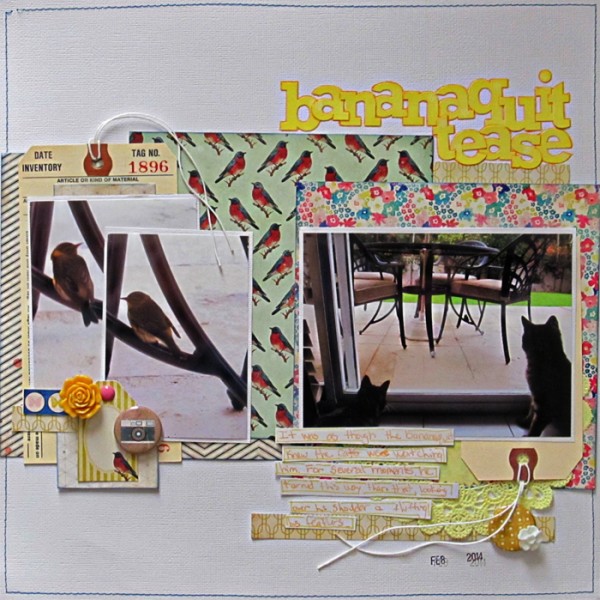
Christy Strickler says, “My cats noticed a bird on our back patio. I created a band on the right side of the canvas by keeping the title, journaling and cluster of embellishments the same width as the photo.”

