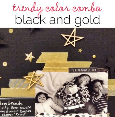
 Use a scrapbook page color scheme of black and gold and you’ve got instant drama–a drama that’s well suited to some of the scrapbook page storytelling you do. Following on the movie remake of The Great Gatsby, stars on the award carpets showed off black and gold. Today you can find current fashion, decor, and accessories using this combo.
We’ve collected black and gold inspiration for you on Pinterest and we’ve got scrapbook pages below that put this combo to work. See the products and textures our team used, see the relative proportions, and see what other neutrals they used to make this combo work.
Kiki Kougioumtzi says, “This layout is about my daughter’s first picture: her ultrasound. I felt this precious moment in our lives deserved a special treatment, and so I chose a rich and elegant color combination. Black and gold are dominant with white supporting. The main design is based on a circle (representing the circle of life) made with gold leafing. Splashes of gold mist mark the positions of the focal elements of title and photo.
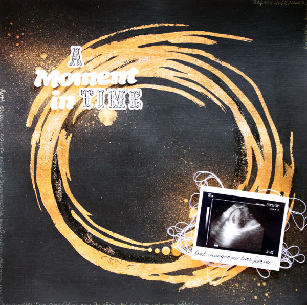
A Moment in Time by Kiki Kougioumtzi | Supplies: Cardstock: Bazzill Basics; Gold leafing & medium: Efco; Alphas: American Crafts, Echo Park; Other: Ranger Perfect pearls and Stickles glitter glue, DMC thread, Sakura Gelly roll pen, Twine+Ink Enamel dots.
Amanda Robinson says, “This page documents something amusing that my son said to me.I added pops of black and gold to embellish my page which has a neutral foundation. ‘Black and gold’ is actually a direct quote from this particular story so my color scheme entirely supports the page topic.”
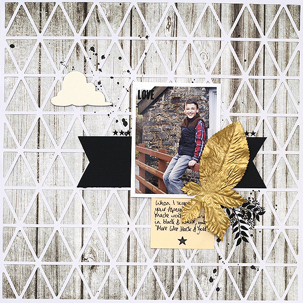
Untitled by Amanda Robinson | Supplies:
Kit – JBS Mercantile, April; Patterned paper – Jillibean soup, Fancy Pants Designs; Leaves – Prima; Rub-ons – Tim Holtz; Chipboard – October Afternoon; Journling card – Jenni Bowlin Studio; Mist – Studio Calico
Terry Billman says, “Every year Laredo Medical Center hosts a Christmas dinner and dance for the physicians and their administrative staff. It’s a little out of Craig’s comfort zone, and I’m glad he tries to fit in my working world. Pairing dark dramatic colors with lighter ones creates makes a strong statement. The metallic texture adds a decadent and extravagant feel. I converted the background of the photo to black and white and used selective coloring to highlight Craig and myself.”
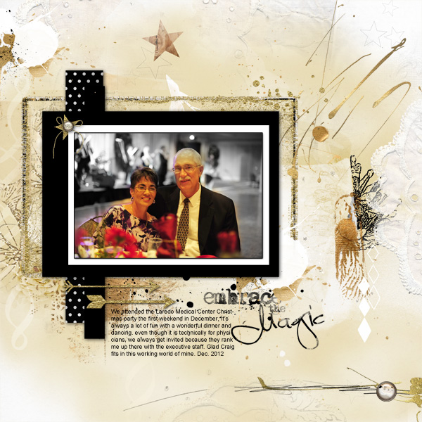
Embrace the Magic created by Terry Billman| Anna Aspnes: Art Play Palette Christmas Magic, Art Play Christmas Tree, Art Play Palette English Rose, Art Play Palette Infatuated, Gold Paint 1; Katie Pertiet: Gilded Photo Frames 1, Golden Essentials No. 4, Golden Essentials No. 2
Katie Scott says, “My son and I have begun an annual tradition of going to the Renaissance Fair when it comes to town in the spring. This year we tried knife, axe, and ninja star throwing. My son earned black and gold stickers that he later gave to me with a very serious instruction: Mom – put these on a scrapbook page, ok? I used the black and gold color scheme of the stickers as my inspiration for the page. I printed a photo collage using Picasa and I desaturated the colors in the photos so they were still in color (as my son dislikes the look of black and white or sepia photos) but the colors were muted so they worked with this color scheme.”
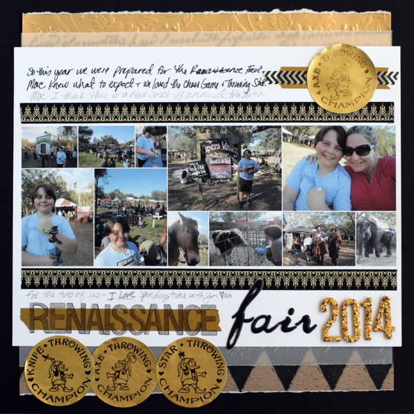
Renaissance Fair by Katie Scott | Supplies: DCWV and various other patterned and vellum papers; American Crafts letter stickers; Scotch brand washi tapes, Sharpie and pencil.
Michelle Hernandez says, “I used washi as a backdrop for my photo, taking care to add the patterned ones to areas where they would be visible. I added sequins and glitter brads for pop. The pop up cardstock stars were a last minute fix for glue mistakes or eraser marks. One of the reasons I don’t use black cardstock often (even though I love the look) is that it’s harder to keep tidy than white cardstock. Everything you do to correct a mistake shows.”
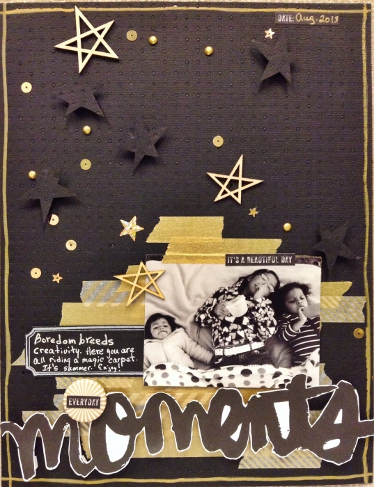
Everyday Moments by Michelle Hernandez | Supplies: Bazzil black cardstock, a Flair For Buttons gold burst flair, MT washi tape in gold and gold stripes, Studio Calico veneer stars, flat gold sequins, foam dots, american crafts mini glitter brads, “Moments” title cut out of American Crafts paper, american crafts chalkboard sticker, My Mind’s Eye mini word sticker, Uniball white pen and Sharpie gold marker for the border.
Christy Strickler says, “A friend of mine talked me into posing for a modeling company portfolio.The picture felt very formal, so I felt that the black and gold accented it well. Black and gold can be considered to have a lot of weight. I lightened up the feel of the layout by using vellum and vellum tape with gold accents.”
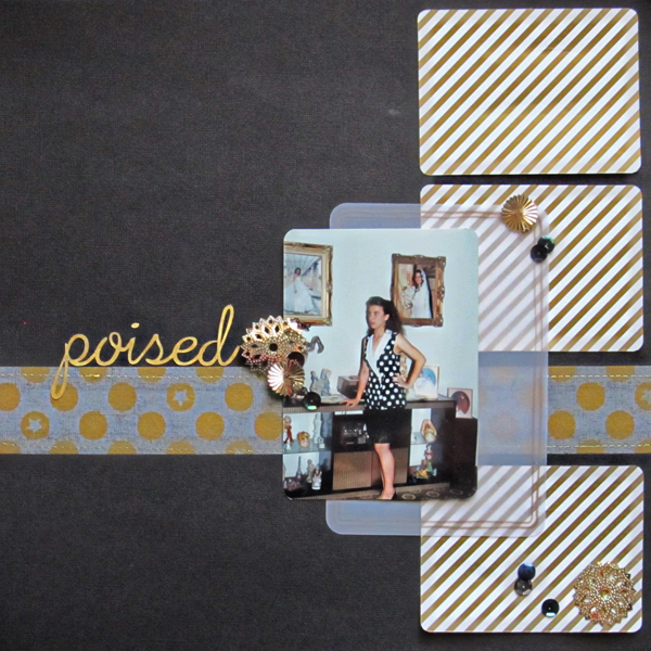
Poised by Christy Strickler |Supplies Cardstock: Colorbok; Journal Cards: My Mind’s Eye; Vellum: We R Memory Keepers; Sequins: Jenni Bowlin Studios; Tape: Freckled Fawn; Font: Silhouette SW Partay Thyme
Celeste Smith says, “My silly kitten, Milo, likes to sit on my keyboard while I work. I used mostly black and white with touches of gold. I tried to blance the bits of gold throughout the page and not have any one thing be overwhelming. I stuck to geometric patterns mostly as I think that the color combination is very modern.”
“I tried to give the page energy with interesting patterns and whimsy with the cut away circle revealing confetti. This color palette could get very mature or very 1980’s shoulder pads very quickly! If I had been allowed to add a little color I probably would have added some pale turquoise blue or even made that gold heart red!”
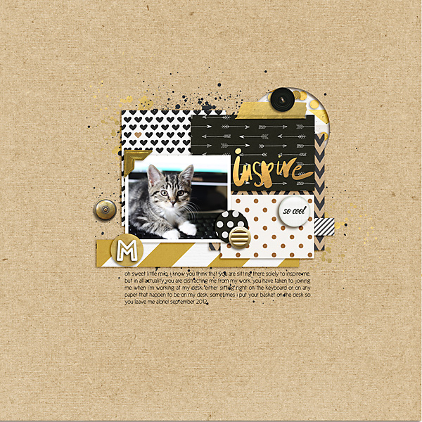
inspire by Celeste Smith | Supplies: Allison Pennington: Get Happy Alpha; Robyn Meierotto: So Daily cards; One Little Bird: So Major kit; Paislee Press: Quintessential vol. 3, Head in the Clouds kit; Laurie Ann: Fortitude kit; Gennifer Bursett: Julep kit; For the Love Of… kit, Far and Away kit; Mommyish: Gold Confetti; Polka Dot Pixels: Crafty Collage; Shannon McNab: Be Merry kit; Michelle Underwood: Take Note kit; Audrey Neal: Neutral Cardstocks; Karla Dudley: I Love It All Solids; Font: New Cicle.
Marie-Pierre Capistran says, “This page is about my two daughters. I sometimes find it challenging to be a parent (a good mom) and I have to stop and look for the good in my kids and when I see it, I feel like we’re good to go again. I wanted to record the good I found lately. I decided to go with a grid design so that I have 9 small frames to play with, to add pictures and lots of embellishment in gold and black. There are so many black Project Life style cards or patterned papers in my stash at the moment that it was easy to find some with words relevant to my story. The gold accents here and there give a sense of value and richness to my page and to my little girls.”
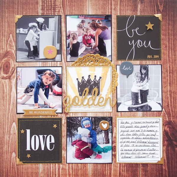
Golden by Marie-Pierre Capistran | Supplies: Patterned paper: October Afternoon, Studio Calico Project Life kits; Glitter paper: Recollections; Gold Doilies: Studio Calico; Photo Corners: Recollections inked with Heidi Swapp Color Shine spray mist; Sun Rays Stencil: Tim Holz collection; Gold ink: Dew Drop Brillance; Chipboard embellishments: Studio Calico; Golden stars: Pretty Little Studio; Others: Silhouette Cameo, Gold thread, black cardstock, white cardstock.

