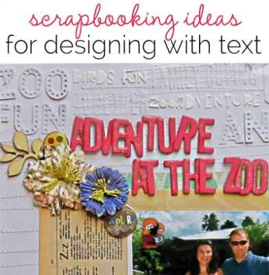
 Text has shape and meaning and makes a good addition to your scrapbook layout design. Check out these images of text in artwork we’ve collected on Pinterest — and then see how the Get It Scrapped Creative Team has used text on their scrapbook pages.
add handwriting in shapes and flourishes

Surrounded by Michelle Houghton | Supplies: cardstock and glitter; Ranger, watercolor paper; Strathmore, Washi tape; SEI, chipboard hearts; unknown, rub ons; Jenni Bowlin, gold ink pad; Tsukinek, ink pens; Sharpie, Ranger and Kuretake
Michelle Houghton says, “This page is about my family surrounding my sister in-law with our love and prayers. There is so much I want to say to Sheri about how brave she is and how we are praying for her, but it is hard to put it all into writing.”
“When I saw the wonderful artwork of text artist Linda Arandas, I was inspired to fill a page with text, letting my thoughts ramble and flow. To create this page I used several different ink pens and wrote phrases and words filling the entire paper that I would build my layout on top of. I used three different colors of ink and varied the size and style of my writing, overlapping and creating pattern with the letters. I added the doodled heart and wings with a black brush pen, and then added more writing to its edges with a black sketch pen. From there the layout is just a few pieces of Washi tape and chipboard added with my photo.”
make a “word cloud” in a shape for telling your story

We Took a Walk by Sian Fair. Supplies: Patterned Paper: Fancy Pants Design; Alpha: Basic Grey mini mono alpha stickers; Word Stickers: October Afternoon; Flair: A Flair For Buttons; Kraft Star: Studio Calico; Wood Veneer: Citrus Twist; Stamp: Amy Tangerine for American Crafts; Enamel Dots: Basic Grey Basics Candy Buttons
Sian Fair says, “This page looks back at our walk along Hollywood’s Walk of Fame one last August afternoon. I used an online word cloud generator called “Tagxedo” to create a star shape filled with Walk of Fame related words. Tagxedo will also make use of a block of text from a website, even your blog, and turn it into almost any shape you can think of. It makes great cards too.”
make a foundation of torn vintage book pages
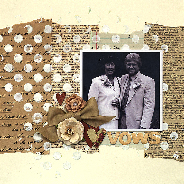
Vows by Amanda Robinson | Supplies: Wooden letters – Studio Calico; Flowers – Prima; Stencil – The Crafter’s Workshop; Other – Chipboard hearts, white acrylic paint, vintage book text papers, ribbon.
Amanda Robinson says, “This layout features an old photo from my in-laws’ wedding. I love to use text and script elements on wedding pages. Here, I used pieces torn from vintage papers to create a collaged foundation for the photograph and other elements. I used a combination of printed and handwritten text to convey the formality of marriage as well as the fun of celebration.”
make a background with layered news articles about your subject
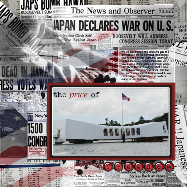
The Price of Freedom by Terry Billman| Anna Aspnes: Tattered Paper 1, Art Play Palette For The Record; Katie Pertiet: Naturally Krafty 2, Buttoned Rimmed Alpha; Maplebrook Studios: Just Linens 37
Terry Billman says, “This layout speaks about the thoughts and emotions I felt when I visited the U.S.S. Arizona Memorial at Pearl Harbor. I created the background by attaching several different newspaper articles about the attack on Pearl Harbor to digital masks. The background also includes photographs of the wall that had the names of those who lost their lives at Pearl Harbor, and two photographs of the American flag and an image of a soldier saluting layered over the text background.”
make a tone-on-tone background with same-color alphas and cardstock base
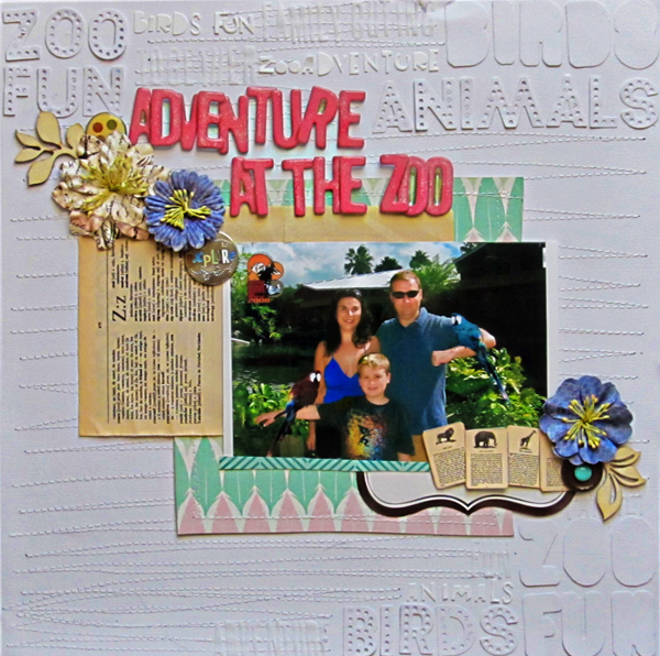
Adventure at the Zoo by Christy Strickler |Supplies Cardstock: Colorbok; Patterned Paper: Studio Calico; Letters: American Crafts, Basic Grey, Studio Calico, X-Cut; Flowers, Wood Veneer: Prima; Button, Flash Cards: Jenni Bowlin; Enamel Dot: My Mind’s Eye; Snaps: We R Memory Keepers: Other: label, dictionary page;
Christy Strickler says, “This photo was taken as we entered the Miami Metro Zoo. Instead of including journaling, I used words and phrases to set the scene for this photo. This layout will be used at the beginning of several layouts about our trip to the zoo.”
“I began my making a tone-on-tone background of text on cardstock. I cut the words from white cardstock and used white letter stickers. I used my machine to stitch a textured background before layering the rest of the embellishments onto the layout. I fit my title and photo mat into the background design, bringing those portions forward with color. Small flashcards, a flower with text, and a dictionary page reinforce what the story is about.”
extract a silhouette and fill with text-print paper
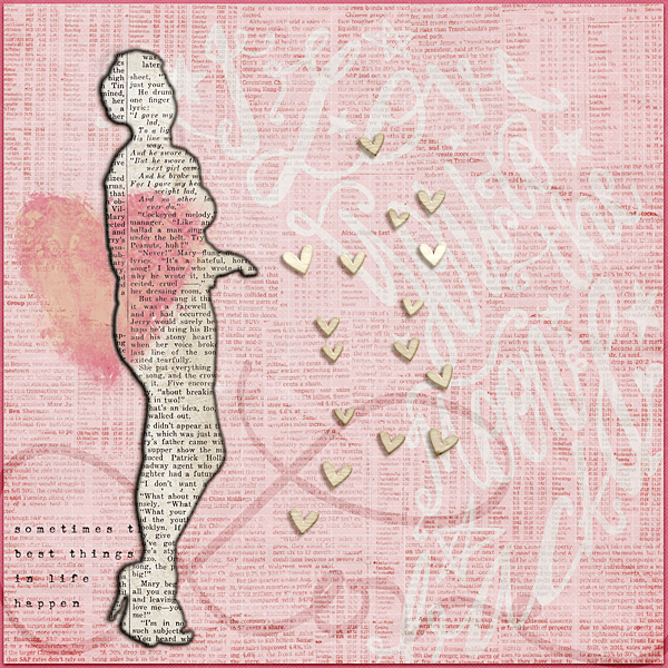
Love by Ronnie Crowley | Supplies: Amy Wolff – Giddy; Chelle Creations – Big City; Furry Friends; Tech No Luv; Just Jaimee – Love You To The Moon And Back; L Drag Designs – Love Always; Mye De Leon – Free Spirit
Ronnie Crowley says, “Sometimes I like to have fun and play digitally rather than worry about the story, and this is one of those layouts.”
“I started with a picture of my daughter and extracted her from the picture. I selected that extraction and on a new layer and filled with black. I clipped typed paper to that to make a silhouette of her. I then selected it again and expanded the selection and on a new layer below this one, I filled and clipped a black paper to it and blurred the edge with a filter. The heart element I place above and below the cut out image. Erasing the part of the top heart which extended beyond the image so that it appeared to be above and below the cut out.”
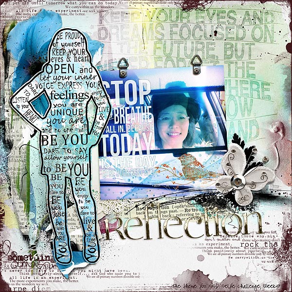
Reflection by Audrey Tan | Supplies: Anna Aspnes: ArtPlay Palette Go Retro, Script Tease Life Overlays No2, Multi Media FlutterBys No2, Multi Media Flowers No1, Retro Glows No1; Val C Designs: Dream, ArtBook She Is; Gennifer Bursett: This Is Why; Angie Hinksman: True Romantics; Jen Maddox Designs: Urban 3; Font: Pea Swimmy Script
Audrey Tan says, “This page is about a selfie challenge that I’m taking part this year. For this page, I added the silhouette image of a woman filled with encouraging text. I added background text to the page to reinforce the idea too.

