 Complementary colors purple and yellow are a trendy scrapbooking color combination this year with Pantone’s color of the year pick of radiant orchid. With variations in hue and saturation this combo can yield a variety of looks. We’ve collected inspiration online for this color combo and our creative team has make pages with their own particular purple-yellow mixes, with lilac, orchid and fully-saturated purple from one side of the wheel and choices like lemon, mustard, and khaki from the other side.
Online inspiration
- Get It Scrapped Purple + Yellow Color Combo Pinterest Board
- Houzz Unique Color Combinations: Yellow and Purple
Scrapbook layouts with yellow and purple
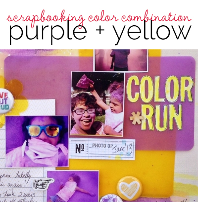
Michelle Hernandez says, “Yellow is my favorite color. It instantly makes me happy so I tend to add it to all my pages. It also goes really well with year’s Pantone color of the year radiant orchid. This is my third scrapbook page using purple and yellow. Once I chose the vellum as the main focus behind the photos I couldn’t decide what to do with the background. I tried both patterned paper and stenciled backgrounds but both were too distracting. I also wanted a background that reflected the mayhem of our first Color Run so I washed some water color into the card stock- it took several sheets to get the right balance of pretty and messy. I then added a patterned paper backdrop to stabilize the paper as it had warped.”
Sue Althouse says, “This page is about my wandering ways as a four year old. I selected a lighter shade of purple for a feminine look, while the dark purple mat grounds my photo to the background canvas. Because vibrant yellow can be difficult for the eye to process, it is used as an accent color and backed with black cardstock to help it pop off the page.”

Out of Bounds by Sue Althouse | Supplies: Cardstock: Bazzill; Patterned Paper, Mistable Butterfly: Studio Calico; Punches: Fiskars, Martha Stewart, Stampin’ Up!; Alphabets: American Crafts; Inks, Mists: Jenni Bowlin, Mr. Huey’s; Washi Tape, Twinkle Goosebumps: Queen & Co.; Buttons: October Afternoon; Floss: We R Memory Keepers; Photo Corners: Scrapbook Adhesives; Typewriter: Remington
Stefanie Semple says, “This layout celebrates my daughter and her different hair styles as well as her penchant for hair dressing. I mixed a bold mustard yellow with a muted dark purple in almost equal quantities. The majority of the layout’s real estate is neutrals with added bits of stitching and metallics.”
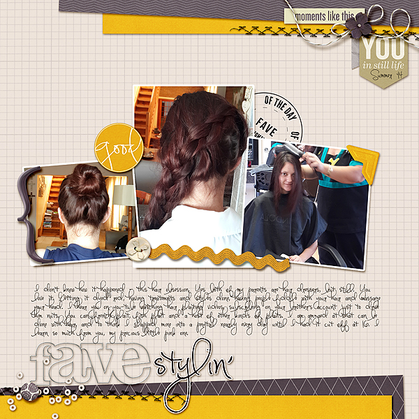
Stylin’ by Stefanie Semple. Supplies: One Little Bird : Still life (kit) and Shadow Styles; Valorie Wibbens and Karla Dudley Collaboration : the good stuff (kit); Charmbox Studios Resize for web action. “Stylin” font is Pea Mily Mix from Kevin and Amanda.
Brenda Becknell says, “I found this old photo of my mom, little sister and me in an old album at my parents’ house and felt it deserved a scrapbook page! For this layout, I went with the gallon/quart/pint rule on color: a gallon of purple, a quart of yellow, and a pint of white. When using a two color combination, it’s important to vary the shades and patterns of the papers. I used a darker purple background with lighter lavender colors in two different patterns. The narrow yellow border and the large flower are deeper shades of yellow than the papers and flower centers. Some touches of white and kraft as neutrals give the page a softer feel.”
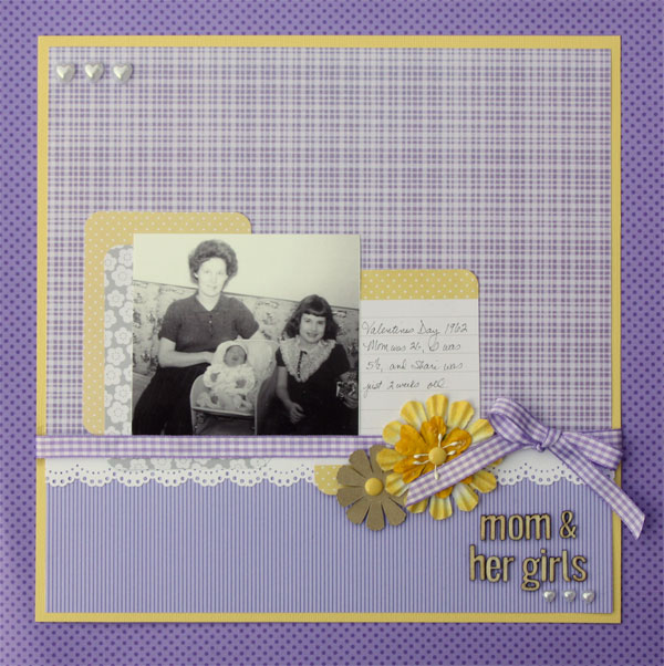
Mom and her Girls by Brenda Becknell | Supplies: Cardstock: American Crafts; Patterned Paper: Doodlebug Designs, DCWV; Journaling cards: Project Life; Wood alphas: Studio Calico; Ribbon: Paper Smooches; Enamel dots and heart pearls: Doodlebug Designs; Flowers: Back Porch Memories
Ronnie Crowley says, “The light at sunset can be the most beautiful light if all the conditions are perfect. In this picture I love how the warm tones are catching on the snow on the peak.To bring out the purples in the sky I used a lilac purple background. Finding the perfect color involved lots of swapping out as it needed to be just the right purple. When I used darker ones it over powered the picture and lighter ones made the picture appear washed out. The yellow used also needed to be more muted yellows that you would get in late moments of a sunset and not too much yellow to reflect the proportions in the picture. When scrapbooking landscape pictures it’s important to let nature lead the way and to use embellishments that enhance the beauty rather than taking center stage.”
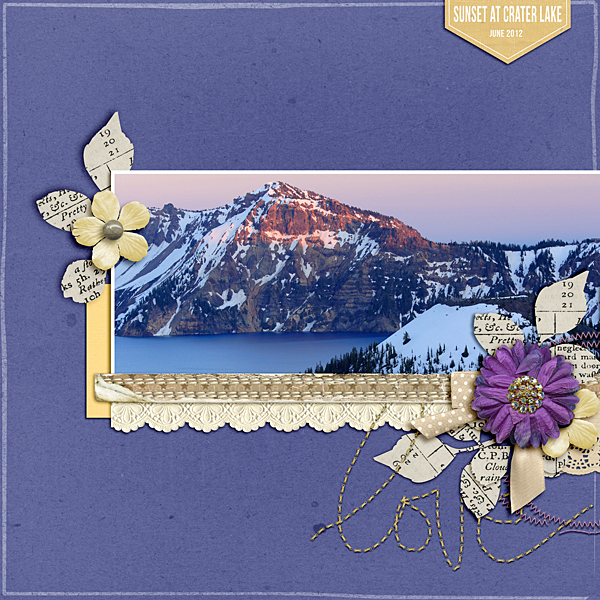
Sunset at Crater Lake by Ronnie Crowley | Supplies: Meta Wulandari Designs – Connected; Vicki Stegall – Butterfly Kisses; Anita Designs – Tranquility; Connie Prince – Dazzled; Creashens – For like ever, You Stitches; Gina Miller Designs – Twilight; Lynn Grievenson – Worn Strip; Mye De Leon – Better With You; Charlize Creation – Heart First; Sugar Fancy Designs – Camera Addict; Traci Stroud – Edged out; Wild Blueberry Ink – Wanderlust
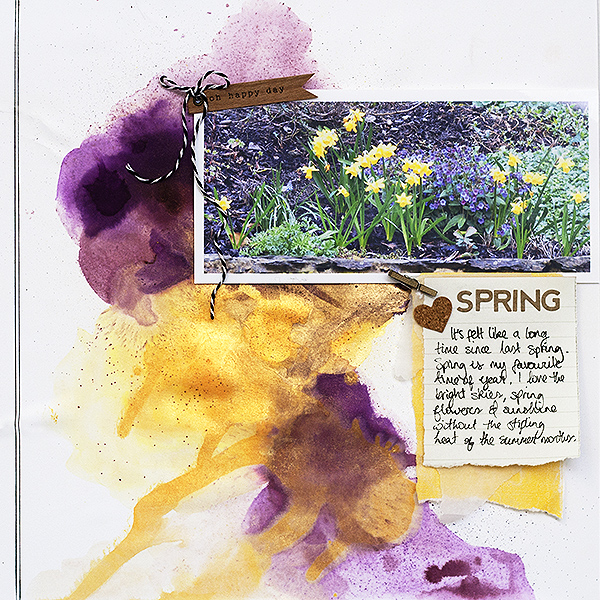
Amanda Robinson says, “This layout documents my love of spring after what seems like an especially long winter. I used dark mustard and plum colors on my background in fairly equal proportions to echo the purple and yellow flowers in my photograph. I used wet mediums and a lot of water to create an organic background which supports my photograph and story.”


