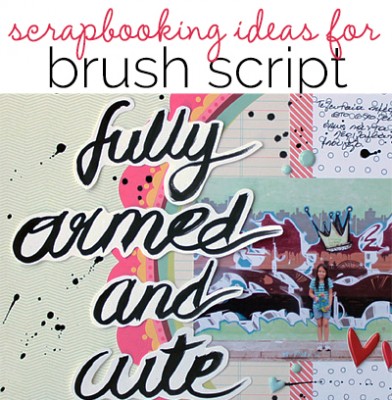
 A recent trend in print, fashion, and decor is to use ink and brushstrokes to create bold typography that’s a prominent part of a design. For your scrapbook page storytelling you can use it to draw attention, tell your story, and–as Amy Kingsford suggests–“date stamp” your page with a current trend.
We’ve collected brush script inspiration for you on Pinterest and we show you how to use this inspiration on the page below.[hr]
hand-letter and fussy-cut a bold script title
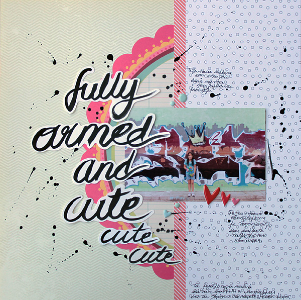
Fully Armed and Cute by Kiki Kougioumtzi Supplies|Pattern paper: Basic Grey, Studio Calico, My Little Shoebox; Other: Twine+Ink puffy stickers, Winsor & Newton black Indian ink, Ranger Claudine Hellmuth Studio paintbrush, Canson cardstock.
Kiki Kougioumtzi says, “This is a photo of my daughter on the last day of school. It is a tradition that they play with water on the last day, and this year she had a water gun. Students from older classes make graffiti, and she also had her markers with her: she was ready!”
“I added titlework in a brush script I created myself, so that my layout had a freestyle look that supported the graffiti in the photo and the story. I used black India ink and a round tip paint brush on plain cardstock. I wrote my words and then fussy-cut each one to build my title. I practiced a lot and tried various sizes of brushes (round tip only) until I had the result I wanted.
My conclusions are:
- The bigger you want your letters, the bigger the brush must be
- You have to make sure that the brush is loaded with the medium you are using (India ink in my case), otherwise you may run out of ink in the middle of the word
- Write each word in one “flowy” motion. Put down the brush once at the beginning of the writing and lift it only at the end of each word. [hr]
add curves and grunge to a linear design with brush script
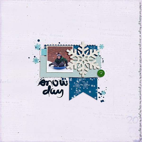
Snow Day by Celeste Smith | Supplies: The Lilypad: Winter Wishes Collaboration kit; Gennifer Bursett: Toolbox Mists vol. 7.
Celeste Smith says, “This page is about a sledding trip we took. I extracted the words snow day from a digital journal card from Emily Merritt for my title. I think the brush script works well with the paint splatter and the snowflake scatter. It adds a little grunge to an otherwise very linear page.”[hr]
add white gesso brush script to a kraft background
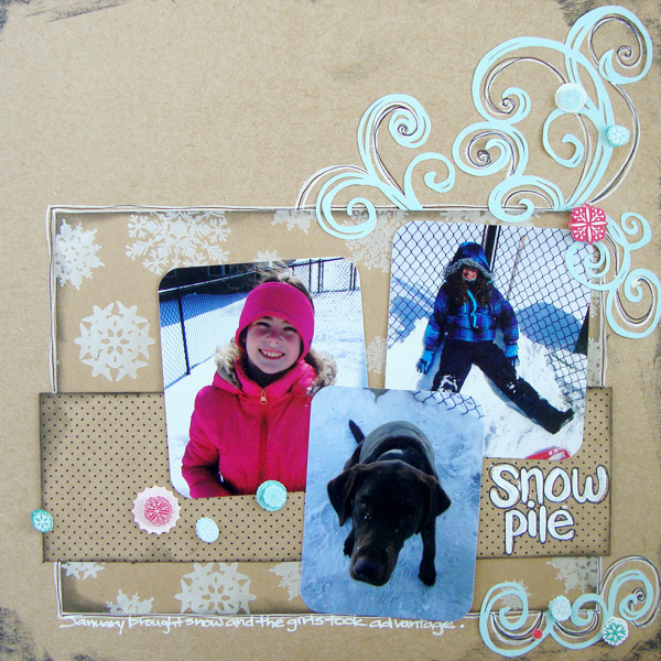
Snow Pile by Michelle Houghton | Supplies: papers and stickers; SEI, ink pad; Tskukineko, ink pens; Sharpie, gesso; Golden
Michelle Houghton says, “A snow day last January inspired this page of my girls and dog playing in the snow.”
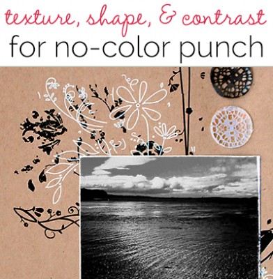 I took inspiration from the pages using kraft with black and white in the Get It Scrapped article on no-color pages last month. I used gesso and a round paint brush to add my title directly onto the layout. The look was just perfect for the fun snow page. The bright white of the gesso on top of the kraft paper pops, and the loose brush strokes add to the playful, childish feel of the page.
Tip: If you are adding your lettering by hand, try it on vellum or tracing paper first and then you can move it around on your page to get a feel for placement and size before you commit it to the page. [hr]
use pre-made digital cards and wordart to add brush script to your page
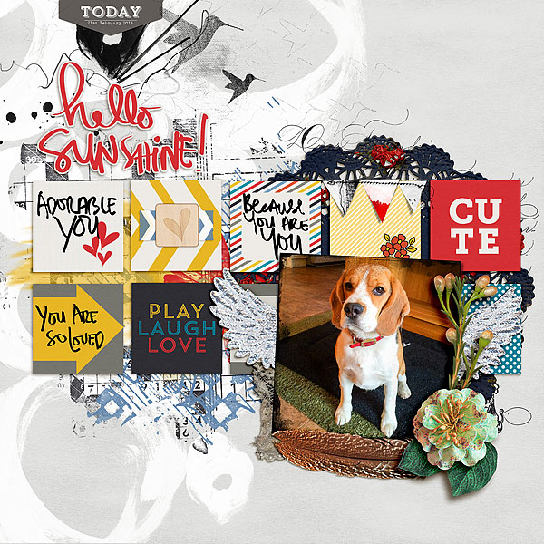
Hello Sunshine! by Audrey Tan | Supplies: Anna Aspnes: ArtPlay Palette Embrace Me, Artsy Edge Frames No1; Juliana Kniepp Designs: Fly, Grow Your Wings; Mye de Leon: Hopscotch, Sentiments; Font: Pea Karynsig, Olivetti Type2
Audrey Tan says, “This page is about remembering my dog. Although he is no longer with us, he is never forgotten. I used several pre-made digital cards printed with loving sentiments rendered in brush script, and a larger piece of word art in brush script for the title.”[hr]
die-cut a brush-script foundation
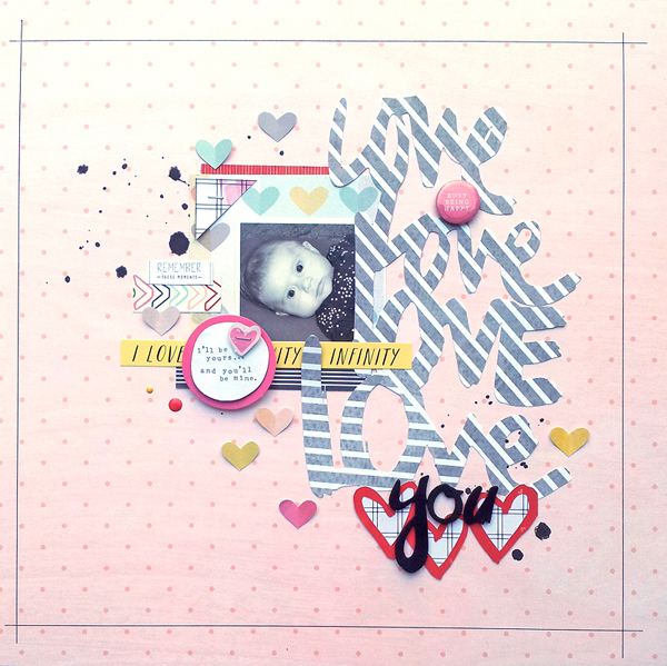
Love You by Ashley Horton | Supplies: Patterned Paper, Thickers, Stickers, Flair Button & Enamel Dots: American Crafts; Spray Mist: Studio Calico; Digital Cut Files: Two Peas in a Bucket; Die Cut Machine: Silhouette Cameo
Ashley Horton says, “I tried to get my niece to smile for a photo, but even with no smile, she is adorable. The photo lighting was poor, so I went with a smaller photo crop and a dominant brush script foundation which creates part of the page title. “Love” was repeated in a brush script font several times and cut from patterned papers. I combined it with black Thickers in a brush script style.”[hr]
cut a brush-script print pattern into large foundational shapes
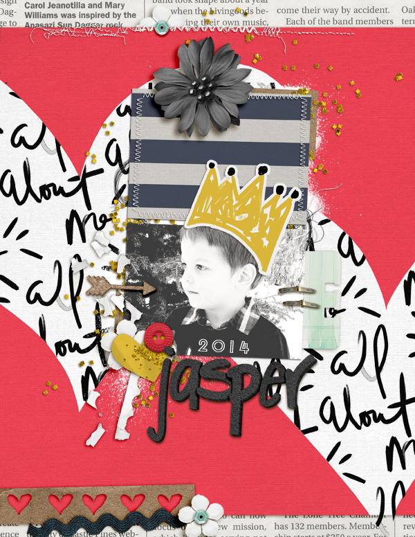
Jasper 2014 by Amy Kingsford | Supplies: Valorie Wibbens: Eat Cake, Make Believe Collab (with Paislee Press) Krafty Foam Alphas; Allison Pennington: Seize; Amy Martin: Two of Each V. 2 and Blanc Stitches.
Amy Kingsford says, “This is the title page for my son’s 2014 album. Because I didn’t plan on adding any journaling to this page I wanted to do something fun with text. I used a brush script patterned paper by Valorie Wibbens cut into large heart shapes. I like to add trendy items to my title pages to serve as a visual “date stamp,” and brush script is totally hot right now! [hr]
complement a brush-script title with fussy-cut brush-script doodles
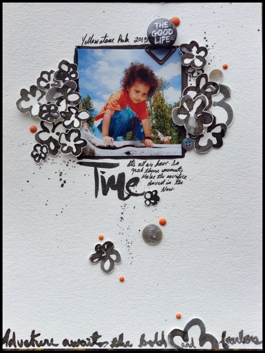
Time by Michelle Hernandez | Supplies: Watercolor paper, Dylusions spray ink, enamel dots, flair and #6 round brush.
Michelle Hernandez says, “This is a favorite photo from last year’s extended family trip to Yellowstone National Park. We almost didn’t go because we were sticking to a tight budget. My husband and I are now very glad we did. The memories from this one trip are priceless.”
“I’ve been meaning to practice my hand writing for a while, so I took this on as a challenge to my normal style. I practiced quite a bit before I was satisfied. I used Dylusions spray ink and a #6 round brush to write the words and paint the flowers. I cut the flowers out to add a bit of dimension and threw in some enamel dots to give the page some pop.[hr]
Which of these ideas has you inspired?
Let us know if you give any of them a try. We’d also love to hear your best tips and product suggestions for getting this trendy look on the page.

