 Scrapbook page storytelling that’s done with a mix of both the obvious and the hinted-at engages the viewer or reader at a deeper level. On these pages we have scrapbooking ideas for supporting the clearly explained parts of a story with cut-paper collage.
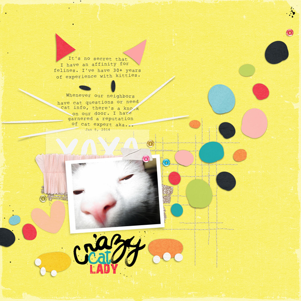
Carrie Arick says, “This page is about my reputation as a (crazy) cat person. Rather than an obvous image of a cat, I created a suggestion of one on my page to reinforce the story I’m telling. Since I work digitally, I created a template: I used simple vector shapes, each on its own layer, to construct my cat design. I converted the vector layers to raster layers, then warped and skewed my shapes so they would feel more abstract. I ended up taking most of those pieces away until I had the simplest form of a cat possible. I clipped bold colored paper to the shapes, kept the embellishing simple so the collage could stand-out and plugged in my photo and text into the missing parts of the cat.”

Crazy Cat Lady by Carrie Arick | Supplies: Just Jaime: Storyteller Papers- February 2014, January 2014, July 2013; Mommyish Designs: Geek Chic Papers; Micheline Martin: Paper Party; Valorie Wibbens: Queen of Hearts, Sprinkles v. 20; Kaye Winiecki: You & Me; Font: 28 Days Later, Rough Typewriter
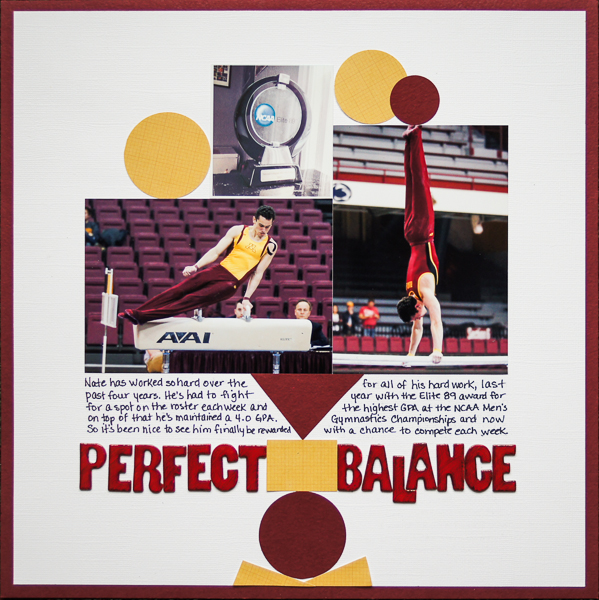
Marcia Fortunato says, “I made this layout to honor my son’s hard work and determination these past four years as a student athlete at the University of Minnesota. He’s had to balance academics with athletics, and he has excelled at both. I punched and hand cut simple shapes in maroon and gold since those are Minnesota’s school colors. I then stacked them on the page with my photos to represent the precise balance of a gymnast. There is also a double meaning—the balance that a student athlete much maintain in order to excel at both academics and athletics.”

Perfect Balance… by Marcia Fortunato | Supplies: Cardstock: Bazzill Basics; Patterned paper: Simple Stories; Letters: American Crafts Thickers; Markers: Staedtler, Sharpie.
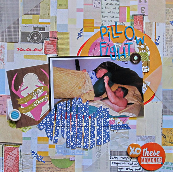
Christy Strickler says, “I began that page about my husband and son pillow-fighting with a piece of patterned paper that already had a collage design printed on it. My goal was to build upward, pulling color from the background collage into the upper layers. The colors in the upper layers are darker and richer in an effort to draw focus toward the photo.They are still matte, but they hold more energy than a pastel tone. Pillow fights make me think of feathers and I wanted to add the motif here. Rather than use an actual feather, I created a feather shape with rectangles and triangles. Most of them are small and scattered through parts of the page. I used one larger feather to anchor the photo. I created a visual triangle by placing grey rectangles strategically within the canvas.”

Pillow Fight by Christy Strickler |Supplies Cardstock: Colorbok; Patterned Paper: Studio Calico, Carta Bella; Letters: American Crafts; Flair, Chipboard: Amy Tangerine; Buttons: Freckled Fawn, Jenni Bowlin; Enamel Dots: Freckled Fawn; Pen: Bic Mark-its
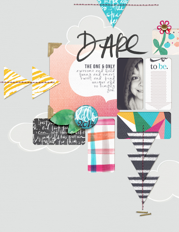
Amy Kingsford says, “This page is about my son and his developing individuality and independence. I began with a grid-like template by Karla Dudley that featured several staggered rectangle cutouts. I clipped my photo to one that resulted in a fun crop that only showed half his face and then I chose several bold geometric patterns to fill the other rectangles. I layered shapes (triangles, clouds, etc) over top and beneath this foundation to create my own abstract collage. The repetition of shapes and color was key in helping me to make sure that this fun design didn’t get too out of hand.”


