 Part of scrapbook page storytelling is putting things together so that the viewer knows where to start looking and then where to look next and next. There are several tools for creating flow on the scrapbook page. One technique is to understand that the viewer’s eye will move in the direction in which your subjects on the page are looking and to leverage that. See how our Creative Team has made pages that use “line of sight” to tell their stories.
turn a geometric print pattern to emphasize line of sight
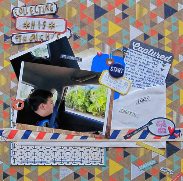
Collecting His Thoughts by Christy Strickler |Supplies Patterned Paper: October Afternoon, We R Memory Keepers; Flair, Stamp, Wood Veneer,Paper Clip, Journal Card: Studio Calico; Twine: Jillibean Soup; Stickers: Twine and Ink; Labels: Life-Love-Paper; Ribbon: May Arts; Ink: Tsukineko; Other: Envelope, tag
Christy Strickler says, “Lately, my husband and I keep noticing how my son seems lost in thought. I placed the photo on the left side of the canvas ( the same side he is situated in the photo). The canvas, itself, is a patterned paper made of triangles. I turned the page so that those triangles are pointing in the same direction my son is looking. With this particular pattern, some of the triangles then point back towards him. After paperclipping my son’s photo to an envelope, I stuffed it with a journal card and and words/phrases, allowing some to spill out. I can only imagine what he’s pondering. I wrote about this in the journaling, speculating about whether he was setting goals for the future or observing life as he collected his thoughts.”
emphasize the sight line with the other lines in your design
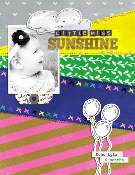
Little Miss Sunshine by Amy Kingsford | Supplies: Valorie Wibbens: I Whaley Like You; Karla Dudley: Holly Alpha; Gennifer Bursett: Far and Away; One Little Bird: Stay Tuned.
Amy Kingsford says, “This is a photo of my niece at 6 months old. I typically don’t like to direct the eye off of the page but with a profile picture like this one it’s hard to avoid. So I decided to emphasize the broken rule rather than skirt around it. I arranged all of the lines and patterns in my pieced background so they traveled off the page in the same direction my niece was looking and then I made sure to arrange my other key elements in a way that wouldn’t disturb the directionality of the page. I think the fact that this design moves the eye off the page is actually a large part of its appeal as it adds to the wonder and excitement of the design. The viewer can’t help but ponder what has captured my niece’s attention and sparked her joyous reaction.”
emphasize line of sight with digital techniques

Light by Andrea | Supplies: Erica Zwart Ocean view paper, Outdoor adventure mask; Anna Aspnes Foto Glows No 4.
Andrea says, “I really loved this photo of my son and how the rays of the sun reinforced his line of sight. I added a photo glow that reinforces the rays behind him and moves the eye forward. The pixelated appearance of the photo is a new technique I learned from Amanda Taylor. First I used the rectangular marquee tool to draw small squares and rectangles. It was easier when I turned on the grid. I duplicated those layers a few times and then layered them over the photo. I selected the area those rectangles filled on the photo, duplicated these bits to a new layer and moved the duplicated bits off the photo. Next I used the mask tool to erase these rectangular areas from the photo. This also reinforced the line of sight. To finish it off I used a quote about light.”
add an element to your page that mimics the thing your subject is looking at
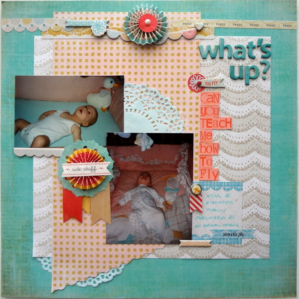
What’s Up by Susanne Brauer | Supplies: Paper, Basic Grey; Alphabets, Basic Grey and Studio Calico; Doily, SEI; Chipboard, Rosettes and Brad, Basic Grey
Susanne Brauer says, “These are shots of my son as a baby engrossed in the mobile above his crib. I added a top border with a central element to the canvas so that his line of sight in both snaps would be toward it, echoing the mobile. The border prevents the viewer’s eye from totally leaving the page. I placed the title high up on the page, and added what he might be thinking in a downward line to draw the viewer’s eye back to the journal block. It was a playful way to scrapbook the subject.
give a subject in movement some place to go
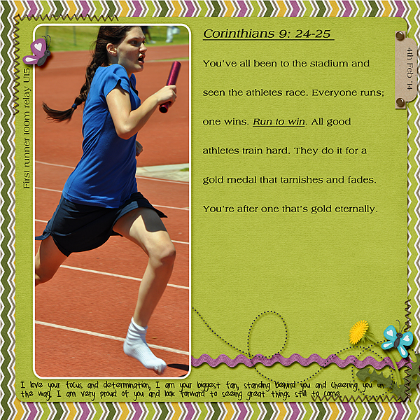
Run the Race by Stefanie Semple| Supplies: Chelle’s Creations: In the backyard, Erica Zane: Tab you’re it.
Stefanie Semple says, “This is a less than perfect photo of my daughter running in a relay. I wanted to encourage her to look at the big picture about giving of her best even though I chopped her head off and her team went on to come stone last. Because she is running toward the right, I placed the photo on the left and added ribbon and string elements to the right for movement. She is looking at the journaling. The date tab stops the viewer’s eye from drifting right off the page.
give a subject shot from behind something to look at with a creative canvas background

Going Places by Deborah Wagner. Supplies: Anna Aspnes – Find My Way Overlays, Katie Pertiet – Roughed Up Maps No. 7, Traveler Photo Masks, Page Blends No. 1, Page Blends No. 3, Almost There Kit, Going Away Kit, Made With Wings No. 3, Whimsy Words No. 2, Ad Inspiration 6-3–11, Catana Solids; Lynn Grieveson – Red Beach Kit; Green Grass Designs – Travel Along Quotes
Deborah Wagner says, “This is a photo of my nephew after his high school graduation. He is gazing into his future and ready to take on the world. I extracted him from the original photo and placed him on several layers of maps, overlays, and vellum to create the scene.”
bring the viewer’s eye back from the line of sight’s path with borders and arrows
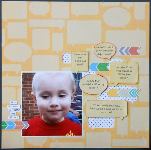
This is What a Little Boy Thinks by Brend Becknell | Supplies: Cardstock: C’oredinations; Patterned paper: Elle’s Studio; Word stickers: Tim Holtz; Ink: Hero Arts; Font: CK Teacher’s Pet
Brenda Becknell says, “Every now and then I get a photo that captures the mischievous side of my grandson’s personality. His sideways glance makes me wonder what he’s thinking about at that moment, so I played up that theme by using thought bubbles, popped up with foam adhesive, off to the right of the photo. I used small word stickers to put the title down and to the left of the photo, where his gaze goes. To add to the movement, but keep the eye from wandering off the side of the page, I cut out some of the thought bubbles in the background paper and backed them with a dotted paper. I added chevrons in contrasting colors all pointing in to the photo. I backed the page with dark grey cardstock to give a more defined edge and help pull the eye back into the page.
brings the viewer’s eye back from the line of sight’s path with visual weight and balance
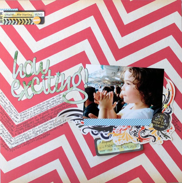
How exciting! by Kiki Kougioumtzi: Pattern paper,chipboard shapes: Studio Calico; Die cuts: Kaisercraft; Puffy stickers: Twine+Ink; Alphas: Basic Grey.
Kiki Kougioumtzi says, “This layout is about my daughter’s first experience attending a live football game.I placed the photo so that my daughter’s gaze leads you to the layout title. The title, itself, sets the tone of the page and makes you want to read more about it. Then the journaling leads you back to the photo. All the other embellishing supports the photo’s line of sight, heavily built up on the right (where my daughter stands) and gradually disappearing to the left where she is looking.
let the line of sight go off the canvas when it serves your story
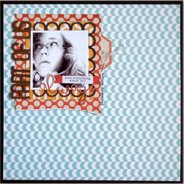
Emily Pitts says, “This is my daughter’s Facebook profile picture right now. You’ll notice that my daughter is looking off the page, to the left: a HUGE no-no in my book, but this time I’m OK with it. I am trying to convey that her new life is out there, where she’s looking, and that it’s OK for her to be doing this. So I’ve concentrated my design in the upper left hand corner rather than leading the eye around the page–even the chevrons in my background point to the left.”

