 Working with threes is a great way to make a solid looking scrapbook page design — and to make it efficiently. They eye likes things that come in threes. When you work with 3 items, you have the options for both symmetrical arrangements and asymmetrical. Line ’em up and you’ve got symmetry — pull two of them apart from one and you’ve got asymmmetry.
There are many ways to build a foundation of threes (and we cover them in Scrapbook Coach Three Acts). Here, we’re showing you pages that use three columns to give elements a home and, also, to organize a story. This is a good design for a page from a small event or outing, one with several photos taken at different time
Sue Althouse says, “This page is about our summer mini vacation and how we celebrated my birthday. The columns are defined by photos and 4″x 3″ pocket page cards, starting with our day on Lake Huron and ending with my birthday dinner. The layering behind the columns is designed to ground elements to the kraft background and break borders. The embellishing on top decorates each compartment and moves the eye around the page.”
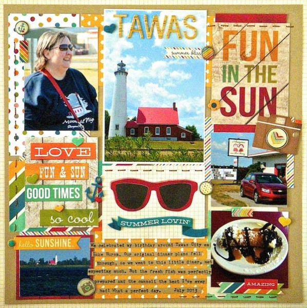
Tawas by Sue Althouse | Supplies: Cardstock: Bazzill; Patterned Paper, Stickers, Brads, Chipboard: Simple Stories; Alphabets: American Crafts; Floss: We R Memory Keepers; Typewriter: Remington
Stefanie Semple says, “My daughter participated in a few track events, and I wanted to get them onto one page. I used alignment to define the three columns. This arrangement let me grouping and separate the three different events. The middle column has a patterned paper background. This and the lack of row alignment cues the reader to read them by column and not from left to right.”
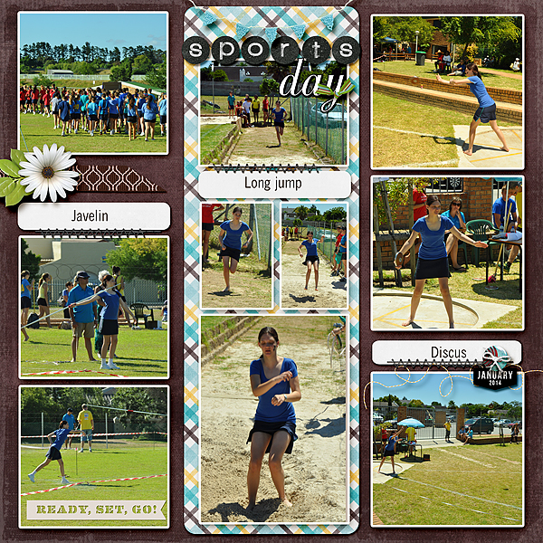
Sports Day by Stefanie Semple. Supplies: Melissa Bennett: Birds of a feather (kit); One Little Bird Designs: Metro (kit); Amy Wolff: Itsy Bitsy Alpha; Britt-ish Designs: Tack it down (stitching); S Creations Date strips 2014; One Little Bird Designs Shadow Styles; Charm Box Studio’s: Resize for web action.
Brenda Becknell says, “This page showcases photos from a rare date night with my husband. I went with a three column layout for this page because I wanted to include multiple photos from the game, but none of the photos were really great. Printing them in smaller sizes worked well. The center column is 4″ wide to accommodate landscape orientated photos, while the two outer columns are 3-3/8″ wide, to fit 3.25″ wide photos with a tiny border of red cardstock showing. I left some white space (or in this case red space) at the top left and bottom right corners, filling part of that open space with tickets tucked behind the larger left photo, and a journaling block. Those two items, along with the white center title space, give a diagonal flow line across the page. To add just a little interest to all the straight lines on the page, I tucked two half circle baseballs into the title space.”
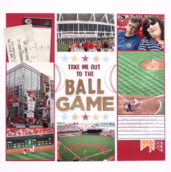
Take Me Out to the Ball Game by Brenda Becknell | Supplies: Cardstock: Michaels, Bazzill; Alphabet stickers: Fancy Pants, American Crafts; Stamps: Close to my Heart, Technique Tuesday, Paper Smooches; ink: Ranger, Hero Arts, Quick Quotes; circle punch: Fiskars
Celeste Smith says, “This page is about my husband’s amusing “Ugly Christmas Sweater” experience. I created three large rectangles in a row on my page. I filled one with a photo, one with some kitschy Christmas paper, and one with my journaling. I think that if you have columns like this you should try and anchor them a bit as I did with the striped paper on the bottom. The little Santa and my title break the borders and give the page a little less boxy feeling. “

Ugly Christmas Sweater by Celeste Smith | Supplies: Creashens: Merry Little Christmas; Celeste Knight: Peppermint Twist; Sahlin Studios: Santa’s Workshop.
Marcia Fortunato says, “Since my family is now all spread out, I’ve decided to choose one day each month to have everyone take a photo and send it to me. These are our photos from January.”
“A couple of the photos couldn’t be easily cropped to squares, so instead of using a straight grid I used three columns. To reinforce the column design I left space between the columns, but did not leave space between the photo mats within the columns. I shifted everything just a bit to the right of center to accommodate labels along the left side of the columns and also to add a bit of tension.”
“Each column includes photos from each “sub-group” within our family: my husband and I, my oldest son and his fiancé, and my second son with his wife and son. Then I put the photos from my two youngest sons where they best fit to fill in the columns.
I think that the three column design is good for organizing a lot of photos and/or journaling, and in my case I used it as an alternative to a straight grid to emphasize the subgroups within the whole.”
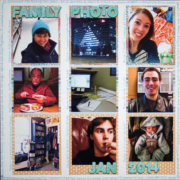
Family Photo… by Marcia Fortunato | Supplies: Cardstock: Bazzill Basics; Patterned paper: Studio Calico; Letters: American Crafts Thickers; Pen: Sharpie.
Marie-Pierre Capistran says, “This is a page about my trip to CHA.”
“When I started working on it, I wanted it to look a little bit like a newspaper article. I wanted the story to be told with lots of text and lots of photos. I started by printing my photos and I began writing the story, as it actually happened, from the beginning to the end. I had lots of content so the page filled itself. I tried to keep clear borders between the columns so it doesn’t look like one big chunk of text. The frame around the patterned paper base keeps the eye inside the boundaries of the page.”
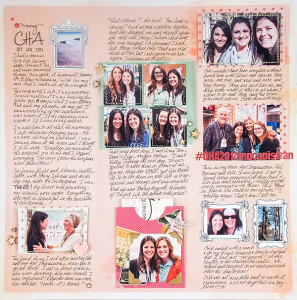
My CHA by Marie-Pierre Capistran | Supplies: Patterned paper: Dear Lizzy; Vellum: Dear Lizzy; Letter stickers: Echo Park; Pocket: Recollection; Frames: Silhouette; Wood Veneers stars and heart: Studio Calico; Chipboard stars: Heidi Swapp; Enamel Dots: Twine and Ink; Photo Corners: Recollections; others: golden thread, Heidi Swapp Color Shine spray ink, watercolor.
Terry Billman says, ” Two powerful words, silent and listen, have the same letters yet completely different meanings. To accentuate the wood letters, I framed them and placed them in the wide center column. I used serene photos and placed them in narrower columns of the same height on each side of the center column. Since the center column is the focal point, I placed the journaling in the center and formed a vertical column.”
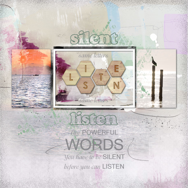
Silent-Listen by Terry Billman | Supplies: Anna Aspnes: Art Play Palette Radiant, 4 X 6 Artsy Kardz Radiant, Art Play Palette Hello Autumn, Art Play Palette Autumn Haze, Art Play Palette For the Record, Frame Transfer Layered Template 3, Artist Edge No. 2; Katie Pertiet: Watery Chevrons No. 3; Laurie Ann: Little Charmer Alphabet
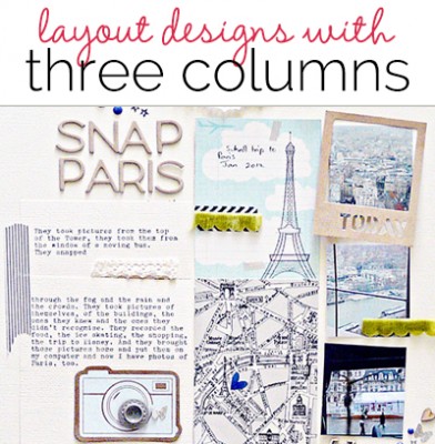
Sian Fair says, “This is a page about my pleasure in discovering the range and variety of photographs my daughter brought back from her school trip to Paris.”
“I chose a column design to enhance and support the photos of the Eiffel Tower. At the start, I found it difficult to arrange everything I wanted inside a 3 column format–so to get the design process going, I stopped thinking from left to right and I started with the middle column, building from the very top of the page down–and then I added a column on either side. Working from the middle out worked for me.”
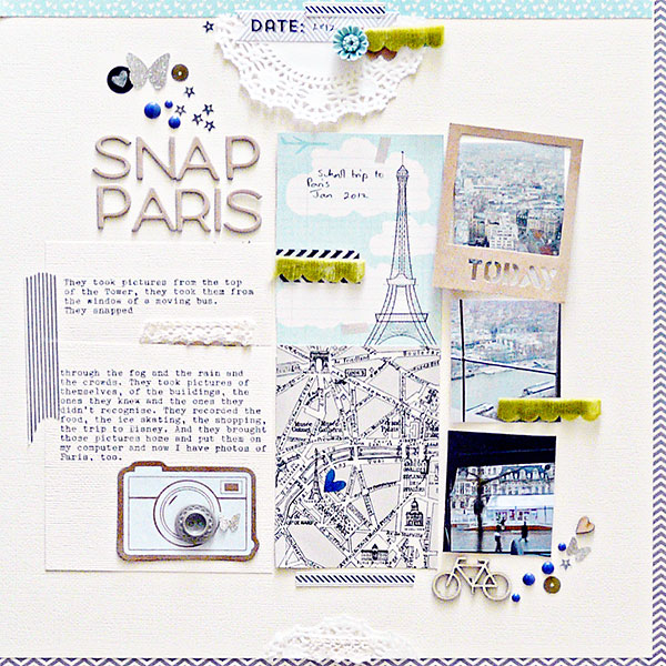
Snap Paris by Sian Fair | Supplies: Patterned Paper: October Afternoon Travel Girl; Alphas: American Crafts Thickers Hardcover; Wood Veneer: Studio Calico; Enamel Dots: Teresa Collins Family; Stickers: October Afternoon Label Stickers, My Minds Eye Label Stickers and American Crafts Dear Lizzy Phrase Stickers; Journal Cards: October Afternoon; Frame: Jillibean Soup Placemats; Kraft Camera: Maya Road

