 Make a page with high-impact and obvious mood (ranging from calm to vintage to elegant) by putting away your colors and sticking with black and white and beige on your next page. Take a look at what makes these pages successful and the individual elements that catch your eye and add punch.
add high-impact brush-stroke text in black
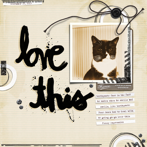
Love This by Carrie Arick | Supplies: Just Jaimee: Painted Word Brushes. Painted Words Vol. 1, Merry & Bright Washi Tape, Doodle Circle Brushes, Doodled Line Brushes, Just Jaimme & Amanda Yi: That’s Good Joe Collaboration; Amy Martin: Need More Stitching v. 6; Font: Mom´sTypewriter
Carrie Arick says, “Whenever my cat smells something he doesn’t like, he makes the funniest eww face. Since my page was about a bold reaction, I thought a bold black would help reinforce the story.”
“Black carries more visual weight than the beige and white, which made it challenging to create balance on my page. I solved this by using the black to create contrast with the other two colors in groupings, adding more weight to the white and beige while keeping the black from being too harsh.”
“These are basic colors that are found on all my layouts, so it was fun to explore them in a new way. I used this an an opportunity to use a lot of brushes without worrying about recoloring them. While my embellishing is simple, it’s the palette that provides the bulk of visual interest. I think because you’d find on these colors on animals, like a cheetah, they pique curiosity and remind us of movement that keeps the palette from being dull and elevates simple to complex.”
alternate black and white doilies and line art
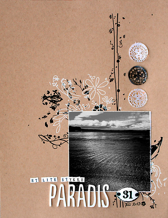
A Little Piece of Paradise by Lise Mariann Alsli | Supplies: Papers: Bazzill card stock Embellishment: Basic Grey – sparking rubs, Bobunny rub ons, Prima plaquettes; Inks: black pen, Dylusions ink spray; Alphabets: American Crafts thickets, Adornit mini alpha Other: white lace, page pebbles.
Lise Mariann Alsli says, “This picture was taken last summer on the island where I grew up. This beach is one of the many places where it is nice to take a bath (although the temperatures here in Norway might not be very bath friendly). I absolutely love this picture. It is so serene and catches all the best parts about the island: the ocean, the beach, the calm surroundings and the beauty.”
“I am one of those scrapbookers who like to use bright color, and I almost never make a page without them, so this was a challenging assignment for me. I had to use something that could make the page feel alive and vibrant without red, yellow or pink. The answer: 1) I made a flowing, “unpredictable” background by using black-and-white rub-ons, and 2) I used a picture with vibrant contrast and flowing movement.”
“I love how using those calm colors highlights the beauty and calm of this photo. These things would probably have been lost if I used all my usual crazy colors. The result is a page I am proud of.”
punch up a black-and-white conversion with “hard light”
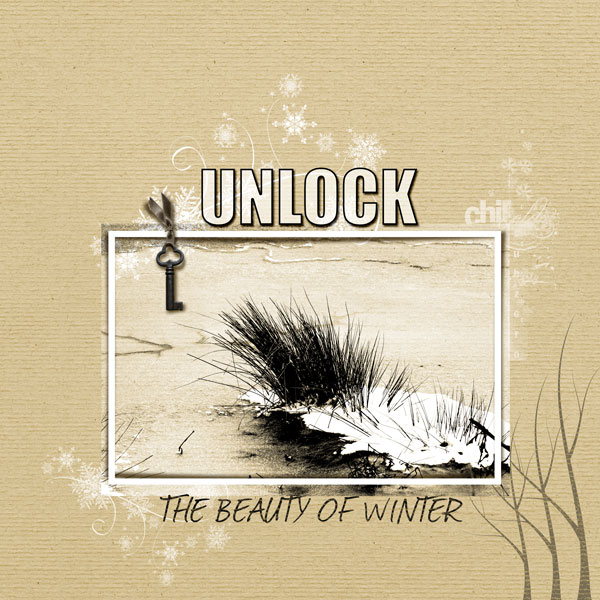
The Beauty of Winter, Andrea Hayes | Jessica Sprague Brown Textured Paper; Simply Tiffany Studio Pink Snow Tree; MCO snow flurry; Anna Aspnes, Mini Palette Winter Word Art, Crazy Life Frame; One Little Bird, Worn Key.
Andrea says, “This layout is about the simple beauty that you can find in winter.”
“When I think of winter I think of blue cool colors, and using beige was a challenge. Converting the photo to black and white helped. I wanted the texture to show through, so I used the Hard Light blending mode. I added a levels adjustment layer on Hard Mix and reduced the fill opacity to 29%.”
when you can’t use color for emphasis, use shape and contrast
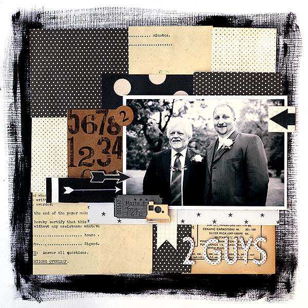
2 Guys by Amanda Robinson |Supplies: Patterned paper: Ruby Rock-it, Sassafrass, Jenni Bowlin Studio; Wood veneer – Studio Calico; Fabric and die-cut arrows – Ormolu; Aplhabet stickers – American Crafts; Cardstock – Bazzill Basics; Other – Vintage papers, vintage game piece, acrylic paint.
Amanda Robinson says, “I used this page as an opportunity to scrap a photo of my husband and his step-father at our wedding.”
“The most challenging thing about using this color combo was not being able to use a pop of color to draw attention to the focal point. Instead, I got creative in using tones and shapes (like arrows) to guide the eye. I think it’s a great color scheme for masculine pages and pages that benefit from a calm tone.”
fotoglows and layered frames add monochromatic interest
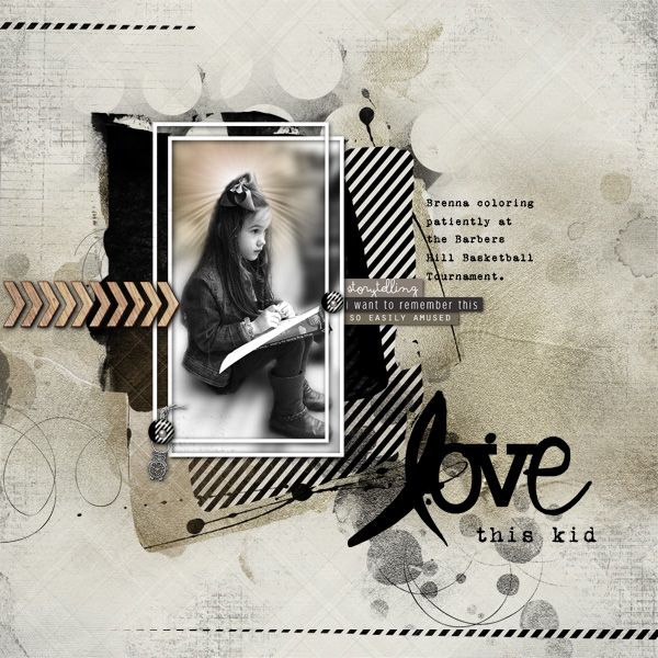
Love this Kid by Terry Billman | Anna Aspnes: Art Play Palette Sophistica, Art Play Palette For the Record, Warm Glows No. 6, Script Tease Learn Overlay; Katie Pertiet: Cut Ups Everyday No. 2, Black White and Tan Wood Chevrons; Ali Edwards:Christmas Text Words
Terry Billman says, “There’s no doubt about it, I love to scrapbook photos of my granddaughter. This page is about her patiently coloring at the gym while Craig and I watched her dad coach a basketball game.”
“In order to focus on her and not the entire photo, I converted it to black-and-white and blurred the background. I placed a blurred copy of the photo on its own layer so I could highlight an extraction of her by placing a fotoglow between the two versions of the image. I like how the colors convey a serious feel to complement Brenna’s thoughtful look. I have to admit, I wanted to add a splash of color for contrast but the fotoglow to added the needed zing. I also layered frames for depth and interest.”
let vintage photos shine with a neutral treatment
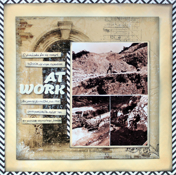
At work by Kiki Kougioumtzi | Supplies: Pattern Paper : Echo Park, Bo Bunny; Cardstock: Canson; Stamps: Kaisercraft; Ink: Ranger Distress; Gesso: Liquitex.
Kiki Kougioumtzi says, “This is a layout about my dad at one of the jobs he had when he was younger. I don’t have many details about where and when, so the main journaling is hidden behind the photos on a card, with space to add more to the story. You can see the black and white border of the card peeking through.”
“The photos were already black and white but to make them look more vintage I converted them to sepia. I used mainly beige and bits of black and white because I wanted the piece to look vintage. The beige cardstock was originally white, but I inked it to look old. I liked this color combination, and I’m pretty sure I’ll use it again to make more layouts with photos of my ancestors.”
choose one shade of beige for recoloring all digital elements
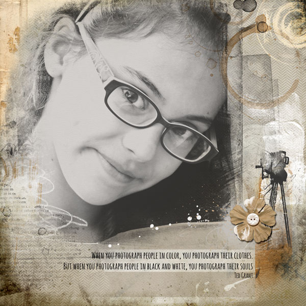
Photography by Anja de Dobbelaere | Supplies: Anna Aspnes | Art Play Palette Snapshot, Art Play Palette Fotographie, Art Play Palette Encapsulated, Snapshot No 1; Jennifer Valencia | High Key Black & White Photoshop Action
Anja de Dobbelaere says, “This picture of my daughter was taken last May. First I converted the photo to black and white with a Photoshop action. Then I went looking through my digital kits. This is a color scheme I like using because I think it makes scrapbooking easier because you don’t have to choose colors. I like how it lets the photo shine. I used a beige transfer in the top left as a basis for recoloring some of the digital brushes and other elements to keep it all a consistent tone.”
evoke sophistication in black and white and gold
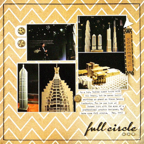
Full Circle by Sue Althouse | Supplies: Cardstock: Bazzill; Patterned Paper: Crate Paper; Alphabets: Silhouette (Calendary Hands font); Mist: Mr. Huey’s Opaque White; Brads: My Mind’s Eye; Floss: We R Memory Keepers; White Canvas Stickers: Little Yellow Bicycle, Studio Calico; Typewriter: Remington
Sue Althouse says, “This page is about visiting an exhibit of Legos with our adult son. The challenge of working with these colors was lessened considerably because my photos were already within the palette. These cosmopolitan Lego landmark buildings called for a sophisticated treatment, which this classic color combination provided.”
span the page with oversized tone-on-tone titlework
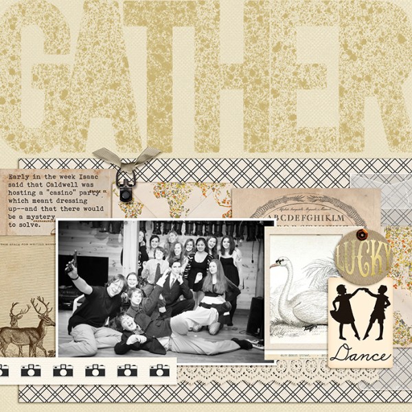
Gather by Debbie Hodge | Supplies: Love You More by Laurie Ann; Country Road by Sahli Studio; Eclectic Easter by Just Jaimee; Better Together, Give Thanks by Ardent Sparrow; Fortitude Basics by Laurie Ann; Vintage Mini Deck Silhouettes by Jenni Bowlin; Tied Fasteners by Katie Pertiet; Blessed and Lucky by The Lily Pad Designers; Vellum Envelopes by Snips and Snails; Travel Time by Anita Designs; Sal de Mar by Viva Artistry; Little Miss Sunshine by Zoe Pearn; Bohemian Typewriter
Debbie Hodge says, “This photo is of my youngest son and friends on a recent Friday night when two of the boys decided to host a dress-up party and suprise the guests with a mystery to solve as the party progressed.”
“When I have photos with especially warm colors because of limited flash, I often covert them to black and white for a sharper look. Because this photo has so many people in it, I decided to go with black and white and beige to keep things simple — and elegant in keeping with my subjects. I layered ephemera with the photo in a band across the page and added an oversized, spackled title with lots of texture spanning the width of the page.”
We’d love to see your black-and-white-and-beige pages! Add them to our gallery and/or link us up in the comments.

