 Breaking design rules is actually a great way to brush up on what the design rules are, how they look applied, and then how you can break one rule when you buoy up the design with another rule that’s followed. Below is an excerpt of the newest ebook in the library of over 40 classes in the Get It Scrapped Membership is Rule Play. [hr]
Graphic and typeface designer Peter Bilak said, “Right and wrong do not exist in graphic design. There is only effective and non-effective communication.”
The design elements and principles we spend so much time working with at Masterful Scrapbook Design are guidelines that you can use to build a solid and appealing design that tells a story.
Once you understand these rules, though, it’s time to break them purposefully and take advantage of the benefits that rule-breaking yields.
1. breaking design rules offers a challenge
Emily Pitts says: This layout was actually driven by the idea of symmetry being “dull.” I thought, “That is just the opposite of Ethan!” After that, it all fell into place.
While design principle rules advise that symmetrical designs can be formal and even dull, Emily went against that advice and made a symmetrical page full of charm. She details the many ways she made this design work in the Masterful Scrapbook Design class Rule Play which is available to all subscribers to the Get It Scrapped membership.
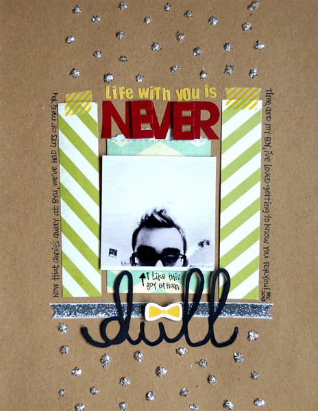
Never Dull by Emily Pitts | Supplies: cardstock by Jillibean Soup; patterned paper, alphabet stickers, chipboard embellishment, and bag by Fancy Pants; ribbon by Maya Road; washi tape by My Mind’s Eye; glitter by Stampendous; adhesive by Alene’s, Xyron, and Scrapbook Adhesives; die cut machine by Silhouette; pen by Uniball; font: soymilk.
2. breaking design rules gets you designing with confidence
While the accepted wisdom is that a visual design needs a focal point, Amy Kingsford made a page about “unity” that does not have a focal point.
Amy says: Because I set out with the intent of not including a focal point, I didn’t take things half way. I followed through full-force.
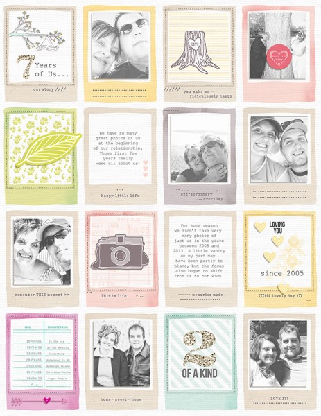
7 Years of Us by Amy Kingsford | Supplies: American Crafts + Dear Lizzy: 5th and Frolic Digital Collection; Sahlin Studio: Glitter Styles; Robyn Meierotto: Cut. It. Out Stitched Frames.
3. breaking design rules offers artistic opportunities
Doris Sander used an awkward combination of photo placement and white space to draw attention to the inadequacies of my photo. She says: I wanted to show off that it was a very badly composed shot. This is a true example of a design rule being deliberately broken for artistic effect. I’ve used other design rules to compensate for it and create balance on the page.
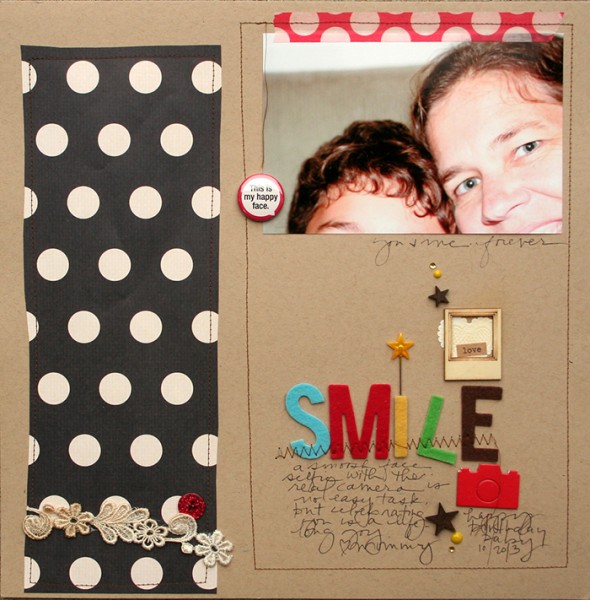
Smile by Doris Sander | Supplies – cardstock – Bazzill, patterned paper, flatback – Jenni Bowlin Studio, chipboard camera – Studio Calico, felt letters – KI Memories, pin – Maya Road, word sticker – Tim Holtz, die-cut heart – Martha Stewart, washi tape, button – Queen & Co., epoxy dots – My Mind’s Eye, trim – vintage, wood stars – Coffee Break Designs, wooden frame – Maya Road
4. breaking designs rules takes you out of your comfort zone
Tiffany Tillman says: White space IS my friend and I use it frequently. I don’t feel that I go overboard but I enjoy a design that breathes! Consider me a design claustrophobic who requires wide open spaces! Brace yourself folks! With this page, I created a layout that didn’t use whitespace. Can you believe it? Me!
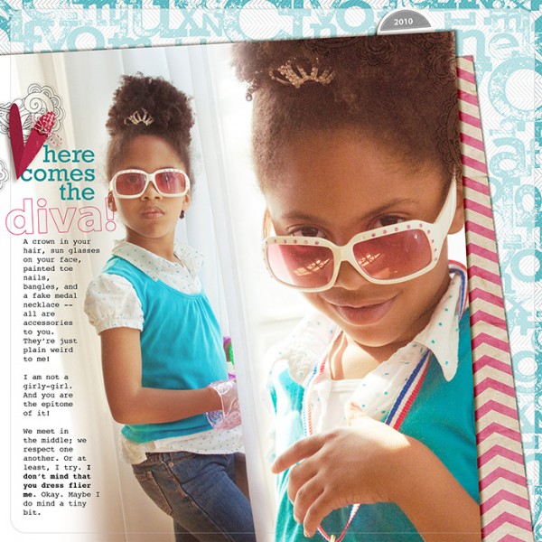
Here Comes the Diva by Tiffany Tillman | Supplies: Kraft Chevron Paper by creashens; Letter Stamp & Embellishments by Karla Dudley; Fonts: Myriad Pro and Courier.
5. breaking design rules lets you stay true to your style
Katie Scott says: I like to break the rule of including white space on a page because it makes me feel like I’ve gotten my money’s worth from the real estate on the page. I like feeeling that I’ve used it up, so that my scrapbook albums are full.
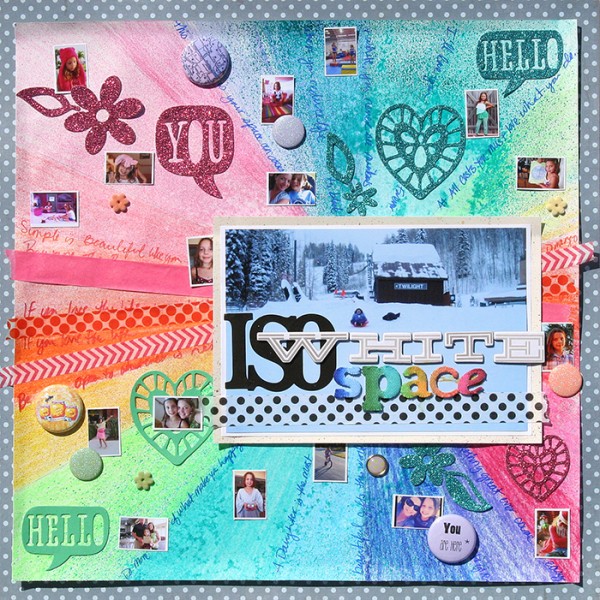
ISO White Space by Katie Scott / Supplies: Patterned Paper by Echo Park and DCWV; cardstock; embellishments by K&Company and Recollections; pencils, pens and markers by Prismacolor, Rexel Derwent, Copic and Sharpie; spray mists by Maya Road and Heidi Swapp; washi tapes by Recollections and Office Depot; letter stickers by American Crafts.
6. breaking rules gets you something fresh
Tami Taylor says: On this layout I didn’t give a care or worry to creating visual balance. Instead, I cared more about using supplies that appealed to me and exploring how this photo of my son tapped into feelings about my own childhood.
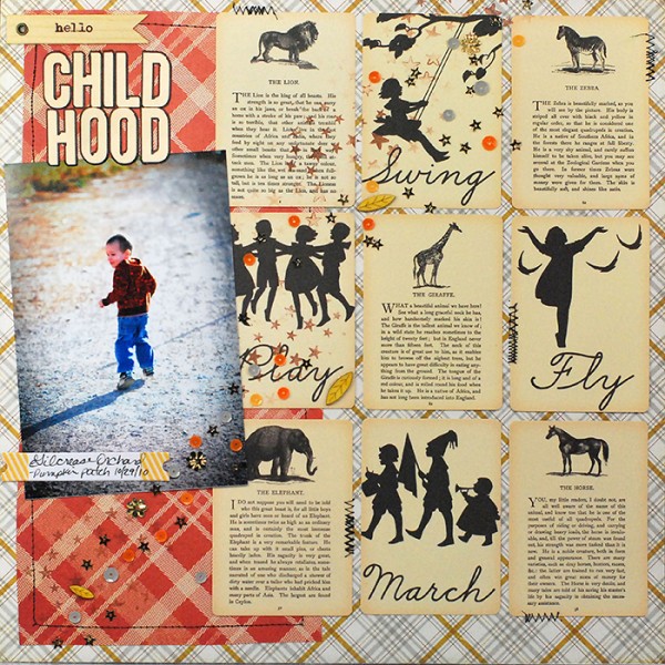
Childhood by Tami Taylor | Supplies: JBS Mercantile November 2013 Kit, Alphas – JBS Mercantile.


