
 You’ve heard about all those design principles and scrapbooking “dos” — now see how to shake things up when you’re smart about breaking the rules. See how 6 of our creative team members set about making a page with the intent of breaking at least one scrapbook design rule. If you’re in the mood for more rule breaking, be sure to check out “Rule Play” at the Get It Scrapped membership after January 8.
1. forget about multiple clusters and a visual hierarchy
Sian Fair says, “Unwell and stuck in the house one day, I decided to take photos of the views from different windows.”
“One design principle I enjoy using a lot is emphasis. I like to have clusters on my page and work to get the viewer’s eye moving through them. I decided to see if I could make an effective page which had only one area of interest–with everything close together.”
“I liked this idea because it also emphasized the story of my page: the notion of being stuck in one place, unable to move about. But I also wanted to get a bit of tension going: a little bit of me likes an excuse to stay inside and make things, so I found a paper with a heart pattern to set against the tight, claustrophobic feel of the tiny photos and to add some depth and energy. I almost succeeded in keeping everything in one place: at the last minute I added the black washi tape at the top to stop the eye from falling off the page. Which just goes to show that maybe breaking the rules is a good enough way to start even if you pull it back at the end!”

In, Not Out by Sian Fair | Supplies: Patterned Paper: Crate Paper and some small scraps; Embellishments: label and stamp from Citrus Twist
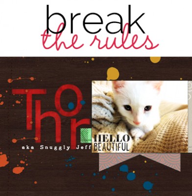
2. avoid contrasts and repetitions
Christy Strickler says, “As my son gets older, I find myself thinking about the future more often, and this page is about this inclination.”
“Breaking design principles allowed me to build a layout that feels uncertain in much the same way as the future. I normally try to emphasize my photos using repetition ( visual triangles/power of three) and by using some contrasting colors.”
“This time, I wanted the photo to blend into the background. I used stencils and embossing paste to build a textured background. No pattern is repeated. Many of the stenciled elements point downward. I matched sparkling watercolor paints to colors within the photo and did my best to blend it into the background. I also painted over white letters so that the title is not predominant. Using a glaze pen to journal on the photo allowed it to show, but just barely. I covered random wooden elements with a white gelato to create a hazed, milky look. Nothing about this layout is certain except for the diagonal flow from the title, the photo and then, to the elements in the bottom of the layout.”

What Will the Future Hold by Christy Strickler Supplies| Cardstock: Colorbok;Letters: Basic Grey; Embossing Paste: Wendy Vecchi; Stencils: JBS Mercantile; Wood Veneer: Studio Calico, Basic Grey; Coloring Medium: Gelatos, Watercolor paints by Yasumoto; Button: Queen and Co.
3. get unity without repetitions
Carrie Arick says, “Here I’m sharing how our kitten became a cat with two names.”
“I use the rule of repetition create visual triangles with color when composing a page. For this page I decided not to repeat any shape or color and relied on emphasis, contrast and alignment instead. My photo draws you in with emphasis and contrast: The photo’s value is the lightest spot on the page and also has the most embellishment. Using these two rules ensures it’s the focal point instead of the heavy, red title. The alignment of the text then moves your eye across the page. You could technically say the text repeats, but it doesn’t form a triangle and the respective shapes do not repeat. Instead there are two blocks of text on either side of the page.”

Thor by Carrie Arick | Supplies: Gennifer Bursett, Mye De Leon & Kara Dudley: Autumn Twist Collaboration; Sara Gleason: Ooey Gooey Alpha; Fonts: Catherine’s Lazy Days, AA Typewriter, KG Somebody That I Used to Know
4. misalign and omit emphasis
Michelle Houghton says, “I took dozens of photos of the beautiful wildflowers in Colorado and these are a few of my favorites.”
“I wanted my page to have the same feel as the wild riot of flowers that appeared randomly across the landscape so I purposefully tried to break the rule of “alignment”. Instead of lining up edges of elements I purposely tried to avoid lining up my pieces. What I realized after I had placed the final elements on my page is that unknowingly I also broke the rule of emphasis. By mis-aligning my Haiku journaling, title and photos and creating a background that was an extension of the photos I ended up with a layout without a focal point or an emphasis. Luckily, it too reinforces the idea of the riot of color that I wanted to capture.”

Summer Haiku by Michelle Houghton | Supplies: cardstock, Bazzil Basics, sticker letters; American Crafts, ink; Sharpie, paint; Golden
5. instead of emphasizing one photo, create a busy blur
Katie Scott says, “There are lots of changes in my house as the kids are growing up, and this Halloween felt like the end of an era. I tried to brave it out, dressing like Katniss from The Hunger Games and not getting too sappy about time marching on.”
“I could have focused on one of the things that made me feel nostalgic – like my son in his costume or my husband staying home rather than trick or treating with us or our first stop at my in-laws’ house (they are 89 and 92 so we feel like each holiday with them is a gift). Instead I tried to make it feel like just another typical Halloween because I wanted to savor that it was just another ordinary Halloween.”
“I created a picture collage using Google’s free program Picasa and made all of the photos the same size by selecting the grid feature. While the pumpkin photo does grab some focus because of the color and because it is the only detail shot, I think that I have successfully broken the rule of emphasis or focus so that the rest of the photos feel like kind of a blur which represents the busy nature of the night.”
“Embellishments are typically used by scrapbookers to lead the eye around the page. I did not use any embellishments on this page other than the captions of each of the photo which I created with my word processor so that each photo in the grid got the same treatment. I also took the focus a bit off of the yellow part of the title, Just An Ordinary 2013, by placing the black Halloween right underneath it – so it is also a bit of a blur and intentionally a bit more difficult to read.”

Just An Ordinary Halloween by Katie Scott | Supplies: American Crafts Dear Lizzy and Crate Paper patterned papers; American Crafts and Jenni Bowlin letter stickers; water colors and watercolor paper; Staedtler Pigment Liner pen; Courier New font.
6. be a little off balance
Amy Kingsford says, “I made this page to capture a great photo I took of my son being just as happy as can be.”
“I went for an obvious asymmetrical design because I liked the energy created by the stitched circular foundation coming off the page and the contrast created by the white space that resulted in butting most of my page elements up against the one side. While I normally try to achieve a bit more of a balanced look in my designs, I thought breaking the rule in this instance added a lot of oomph to this otherwise simple page.”

Happy by Amy Kingsford | Supplies: Karla Dudley: The Good Stuff Collection; Robyn Meierotto: Cut.It.Out Masks.
