 What’s your favorite Christmas color scheme? While saturated reds and greens are the traditional colors of Christmas, you can get a fresh look with “tints” of these colors. (A tint is a color with white added.) Check out these pastel Christmas pages from the Creative Team.
Sian Fair says, “This layout combines lots of thoughts and design ideas which I drew together into one page: my thinking about that perfect Christmas in a retro wrapper I guess you’d call it!”
“I started this project thinking what pastel conjured up for me: I thought fifties, or earlier, retro sweetness that I could try to update. I flipped through photos looking for something simple and neutral to start with. The deer is a cake decoration and once I found him, I was able to choose a pink paper with a pattern that echoed his antlers.”
“I gave the photo a faded, neutral filter because I didn’t want it competing with the colors of my page. Once I got my retro look I came up with the keep calm theme: maybe not very original any more, but, then again, maybe we all need reminding about it every year! I added darker brown and natural wood touches to keep the pink from becoming too sugary and typewritten journaling to support the retro feel.”
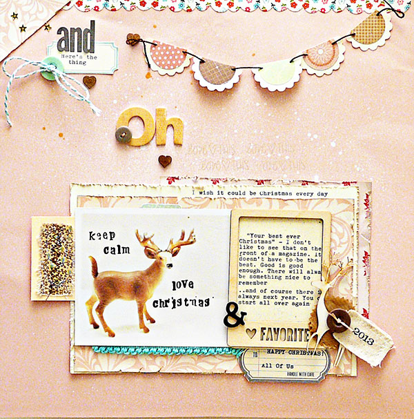
Keep Calm by Sian Fair | Supplies: Patterned Paper: October Afternoon, American Crafts Dear Lizzy; Alphas: Alison Kreft for Websters Pages, Studio Calico; Embellishments: Freckled Fawn wood veneer frame, wood veneer deer from an old kit, Citrus Twist journaling tags, October Afternoon sticker; Other: Maya Mist gold spray ink, Staz-On black ink
Kiki Kougioumtzi says, “My daughter started to have doubts about the existence of Santa. After a conversation she had with a very persuasive Santa she wasn’t so sure anymore about her doubts.”
“For this page, I converted my photos into black and white because I didn’t like the busy background. I added selective coloring and blurred the rest of the photo. Because I wanted to a calm color combination I decided to work with pastels. The color red (dominant in my photos) was my starting point. From there I chose pastel green (its opposite) and pastel blue (analogous to green) as my dominant colors. I also added pink (a tint of my initial red) and bits of purple (analogous to blue and red) and white(neutral). To add some interest and lead the eye to the title I used a pop of bright red in my title.”
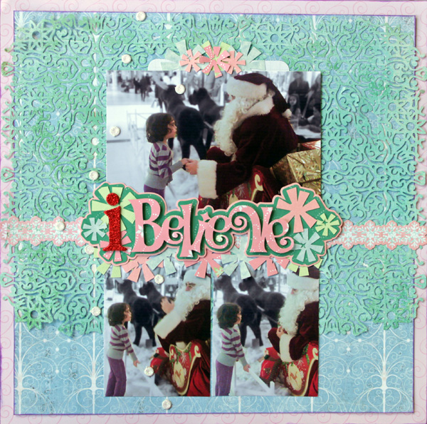
I Believe by Kiki Kougioumtzi | Supplies: Pattern paper: Basic Grey, Sandylion, K & Company; Cardstock: American Crafts, Bazzill Basics; Chipboard: DCWV; Other: Silhouette Cameo.
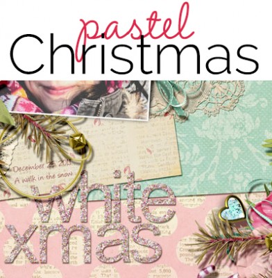
Anja de Dobbelaere says, “This picture was taken on Christmas Day, 2011. It had snowed a lot, I think it was the first white Christmas that I can remember, and it looked amazing!”
“My sister and my dad and his partner came to see us, and we took this walk in the snow. I think the pictures already had some pastel colors, especially the knitted hat my daughter is wearing. I simply went looking in my collection for matching kits. One of those is not even a Christmas kit, but elements from it worked just fine because of color. I layered and layered until I thought it was okay. I like all the candy colors.”
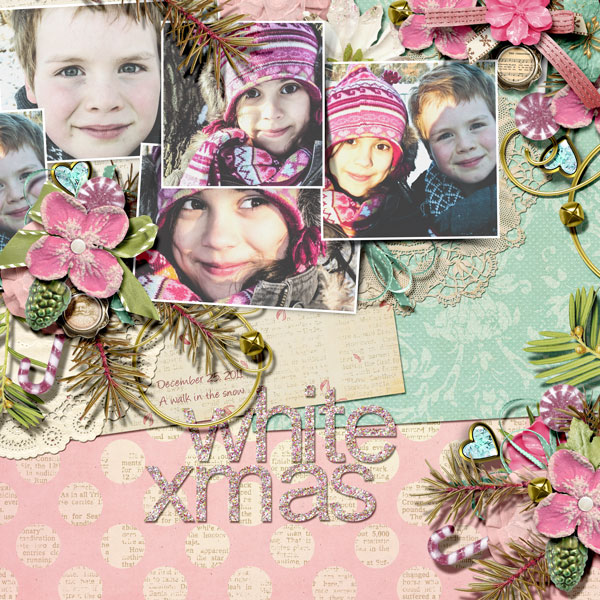
White X-Mas by Anja de Dobbelaere | Supplies: Brandy Murry: Lilly’s Christmas, Scrap Simple Embellishments -Dramatically Lifted Photo; Digital Design Essentials: Shabby Holiday; Anita Designs & Joyce Paul Designs: 25 Days till Christmas; Valentina Creations: When I was Young; ET Designs: Winter Dreams
Kristy T says, “This layout tells the story of the kids sprinkling the reindeer food on Christmas Eve, in preparation for a visit from Santa and his reindeer.”
“I selected colors that would tone in with my photos to create a watercolor background and also watercolor presents I wanted a mix of the colors but also used slightly more pink in the layout, in combination with lots of white and silver to keep the page soft. The silver alphas and embellishments bring a Christmas feel to the layout. The grass in the photos was quite a vibrant green, so in Lightroom I used the saturation slider for the color green only just to tone down the green so it didn’t completely dominate the softer colors of my embellishments and background. This left the other colors in my photo unchanged.”
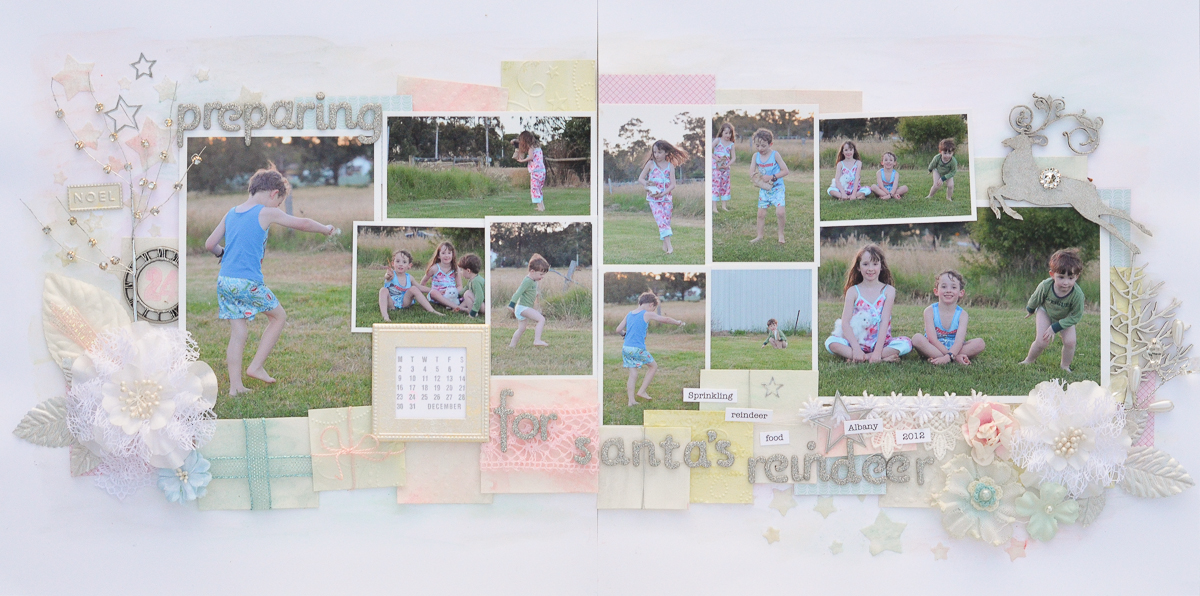
Preparing for Santa’s Reindeer by Kristy T | Supplies : Card: Artee; Watercolour Paper; Gelatos: Fabercastell; Paints: Twinking H20s, Adirondack; Glitter paint: Viva Decor; Alphas: American Crafts; Patterned Paper: Echo Park; Ribbons: Unknown; Lace: Unknown; Flowers: Prima; Leaves: Prima, Green Tara; Metal Embellishments: Making Memories, Tim Holtz; Beaded Tree and Branch: Green Tara; Chipboard: Dusty Attic; Pen: Atyou Spica; Ink: Archival, Versacolour; Template: Prima; Glitter: Ranger; Texture Paste: Jo Sonjas; Embossing Folders: Sizzix; Stamp: Amy Tangerine; Stickers: Unknown
Katie Scott says, “My daughter recently declared that she is over Barbie Dolls while just last Christmas she was all about Barbie. With Christmas coming, I wonder if she is going to ask for the Christmas Barbie or if last Christmas was ‘Barbie’s Last Christmas.’ I had to use pink on this page about Barbie’s Christmas. The aqua green and aqua blue colors were a nice contrast. I arranged my photos to look like a package with the rick-rack border stickers to make it look like a Christmas present.”

Barbie’s Last Christmas by Katie Scott | Supplies: American Crafts and Kaiser Crafts patterned papers; Pebbles and American Crafts letter stickers; Kaiser Crafts and Recollections embellishments.
Audrey Tan says, “This page is about my boys spending Christmas with their cousins. They don’t always get to see them on a regular basis and when they do meet up, they are the best of friends. So it was extra special that year that they got to spend Christmas with their cousins.I went for pastel blue hues to denote a male page but kept to the Christmas theme with decorations of poinsettia and pine branch.”
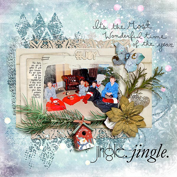
Jingle Jingle by Audrey Tan | Supplies: Julianna Kniepp: Hoodies And Cold Nights; Anna Aspnes: Laced Frames No1, Christmas Word Art No3, Canvas Transfers No1
Traci Reed: 365 Unscripted Christmas Scribbles, Christmas Blondies; itKuPiLLi Imagenarium: My Sweet Lord; Katie Pertiet: Carded Stacks No1
Font: Shelter Me
Amanda Robinson says, “This is a simple page which captures my parents’ living room all decorated for Christmas – my favorite place to be, at Christmas! I chose this photo as I had already edited it to be black and white due to some bad lighting in the image. I thought it would be ideal for experimenting with non-traditional colors.”
“I took my color inspiration from the basket of Washi tape on my desk and ended up creating my foundation layer entirely from strips of peach, mint and grey tape. I couldn’t resist adding a couple of gold elements to my page to add some festive warmth to what was initially a fairly cool colour scheme.”
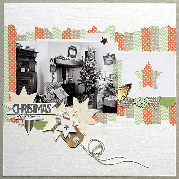
Christmas Baubles by Amanda Robinson | Supplies: Cardstock – Bazzill; Tag – Ruby Rock-it; Digital die-cut quilting star – JBS Mercantile exclusive; Die-cuts – Basic Grey, October afternoon; Alphabet Stickers – Jenni Bowlin Studio; Flair – Paper Bakery; Other – Star punch, Washi tape, gold star brad, twine.
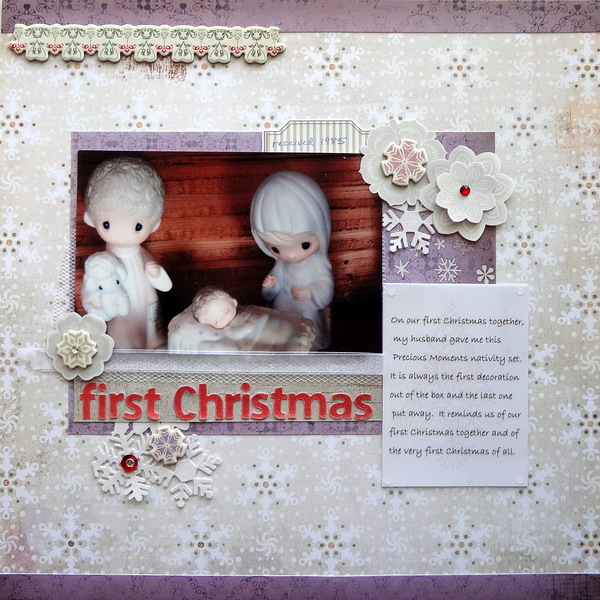
Susanne Brauer says, “This page is about my favorite Christmas keepsake. The first year we were married, my husband bought me a Precious Moments nativity set for our home. At the time I collected these figurines, and although my collection has been pared down, these pieces will always be kept because the cherished memory and tradition they represent.”
“I chose to lavender as the focal color because it happened to be the first and prettiest sheet in an older paper pack called Bella! Classic Christmas, which is an interesting choice of name since the patterns were classic, but the colors were not. I knew the purple would complement the pinks and blues on the Holy Family figures. I paired it with a white and taupe background from Basic Grey that would pick up on the wood of the stable. All my embellishments came from leftovers of prior years’ Christmas card-making supplies.”

