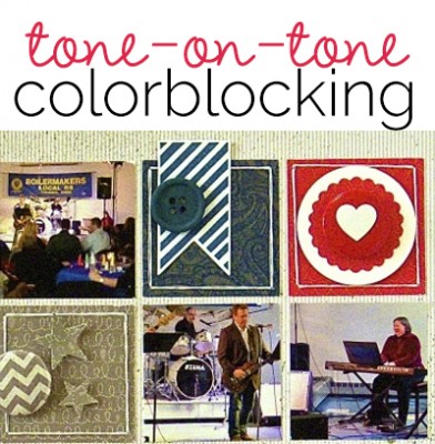
 On your next page, try this scrapbook embellishments idea for making a page that’s big on color and big on embellishments while never falling into chaos. Add a grid of differently colored blocks and then match embellishments to each block by color.
We fell in love with this technique during the Grids and Blocks class at Masterful Scrapbook Design (which you can still get) and our team works (and plays with) this approach on the pages below.
Sue Althouse says, “This page is about sitting in with a friend’s band playing keyboard on New Year’s Eve.”
“I love to color block by combining different shades and tones of the same color. It adds interest, texture and dimension to the page without making the page busy and chaotic.”
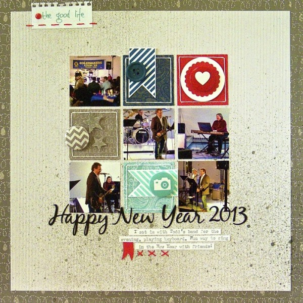
Happy New Year 2013 by Sue Althouse | Supplies: Cardstock: Bazzill
Patterned Paper, Tags: Little Yellow Bicycle; Alphabets: Silhouette;
Star Punches: Fiskars; Stamps: Stampin’ Up!; Inks, Mists: Hero Arts, Mr. Huey’s
Buttons: October Afternoon; Flair: A Flair for Buttons; Floss: We R Memory Keepers
Heather Awsumb says, “This page is about snuggling with baby lions during a recent trip to a local game farm.”
“I started this page with the paint element on the bottom, decided on a color scheme and built up from there. I thought that color blocking the title across the three blocks would be an interesting way to use this technique. After settling on the title font (Bebas Neue) I then looked through my supplies by color to decide on what to add to each block.”
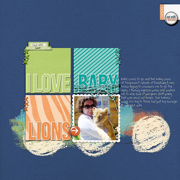
I Love Baby Lions by Heather Awsumb: Astro Solids, Artsy Layered Paint No 1, Day Out Kit, Cardstock Tabs No 2, Away We Go Add on Paper Pack, Dragon Trainer Element Pack, Little Layette Kit, Arrow Flairs No 1, Flagged Sentiments No 1, Bakers Twine Sea by Katie Pertiet; Little Safari Paper Pack by Mindy Terasawa
Marie-Pierre Capistran says, “This page is an ode to my grand-father. I describe him and his hobbies, what I still remember most about him and things that made me love him.”
“For my embellishing, I made a grid of squares and then added ‘colorblocked’ embellishments. I wanted the small elements to be representative of my grand-father. I didn’t want to add a flower just to add a flower. Everything here is chosen for a purpose.”
“For the base of the squares I chose elements that I repeated throughout my grid: the patterned paper (2 squares of wooden paper and 2 squares of floral paper), the color gold and the green elements/letters. For a tone-on-tone effect, I played with transparency to let the color from underneath shine through. It’s the case with the green washi tape and the green circle underneath the green translucent letters and numbers. I also went with the number 3 in terms of repeating: 3 golden accents, 3 times the turquoise color, 3 squares with the color green. Finally I repeated the same colors in the left column, where the journaling and photo sit.”
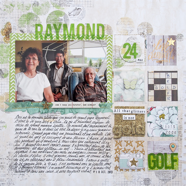
Raymond by Marie-Pierre Capistran | Supplies: Raymond by Marie-Pierre Capistran | Glitter Cardstock: Recollections; Patterned Paper: Bo Bunny, Studio Calico, Dear Lizzy for American Crafts, Crate Paper; Alphas: Studio Calico; Ribbon: Hug Snug ; Word Strip: Studio Calico; Stamp: Lindsay Letters for Studio Calico; Chipboard Butterfly: Studio Calico; Washi Tape: Studio Calico ; Chipboard Letters: Maya Road, Glitter: Stickles by Ranger; Gold Stars Rub-Ons: Studio Calico; Wood Veneer: Studio Calico; Enamel Dot: Queen & Co.
Lisa Dickinson says, “I snapped photos of my daughter and her best friend after I had lunch with them at school one day. I wanted to document their friendship (which started 4 years ago in preschool) and the topics they currently bond over. “
“On this layout, the grid allows me to incorporate a lot of colors–pink, aqua, green and yellow in various shades–and still maintain an organized and compartmentalized design. By embellishing with tone-on-tone color-blocking I was able to pile on lots of embellishments (which is probably my favorite part in the design process!) because each block of the grid “contains” those accents to a limited space and they don’t look haphazard or chaotic.”
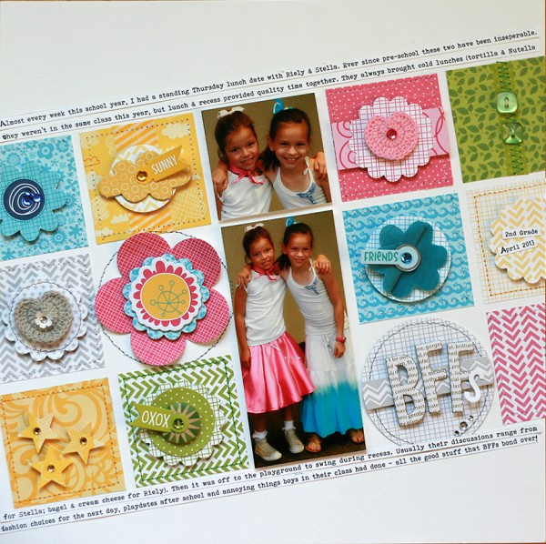
BFFs by Lisa Dickinson | Supplies: Bazzill Basics cardstock; Bella Blvd patterned paper, stickers, chipboard, washi tape, crochet accents, fabric flower, buttons; EK Success, Fiskars & Epiphany Crafts punches; Making Memories & Creative Charms rhinestones; Bohemian Typewriter font.
Stefanie Semple says, “These photos are from my son’s school leaving dance.”
“I used a grid design with formally styled patterned papers. The color scheme is limited to allow the colored photos to shine. I created tone-on-tone embellishment clusters to add interest and classy details. Matching the element colors to their base meant that texture and dimension (i.e., digital schadowing) was important here. I added a cream frame bottom right so that the eye is lead from top left through the middle to the bottom photo.”
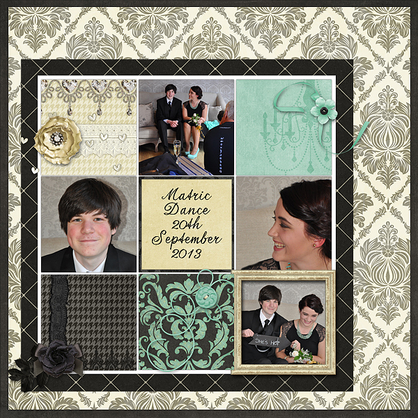
Matric Dance by Stefanie Semple | Supplies: Studio Flergs and Litabells Designs collaboration; L’amour
Marcia Fortunato says, “This page is a reminder to myself to sometimes take the time to just relax.”
“I used a 3-across blocked design, and divided the first block into three rows. I used tags as the base for each embellishment cluster in colors pulled from my photo. I particularly like little word and phrase stickers, so I looked through my stash to find some in brown, blue, and green to support my theme. I used a pink mat and other spots of pink to balance the design and add small pops of contrasting color.”
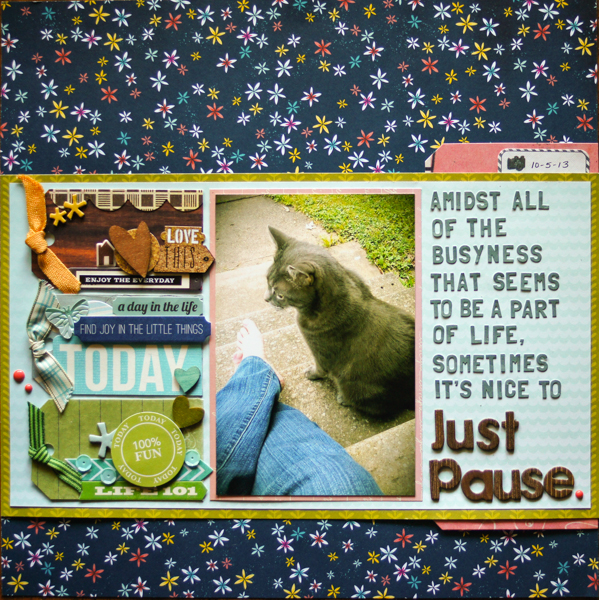
Just Pause by Marcia Fortunato | Supplies: Patterned paper: American Crafts, Studio Calico, Pebbles; Alphabets: Basic Grey, American Crafts (Thickers); Tags: Cosmo Cricket, My Mind’s Eye; Ribbon: Basic Grey; Embellishments: Studio Calico, Basic Grey, Jillibean Soup, October Afternoon, American Crafts, My Mind’s Eye, Life-Love-Paper, Fancy Pants Designs; Pen: Sharpie; Other: American Crafts (adhesive), Scrapbook Adhesives by 3L (3D foam squares).
Audrey Tan says, “This page is about our trip to Universal Studios in Singapore.”
“I’ve chosen a patterned paper with frames that mimic a grid and placed my photos and embellishments on the frames from the print. The frames holding embellishments are filled, first, with a colored block of patterned paper and then with embellishments in the same color.”
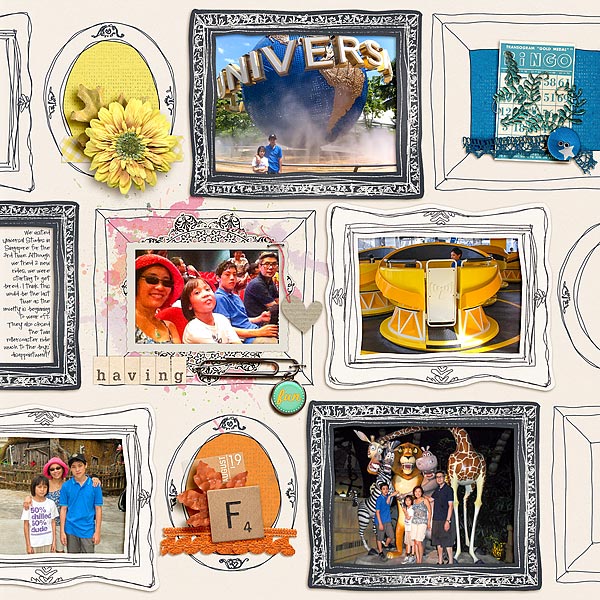
Having Fun by Audrey Tan | Supplies: Pink Reptile Designs: Fallala, Date Me All Year Round, For You Mom, Early Start, Easy Peasy, I Believe In Miracles,So Charmed Alphas, Teeny Tiny Titbits; Font: Pea MissStaker
Amanda Robinson says, “On a Christmas shopping trip last year my son was more taken with a parrot hand puppet than the Christmas decorations.”
“As this was a Christmas layout I used red and green, but I also pulled in a dark blue from the photograph to add a less traditional element and complement the less traditional subject matter. I organize most of my embellishments by color so it was easy to find little bits and pieces to fit the spaces I needed. When embellishing I focused mainly on the size and color, and chose generic embellishments to eliminate the extra task of fitting the theme.”
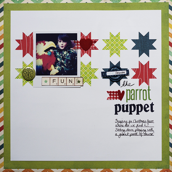
The Parrot Puppet by Amanda Robinson | Supplies: Patterned Paper – Echo Park; Cardstock – Bazzill Basics; Digital cutting file, Washi Tape- Jenni Bowlin Studio; Alphabet stickers- Crate Paper, Jillibean Soup; Flair badge – Ormolu; Date tag – Teresa Collins Designs; Other – Vintage buttons, felt hearts.
Summer Fullerton says, ” was recently combing through my photo files and stumbled upon these fun self-portraits my daughter and I took one afternoon last summer. I really wanted to capture this moment in time when we were laughing and being silly. It’s nice to have those moments with our children when we are not constantly lecturing and parenting, this layout is about one such time.”
“One of my current go-to embellishing techniques is tone-on-tone colorblocking. I did this on the middle and far right block in this design, but to give my title emphasis and I used pink on green–both tones are quite pale, however. To further balance out the color on this layout I added mist in the same color as the title. This gives this layout left-to-right flow.”
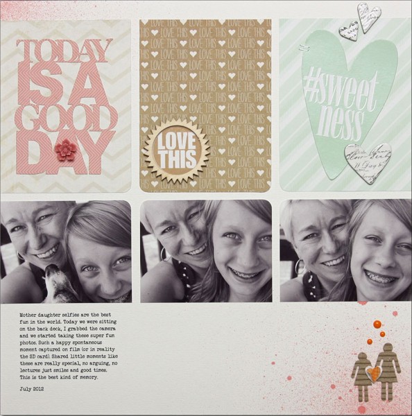
Good Day by Summer Fullerton | Supplies: Cardstock Bazzill, Patterned Paper My Minds Eye/Webster’s Pages/American Crafts/Heidi Swapp, Mist Studio Calico, Wood Embellishment Studio Calico, Clear Stamp Technique Tuesday, Ink Close to My Heart, Chipboard Hearts Heidi Swapp, Die Cut Heart Heidi Swapp, Heart punch EK Success, Enamel Dots My Minds Eye, Corrugated People Jillibean Soup, Silhouette Cutting System and Image, and font Veteran Typewriter downloaded from the internet

