 Color is a great storytelling tool for any visual journaler because of its associations with nature, its ability to trigger a physiological response, and because of the cultural connections people make.
Typically, a scrapbooker turns to the colors of autumn that occur in nature: transitional orange and earthy brown. It can be fun, though, to shake up those expectations and still tell a story rich in color. The Get It Scrapped Creative Team has made this collection of evocative autumn pages that use unexpected colors.
Amanda Robinson says, “I documented a colorful fall sunset which I photographed at my local beach. Although this is a fall photo, the colors in it are not what one would traditionally consider to be representative of fall. I took my color scheme straight from the picture by selecting lots of pink supplies and added a pop of yellow to represent the sun.”
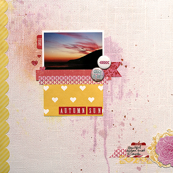
Autumn Sun by Amanda Robinson | Supplies: Patterned paper – Echo Park; Washi Tape – Echo Park, Paper Bakery; Stickers – Echo Park, Teresa Collins Designs; Flair badges – Paper Bakery; Other – Wallpaper, watercolor paint.
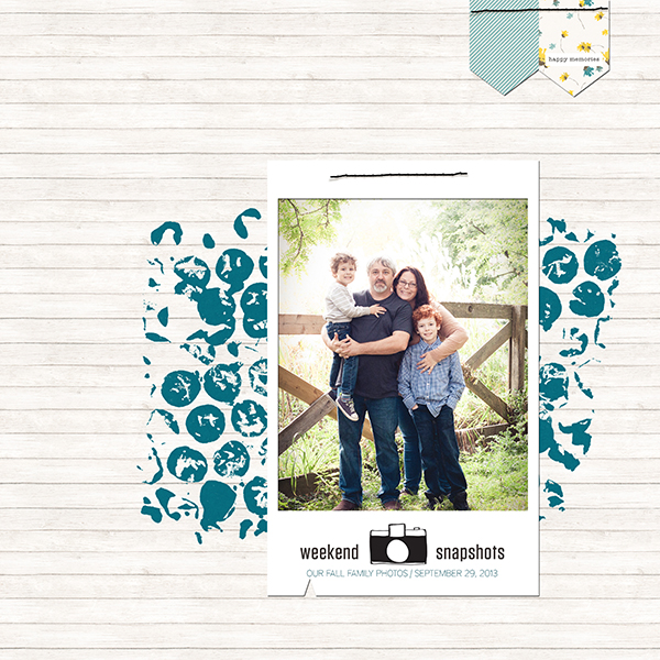
Tara McKernin says, “This photo is a capture from our time exploring the University of Guelph campus. I went with colors from within the image that didn’t go with the fall time of our photos. I chose to pull the white from the tall grass tops and blue from our clothing. I really like how the layout feels cool rather than autumn focused. It allows the photo to be the focus.”
Marie-Pierre Capistran says, “For me, fall means the end of the summer and I simply don’t like it. This year though, as so many people told me it’s their favorite season, I decided to try to love it and I went looking for fall beauties with my daughter and my camera.”
“As I thought my pictures where colorful enough themselves, I mounted them on white cardstock and I accentuated the the layout with gold, aqua and apple green. These colors are cheerful and glorious and convey the message of me looking for the beauty in autumn. The gold and glitters remind me of the light shining through leaves at this time of year. The green and blue are still found in the nature, even though the leaves are turning yellow and red.”
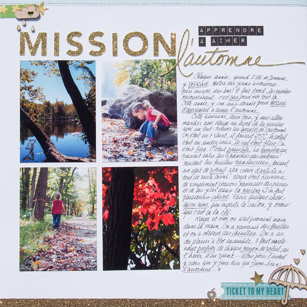
Quest to love fall by Marie-Pierre Capistran | Supplies: Cardstock: Bazzill, Recollections; Patterned paper and Sticker: Elle’s Studio; Wood Veneer: Freckled Fawn; Punch: Fiskars; Washi Tape: from stash; metal apple: from stash.
Deborah Wagner says, “I used pink, purple, and turquoise as my main colors. This color palette is one of my favorite, and one I often use for beach pages.”
“To make it work for an autumn page, I played with the gradient tool, making a linear and radiant layer (with the main colors as my beginning and ending point), and clipped them to my photo. Then I duplicated the gradient layers and clipped them to my word art and leaf elements.”
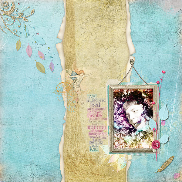
Autumn Leaves by Deborah Wagner. Supplies: Katie Pertiet Paper Reveals No.2, Alandia Rancheros Kit, Branched Paper Pack, Bluebird Kit, Crowning Affair Vibrant Kit, Fabulous Fall Flourishes No.4, Lifted Leaves No. 1, Frame Hangers No.1, Vintage Blendables: Fairies No.1, Simple Collage frames No.2, Blendable Photo Cards No. 4, Surf Lagoon Kit, Shabby Clusters No. 1, Carte Post Kit, Winter Artistry Kit, Roughed Up Autumn Mix Paper Pack, Winter Peony Kit, Quote Transfers Autumn No. 1; Lynn Grieveson Summer Sunset Kit; Mindy Terasawa Girl About Town Kit
Katie Scott says, “We live at sea level in Florida so October is Hurricane Season for us, and it is always a stressful month of weather watching and house security.”
“My color scheme is red, blue, black, and crème. I googled “hurricane warning” and red and blue with neutral colors was a common color combination used by weather services for hurricane warnings. I added papers with maps and a Jenni Bowlin October calendar tag.”
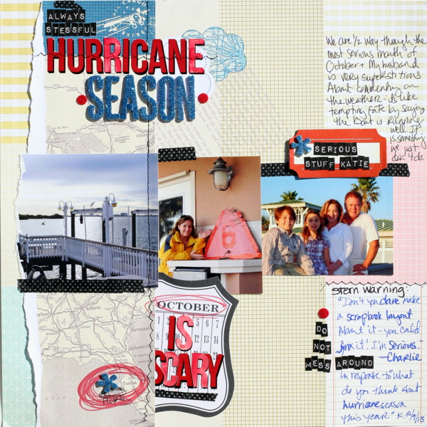
Hurricane Season by Katie Scott | Supplies: American Crafts Amy Tangerine patterned papers; Jenni Bowlin, Tim Holtz, and American Crafts letter stickers; Copic markers, machine stitching. washi tape, Studio Calico journaling spot.
Carrie Arick says, “I created this page to document not only my in-law’s tradition of renting a house near the beach every September, but also to capture the oddness of seeing the leaves turn this time of year.”
“I used ombres of red and blue with gold, charcoal grey and creams. I really love the saturated red and blue in the ombre paper, especially when paired together. Fall colors are briefly rich and the ombre reinforces the transition of color seen in the photo of the trees, so I knew they’d work for this page. The unexpected colors also support the details of journaling.”
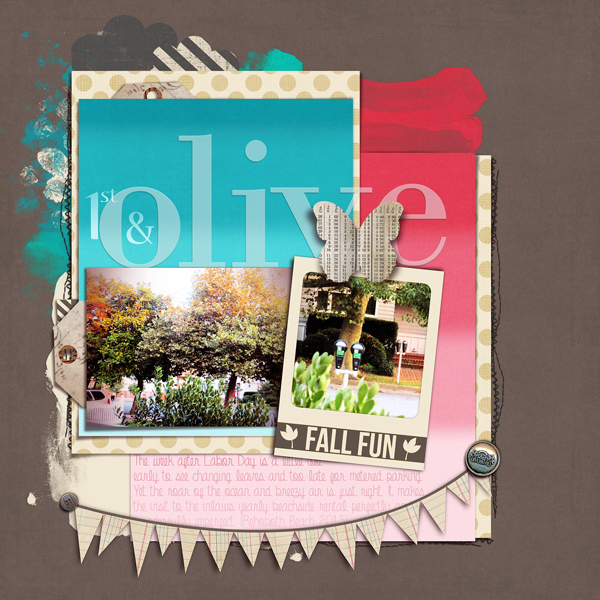
1st & Olive by Carrie Arick | Supplies: Sahlin Studio: Blessed Alpha, Just Jaimee: Storyteller Collection- September; Fonts: Aubery, Eternal Promise
Sue Althouse says, “This page is about how much I love and appreciate my husband. The photo was taken in the fall, but instead of the rich, saturated colors associated with the season I chose the exact opposite: a pastel, watercolor palette. The green is light and fresh, while small bits of pink and coral suggest spring, not fall. The dominant navy swings the page to a more masculine tone. This combination highlights the topic of my layout, not the time of year the photo was taken.”

