FInd more ideas for pie charts on your pages on our Get It Scrapped pinterest boards.
by Debbie Hodge
In today’s information-packed world, the infographic has become a popular way to tell a lot with pictures, numbers and few words. We recently showed you how an infographic can inspire your scrapbook page design. Here we show you how one piece of the infographic — a pie chart — can become a part of your story and design.
Marie-Pierre Capistran says, “I decided to make a page about what I love at the moment and used several pie charts to record these things. I included what I like to eat, where I like to go, what I like to do, what I am proud of, and what I dream of.”
“So that each pie chart would be different, I used a unique color palette for each. One is very bold and colorful; the other one is more muted; one is yellow and pink; the other one is blue, and finally, one is made with watercolor instead of patterned paper. I also played with the size of the pies but used the same title font and title color for each to create unity. I used a black and white photo so that it wouldn’t compete with all the color schemes on my page.”
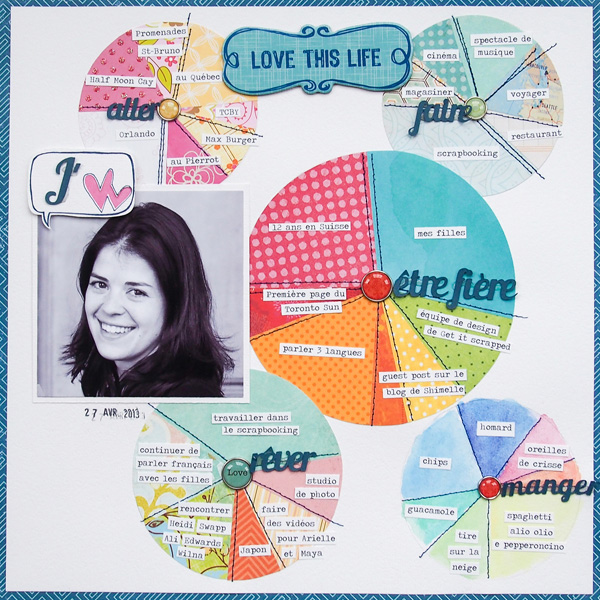
I love by MPCapistran | Supplies: Cardstock: Stampin’ UP!; Patterned Paper: Little Yellow Bicycle, Magenta, Echo Park, Amy Tangerine by American Crafts, My Minds Eye and other pieces from my scraps; Chipboard die cut: Little Yellow Bicycle; Brads: Teresa Collins; Others: Silhouette, date stamp.
Amy Kingsford says, “This page is about my son’s boyish qualities. I’ve been wanting to scrapbook this fun photo for a while, but this assignment gave me the perfect idea for getting it onto a page. To make this design I used the .png version of a pie chart cut file from Deena Rutter, and I placed each slice on its own layer, and clipped photo and patterned papers to the different pieces. Subtle circular brushes in the background echo the shape of a pie, and I used a fresh and masculine color scheme.”
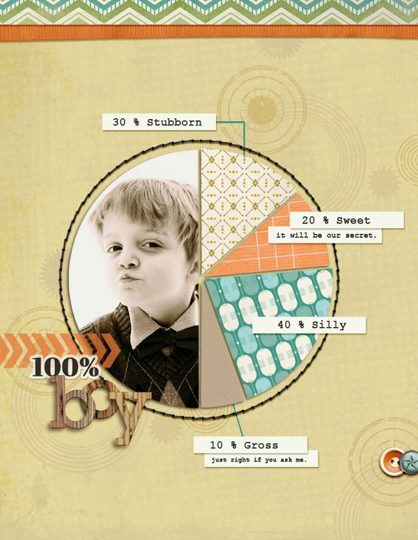
100% Boy by Amy Kingsford | Supplies: Deena Rutter: Hotel California Papers and Elements, Pie Chart Cutting Files; Karen Funk: Simple Stitches, Be Unique Elements; Creashens: Bare Necessities Papers; Just Jamiee: Birthday Wishes Patterned Papers; Mye de Leon: Veneer Alpha
Adriana Puckett says, “My daughters thoroughly enjoyed a science-oriented library program recently. I found that using a pie chart was a new and creative way to present my journaling. I used a digital pie chart, added my text in Photoshop, printed it to photo paper, and then cut it with a circle cutter.”
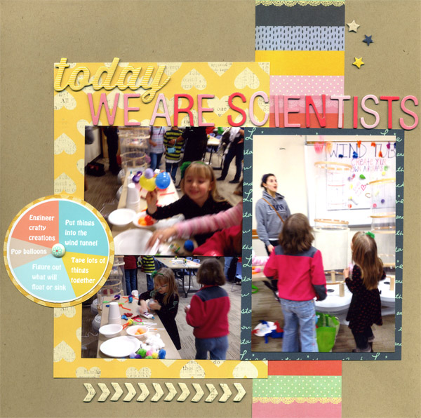
Today We are Scientists by Adriana Puckett | Supplies: Cardstock: Bazzill Basics; Patterned Paper; American Crafts and Studio Calico; Letters: American Crafts Thickers; Chipboard stickers: American Crafts; Brad: Stampin’ Up; Pie chart digital design: Sweetness by One Little Bird Designs.
Tara McKernin says, “This layout is a snapshot of my life right now. I love the little slices it showcases. I took the .png file from Deena’s die cut set and used it for clipping my photos to. I chose all iPhone images within the last month to show a snapshot of life right now.”
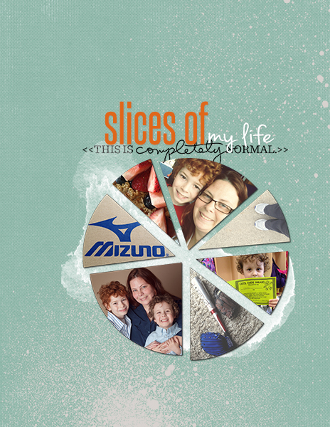
Slices of Life by Tara McKernin | Supplies: Pie Die Cut, Deena Rutter; Paper, Karen Funk; Word Art, Ali Edwards; Paint, Just Jaimee and Paislee Press
Adryane Driscoll says, “When I sat down to do this, the first thing that came to mind was Don McLean’s American Pie (1971) and the lyrics. Way back when, my grandfather owned a 1957 Chevy. My grandfather loved that car. I clipped the photo of the car to most of the pie chart layers then added drop shadows to the individual slices to give them some dimension. I liked the weight the numbers added, and I liked the loop because it goes with the song so well.
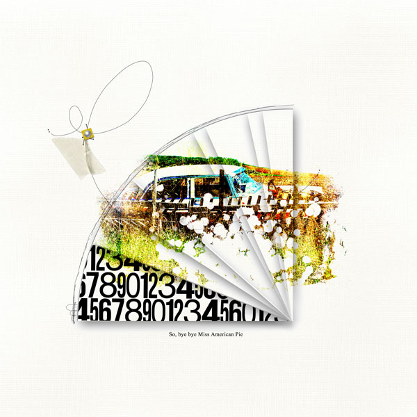
Miss American Pie by Adryane Driscoll: Credits: LReid I Wonky Pie Templates; LMurphy I Junker; Anna Aspnes I Light Textured Neutrals No.2, JazzedUp LoopdaLoops No.1
Amanda Jones says, “My son is crazy about all animals so I created a pie-chart page to capture this obsession.I drew a large pie-chart shape on my layout, extending it outward to fill the entire 12″ x 12″ page. I divided each “slice” of the pie into smaller sections which I then colored with watercolors in tones that worked with the photo. I wrote the names of some of my son’s favorite animals in some of the spaces to enforce the theme.”
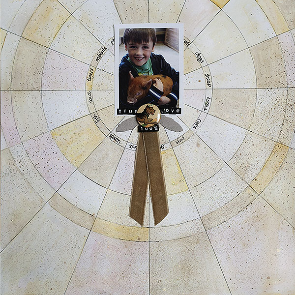
True Love by Amanda Jones | Supplies: Cardstock – Bazzill Basics; Chipboard feathers, flair – Jenni Bowlin Studio; Alphabet stickers – Kaiserkraft; Ribbon – Vintage; Other – watercolour paints.
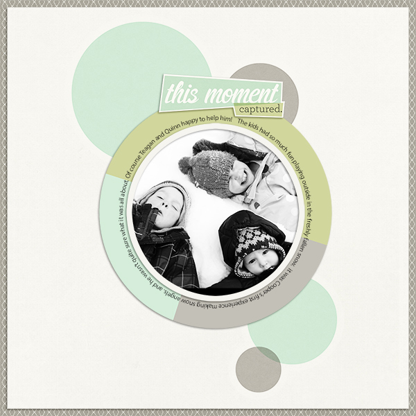
Barb Brookbank says, “This layout is about three of my grandchildren making snow angels. It was the first time for the baby–and he didn’t quite know what to make of it! I thought it was a perfect photo for a-pie chart-inspired layout. I made the pie chart frame myself and filled it with colors from the kit I used.”
Ashley Horton says, “I snapped this photo of my husband and our middle daughter one Saturday on a picnic. When I saw the assignment for Pie Charts, I knew a pie chart would be perfect with this photo and page title, ‘Guess How Much I Love You.’ I filled one section with hearts to represent the love theme from the title and photo. I used my Silhouette Cameo to cut a large 6-inch circle. I added a smaller cut triangle, using the heart patterned paper and gave it dimension with pop dots. I used stitching to section off pieces of the pie chart. I cut a smaller pie chart and added it to the center of the larger pie chart.
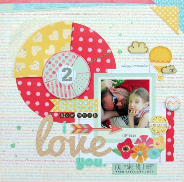
Guess How Much I Love You by Ashley Horton | Supplies: Patterned Paper, Thickers, Stamp & Bits: American Crafts; Tags & Tidbits: Elle’s Studio; Wood Veneers: Freckled Fawn; Flair Button: PandaEight Designs; Enamel Dots: My Mind’s Eye; Spray Mist: Studio Calico; Doily: Hobby Lobby; Letter Stickers: Authentique; Font: Pacifico
Terry Billman says, “My granddaughter had her first professional ballerina photographs taken in May 2013. I used a three dimensional pie chart in coordinating papers as a platform for her photograph. I placed soft glows and light bursts behind the photograph to highlight her.
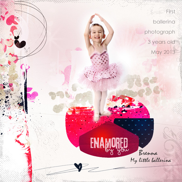
Enamored by You created by Terry Billman| Anna Aspnes: Art Play Palette Enamored, Love Glows 1, Foto Glows 4; Katie Pertiet: Spot Dot Flourish Overlay 4
Debbie Hodge says, “I put the pie chart on this page purely for fun–to work in multiple patterned papers and colors on a simple everyday life page. Like Amy and Tara, I use Deena Rutter’s pie chart digital mask to get the shape onto the page.”
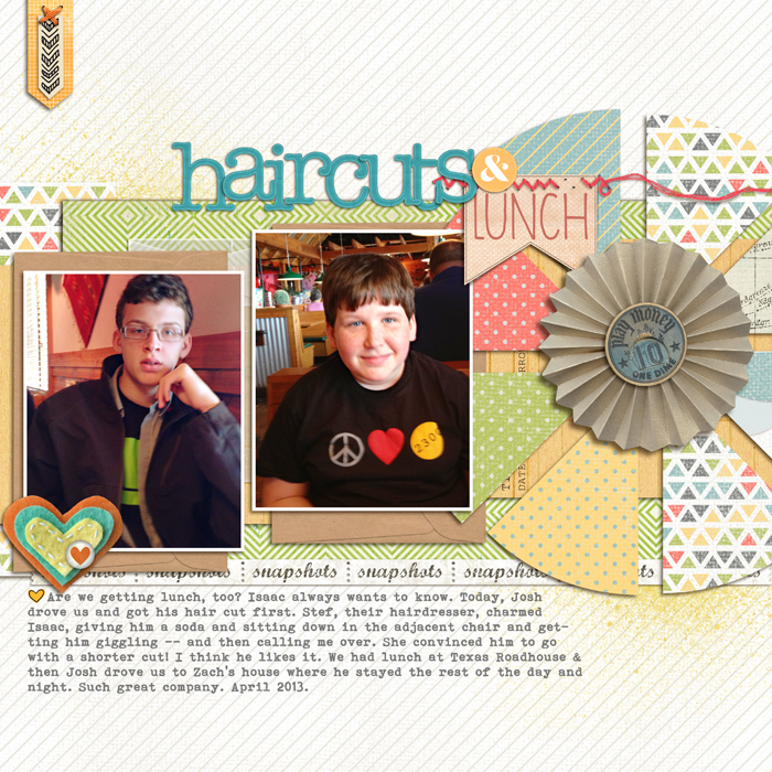
Haircuts & Lunch by Debbie Hodge | Supplies: Patterned Paper: Let’s Go by Rebecca Wagler; On Trend by Crate Paper; Tissue Ombre by Agnes Biro; Have A Heart 2 by Pattie Knox (flair); Stax On Hearts by Kaye Winiecki (hearts); Sketchbook by Amy Tangerine (arrows); Library Cards by Fruit Look Sally; 5th & Frolic by Dear Lizzie (&); Word Label Templates by Anna Aspnes (pennant); Pie Charts by D Rutter (template mask); Snips & Snails Winter Frost (burst); Autumn Frost by Sahlin Studio (chipboard dime); Going Places by Rebecca Wagler (envelope); Basic Paper Alpha Teal, Postage Strips Words, Flossy Stitches Orange by Katie Pertiet; How it Began by One Little Bird (mist); You Are Here (stitching) by Allison Pennington; Wayang, Bohemian Typewriter fonts
[current]

