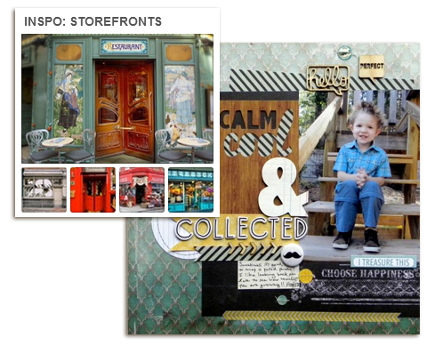
Ashley Horton was inspired by the colors and textures on a Paris Storefront. Check out our Storefronts inspiration board.
by Debbie Hodge
Storefronts, with their photo-shaped windows and doors, make a great starting point for layout inspiration. Add in trim, window boxes and window displays, benches, awnings and signage and you’ve got inspiration for titlework, embellishment, texture, mood and more.
Be sure to click on the links to inspiration photos when they are not shown here (because of copyright). Lots of great eye-candy. And we’ve collected more storefronts for you inspiration on Pinterest: Inspiration Storefonts.
The Get It Scrapped Creative Team has translated several storefronts into eye-catching scrapbook page design.
Amanda Jones says, “This is a simple, everyday page capturing the beauty of a local area. I was inspired by these two storefronts. I took the shapes from the black and white logo on the Polka Gelato storefront as my main page elements and framed them on either side with flag pieces with the type cut away as on the General Store storefront.
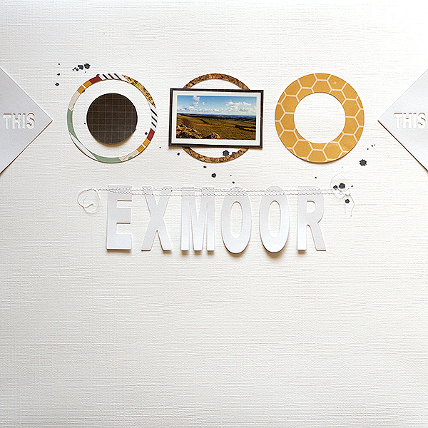
Exmoor by Amanda Jones | Supplies: Cardstock – Bazzill Basics; Patterned paper – Simple Stories; Electronic Die-cutting machine – Silhouette Cameo; Ink Spray – Tattered Angels.
Betsy Sammarco scrapbooked photos of her niece with a backdrop of circles inspired by a local window display.
Betsy says, “Window designers are wonderfully creative! A window display can inspire the layout or background elements of an entire page. This window not only contains a great color combination, it also shows great design possibilities of using circles on a page. The lines of various sized circles of the display inspired the background design of the layout below.”
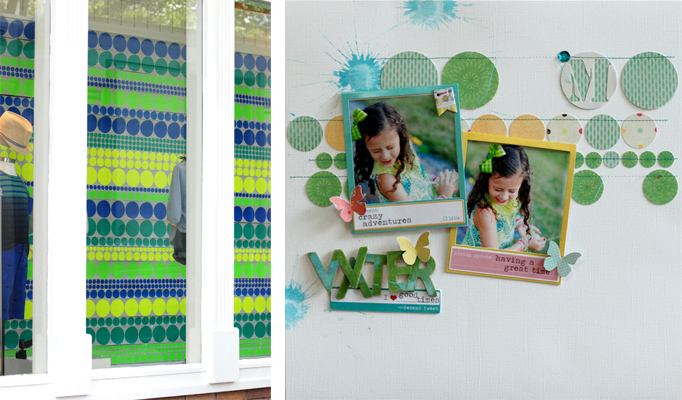
Water by Betsy Sammarco | Supplies: all supplies from a Jenni Bowlin Studio Mercantile Kit, Cardstock: Bazzill, Patterned Paper: My Mind’s Eye, Pink Paislee, Wooden letters: Studio Calico, Photo frames and stickers: Heidi Swapp, Chipboard banner: Pink Paislee, Paint: Jenni Bowlin Studio.
Adriana Puckett says, “This layout is an homage to book-spine poetry, a recent discovery that I made and absolutely love! The photo on the page is of an arrangement from Maria Popova at Brain Pickings. A storefront photo from Flickr by Penelope Fewster provided the perfect inspiration for my layout, with its rounded script title and symmetrical design.”
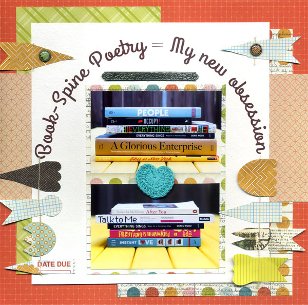
Book-Spine Poetry by Adriana Puckett | Supplies: Paper: Studio Calico; banner embellishment: Basic Grey; brads: Basic Gray; font for title: Grand Hotel; misc: crocheted heart.
Brenda Becknell was inspired by a candy-colored photo of stores on Main Street in Disney World taken by Burnsland photos when she scrapbooked these everyday photos of her grandkids, journaling about how much they have brightened up her life. She says, “I was inspired by the pastel colors of the buildings and the different types of trim on the buildings and the way they were lined up down the street.”
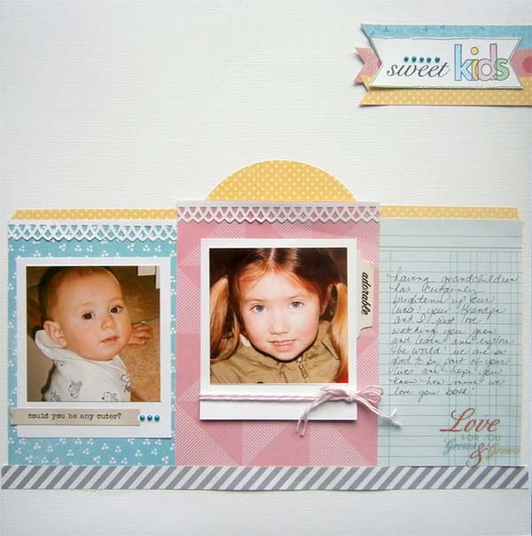
Sweet Kids by Brenda Becknell | Supplies: Cardstock: American Crafts; Patterned Paper: American Crafts & Jillibean Soup; Sentiment sticker: Pink Paislee; Pearls: Queen & Co.; Stamp: Technique Tuesday: Border punch: Martha Stewart “Lattice Arch”: Twine: The Twinery: Markers: Copic
Stefanie Semple says, “I made this layout for a friend about the dogs that fill her home and heart with love. I love taking portraits of people and pets, and gifting a layout of them.”
“I was inspired by this photo of a store front in the New York Times Fashion and Style section, and copied the shapes of the store front’s door and windows for my photo spots. I used a similar white capital lettered font/alpha for the title as the store name. Even the papers I chose are similar in color to the storefront photo. I placed a paw print on the heart to separate the two words within the title, as well as to play on the idea of heart and home full of canine love.”
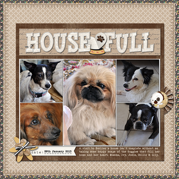
House full by Stefanie Semple | Supplies: Juno Designs: Tell your story (kit); River-Rose Desings: Cats and Dogs (kit).
Marie-Pierre Capistran says, “It’s a tradition for us to meet once a year at a maple sugar house (we do that instead of meeting at Christmas) and this is a page about this year’s meeting with my extended family.”
“From this photo of a storefront, The Modern Pantry, I took the general layout of the windows and the door as well as the placement of the title and subtitle. I also kept the gold lettering on black bands for the title and subtitle. Finally, I added word tags on the pictures, as there are flower boxes in front of the windows on the picture.”
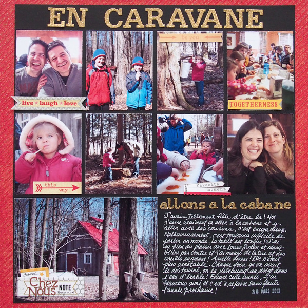
Sugar house by Marie-Pierre Capistran | Supplies: Cardstock: Stampin’UP!; Patterned paper: DCWV and some gold paper I had in my stash; Letters: Making Memories, Basic Grey; Alpha dies: PTI; Others: small word tags from my stash, tiny attacher from Ranger, date stamp.
Looking at storefronts, it was hard to narrow it down to just one! I liked the windows and position of the door in this one so I made a line drawing of it and formed a makeshift template to start. This second adorable shop had the awnings and I just loved them and I loved the tables in front of this Japanese shop. And a photo by Digital Watt on Flickr was by far the greatest inspiration of all, So I made a collage of all the little things I loved and created my very own storefront.
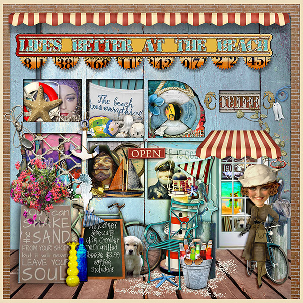
Life’s Better at the Beach by Vicki Walters | fonts Old Stamper and TangieAJImpossible Things
Anna Aspnes at Oscraps-Multimedia Flowers no 1 and MultiMedia Sea Life; Paula Kesselring at Oscraps-Summer Beach Joanne Brisebois at Oscraps-Count the Ways BRimm at Devient Scrap-Nantucket; Holliewood Studioes at Devient Scrap-Just Another Day; Mister Whiskers at Devient Scrap-Chalkboard; Studio Manu at Scrapbookgraphics-Vintage Summer.
Rosann Santos-Elliott says, “This layout is about a mother and daughter’s day at a farm during the fall season. It was inspired by a photo on Flickr taken by Jim Rice of a storefront decorated for harvest time. I used clusters to represent the decorative clustering outside the store and used fall color with a touch of summer colors to offset the green background.”

Sweet. Happy. Together by Rosann Elliot-Santos | Supplies: Simple Stories – Green Dot/Grid paper; Decorative Brads; Bingo Cards/Diaganol Strips; Simple Stories – 100 Days of Summer Fundamental Stickers; Simple Stories – 24/7 Chipboard; MME – The Sweetest Thing Decorative Brads
Adryane Driscoll says, “I liked the look of the lettering on this storefront from Bodie and Fou found pinned here. The word “vintage” reminded me of times spent in flea markets and antique stores looking for little treasures. Because the page was going to be busy, I tried to limit myself to three types of elements: flowers, gems and flying things.”
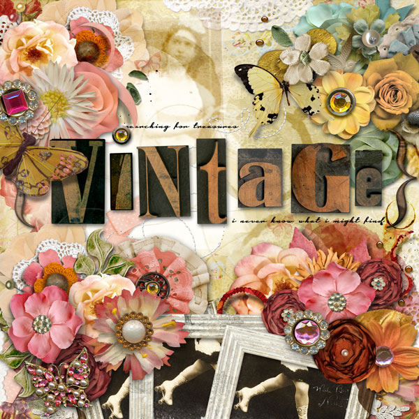
vintage by Adryane Driscoll: Credits: Anna Aspnes I ArtPlay Palette Simplicity, MonoBlendz Avalanche Paperie No.7, Doily Edge Overlays No.1, ArtPlay Palette Night Before Christmas, ArtPlay Palette Sweet Pea, Stitched LoopdaLoops White No.1, ArtPlay Palette Gather, ArtPlay Palette Truth, WoodShop Alpah&Number Set No.1, WoodShop Buttons No.1, ArtPlay Palette Globe Trotter, ArtPlay Palette Lifes Little, and ArtPlay Palette Metro Graffiti; O’Scraps Seven Birthday Collab; Pattie Knox I PinIts!; Forever Joy I Petticoat Rose and Breathe; Holliewood Studios I Art Journaling; J Kneipp I Far From Here; and Katie Pertiet I AllSet Alpha No.2
Katie Scott says, “The storefronts Pinterest inspiration board made me think about my daughter’s excitement about our recent cruise, and how she was probably more excited about shopping for the cruise and showing off her “fashions” than the actual trip. Rather than using one particular storefront, I let my mind wander to mannequins and and fashion magazines. I used papers and products with silhouettes of fashionable women for this page.
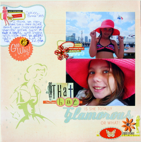
That Hat by Katie Scott | Supplies: DCWV paper; stickers and embellishments from Studio Calico, Authentique, Crate Paper, and Basic Grey.
Ashley Horton says, “Candid shots are great for telling the stories in your children’s lives, but sometimes it’s nice, to get those posed shots. They are the ones you can look back on and see how much your child has grown from year to year.”
As soon as I came across this French storefront from Beautiful Portals, I knew I wanted to work with this amazing color scheme. I loved the calming feel created by the teal, wood grain, and black in the photo, and there was just a touch of juxtaposition with the addition of the yellow. The papers I chose to work with for this color scheme are from the Glitz Design Uncharted Waters collection, but I was able to use them out of the nautical-themed context, by using everyday embellishments.
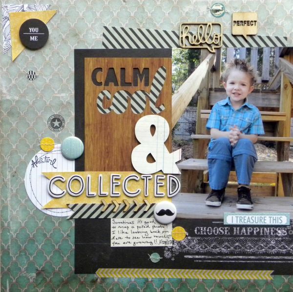
Calm, Cool & Collected by Ashley Horton | Supplies: Patterned Paper & Paper Garland: Glitz Design; Patterned Paper & Wood Veneers: Studio Calico; Flair Buttons: The Paper Bakery; Tags: Elle’s Studio; Memory File Stamps: Heidi Swapp; Hello Wood Veneer: Freckled Fawn; Washi Tape: Pebbles; Thickers: American Crafts: Fonts: Abadi MT Condensed Extra Bold & Pacifico
[current]

