We’ve collected rainbow treatments for hair, home, wedding, fashion and even make-up on our Color: Rainbow Pinterest Board.
by Debbie Hodge
The spring fashion runway was full of bold colors and rainbow combinations, and the “rainbow” color scheme is a popular choice for weddings in 2013, Rainbow-colored hair treatments are even trendy this year.
Here, the Get It Scrapped Creative Team put rainbow color schemes to work on their scrapbook pages, matching their color treatments to page subject and finding a variety of ways to incorporate so much color.
1. put a series of rainbow watercolors in stamped mason jars
Marie-Pierre Capistran says, “These are photos of my husband reading a bed time story to our girls paired with a quote about love.”
“I painted a series of watercolor splotches in rainbow colors, and then I stamped a mason jar over each color. Black and white photos let the rainbow colors shine.”
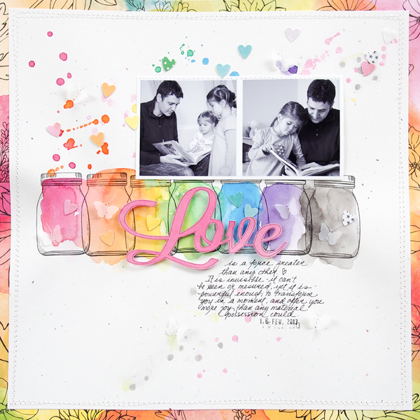
Love by Marie-Pierre Capistran | Supplies: Cardstock: SU!; Pattern paper: Amy Tangerine; Stamps: Dear Lizzy; Paper punch: SU!; Other: vellum paper, date stamp, sewing machine, Silhouette.
2. add a rainbow page border
Amy Kingsford says, “This page is about sharing my childhood love of spin art with my son 20 years later.”
A rainbow border at the bottom and a mix of brightly colored elements in every color of the rainbow sprinkled throughout the page complement this colorful subject. I’ve thrown in splashes of black in for a “tattoo art” feel. It works well with my subject because of its artistic theme and also because of the rainbow bokeh effect on my Instagram photo.”
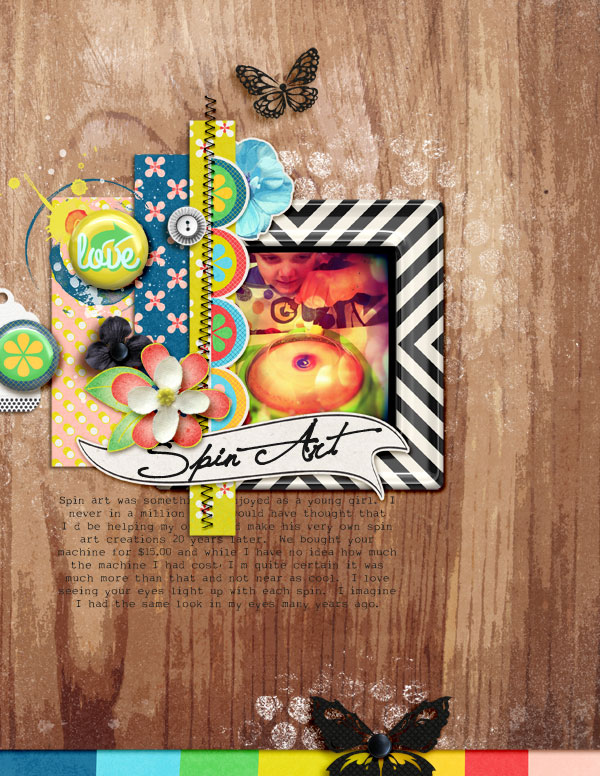
Spin Art by Amy Kingsford | Supplies: Creashens: Lemon Squeezy Kit, Lemon Squeezy Add-On, Lemon Squeezy Frames, Lemon Squeezy Flairs; Crystal Livesay: Effortless Templates; Karla Dudley: Butterfly; Robyn Meierotto: In Stitches: Basic Neutrals.
3. back up a die-cut foundation with Swiss dots in rainbow colors
Sue Althouse says, “This page is a glimpse of me at 4 years old.”
“The rainbow colors appear as border strips at the edge of the black card stock and as backing to my Silhouette chevron shape. These bold, bright colors support the theme of a happy little girl, all dressed up to have her picture taken.”
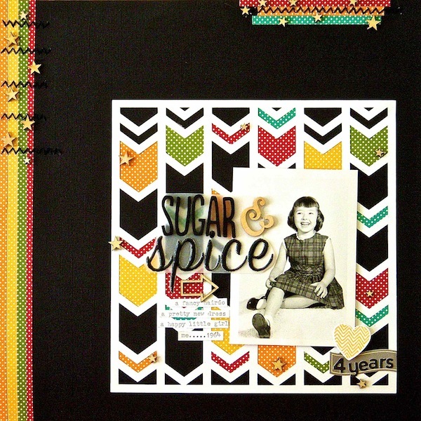
Sugar & Spice by Sue Althouse | Supplies: Cardstock: Bazzill; Patterned Paper: Jillibean Soup; Alphabets: American Crafts, Jillibean Soup; Stickers: Jillibean Soup; Chevron Heart: Stampin’ Up!; Floss: We R Memory Keepers; Wood Veneer: Freckled Fawn, Studio Calico
4. render a series of arrow-like chevrons in rainbow colors
Terry Billman says, “Playing at the park with my granddaughter is one of our favorite things to do when she visits. She loves to play hide and seek in the tunnels, running from place to place, and screaming every time I say, “I see you!”
“Bold rainbow colors against a white background create excitement and energy. I used five colors of the rainbow on the chevrons to direct the eye to the photo highlighting her face.”
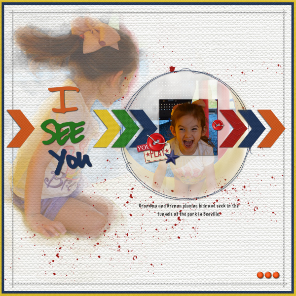
I See You created by Terry Billman| Maplebrook Studios: Just Linens No. 14, Ingrid Solids, Janine Solids, Just Linens 23; Katie Pertiet: Classic Cardstock Lively, Classic Embossed Chevron Christmas, Plated, Cut Ups Love 2, Star Spangled, ; Anna Aspnes: Art Play Crazy Life, Stitch By Anna Circle 2, 12 X 12 Stitch By Anna Border White, Art Play Palette Ex Libris; Ali Edwards: Life In Pictures; Patti Knox: Fasten Its; Gone To The Dogs
5. create a foundation of rainbow-colored paper strips
Katie Scott says, “I recently organized my daughter’s closet, transforming it from toy storage to clothing on hangers. Of course we used the ROY G. BIV method just like I do with my clothes.”
“I made a foundation of rainbow-colored paper strips cut from 6″x 6” paper packs. Like the clothes in the photos, they are arranged in “ROY G. BIV” order (red, orange, yellow, green, blue, indigo, violet). I stitched the strips to support the closet and clothing theme.”
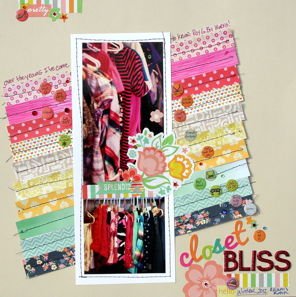
Closet Bliss by Katie Scott | Supplies: American Crafts Dear Lizzy and Maggie Holmes and Amy Tans 6×6 Paper Packs; GCD & Memory Makers letter stickers
6. give your titlework a rainbow treatment
Vicki Walters added a rainbow-colored treatment to her titlework and circular frame on “Color My World.”
Vicki says, “I clipped an image of rainbow colored pencils to the title text, and I used a multicolor gradient on painted frames. The frames are actually two layers, one in greys and the other in color and then each halved and then merged.”
The photo got a color treatement, too. Vicki says, “The photo was taken in Alaska. It was layered twice,top desaturated, middle desaturated and then faded and the bottom left in color with the saturation bumped up to really bring out the blue. I used the erase tool to uncover part of the color photo on the bottom (more so on the top layer and less on the second layer). I blended them together to have the photo go from black and white and change to color.”

Color My World by Vicki Walters | Supplies: Anna Aspnes at Oscraps-12×12 Artist Edges Overlays no 5, Artsy Paint no 2, Painted Frames no 1 Brushset, Potpourri Paperie no 7,and Skinny Lined Overlays no 2
7. use a rainbow of colors laden with emotional meaning
Kiki Kougioumtzi says, “The sculptures in these photos were made from burned trees left after a big fire that destroyed a great part of this forest. In this same area, there was a sanatorium for tuberculosis patients and the sculptor wanted to represent their feelings.”
“I considered the emotions connected to these pieces to choose my colors. I chose blue (calming and soothing) from the photos. Then I used used the color wheel and pulled green (refreshing, hope) and yellow (quarantine). I could have used orange too, but there is drama in the story, so I completed my combination with purple (destruction and depression).
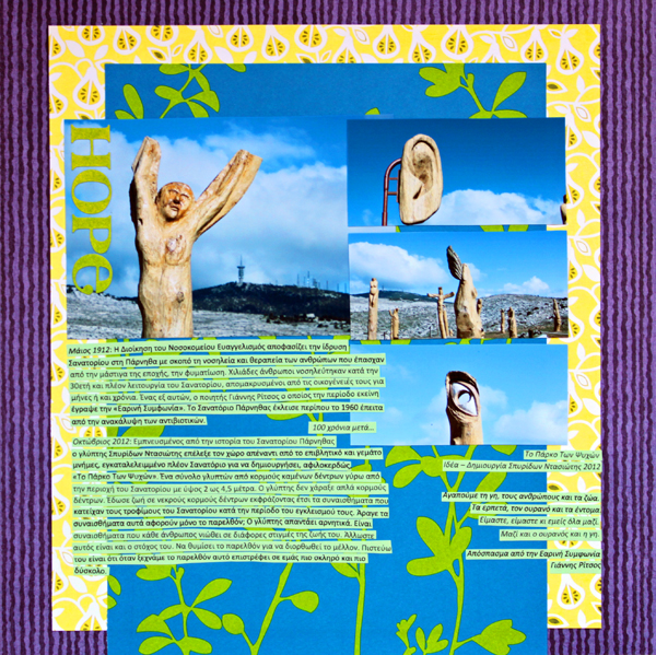
Hope by Kiki Kougioumtzi|Supplies:Patterned paper:Me and My Big Ideas,Basic Grey, Graphic45;Cardstock:Canson;Alphas:Basic Grey.
8. use a rainbow of pastel colors to back up family artwork
Adriana Puckett says, “My daughter’s artwork sets the stage for the rainbow colors here. She blended large patches of red, orange, yellow, green, and blue. I mounted it on white cardstock and then again onto Dear Lizzy’s Neapolitan paper. I think it makes the artwork look mounted among an exhibit.”
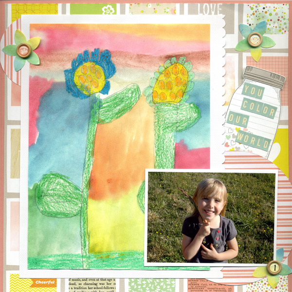
You Color Our World by Adriana Puckett | Supplies: Patterned paper: Dear Lizzy Neapolitan paper; American Crafts mini stickers; Stampin’ up petal punch; misc. wooden embellishments.
9. layer Washi tape and matching buttons in a rainbow of color
Michelle Houghton says, “Each year our neighborhood has had a big Easter Egg hunt for all the kids. The bright colors of the eggs and the sunshiny day were a perfect match for a rainbow color scheme.”
“I used long strips of rainbow-colored Washi tape to make foundations on both sides of this 2-page layout. I topped these strips with buttons in matching colors, emphasized the rainbow and grounding my photos to the page. “

Easter Hunt by Michelle Houghton | Supplies: cardstock; Bazzill Basics and Bazzill Swiss Dots, tape; Queen and Company, buttons; Buttons Galore and More, chipbord letters; American Crafts, journalling tag; Basic Grey, ink; Sharpie
[current]

