Got lots of photos? Check out the Get It Scrapped team’s ideas for getting 9 photos onto the page.
Katie Scott says, “These photos are from a fun layover at the Denver Airport. My husband had seen a show about this airport on the SciFi channel so I took extra photos for him.”
“To get nine photos on the page, I cropped down 4″x 6″ photos to 3.5″ x 5″ and arranged them in a grid. I didn’t have a focal point photo originally, but I thought the photo of my daughter smiling in the lower left came out particularly well so I added embellishments to draw attention to it.”
“To get flow across the two pages, I used the same background paper and photo mat on both sides, and I used a chevron/arrow strip of paper across the two pages.”
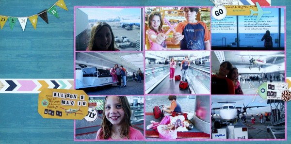
Denver Airport by Katie Scott | Supplies: American Crafts & Crate Paper patterned papers; American Crafts, Crate Paper, Basic Grey & Studio Calico embellishments.
Stefanie Semple says, “The photos are from a tour of Antigua my hubby and I made while the kids were asleep aboard the cruise ship.”
“I used a single focal photo as a panoramic spread across both pages to unite the two pages and create my focal point. I added the detail shots around the edges of the spread and used an alpha in a color that’s legible but not attention grabbing.” All of these things contribute to the story while letting the large photo take center stage.
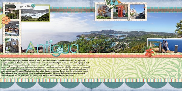
Antigua by Stefanie Semple | Supplies: ScrapMatters Design Team Collaboration:Me Ke Aloha (kit); LDrag Designs: In The Tropics (kit); Little Green Frog Designs: Panorama Template
Michelle Houghton‘s page holds a collection of nine family photos from a summer vacation. Michelle says, ” I didn’t emphasize any one photo over the others since the page is about the fact that we end up with a lot of photos of people snuggled in together.” Rounded corners, a yellow mat, and placement of the photos in two rows across the spread, unite the two sides of the layout.
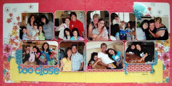
Too Close by Michelle Houghton | Supplies: patterned paper, jewels, pins, clips, tuel and tissue; SEI, letters and brackets: American Crafts
Tara McKernin says, “This page is about the afternoon spent in a field filled with dandelions and making wishes with my Jake. I don’t have one photo as a focal point, but have collaged them and, as a whole, they tell the story. I played with photo placements within the grid, looking for visual balance spreading out the close-ups and darker photos.” The photo grid goes over the break in the middle of this two-page 11″ x 8.5″ layout uniting the two sides.
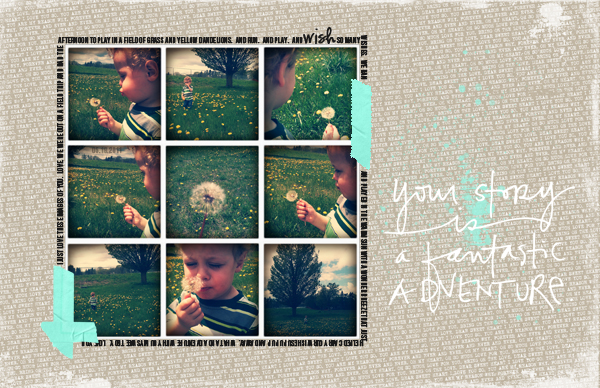
Wishes | Tara McKernin | Supplies: Ink splatter Paislee Press More + Less ; Paper Ali Edwards Hello my heart & word art Remember Sentiment Stacks; Fonts BEBAS and CK Ali’s Writing; tape Sahlin Studios
Sue Althouse says, “This page is about our visit to Pond Hill Farm in northern Michigan. I wanted to include as much as I could of this event, so I opted for a collage of photos.”
“The left side page is arranged as a traditional 12″ x 12″ layout with two vertical photos, while the right side is a divided page protector filled with seven pictures. This allowed me to keep all my photos their original 4″ x 6″ or 4″ x 3″ sizes. I added patterned paper strips and embellishing to a few pictures in the divided protectors to give them elements in common with the left side and to tie the layout together.”
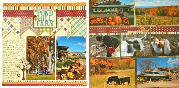
Pond Hill Farm by Sue Althouse | Supplies: Cardstock: Bazzill; Patterned Paper: Simple Stories, Lily Bee; Alphabets, Stickers: Simple Stories; Inks: Tim Holtz; Floss/Twine: My Mind’s Eye, We R Memory Keepers; Twinkle Goosebumps: Queen & Co.
Terry Billman says, “This page is about Cami and her Grandpa spending an afternoon at Cole Park, located on the beach in Corpus Christi. This was her first time to visit Cole Park, and she was excited to feed the birds, play at the playground, and explore the pier. I like to have my photos pointed toward the center of a two-page layout and I’ve placed shots to achieve this. The photo of Grandpa stooping down on the shore with Cami in his arms is one of my favorite photos, and it is my focal poitn, used alone and enlarged on the left side.”
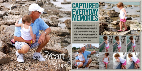
Captured Everyday Memories by Terry Billman| Katie Pertiet: Chandra Solids, Coastal, Oiselet, Template Inspiration; Anna Aspnes: Grandparent Word Art
Brenda Becknell says, “We were lucky enough to get our entire family together for Thanksgiving this year, and I gathered random photos from the day on this page. A few of these photos had people looking toward the left, and I put those on the right page so they were looking into the center of the layout. I carried over the checked paper and paper and sticker borders to both pages of the layout, and used layered sticker elements to fill in the empty spaces. Twine and journaling are on the page, to balance the heavier right, which had one more photo and a larger portion of the title.”
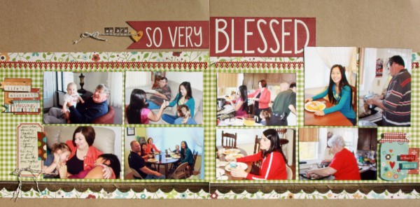
So very Blessed by Brenda Becknell | Supplies: Patterned Paper: October Afternoon, Simple Stories; Stickers: Simple Stories
Vicki Walters says, “The occasion for this photos is my great great niece’s first birthday party. On the first side I slipped in one photo with her dressed pre-cake and concentrated on “cake face” which I think is just adorable! On the other side it began with her “cake face” and then her opening gifts and playing with her friends. I just love their faces when they dig into their first birthday cake and that’s what I concentrated on in this layout.”
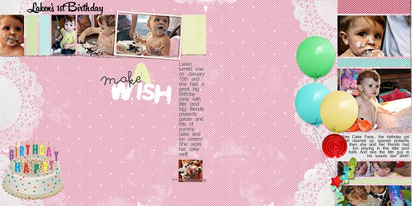
Make a Wish by Vicki Walters | Supplies: Anna Aspnes Designs: ArtPlay Chevron Girl Craze papers, ArtPlay Palette Birthday; Biograffiti: Four Play no 1; Unknown: cake clipart.
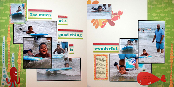
Rosann Santos-Elliot says, “These pages are about my son’s first attempt at boogie boarding on the Jersey shore. I didn’t really think of any one photo as a focal point. I had no planned method for placing the photos. I cropped as I went along, placing them so that the subjects in the photos head into the center of the two-pag spread. I created a sea scene on the far left and far right edges, mirroring elements and bracketing or framing my photos.”
Debbie Hodge says, “My mom put her heart into making a meaningful, charming, warm memorial service for my dad, and I have hundreds of photos from the day, but haven’t scrapbooked many of them yet. This is my beginning, though, photos from the morning of the service showing my family preparing, scrubbing down tables, setting up parking signs, mowing yet again, arranging flowers and more. I also included one shot as people began to arrive under the tent.”
“I arranged six 6″ x 4″ photos in pocket-page arrangement on the left side, and made a more traditional page design on the right. I repeated two of the embellishing items on the right to the left, adding yellow rickrack over one photo and a brown doily in the top left corner. The two pages are united both by the look and content of the photos and these repeated bits.”
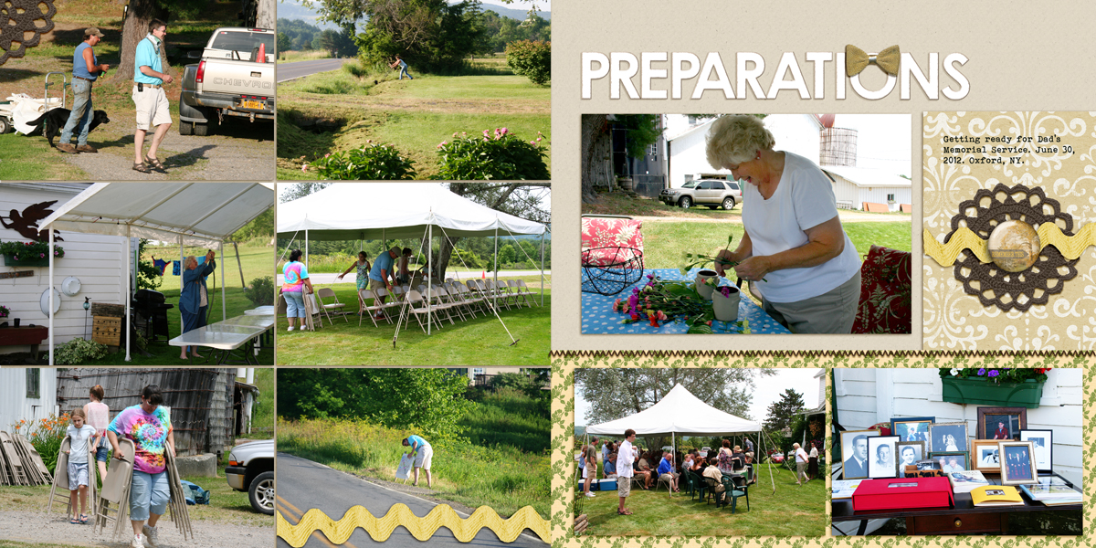
Preparations by Debbie Hodge | Supplies: Shine by Karen Funk; Bare Necessities by Creashens; Iced Cookie Alpha by Valerie Wibbens; Stitched by Anna Brown by Anna Aspnes; Photo Wraps 11, Color Study Flair Brown by Katie Pertiet; Make it Meaningful by Vinnie Pearce; Fall in Love by Robyn Meierotto; Bohemian Typewriter font
[lovesketches]

