 by Debbie Hodge
Consider your home: the places you sit, the items you use daily, the decorations you choose, the messes that arise. And then get them onto the page!
Playroom
As Tara McKernin picked up her son’s toys, she thought about how the contents of the toy room change over the years and she took photos right then with her camera photo. She says, “I pulled out my iPhone and took photos and processed them in RabLab easily to black and white to keep a clean look to the page. I didn’t stage anything. I just photographed the toys in his room. Yellow and blue are my go-to colors for any page–they speak to me and our life right now.”
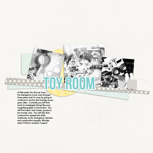
Toy Room by Tara McKernin | Supplies: Simply Tiffany Easy Going Templates; Papers from Karen Funk Happy together and Robin Meierotto Love Love Love Papers
Debbie Hodge says, “I like including the context of our house in everyday life photos. These two pages show the same area a year apart. In the first my sons are playing sax and trombone, and I made sure to step back and get the view into the dining area and to capture the piano and settee in our “music” spot.
“The second layout shows the area this year — after I’d moved furniture. We love to play board games and I really wanted to make a comfier spot with a low table and chairs for that. When I took these photos of my son and friends playing games on a no-school teacher work day, again I got the long shot and the dining area in the back. It shows how the furniture has moved and how we use the space.”
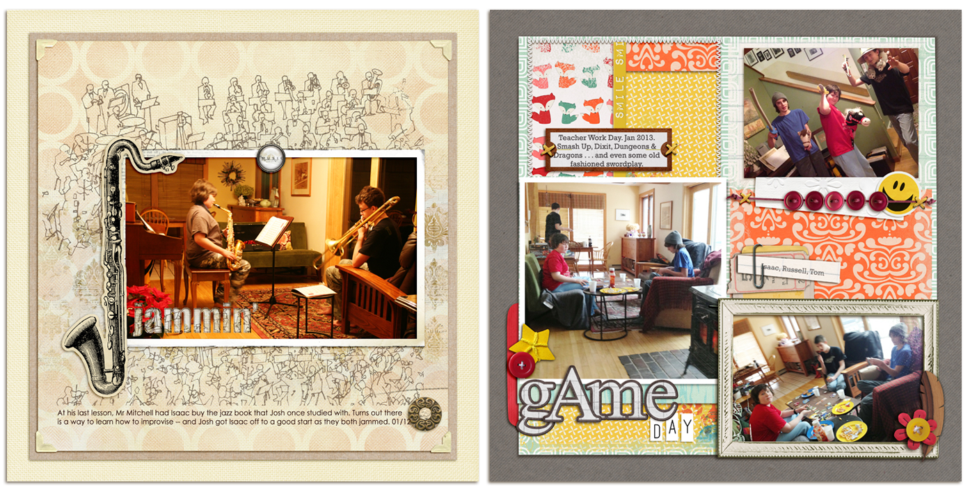
Jammin’ by Debbie Hodge | Supplie: Artplay Palette Concerto, Vintage Fotokorners by Anna Aspnes; Just Hint At It Brushes No 6 by Lynn Grieveson; Krafty Canvas No 1 by Katie Pertiet; Just Linens No 1 by Maplebrook Studios. Century Gothic, Impact fonts.
Game Day by Debbie Hodge | Foxy by Gina Miller (papers & embellishments); Jane by Ardent Sparrow (ticket); Rules of the Road Alpha, You Make Me Happy by Mye De Leon; Flossy Stitches Yellow by Katie Pertiet; Ordinary Special by Kaye Winiecki; Woody Feathers by Lynne-Marie; Amore Mio Envelopes by Paula Kessselring; Alpha Bits, Krafty Essentials by Karla Dudley; Foto Inspired Template Pack 2B by Anna Aspnes; Fastenating by Scotty Girl; Chin Up by Allison Pennington; Bohemian Typewriter font
Bathroom
Adryane Driscoll says, “This is the scene in our bathroom on and off throughout the day. I took this photo because the scene makes me laugh but I didn’t know how I would scrap it until seeing the topic “Rooms in Your Home.” After playing with the contrast on the photo, I chose papers that had the same colors and vibrancy. I went with the acrylic alpha because it’s clear, like water. I added little black squares to echo the pattern of the bathroom tile and to create a simple visual triangle with the dark color on the bathroom door. I added water stains to complete the page.”
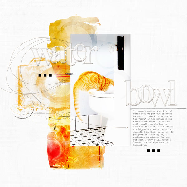
Water Bowl by Adryane Driscoll: Credits: Anna Aspnes I Artsy Layered Template No. 65 (modified), Arcylic Alpha&NumberSet No.1, ArtsyCameras No.1, 4 x 6 ArtsyKardz Bask, and MonoBlendz Avalanche Paperie No.5
Retreat
Barb Brookbank says, “I love my sitting room. I have my comfy sofa, afghan, and antique cabinet where I keep my books. When I close the door, no one dares enter. This is where I sit, I meditate, I dream, I read, I sleep, I heal. There is no phone, and no tv. Just a large window with stunning views of the trees and lake. It’s so peaceful, quiet and safe. It’s my room. My retreat.”
Stefanie Semple says, “I love my bedroom. It can be a wonderful haven for me when life gets too noisy and busy. I took photos specifically for this layout, and I did tidy up, making the bed and staging some of the shots. I see it a little like real estate photos: you want to make the house look the best it can.”
“I chose a kit that had similar colors to my bedroom. I wanted something floral as well as something I could use to create a his and hers feel within my double page, because that’s what my layout is about. I like that the layout works as a double while representing two distinct halves. I did this by changing up the backgrounds and playing off the pinks and blues.”
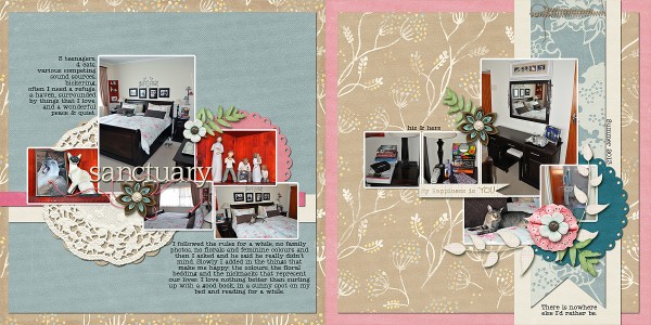
Sanctuary by Stefanie Semple | Supplies: LDrag: Practically perfect (kit); Elise’s Pieces Designs: Falling softly (mini kit); Keepscrappin designs: Gimme 5 (templates).
Bed Room
Debbie Hodge says, “I love recording my son’s rooms over the years. As Marie-Pierre mentioned above, it can be hard to step back far enough to get the whole view (especially in my youngest son’s very small room). I love her tip to use the iPhone panorama feature and will try that soon. My solution here was to get these photos of one wall and to describe in the journaling the contents of the bookcase shown and the items on the other that aren’t pictured. I added retro-look toy embellishments where are perfect for this subject.”
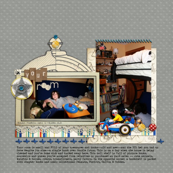
Nuts N Bolts by Maya de Groot; Child Play by ViVa Artistry and Paula Kesselring; Meadowlark, Tidbits by One Little Bird; Stitch Medley by Quirky Twerp; Also a Very Small Alpha by Allyson Pennington; Brad Bonanza No 2; Triumph Tippa, Billabong, Flux fonts.
Debbie Hodge made this page of her older son’s room 5 years ago, taking lots of detail shots. Debbie says, “It’s time to do another one of this room. It will be fun to see what’s changed and what’s stayed the same.”
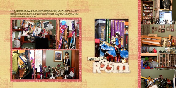
Joshua’s Room by Debbie Hodge | Supplies all from Designer Digitals.
Dining Room
Katie Scott says, “This page records our Christmas Eve Dinner last year. Our dining room is not always in the same room since my husband and I love to rearrange our house every 6 months or so. I took the photo on Christmas Eve 2012 with the self timer setting on my point and shoot camera. I used background paper that looks like dark wallpaper because it reminds me of a formal dining room. I chose the seemingly mismatched bright colorful paper as a contrast and because our dining room is not at all formal and is ever changing and often chaotic.
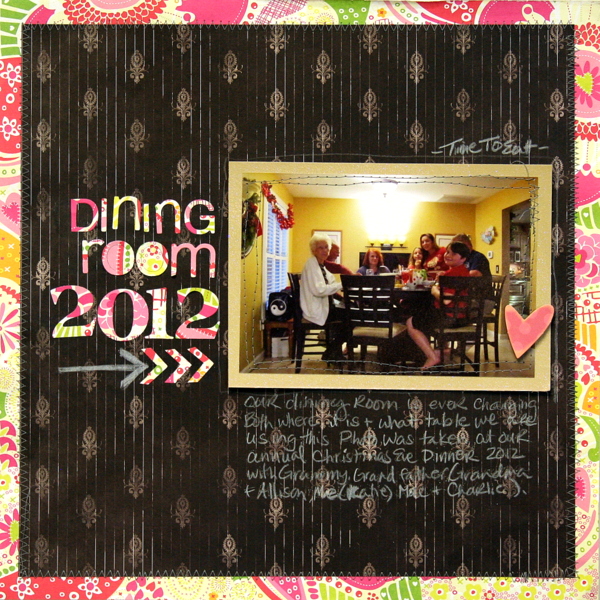
Dining Room 2012 | Supplies: Patterned Papers: DCWV; Quickutz Dies; machine stitching, white pencil.
Rosann Santos-Elliott says, “This layout is of my dining room. It’s the first room completed in the long-term renovation of our home and I decorated it on a budget. I am so happy with how it turned out and to have a page recording it.”
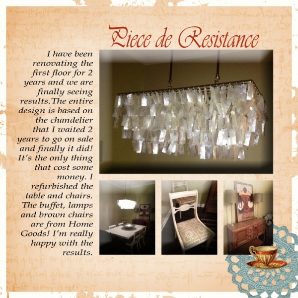
Piece de Resistance by Rosann Santos-Elliott | Supplies: Karah Fredericks: Someone; Maya de Groot: Brocante
Family room
Terry Billman says, “The kitchen/family room is one big room in our home. It is the hub of the house where everyone congregates every day and for holiday gatherings. I gathered photos that I already had in order to show this place.”
“I came up with the title first and then chose this template that is like a wheel with the center being the hub, representing my kitchen/family room. I chose colors similar to the southwest colors in my home. Since there were so many colors in the photos, I converted most to sepia tone.”
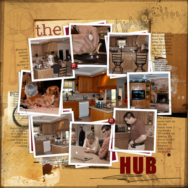
The Hub created by Terry Billman| Anna Aspnes: Holiday Template 1, Art Play Palette Ablaze, Art Play Cuisine, Art Play Preserve, Art Play Genuine, Art Play GradYOUate
Debbie Hodge scrapbooked her living room — and, especially, the addition of new chairs. She says, “I often take photos of my family in the living room with the BIG VIEW because I love seeing how things change over the years. The chairs in the photo are sitting where our sofa was for many years — and I’ve got lots of older layouts that show just that.”
“This was a few days before Christmas and the house was tidy and as I played a game with Isaac, I realized it looked GOOD! It doesn’t always look this way. I propped my camera up on the sofa across the room and took the photo with a self-timer. I used pretty print papers that remind me of home decor and lace since in the journaling I talk about how the styling on these chairs is fussier than our other pieces.”
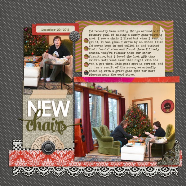
New Chairs by Debbie Hodge | Supplies: Vintage Christmas by Katie Pertiet; Chin Up by Allison Pennington; Day Planner by Paislee Press and One Little Bird; Worn by Sahlin Studio and One Little Bird; Iced Cooke Alpha by Valerie Wibbins; Washi Tape, Sweet Storytelling, Lined Journalers by Sahlin Studio; Pedal Pushers by One Little Bird; Mercury Script, Bohemian Typewriter fonts.
Craft room
Kiki Kougioumtzi says, “This is a page about my craftroom. Is’s an ongoing project, as my hobbies and interests are ever evolving.”
“I already had the photos. Every time I decide to change things up, I take a before photo to help me plan the things better and I note things that worked and things that need to change. I always try to take the photos with natural light, to really see the environment.”
“When I was searching my stash for products for the layout I knew I wanted to use the paper with the clipboards and a measuring tape I had. Things that I actually use with every reorganization of the room.”
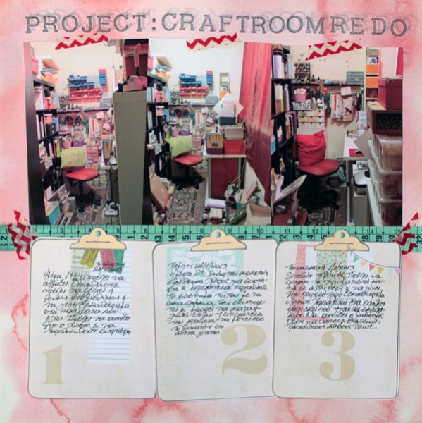
Project:Craftroom redo by Kiki Kougioumtzi|Supplies:Patterned paper:Basic Grey,American Crafts;Stamps:American Crafts;Other:washi tape,brads,measuring tape,Tsukineko Memento ink.
Marie-Pierre Capistran says, “This is a page about my scrap room. I photographed the room right after I had finished a project and tidied up – not excessively, just the normal putting every thing away.”
“Taking pictures of a room can be challenging. Backing up enough to get the whole room is almost impossible. So for this picture I used my iPhone! There’s a feature on the iPhone that let you take panoramic pictures. To find it, launch your camera iPhone and hit option. You’ll see the panoramic option. Then, you stand in the middle of the room and you start taking the picture, slowly turning. Here, I stood in the arch doorway leading to my husband’s office so this is exactly the view we have of my scraproom from the office. I think it’s cool to have a picture representing exactly what you see in your home. I printed my photo on an 8.5×11 sheet of photo paper.”
“Since the page is about my scrap room, I wanted it to have an artistic feel despite the 11″ wide photo that was giving the page a graphic feel. I used a paper from Sassafras Lass with lots of cute crafty elements. To make the paper and its crafty elements look real, I added layers to the embellishment clusters. I added a lot of stitching to the page since I love to do that on my layouts, and I wanted my page to represent my everyday scrapbooking style.”
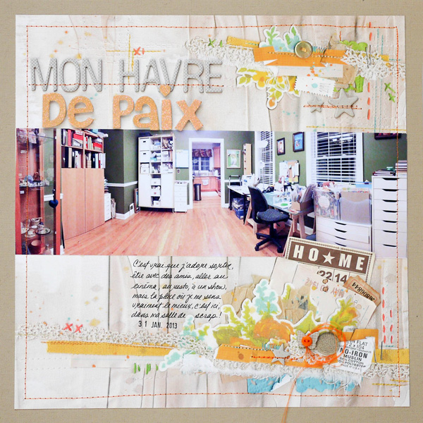
My peaceful place by Marie-pierre Capistran | Supplies: Cardstock: Stampin’UP!; Paper: Sasafrass Lass; Chipboard elements: Studio Calico, Stampin’UP!; Button: Basic Grey; Letters: American Crafts Thickers, Me and My Big Ideas; Bingo card: Jenni Bowlin; Ticket stub: Tim Holz; Other: sewing machine.
Ashley Horton says, “I am so thankful to have a designated Scrapbook area in my home. I recently rearranged a few things in my scrap area, so I thought it would be the perfect time to take a few photos. I think the photos you take of the rooms in your home, should be determined by the idea you want to convey on your layout. If you are looking for an every day approach to your layout, you may want to leave the room as is–meaning, if it’s a mess, with laundry, toys, or whatever all over the place, then leave it that way for your photo. If you are looking to tell a different story, you may want to clean things up a bit, and not distract from what you want your photos to say.”
“There were several things I incorporated, to pick up the theme of my photos. I used bright colors, because when I looked at the photos, that was one of the first things I noticed. I chose papers and Washi Tapes that would coordinate with the colors in my photos. I also used misting, which is one of my favorite techniques to play around with in my Scrapbook area. To incorporate a lot of the supplies, that I keep in my Scrapbook area, I used washi tape, baker’s twine, stickers, enamel dots, flair, Thickers alphas, spray mists, a mask, my black sharpie, and a fun binder clip.”
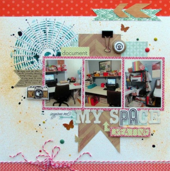
My Space by Ashley Horton | Supplies: Cardstock: Bazzill; Patterned Paper & Stickers: Echo Park; Spray Mist, Mask, & Butterfly Stickers: Studio Calico; Washi Tape: Recollections; Flair Button: A Flair for Buttons; Baker’s Twine: The Twinery; Thickers: Pebbles & American Crafts; Font: CK Cool; Enamel Dots: My Mind’s Eye; Other: Binder Clip
What rooms have you scrapbooked–and which ones do you need to get on the page?
[current]


