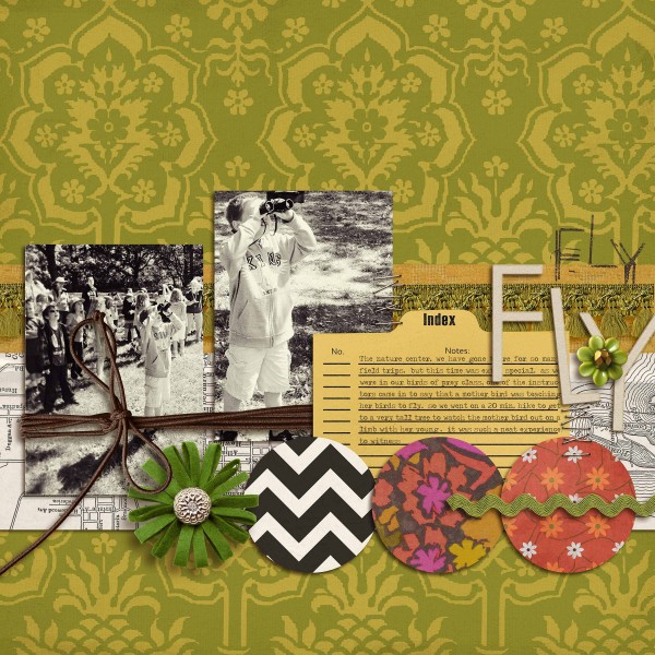
 by Debbie Hodge
Nostalgic and vintage looks have been popular for a while, and that trend continues in 2013.
What’s new is that crafters and scrapbookers are finding ways to give vintage motifs and materials modern updates. It’s about mixing the old with the new, the expected with the unexpected, playing with elements like scale, color, print pattern, styling and technique.
update vintage motifs with modern styling
Katie Scott gave the traditional silhouette motif a tie-died vibe. Katie says, “My son is sometimes hard on himself and I wanted to make him something encouraging. I wanted to take a colorful take on a silhouette and tweaked the photo of my son to look like a hyper-colored silhouette. I also looked for printable vintage arrows on Pinterest and found “14 Vintage and Pretty Arrows.”

Brave by Katie Scott | Supplies: Picassa for photo editing; Basic Grey embellishments; American Crafts twine; Martha Stewart border punch; Bo Bunny patterned paper; Vintage Arrows (unknown source found on Pinterest).
Anna Aspnes frequently uses vintage illustrations with modern digital techniques for unexpected looks. Here, old story-book illustrations stand out against photo glows and splatters. They’re mixed with blended photos and modern typography for an eye-catching and eclectic look.
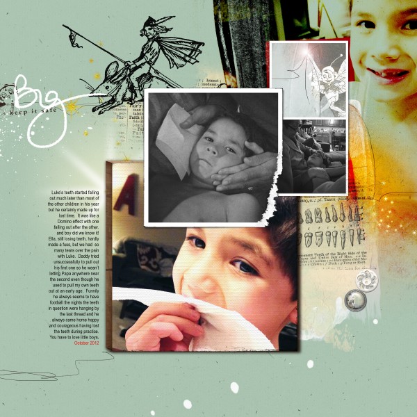
Big by Anna Aspnes | SUpplies: 5) Supplies: Artsy Layered Template No. 74, ArtPlay Palette Fairy, Fairies, Imps and Elves No. 1 Fonts: Arial Narrow
We challenged our creative team to give vintage elements a modern twist on their scrapbook pages. Check out what they’ve done and get ideas for your own original looks.
Barb Brookbank used kitschy-vintage elements on which motifs and type treatments of the past are rendered in modern forms. Vintage illustrations in the modern “flair” buttons and “scrabble-styled” alphas are two of the juxtaposed pieces on her page “Together.”
She says, “This is a photo of my parents taken in 1971. It was their 25th wedding anniversary. Mom and Dad were married for 51 years and were inseparable until parted by death. This retro-inspired kit was a perfect match for this photo. The colors are soft and match my Mom’s dress. The Valentine theme was appropriate since my parents were very much in love.”
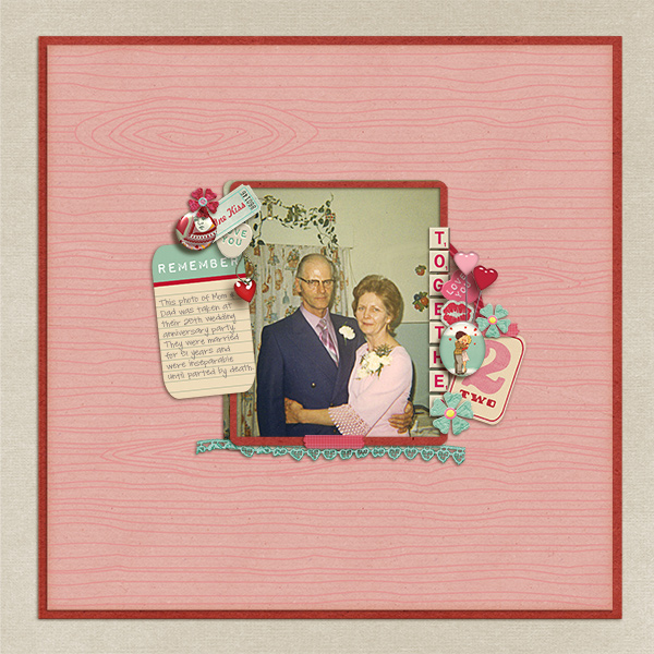
Together by Barb Brookbank | Supplies: Quick Kiss Template by Forever Joy Designs; Font – DJB Carly Sue Got Married by Darcy Baldwin
update vintage motifs with modern color combinations
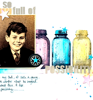
Amanda Jones painted vintage-look stamped mason jars with bright inks. She says, “I was fascinated with this old photo of my father at a young age and created this page to question how he might have expected his life to turn out. i used a bright modern colour scheme with my vintage elements by painting the stamped images to add an interesting twist.”
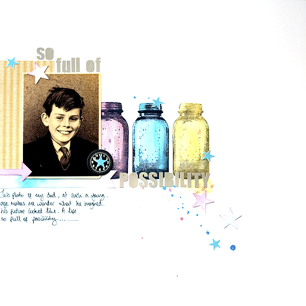
Full of Possibility by Amanda Jones | Supplies: Kit – JBS Mercantile; Patterned Paper, stamps, chipboard clock – JBS Mercantile; Aplpha stickers – Fancy Pants; Other – Watercolour Paints
Light, bright greens, blues, and yellows give this page a fresh feel. Christy Strickler used vintage motifs including a mason jar, feathers and doily on this page about her son swinging on a hammock at a local restaurant. She says, “Energetic patterns like stars and chevrons add a youthful feel to the layout and support the theme of energy.”
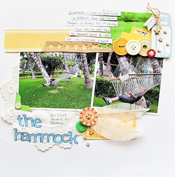
The Hammock by Christy Strickler Supplies| Cardstock: Colorbok; Alphas: Pink Paislee; Marker: Bic Mark-it; Wood Shapes: Studio Calico; Buttons: My Mind’s Eye, JBS Mercantile; Chipboard: My Mind’s Eye; Feathers, Die Cut: Jenni Bowlin,October Afternoon; Stamp: American Crafts;Sticker: Jillibean Soup;Other: Twine,ribbon, doily; kraft paper; Digital Stamp: Graphics Fairy
Deborah Wagner scrapbooked a photo of her niece in Peru with vintage elements that include doilies, buttons, lace and a crocheted banner. She used jewel-toned red and blue with white to give the elements a modern look — and to coordinate with her niece’s costume.
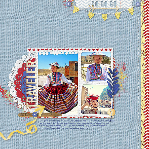
Traveler by Deborah Wagner. Supplies: Katie Pertiet – Meant to be LT, Looking for Love Kit, Garden Stakes Dates, Nana’s buttons, Color My Love Paint, Catana Solids, Banner Words No. 6, Bunny Slope Rosy Kit, Hey There Kit, Cleaned Stitched White No. 3; Lynn Grieveson – Snips and Snails Kit, Smallest Airman Kit; Ali Edwards – Text Frames, Cassie Jones – Bending Shadows
update vintage motifs with modern print patterns
Leah Farquahrson collected an oversized bouquet of paper feathers cut from a combination of graphic and romantic papers on this anniversary page. She says, “My husband and I recently celebrated our 11th anniversary. It’s hard to believe it’s gone so fast!”
“I am still loving the feather trend – I decided to go with an oversized bouquet for this layout. My personal style for years and years has been to take those things that I love from my childhood (or beyond back to antiques), and put a more modern twist to them. Or home is decorated this way, and I even dress in the same manner, so it totally fits for my scrapbooking.”
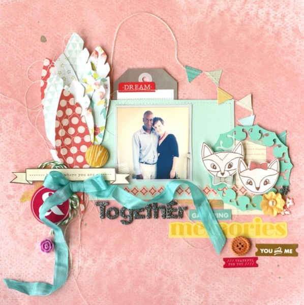
Together by Leah Farquharson: patterned paper, stickers, chipboard, carbuncle flower, printed wooden button, banner, flower, letter stickers, tag, cardstock: American Crafts. Twine: The Twinery. Seam Binding: Zipper Stop. Silhouette diecut: Jenni Bowlin kit exclusive cut for January. Mint Julep ink: Studio Calico. Woodgrain fabric: Joel Dewberry.
Sue Althouse says, “This is a nostalgic page about my mother at age two. I embellished the layout with a doily and butterfly motif, creating a custom look using a favorite technique. First, I cut patterned paper strips 1/4″ wide and adhered them closely on regular printer paper. Then I used my punches to create unique color combinations. The lightweight backing is key, so the punches will cut all the way through.”

Sweetheart by Sue Althouse | Supplies: Cardstock: Bazzill; Patterned Paper, Stickers: Crate Paper; Brads: My Mind’s Eye; Enamel Dots: Doodlebug, My Mind’s Eye; Punches: EK Success, Martha Stewart
update vintage print patterns with modern combinations
Krista Sahlin mixed retro colors and patterns with a bold black-and-white graphic chevron print. She says, “I am a true lover of all things kitsch and retro, so I love to include the patterns, colors and vibe from earlier eras. A great thing about this color palette is that it can work for almost any subject, theme, gender or time of the year.”
mix vintage ephemera with current styles
Marie-Pierre Capistran‘s page tells the story of the school she went to at 10 years old.
Marie says, “As I began creating the page I had one idea in mind: it should reflect the time period of the story and I dug through my box of old things incorporating stickers and cards. I combined them with everything from my stash that was resonating “vintage” to me along with current school themed papers. I focused on the yellow in my stickers and arranged a visual triangle of yellows around my photos.”
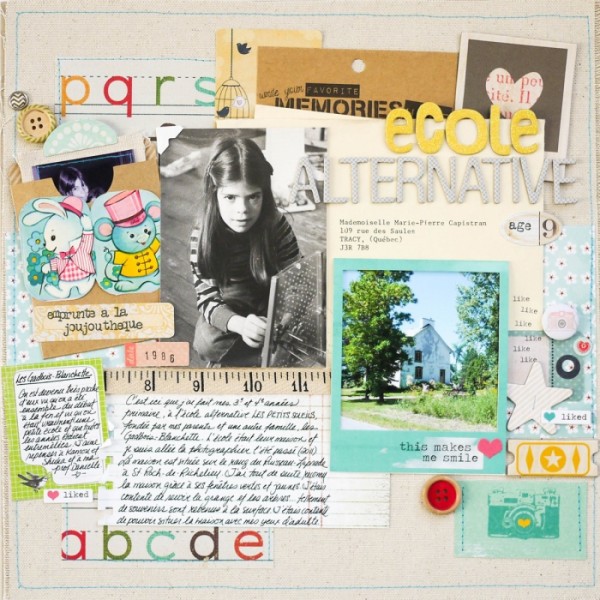
Ecole alternative by Marie-Pierre Capistran | Supplies: Canvas for the background: Recollections; Patterned papers: Recollections, Basic Grey; Die cuts: Fancy Pants design, Recollections; Mini-envelope: Recollections; Canvas tag: 7 Gypsies; Stickers: Crate Paper; Heidi Swapp; Polaroid frame: Heidi Swapp; Rub-ons: Heidi Swapp; Chipboard elements: Dear Lizzy; Buttons and brads: Dear Lizzy; Thickers; American crafts, Amy Tangerine; Stamps: Inkadinkadoo, date stamp; Punch: SU!; Others: Tiny attacher, ribbon froms my stash, sewing machine.
use a vintage treatment with a modern image
Amy Kingsford gave her modern family photo, taken at a shopping mall, a vintage treatment with a sepia-toned photo treatment and a backdrop of vintage images and elements.
Amy says, “I used this wonderfully vintage background with silhouette flair and a damask print pattern to scrapbook an everyday photo of my family. I wanted to create the idea of family being timeless. I’ve accented my page with trendy items as a sign of the times and to add a bit of oomph. These items include the wood veneer shapes, the messy piles of thread, and the paint-dipped leaf.”

Family First by Amy Kingsford | Supplies: Jenni Bowlin Studio Digitals: Haven Collection, Souvenir Embellishment Kit; Creashens: Dippers; Sahlin Studio: Wood Veneer Shapes; Amy Martin: Telling It Template V. 3, More of a Mess: Piles.
update vintage compositions with a modern backdrop
Debbie Hodge arranged vintage elements and photos in two blocked bands, then displayed her groupings on a modern backdrop of clean white cardstock and bright graphic print patterns.
Debbie says, “As I put this together, I thought about the idea of a vintage ephemera and photos clipped to a whiteboard, perhaps something that hangs in the kitchen for family messages atop graphic print wallpaper. My goal was to evoke the feeling of an eclectic bulletin board in a modern home. The metal clip and the “cool” blue circle top the clusters — as if they were fastening the vintage pieces to the board.”
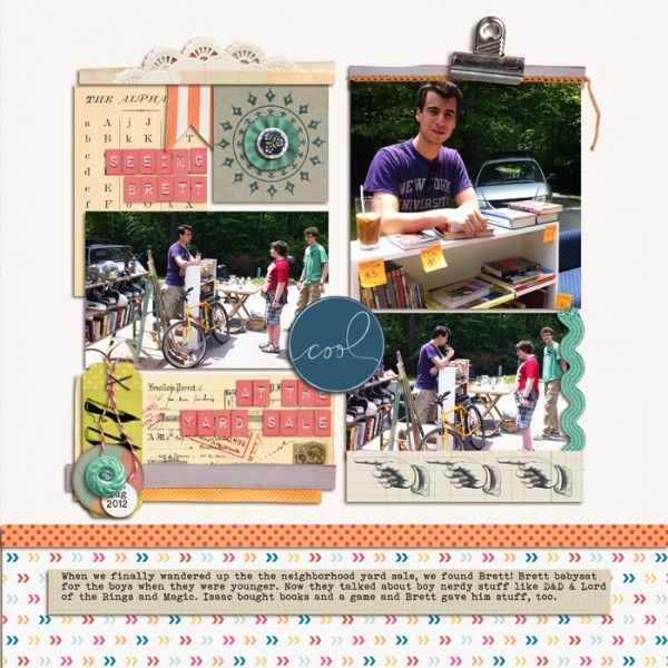
Seeing Brett at the Yard Sale by Debbie Hodge | Supplies: Life365 by Karla Dudley; Embroider Me by Pink Reptile Designs; Teak, Petals 4, Fig Tree by Sara Gleason; So Much Joy by Two More Days; Ordinary Special by Kaye Winiecki; Doily Edgers by Katie Pertiet; Pretty Pieces by Lynne-Marie; Jolly Ole by Sahlin Studio; Chin Up, You Are Here (clip) by Allison Pennington; Going Places, Big Ideas by One Little Bird; Bohemian Typewriter font
[current]

