Got lots of photos? Check out the Get It Scrapped team’s ideas for getting 8 photos onto the page.
Terry Billman says, “It’s not often I’m in a photo because I’m usually behind the camera. This page is about my husband taking photos of me while I was taking photos at the river. The original design was to have 8 photos all the same size spread across a two page layout. The photo on the far right didn’t work well in a small square. though. To balance the page, I enlarged it and blended it into background paper across the 2-pages. I spread the other photos evenly across. The photos are arranged so that I’m looking into the center of the page.”
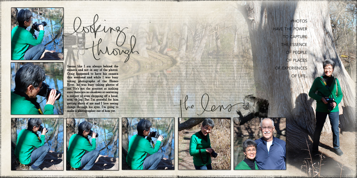
Looking Through the Lens created by Terry Billman| Katie Pertiet: Frosted Winter Solids, Candid Brushes; Anna Aspnes: Arsty Cameras; Art Play Palette Fotographie, 12 X 12 Artist Edges 6; Ali Edwards Photography Word Art, Photography Hand Drawn Brush
Adriana Puckett says, “This two-page layout showcases a girls’ scrapping weekend at the beach last winter. The photo under the title is the focal photo, and three other photos other photos are arranged in a column on a shared mat. On the right, I showcased our scrapping and eating; on the left, beach shots. To promote flow across the two pages, I closely coordinated patterned papers.”

Girls Only Weekend by Adriana Puckett | Supplies: Patterned paper: Fancy Pants The Good Life; Cardstock: American Crafts; Title and paper doll border cut from Silhouette Cameo (designs from store); Brad: Basic Grey; Design: Creating Keepsakes sketch from 2011 summer camp
Vicki Walters says, “These photos are from an Alaska and Seattle trip my daughter treated me to in August 2010. It was wonderful and the first time I’ve ever traveled from the east coast. I chose the papers and elements because the blues and the oranges highlighted the orange life boats on the ship. I used a template for arranging my eight photos and it was perfect even since it came with perfect title since this trip was indeed a gift.”
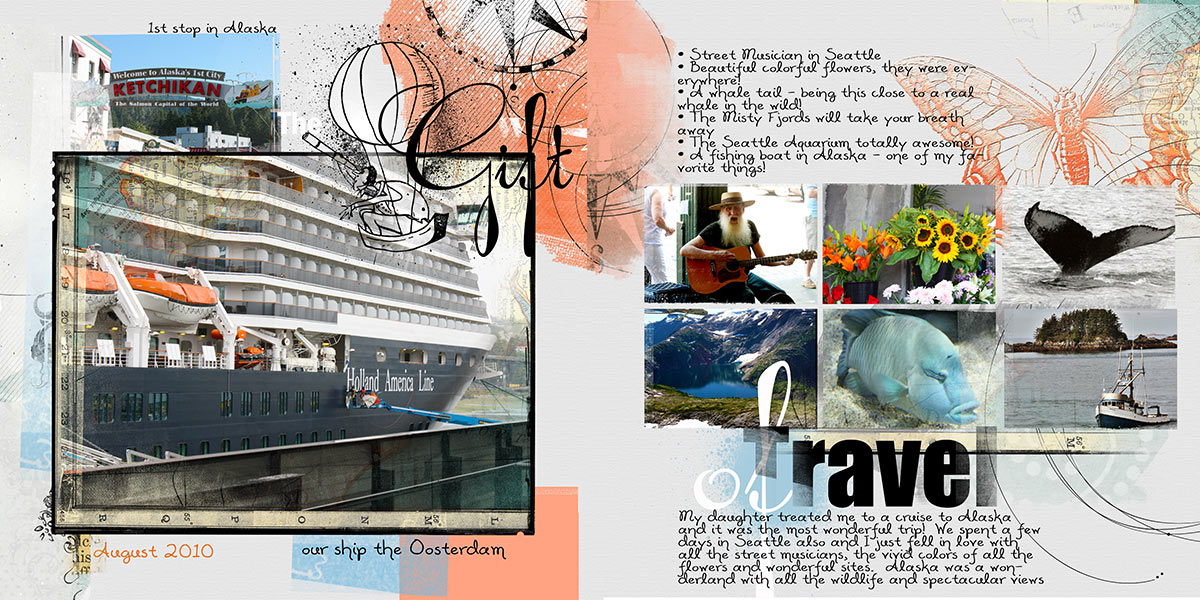
Gift of Travel by Vicki Walters | Supplies: Anna Aspnes at Oscraps: MultiPhoto Double Page Template no 9 and ArtPlay Palette Embrace Life;
Font: Alisha.
Sue Althouse says, “This page is about our spring break trip to Springfield, Illinois, focusing on the Old State Capitol and Lincoln’s Tomb. The layout begins with a focal point photo of Lincoln under the title. The placement and double matting all serve to draw the eye to this photo. With the theme firmly established, I next placed a vertical strip of 3 smaller photos, followed on page two by a grouping of 4 larger photos and the journaling. The turquoise polka dot band and red border strips of patterned papers run horizontally across the entire layout to promote flow across the two pages. Stars, kraft cardstock, and black as an accent color are repeated on both pages to further unify the double layout.”
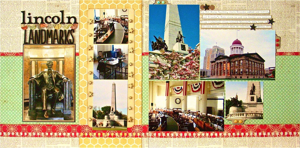
Supplies: Cardstock: Bazzill; Patterned Paper: Lily Bee, My Mind’s Eye; Notebook Border Punch: Fiskars; Alphabets: American Crafts; Ink: Tim Holtz Vintage Photo Distress Ink; Stickers/Tags: Crate Paper; File Folder: Heidi Swapp; Mini Pearls: Doodlebug; Wood Stars: Studio Calico; Tab Punch: Jenni Bowlin
Michelle Houghton says, “These photos are from a day hiking trough the red rocks of Arizona. I used the striking contrast of the blue sky against the red rock to create flow across the two pages. I paid special attention to lining up the land forms in several of the shots. Some of these alignments are photos that were taken side-by-side.”
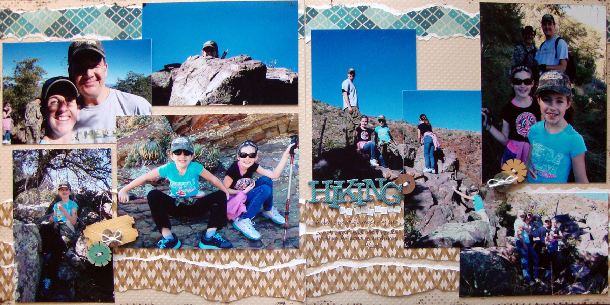
Hiking Up and Over by Michelle Houghton: Supplies | cardstock – Bazzill Swiss Dots; patterned paper My Minds Eye; wood elements – Prima; twine and chipboard letters – American Crafts; sticker letters – Adorn it; ink – Kuretake, Ranger and Copic
Tara McKernin says, “This is a layout I’ve wanted to try for a while: a long strip of photos showing the passage of time. Now here it is: my oldest son from birth to year seven (shhhh he’s ten now).”
“I thought about this layout for a while. I often like to pair a large photo with supporting photos, but in this case–because I wanted a timeline approach to show the passage of time–I kept all my photos the same size and arranged in chronological order. I placed my elements flowing left to right to keep you following the “line” approach. Although my paper is a chevron print, it a small scale tone-on-tone print that’s not distracting. I would love to replicate this layout to show another 8 years on the reverse size. I just might do that!”
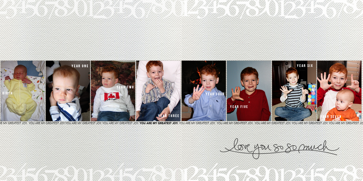
Love You So Much by Tara McKernin | Supplies: Ali Edwards: chevron paper, word art and layered template no.31
Debbie Hodge says, ‘Both of the layouts below use one of my favorite approaches to two making two-pagers with lots of photos. I arrange the photos in two bands spanning both pages.”
“On ‘River with Friends’ I added variety by bleeding the photos at top right and bottom left off two edges.”
“On ‘Labor Day Party,’ I added variety by changing up photo sizes. There are squares alongside rectangles, and there are smaller photos matted on patterned paper that’s the same size as the other photos. The two sides are united with a visual triangle of embellishment clusters spanning the two pages.”
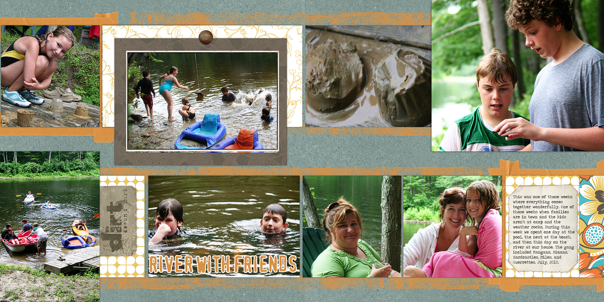
River With Friends by Debbie Hodge
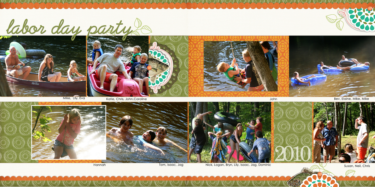
Labor Day by Debbie Hodge
Marie-Pierre Capistran says, “On ‘Some Things Can Only Happen to Me,’ I paired favorite childhood pictures with stories of funny things that happened to me as a child–the kind of things that can only happen to me, as the title says.”
“I printed all 8 pictures in the same size and with the same matting and clustered them. I like to be able to look at all those pictures all at once! I also made a triangle and the three top photos represent me well. The other photos show my relationship to the rest of my family.”
“My text is placed next to the photos, and even though I made a list of things that happened to me, they don’t match the pictures specifically. This way I could use the pictures I really wanted to see and tell the stories I really wanted to tell.”
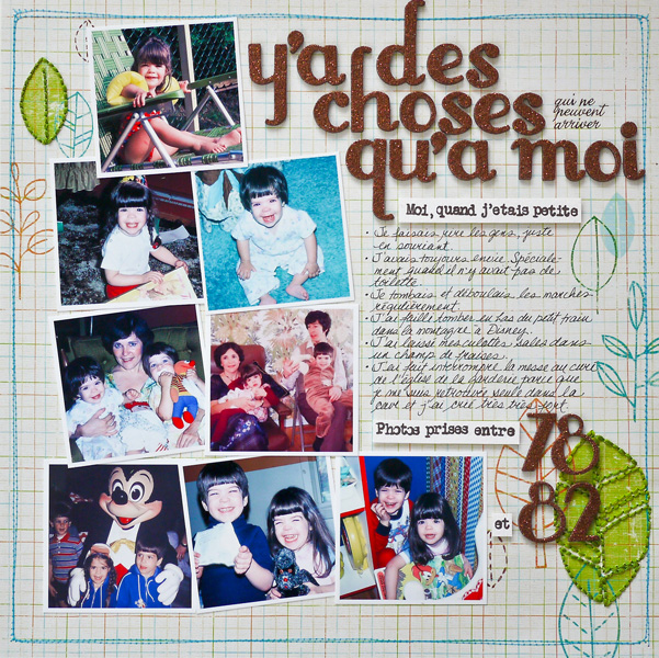
Some Things Can Only Happen to Me by Marie-Pierre Capistran | supplies: Patterned paper: Prima Marketing; Thickers: American Crafts; Rub-ons: American Crafts; Stamps: Inkadinkadoo; Ink: Staz on; Other: embroidery floss, sewing machine, foam dots adhesive.
[lovesketches]

