Page and element edges provide opportunities for both subtle and bold embellishing, for a strip of contrasting pattern or an ornate punched scallop. Use borders to organize, to frame, to decorate. Read on for border ideas.
A bold patterned paper border along the bottom edge of Kelly Noel’s “Ray’s Baseball Camp” repeats a pattern from the banner above. It also works to keep the viewer’s eye in the page, in effect sending the eye back up to the banner and the photos next to it.
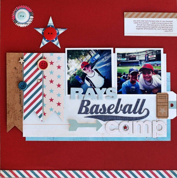
Rays Baseball Camp | Supplies: cardstock – Bazzill, patterned paper – Crate Paper, Pink Paislee; die cuts – October Afternoon, My Mind’s Eye, Pink Paislee, chipboard – Studio Calico, die cut machine, cut file – Silhouette
buttons – Dear Lizzy, October Afternoon, wood veneer – Studio Calico
Adriana Puckett says, “The design and embellishing are minimal here with the borderwork the main embellishment. The bottom border is red paper ribbon with a stitched bunting over it. A scallop border is repeated other places, including at top right. I like layering paper or fabric ribbon over punched paper borders, and then adding embellishments to create texture and depth.”
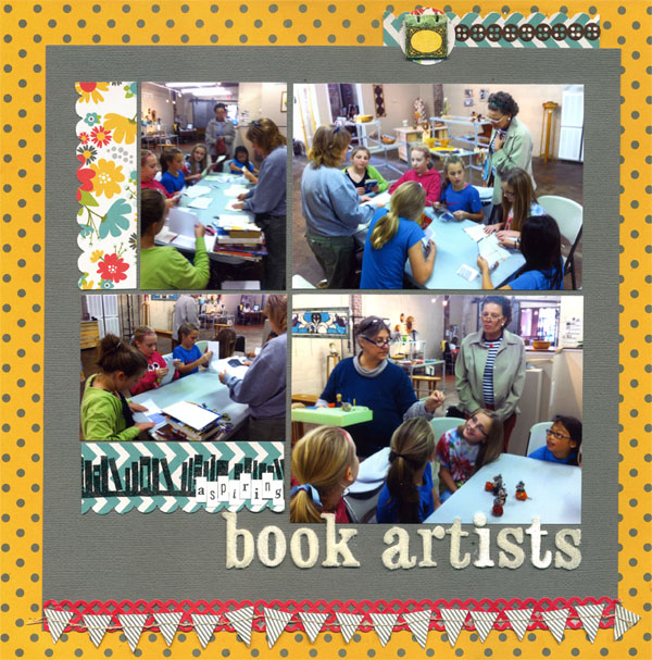
Aspiring Book Artists | Supplies: Patterned paper: Pebbles – Seen & Noted; Paper ribbon: K & Company – handmade; book stamp – Studio Calico; clear embossing powder – American Crafts; Title – AC Thickers and Making Memories (“aspiring”); Small book embellishment – Basic Grey; Stitched bunting at bottom – Basic Grey.
Vicki Walters united the two pages in this spread with a fancy scalloped border spanning the width of both. Striped borders on the bottom layer give the canvas edges definition and interest. Shorter heart and dot borders accent photo clusters and give the page balance.

Puppy Love by Vicki Walters | Supplies: Font: JPaige Amy Print; Anna Aspnes:
CurvyCorner Stitched Blocks no 1, HeartEdge no 1 Brushset, LoadedLayers Heart Layered Templates no 1,
Potpourri Paperie no 5, Stitched by Anna Scalloped Black no 1, Torn N Tattered Hearts no 1. WoodShop Canvas no 1.
Kim Watson uses strips of patterned paper as borders at page and block edges. Each print is different and does the work framing and organizing the many parts of her blocked page.
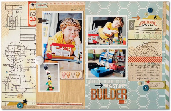
Master Builder by Kim Watson | Supplies: Patterned paper: Heidi Swapp, Studio Calico, Simple Stories, Cosmo Cricket; Die Cuts & Woograin Alphas: Studio Calico, Buttons: October Afternoon, My Minds Eye; Arrows & Stamp: Smash; Ink: Close to my Heart; Stickers: Cosmo Cricket; Other: Sewing machine.
Meghann Andrew says, “I add a metallic shimmer to the edges of the teal band with washi tape, folded in half over the edge. It adds interest and grounds the cardstock strip housing my journaling and title. Since washi tape isn’t very sticky, you actually get several attempts at getting it straight along the edge of your cardstock.” Check out Meghann’s tutorial for the washi tape feather here.
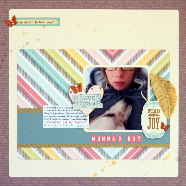
Momma’s Boy| by Meghann Andrew| Supplies: Cardstock, patterned paper, cardstock die-cuts, embossing powder- American Crafts; stickers- October Afternoon (pink letters), Studio Calico (butterflies); washi tape- from stash; journaling tags- Elle’s Studio; stamp- Studio Calico; ink- Stampin’ Up!; metal dots- Mark Richards; spray mist- Studio Calico (gold); other- gold leaf pen, bead wire
Debbie Hodge made “Morning Gab” inspired by border prints in fashion. “It reminded me of vintage tablecloth designs with bold patterns around the edges, so I went to my stash of Jenni Bowlin prints because they are always bold and always vintage. I used the repeating ‘ticket’ print along top and bottom edges. I used a deco-edge punch on a red-white-black floral print for the second strip on the bottom and for the circle borders on the sides. I was aiming to almost (but not quite) frame everything in with borders.”

Morning Gab by Debbie Hodge | Supplies: Red and Black Extension, Front Porch Classic Borders by Jenni Bowlin; A Spring Day by Sahlin Studio; Pedal Pusher, Shadow Like Me by One Little Bird; Staxon Hexagon by K Winiecki; Weathered Ephemera by Celeste Knight; Smart Cookie, Comic Splats by Lynn Grieveson; Very Small Alpha by Allison Pennington; King Me by Katie Pertiet; In Motion by Ashlee Wall; Artplay Easter BUnny by Anna Aspnes; Cocktail, Typenoksidi fonts.
Michelle Houghton says, “I made a double border around my photos.The first is of doodling and two broad columns of patterned paper. The outer border is a purple matte running around the double page layout. With a double page layout, including a border that encloses the two pages together unites the two sides.”
“If you want to include a hand doodled border on your layout remember you can always work in pencil first to test it out. If you aren’t sure what to doodle, take inspiration from your photos and patterned paper. Simplify the shapes you already have on your page.”
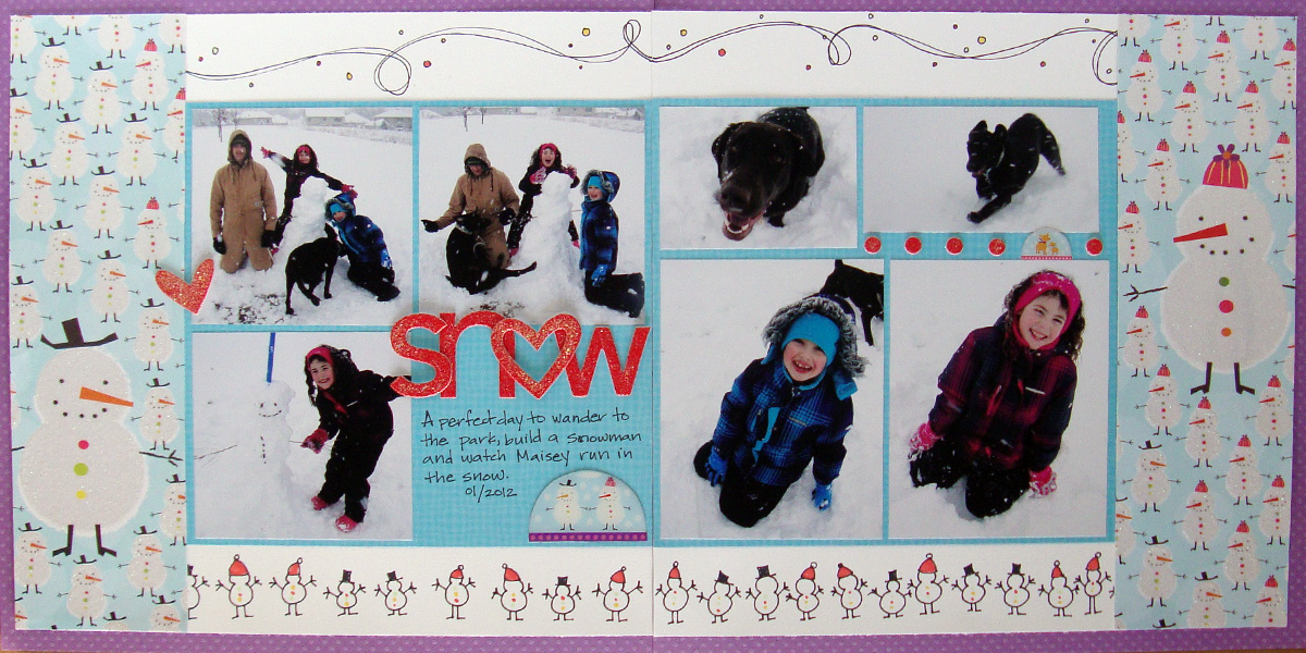
Snow by Michelle Houghton | Supplies: cardstock: Bazzill Swiss Dots, Paper Company; patterned paper, epoxy stickers: SEI; chipboard letters, chipboard shapes: Doodlebug Design; ink: Sharpie, Copic
Audrey Tan added borders beneath each photo. She says, “I made use of lace, paper strips, banners and stitching. Additionally, the whole page is pulled together with a digital edging border.”

3 Generations by Audrey Tan | Supplies:Anna Aspnes: ArtPlay Palette Bask; Julianna Kniepp Designs: Summer Sunshine, WordArts Summer, The Mists Edition: Shapes, About Me, So Sweet; Julianna Kniepp Designs & Jenn Barrette: Seas The Day; The Hidden Heart, Julianna Kniepp Designs, Shabby Miss Jenn & Boutique Cute Doll: About Me; Maya de Groot: Steam Machines; Splendid Fiins: Border Punch Set 2; Agnes Biro: Renewed Spirit; Forever Joy Designs: Sweet Days; Studio 68: Travelogue; Font: Pea Andrea
Ashley Horton wanted a bright, fun layout for these photos of her son playing his first Midway game at the Fair. She made a washi tape border around the page canvas. She mixed several colors and patterns of tape. She says, “I used different lengths and tore the edges and overlapped pieces. If you a cleaner look, use full strips of tape.”
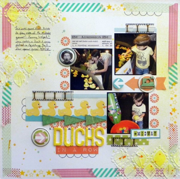
Ducks In A Row by Ashley Horton | Supplies – Cardstock: DCWV; Patterned Paper, & Tin Pin: October Afternoon; Wood Veneers & Spray Mist: Studio Calico; Thickers: American Crafts; Font: Impact Label; Washi Tape: Love My Tapes & SEI; Modeling Paste: Liquitex; Mask: The Crafter’s Workshop; Film Strip: Tim Holtz; Other: Metal Tags
Debbie Hodge says, “I make frequent use of borders on my casual-blocked designs, filling in spots or just capping off an edge. A scalloped border tops my blocked elements and runs the width of the cluster. Shorter bits of ribbon border the bottom of the largest photo. Finally, a full-width border tops the page canvas.”
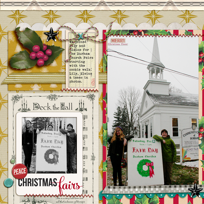
Christmas Fairs by Debbie Hodge | Supplies: Winter Bitten by Creative Victorian Legacy; Wrap Start by Forever Joy and One Little Bird; Elemental Frames by Gennifer Bursett; You Were Here by Allison Pennington; Vintage Bling, Vintage Christmas by Jenni Bowlin Studio; Trim The Tree Ephemera by Sahlin Studio; Cliff Notes Warm & Fuzzy Edition by ALlison Pennington; Hipster Holiday by mommyish; Bebas Neue, Mercury Script fonts
Amy Kingsford says, “I used borders in a couple of different ways here. I made a bold scalloped border by enlarging a smaller digital frame. It frames my page and draws the viewer in. This enlarged frame offers something unexpected and addscontrast to the page. I used a series of horizontal borders below my photo for dimension and interest and to draw the eye to the page’s focal point.”
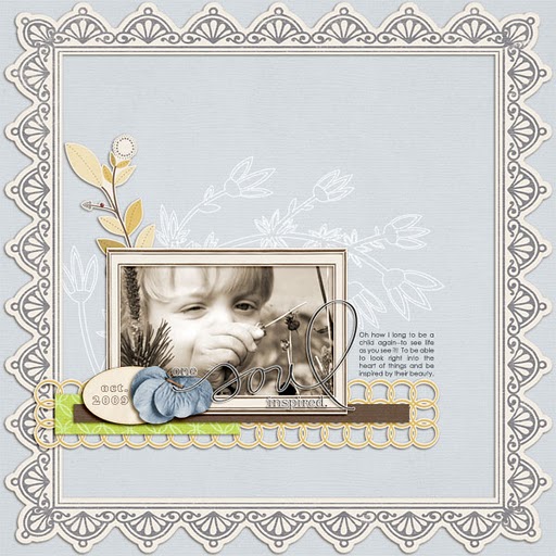
One Soul Inspired by Amy Kingsford | Supplies: One Little Bird: Instinct, Flight Plan No. 6. Fonts: Century Gothic, Alfredo Hollow Heavy
Debbie Hodge says, “When I block my canvas, I often add low-key borders as I’ve done on ‘Self-Timer.’ Just a strip of red dotted paper sits at the seam on the left side of the canvas while gold stitching and stamped flowers sit at the seam on the right side of the canvas.”
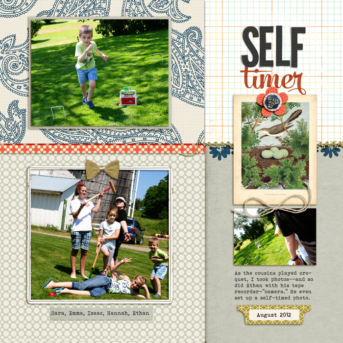
Self-timer by Debbie Hodge | Supplies: Teak by Sara Gleason; Make it Mean by Vinnie Pearce; Snippets Alpha by Gennifer Bursett; A New Day by Mye de Leon; Embroider Me by Pink Reptile Design; Artistry de Blanco by Katie Pertiet
[current]

