Got 7 photos that you want on a scrapbook page? We’ve got single and double page layouts for your inspiration.
Katie Scott says, “I made a collage of 7 photos with the photo of my son holding the flamingo feather as the focal photo. He was wearing a Mario Bros t-shirt which I wanted to cover up so I put the actual feathers over it.”
“I matted the photo collage on a blue cardstock and used that as a pocket for the page and I tucked the Busch Gardens map behind the flamingo embellishment.”
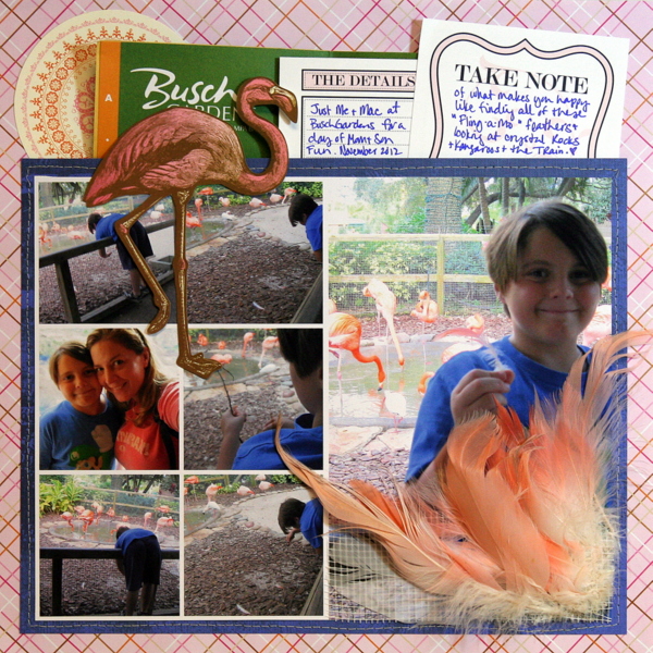
Busch Gardens by Katie Scott | Supplies: K&Co Flamingo and circle embellishments; Teresa Collins Journaling Cards.
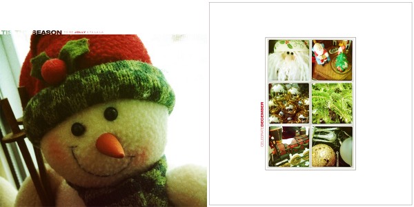
Tara McKernin says, “This is a layout I made featuring our holiday decor for my Project Life album.”
“I featured one enlarged photo on the left side of the layout, and made a grid collage of the other 6 photos on the facing page. I played around with a few main photos but I loved my snowman photo best. When putting my photos together it was like quilting : I played with what I had to see what worked best.”
Adriana Puckett says, “This layout captures some of our favorite scenes from the past summer. I prefer two-page layouts for this many photos. It provides plenty of room for the pictures, journaling, and white space.”
Adriana used two grids on “The Best Days.” There’s a grid of journaling bits on the left with titlework and a circular photo layered over it. The 2 by 3 grid of photos on the right is broken up with the top row slid to the left.
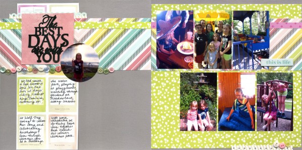
The Best Days are With You by Adriana Puckett | Supplies: Cardstock: Bazzill; Patterned Paper; American Crafts Dear Lizzy 5th & Frolic; Misc: Assorted buttons; Sketch: Pagemaps July 2012; Other: Cameo & title design purchased from Silhouette store.
Jana Morton got seven photos onto a single page with one enlarged shot running the height of the page and the smaller photos arranged in two strips of three each.
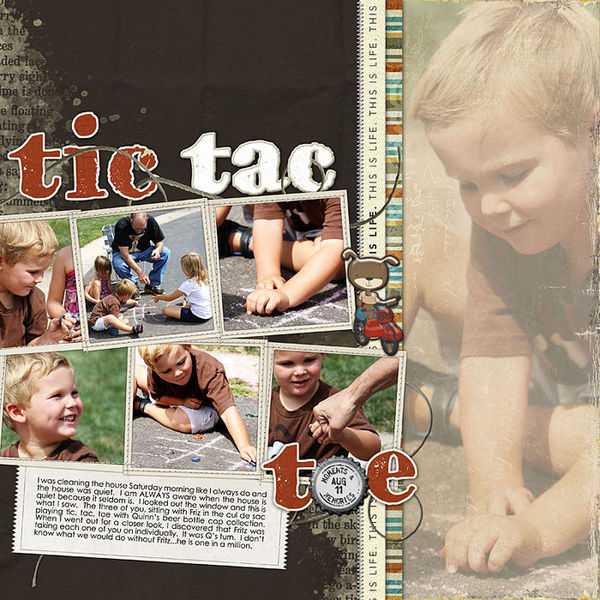
Tic-Tac-Toe by Jana Morton | Supplies: All Designer Digitals. Katie Pertiet: Monarchy Kit, Yarn Swirls No. 3, 2010 Postmarks, Capped Winter, Whimsy Words No. 6, Stitched Up Frames No. 3, Alandia Meadows, Chunky Chipboard White Alpha 2, Naturally Krafty No. 10, Edge Overlays No. 1, Alandia Noces, From My Bookshelf Blendables No. 2; Ali Edwards: Everyday Twill; Lynn Grieveson: Worn Page Overlays
Marie-Pierre Capistran says, “This is a layout I made about my favourite moments of our last Disney trip. I wanted to put a lot of stuff on the page–photos, journaling, patterned paper, and ephemera–and so made my photos small (4 by 3.5″).”
“My goal was to show the best moments of our trip by treating the 7 photos equally. I mounted each with a narrow white mat to help them stand out and clustered each with relevant journaling.”
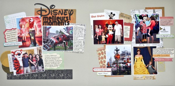
Best Disney Memories by Marie-Pierre Capistran | Supplies: Patterned Paper: Crate Paper, My Minds Eye, Sandy Lion; Labels and tags: Cosmo Cricket, Elle’s Studio, My Mind’s Eye, Fancy Pants Design, Tim Holz; Transparency: Hambly; Washi Tape: Queen and Co.; Letters: American Crafts, Silhouette; Font: Waltograph.
Adryane Driscoll says, “This page is about my children’s experience with a replica steam engine.”
“I opted for a two-page layout with my favorite photo taking up one page and supporting photos on the opposite page. The supporting photos go from edge-to-edge with some overlap onto my focal photo. For added interest I framed three of the supporting photos in black. The metal frames work well with the theme of the page and the main color of the engine. I have the small train photo on the left page and the focal photo on the right heading into the grouping of other photos. I think this provides an easy path for following all of the photos.”
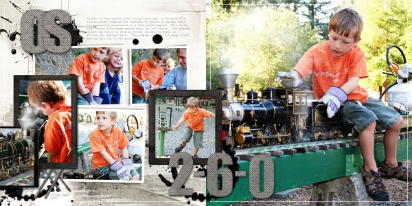
OS 2-6-0 by Adryane Driscoll: Supplies: Anna Aspnes: KreasedTransfers No.2, Dripped ToolSet No.2, Painted Circle Splatz, DifferentStrokes No.2; Lynn Grieveson: Chuff Chuff
Stefanie Semple says, “Hubby and I escaped the kids to spend 4 nights at a game park shown on this page.”
Stefanie grouped her seven photos in two groups – a group of four is in a 2 by 2 grid and shows the venue. The second grouping, of 3, is clustered with one larger photo and two smaller photos and shows the 5-star foods they ate.

Wish you were here by Stefanie Semple | Supplies: Amy Stoffel’s Pasted and Pinned Bon Voyage, Cluster Queen Creations template Gimme Layers 40.
Christy Strickler says, “My son asked for a helicopter ride for his birthday as a gift to the whole family and this page records the outing.”
“I chose the photos for the page based upon how i wanted to tell the story. I included photos of us preparing for flight, in flight, and the landscape we saw. Two larger photos show the helicopter and the view and a strip of smaller photos shows the details of the trip.”
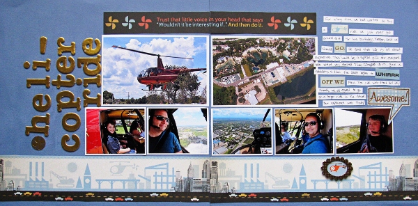
Helicopter Ride by Christy Strickler Supplies| Cardstock: Colorbok; Patterned Paper, Chipboard, Alphas: We R Memory Keepers
Sue Althouse says, “This page is about my dad showing his grandsons how to fly a kite.”
“To create this layout, I arranged the photos and journaling block on the first page, then placed the same size photos in opposing corners on the second page. There is not one focal point photo. Instead, the first page shows the boys unsuccessfully trying to fly their kite and on the second page it’s grandpa to the rescue! This photo placement depicts the story in my journaling.”
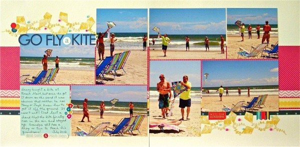
Go Fly A Kite by Sue Althouse | Supplies: Cardstock: Bazzill; Patterned Paper: American Crafts, Pebbles; Alphabets: Bella Blvd.; Stickers: American Crafts; Mini Pearls: Doodlebug; Kite Border: Silhouette
[current]

