 To explain a recent passion for geometrics in home decor and fashion, decorator Linda Edwards says, “After seeing lots of big, bold, excessive florals and ruffles in the 80s and 90s, people now want to go for a more uncomplicated, modern, streamlined look.”
Take a look at scrapbook page galleries recently and you’ll see lots of geometric prints and as well play with geometric shapes on the page.
A benefit to working with geometrics is that they are versatile:
- You can combine and manipulate the pieces for different effects.They’re interesting.
- They aren’t necessarily feminine.
- Most geometric prints have a secondary color of white or off-white – so they mix with other prints well.
Arrange punched circles in a grid.
Tara McKernin made a clean page with 6 punched circles in a 2 by 3 grid. Tara says, “I love the circle, and I love that it’s a simple shape you can repeat. I could have easily filled this page full of circles but I only had a few photos to share. Love it.”
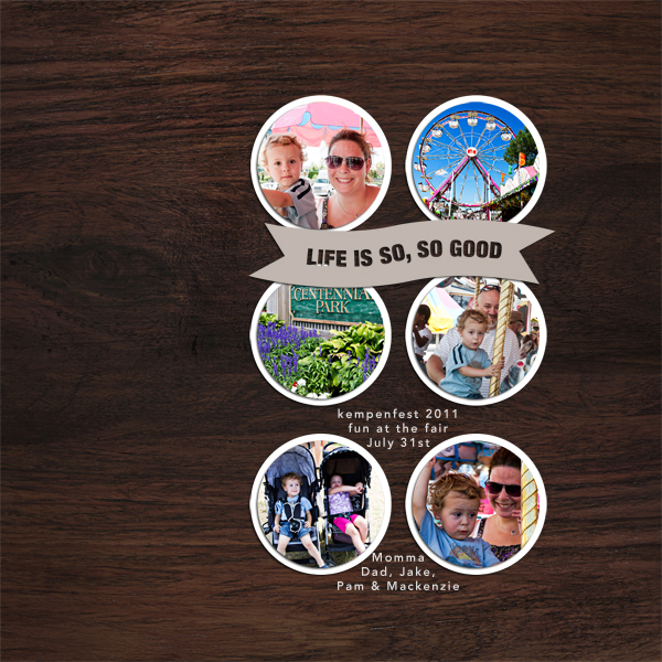
Life Is So Good by Tara McKernin | Supplies: word art from Ali Edwards, font avenir heavy, paper from One Little Bird.
Add tension with folded patterned paper circles.
Katie Scott says, “I made this layout as part of Get It Scrapped’s Guided Style Critique Class that I took earlier in the fall. This is the “works every time layout” described in the book White Space Is Not Your Enemy.”
Katie made a border of circles (chosen to echo the bubbles in the underwater photo) more interesting by punching them from two-sided patterned paper. She folded opposite sides of each circle in to meet at the middle, then lined the circles up next to each other. The result is a sense that the circles are overlapping–and, yet, that can’t be because the prints don’t match. This introduces tension that draws the viewer into the page.
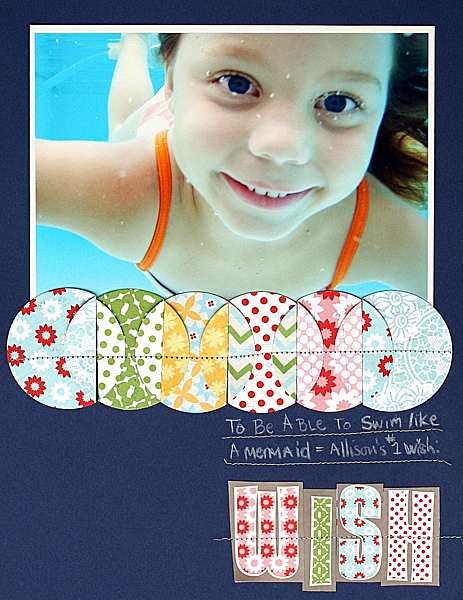
Wish by Katie Scott | Supplies: Lily Bee, American Craft Stickers, white pencil, sewing machine, cardstock, circle punch.
Use broken rows of circles in differing sizes.
Betsy Sammarco design this page inspired by a window display. Betsy says, “When I began this page, I sewed circles completely across the canvas. The page became graphic and loud, though, and it was difficult for me to work with. I stopped with the rows of circles after just 4 rows and started pulling circles off the page to allow for more white space.”
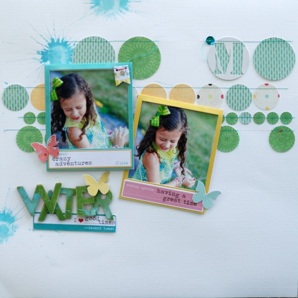
Water by Betsy Sammarco | Supplies: all supplies from a Jenni Bowlin Studio Mercantile Kit, Cardstock: Bazzill, Patterned Paper: My Mind’s Eye, Pink Paislee, Wooden letters: Studio Calico, Photo frames and stickers: Heidi Swapp, Chipboard banner: Pink Paislee, Paint: Jenni Bowlin StudioInspiration Source: Local window display.
Overlay a geometric print with the embellishments of the same shape.
Doris Sander stitched a block of a simple pattern of outlined circles to her page, misted over it, and then topped selected circles with a variety of circular embellishment, stacking some of them for dimension.
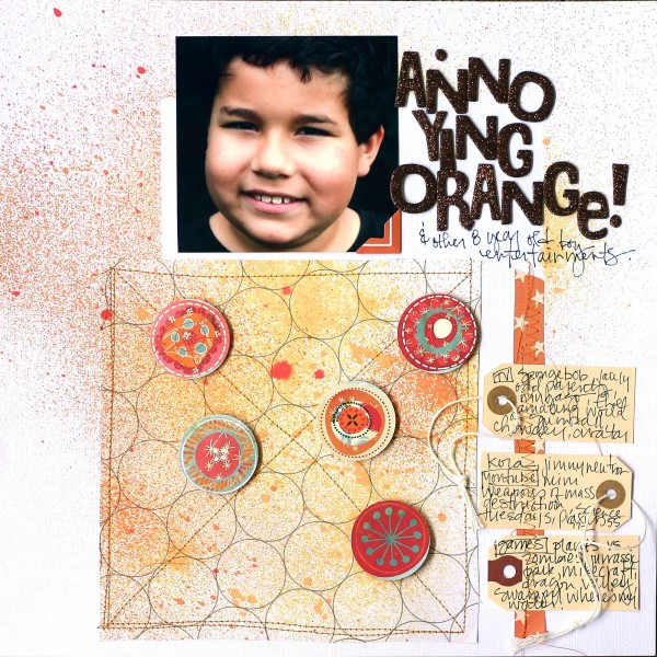
Orange by Doris Sander | Supplies: cardstock – Bazzill, patterned paper – Prima, Studio Calico, JBS Mercantile Exclusive, chipboard letters – American Crafts, tags – Avery, mist – Maya Road
Create your page within a circle
Lynnette Penacho says, “The design of ‘U & Me’ was inspired by the design of a pillow I have on my living room couch.” Her photo is a circle in the center of the page, and it’s surrounded by graduated circle borders and even a border of circles in a circle.
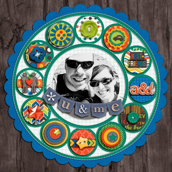
U & Me by Lynnette Penacho | Supplies: My Buddy by Traci Reed, Alpha from Pretty Little Thing by Zoe Pearn and Melissa Bloomer, Stitched by Anna Circles No 1
Layer patterned paper rectangles and photos to create a mosaic.
Brenda Becknell laid down a foundation of rectangles in two sizes (4″x6″ and 3″x5″). She layered her square and rectangular photos over them and then topped the photos with smaller rectangles to create an interesting mosaic that draws the eye. Brenda printed journaling to a transparency backed with paint and layered over the patterned paper. To finish the page and give the geometrics emphasis, Brenda outlined them with a black marker and then stitched over those outlines.
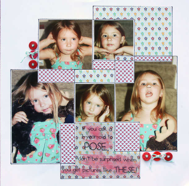
Pose by Brenda Becknell | Supplies: Cardstock: Paper Studio; Patterned Paper: Jillibean Soup; Twine: The Twinery
Rotate a staggered grid of squares 45 degrees counterclockwise.
Inspired by Project Life, Lisa Dickinson wanted to document a quick snapshot of her life with Instagram photos. Lisa says, “A quick scan through the photos on my phone resulted in lots of options to feature on this page. And since squares fit perfectly in a grid, that was an obvious choice for a design framework. Using a base of 2 x 2 squares allowed lots of photos to be included. To keep the grid design fresh, I staggered each row and tilted the whole alignment 45 degrees. The angle adds a lot of life and pizzazz to the page and creates a dynamic that a straight horizontal grid could not.”
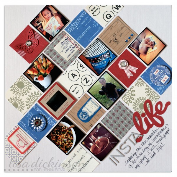
InstaLife | supplies: cardstock (Bazzill Basics, Jenni Bowlin Studio, Core’dinations) + patterned paper, stamp, ink (Jenni Bowlin Studio) + chipboard letters (Studio Calico) + washi tape (Queen & Co.) + punches (Fiskars, Martha Stewart, Creative Memories) + die cut machine (Silhouette) + pen (Creative Memories) + mini staples (Tim Holtz) + vintage labels, misc. buttons, jewels, machine stitching
Make a foundation of circles and rounded-corner rectangles.
Adryane Driscoll began with a photo of her sister in an outfit of geometrics: tiny round buttons and bold black-and-white stripes. She collaged circles and corner rounded rectangles filled with black-and-white papers to create a foundation for her photo. The photo is also a corner-rounded rectangle placed atop the collage and given emphasized dimension over those shapes. Buttons and polka dot tape are circular embellishments finishing the page.
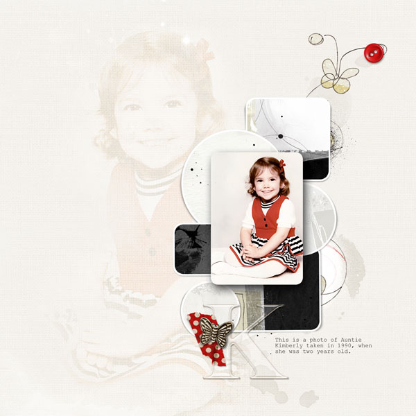
K by Adryane Driscoll | Credits: Anna Aspnes I Light Textured Neutrals No.2, Frame Exhibits No.1, Artsy FlutterBys No.1, 4 x 6 Artsy Kardz Achieve, 4 x 6 Artsy Kardz Classico, Artsy Kardz Authentic, and Taped Dotty Polka.
Use geometric shapes to echo the things you’re scrapbooking.
Christy Strickler used shapes to echo the elements of the subject she’s scrapbooking–having a pizza picnic. Strips of checkerboard print make the foundation for her photo and support the “picnic” theme, giving the sense of an oilcloth table covering. The triangles in the banner are in the shape of a pizza slice. Circles, in the form of brads and buttons, are the same shape as pepperoni–a favorite topping for her family. The photo is framed with a visual triangle (shaped like a big pizza slice of two rosettes and a button at bottom right. Christy says, “It’s like a slice of pizza sitting on a picnic blanket.”
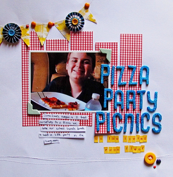
Pizza Party Picnics on the Living Room Floor by Christy Strickler| Supplies: Cardstock: Colorbok; Patterned Paper: Creative Memories, Pink Paislee; Alphas: My Little Shoebox, American Crafts; Chipboard: October Afternoon; Buttons and Brads: Basic Grey; Rosettes: American Crafts
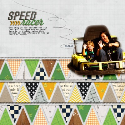
Add energy with rows of bold triangles.
Amy Kingsford made a dynamic background using rows of triangles behind a digitally extracted photo of her son on his first go-kart ride. Amy says, “Not only was I aiming to add energy to the page, but I was also inspired to echo the shape of racing pennants.” The overall design is simple and dominated by the repetition of single shape, and the result is an eye-catching page with lots of energy.

Speed Racer by Amy Kingsford | Supplies: Ardent Sparrow: The Grayson Papers; Karen Funk: Simple Stitches; Gennifer Bursett: When Skies Are Grey; Jenni Bowlin Studio: Vintage Black and Cream; Sahlin Studio: A Wonderful Day Papers, Precocious Papers; Anna Aspnes: Globe Trotter Loop da Loops.
Emphasize your focal point with “pointing” triangles.
Meghann Andrew says, “I love that triangles are trendy right now, because they’re a great aid for creating movement on a page. On “Eat Like a Local,” I centered my focal point photo between two groupings of triangles, the lower grouping points to the photo and helps strengthen its draw.” Meghann used triangles in colors that echo and help pull out the colorful boats in her photo.
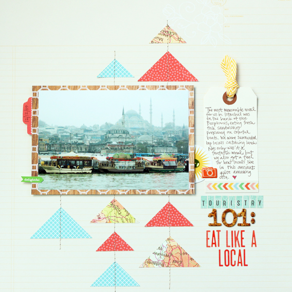
Eat Like A Local by Meghann Andrew | Supplies (from Studio Calico’s Central High kit): Patterned paper- American Crafts (background ledger & colorful arrow border), American Crafts (red), Echo Park (blue), Studio Calico (map), Kesi Art (woodgrain); tag & die-cut shapes- Studio Calico; ribbon- American Crafts + Studio Calico; stickers- American Crafts (‘delightful’, camera & red letters), Studio Calico (teal letters), chipboard lettes- American Crafts; sequin- Studio Calico; die-cutting machine- Silhouette Cameo; other- sewing machine & thread
Make a band of a hexagons
Lisa Dickinson says, “This was a personal challenge to myself to create a page using primarily hexagon shapes in the design. To lay my foundation, I used an acrylic mask of hexagon shapes and painted over it with gray paint – a color that was predominant in my photos. To add definition to the edges, I traced each hexagon shape with a black pen once the paint was dry. This formed a nice stable grid to base my design upon. To help my photos relate to the background rather than just lay on top of it, I chose to crop them in a hexagon shape as well. While larger than the painted hexagons, the photos tie into the painted border with both their similar shapes and colors.”
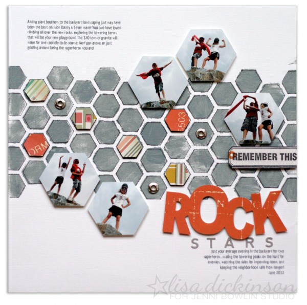
Rock Stars | supplies: cardstock (Bazzill Basics) + patterned paper (Cosmo Cricket, My Mind’s Eye) + stickers (Jillibean Soup) + acrylic mask, paint, stamp (Jenni Bowlin Studio) + grommets (Making Memories) + die cut machine (Silhouette) + pen (Creative Memories) + font (Disproporz)
[ontrend]

