 When you make heritage scrapbook pages, you give old photos and stories new life. Use these page ideas and look at the challenges of working with old photos as opportunities. Research a story, look at the details to recall your life past, consider an era and look for products that evoke a sense of the times.
Pattie told a favorite family story.
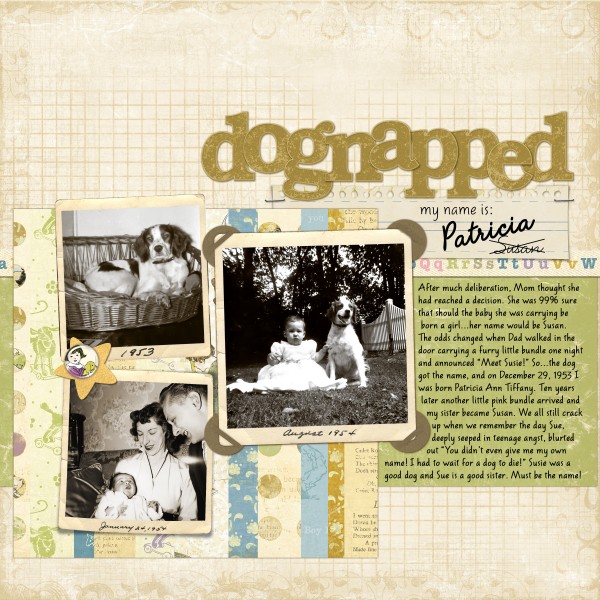
Pattie Knox created “Dognapped Name” to record the story of how she acquired the name Patricia (and why she wasn’t named Susan as planned!).
“With this story in mind,” says Pattie, “I searched through my box of old family photos and was thrilled to find one of myself with my first pet, Susie the Brittany spaniel. In creating this particular layout, the story definitely came first, followed by locating photos to illustrate it and soft colored papers and products that would not overpower the photos.”
Here’s the journaling, and it’s a great story: After much deliberation, Mom thought she had reached a decision. She was 99% sure that…should the baby she was carrying be born a girl…her name would be Susan. The odds changed when Dad walked in the door carrying a furry little bundle one night and announced: “Meet Susie!”
So–the dog got the name, and on December 29, 1953 I was born Patricia Ann Tiffany. Ten years later another little pink bundle arrived and my sister became Susan. We all still crack up when we remember the day Sue, deeply seeped in teenage angst, blurted out “You didn’t even give me my own name! I had to wait for a dog to die!” Susie was a good dog and Sue is a good sister. Must be the name!
Dognapped Name by Pattie Knox | Supplies: Once Upon a Time kit, Ledger 12×12 Overlays, Ledger Grids brushes-n-stamps, Curled Notebook Paper, Vintage Photo Frames-Curled-n-Flat No 02, Fastened Frames No 01 – Katie Pertiet; Felt Board Friends-Wynken, Blynken and Nod – Pattie Knox; Font: American Writer
Amanda combined vintage styled products with an on-trend touch
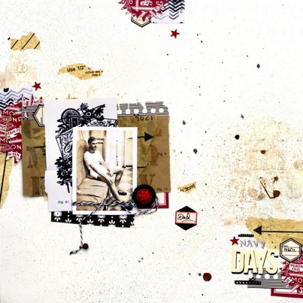
Amanda Jones says, “I discovered this old photo of my Dad recently – he was in the Navy for years and this was taken back in his early Navy days.”
“I gathered a supplies in neutrals, with vintage tones and styling, from the same manufacturer. I combined a mix of bits and pieces to create a collage effect. I added some on-trend hexagon stickers and a chevron stamp to put a modern twist on the vintage theme.”
Navy Days by Amanda Jones | Supplies:
Patterned Paper, stickers, stamps, button, brad, alpha stencil, ink, rub-ons, Silhouette cutting files – Jenni Bowlin Studio
Other: Twine, modelling paste, vintage sewing pattern.
Jana made an entire album of heritage wedding pages.
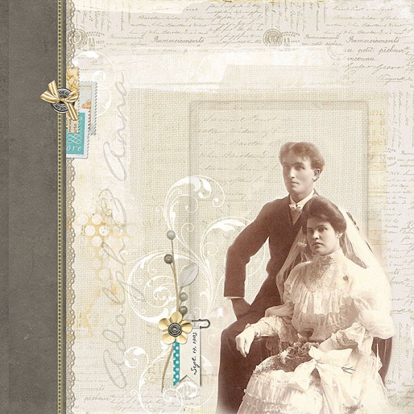
Jana Morton says, “I love passing my ancestor’s stories on to future generations. When I make these pages, I feel like I’m giving old photos and stories new life.”
“I recently created a 200+ page heritage album. As I was collecting information for this album, I kept coming across gorgeous wedding pages. I decided to make another album of just wedding pages. These photos were taken in 1905 and I cherish them.”
Adolph & Anna by Jana Morton | Credits: Katie Pertiet: Carte Post Kit, Crowning Affair: Understated Kit, Bannery Safety Tags No. 2, Letterbox Blendables No. 1, Berks Lane Kit, Arstitry de Blanco Kit, Watery Bookshelf: Dots No. 1, Simply Botanticals Mini Kit No. 1 Le Poirier Element Pack, Page Blends No. 3
Christy used original prints once she had a scanned digital version.
Christy Strickler says, “The photos here are of my husband’s mother as a child with her family feeding deer. I acquired the photos after the sale of my Mother In law’s home, and don’t know the story but found a date stamped on the backs of the photos. I scanned the originals and then used them on the page knowing I have a digital copy. I love the uneven borders of these original prints.”
“I used a deer-print paper to support then story and pulled colors from that paper when choosing and title alphas. If you look closely, the flowers are the same shape as the flowers in the paper. I added crochet and eyelet trims for an old-fashioned, country feel.”
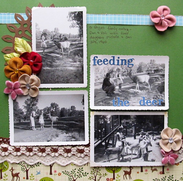
Feeding the Deer by Christy Strickler |Supplies: Cardstock: Colorbok: Patterned Paper: October Afternoon: Alphas and Trim: Webster’s Pages; Doily: JBS Mercantile Stencil; Flowers: Maya Road, JBS Mercantile
Betsy cut a motif emblematic of the 60s with her die-cutter.
Betsy Sammarco says, “I’m a child of the 60s, and this is me! When I look at this photo, I think of playing in our backyard and the wonderful childhood I had. I love that not only does the photo show a cute outfit from the time, but I get to see some of our backyard and a glimpse of our very large garden in the back.”
“My ideas to get the look of the 60s included the paisley motif and a “flower-power” bloom. Searching for the flower-power decals on ebay, I found the original shape of the decal during the “Flower Power” movement, and I used those images to create a digital cutting file for my Silhouette. The original decal had a flower center, but I liked the image without centers in my layout. I also rummaged through my stash to get slick “decal-like” paper to cut from. The bright green and pink are cut from this older paper from my stash.”
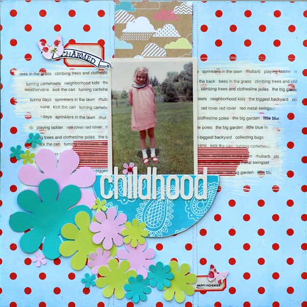
Charmed Childhood by Betsy Sammarco | Supplies: Crate Paper (strawberry and dots), Echo Park (clouds), American Crafts (paislee),
Washi tape, American Crafts Thickers, Amy Tangerine stamp, Tim Holtz labels, EK Success punch, Silhouette cutting machine
Chris used subjects’ names and the few details she knew of them in her journaling.
“Often there is no story to accompany old photos, and the viewer is left to wonder what’s going on,” says Chris Asbury. “I was lucky to receive the names of the people in this photo, and added those names plus the few details I remembered of these relatives in the journaling. The people in the photo are Aunt Belle, Jack Nugent, Phil McCormick, Eileen McCormick, Frances McCormick, Valjean (Spec) McCormick, McCarthy). Spec is my grandmother’s brother who I met when I was young. He had a great sense of humor and a head of hair to match. He also owned a bar–a fitting role for an Irishman! Circa 1930s.”
“To keep the focus on the black and white photo, I created a clean layout with few elements, generous white space, and a bit of red for accent.”
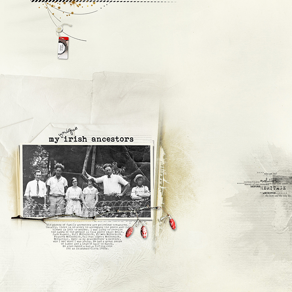
My Irish Ancestors by Chris Asbury | Supplies: Anna Aspnes Designs:
ArtPlay Palette Heraldry,ArtPlay Palette Sophistica,Family Word Mix No.1
Scanty Journal Lines No.2; Fonts: Bohemian Typewriter, Soymilk
Sue used her mother’s words from her baby book for page journaling.
Sue Althouse says, “This photo, taken back in 1964, inspired me to tell the story of the birth of my brother. While I honestly don’t remember what it was like adjusting to a sibling, my mother recorded the story in my baby book, and I used her words on my journaling strips.”
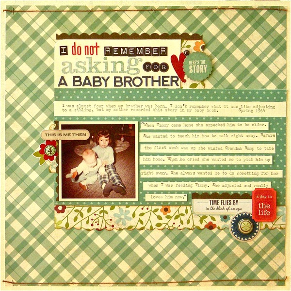
I Don’t Remember Asking for a Baby Brother by Sue Althouse | Supplies: Cardstock: Bazzill; Patterned Paper: Simple Stories; Scalloped Border Punch: Fiskars; Alphabets: Jillibean Soup, Echo Park, Crate Paper, Lily Bee; Inks: Tim Holtz Vintage Photo Distress; Stickers: Crate Paper, Simple Stories; Brads: My Mind’s Eye, Echo Park; Floss: We Are Memory Keepers; Tools: Tim Holtz Tiny Attacher
Amy repeated her photo a second time in a lowered opacity.
Amy Kingsford scrapbooked a photo of her grandmother as a high school senior in the 1930s, repeating the photo a second time for emphasis.
“The story I was inspired to tell was not about my grandmother’s life at that time, but, instead about my memories of looking at old photos of her and hoping that one day I would be as lovely as her. This photo was one of my favorites.”
“I used vintage-styled products and feminine prints in bright colors to support my story and present these beautiful photos.”
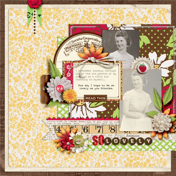
So Lovely by Amy Kingsford | Supplies: Jenni Bowlin Studio Digitals: Apothecary Labels and Borders and Front Porch Collection; Kristin Cronin-Barrow: Manic Monday; Sahlin Studio and One Little Bird: Fresh Collab; Anna Aspnes: Stitched by Anna White Borders.
Doris Sander got a vintage look with a color scheme of aqua, gold, grey, and cream.
Doris says, “This photo was taken when I was 26. Back then I adored stripes, thought life moved at a snail’s pace, and had no clue that I was actually thin. I still adore stripes! The journaling on this one is about a close friendship I formed then and how helping someone else can turn out to be such a blessing.”
“We’re wearing warm clothes and it’s at Christmas, but the photo was taken at the beach so I went with a beach theme using a color scheme of aqua, gold, grey, and cream. I also worked in beach bingo cards, shells, and buttons made of shell. Finally, I added a subtle touch of sparkle to set it all off.”
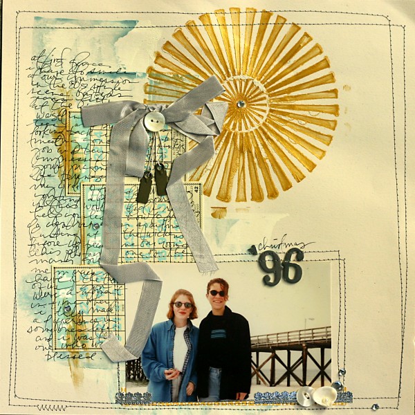
Christmas ‘96 by Doris Sander | Supplies: mini bingo cards – Jenni Bowlin Studio, stencil – Crafter’s Workshop, seam binding – Beaux Regards, alphabet – American Crafts, metal tags – 7 Gypsies, other – buttons, shell, rhinestones, acrylic paint, German foil
Ashley used papers with a modern twist to scrapbook older baby photos.
Ashley Horton says, “I borrowed these two photos of myself as a baby from my mom and scanned them, but have been waiting for a chance to get them scrapped. I could not figure out where I wanted the theme of my page to go. My Mom is not the type who shares a lot of information, so I am unsure of the stories behind my childhood photos, and it makes it difficult to add journaling.”
“I decided to scrapbook these old photos with a modern twist, using papers that were not considered heritage or vintage. Once I got started, I loved how the Dear Lizzy papers worked with the photos to create a “baby” themed page. They added a bright look behind photos that were older and aged in color.”

Sweet Child of Mine by Ashley Horton | Supplies – Cardstock: The Paper Studio; Patterned Paper, Flair Button, Chipboard, Vellum Paper, Ruffle Paper: American Crafts; Brads: Crate Paper; Spray Mist: October Afternoon & Studio Calico; Washi Tape, Stick Pin & Mini Round Gems: Recollections; Baker’s Twine: The Twinery; Fonts: Scrap Baby & CK Emily; Punch: Anna Griffin; Other: Embroidery Floss
Stefanie used the concrete details in her photos to jumpstart her journaling.
Stefanie Semple says, “I hadn’t scrapped these photos of myself at 5 or 6 years old before now as I had no idea what to say. I could see that I was playing, alone with adults watching on. I dug a little deeper and picked out things about me that are evident in the photos that are still true about me today and the layout came together.”
“I used a digital kit with wood-print paper and greens to go with the photos. I used a template with photo spots shaped as if worn and bent and added a white stroke for additional pop. I didn’t do anything to change the color cast of the photos, quite liking their 1970s feel.”
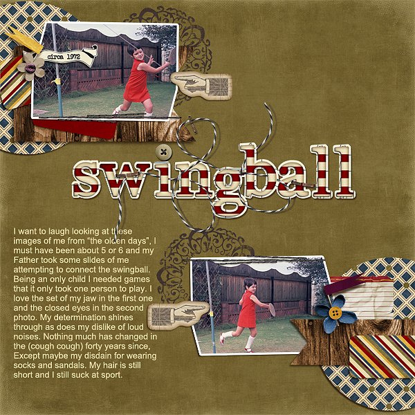
Swingball by Sefanie Semple | Supplies: Kit: “First of May” from Stolen Moments Design; Template: Gimme Layers Vol. 34 from Cluster Queen Creations.
Katie scanned both front and back of her heritage photo and included both.
Katie Scott scanned both this photo of her great grandmother taken in the 20s or 30s and the back of the photo which included her great grandmother’s signature. She says, “The original photo was much smaller, but I printed it 6″ high.”
“I have been making several layouts with older photos lately, and some of them are whimsical and fun with unexpected product. I think, though, that it’s important to make some of the layouts with a “classic” look so I used K & Company heritage papers and stickers. The tones are muted and the graphics evoke a “time gone by” feeling. Since the photo was black and white with the hint of blush on the cheeks added, the muted papers worked well to complement the photo. I can get by using trendy papers with Maude’s photos from the 1960s but this portrait needed a more classic treatment.”
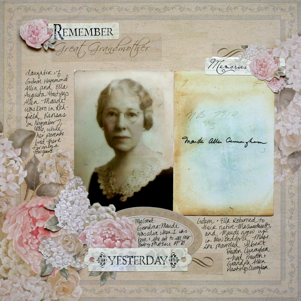
Remember Great Grandmother by Katie Scott | Supplies: Creative Memories stickers, K&Company papers and stickers.
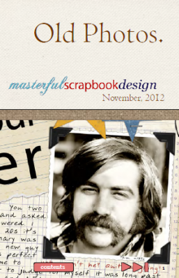 Available November 7th, 2012. “Old Photos”
Ideas and instruction for scrapbooking your older photos and telling the “legendary” stories in your life and that of your family. Subscribe today.

