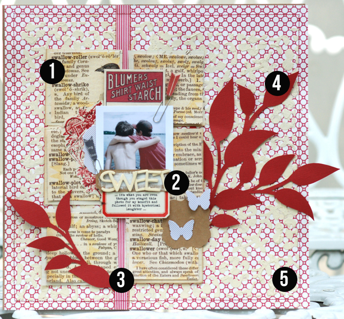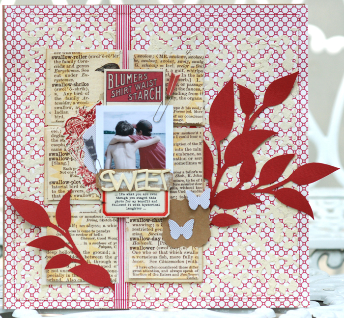
It’s the accumulation of well-chosen and carefully crafted details that create a masterful scrapbook page. Check out 5 details on “Sweet” by Betsy Sammarco and see if one or two of them can inspire your next page. This is just one of the inspired pages that Betsy shared at Masterful Scrapbook Design as a part of the “Finding and Applying Inspiration” issue.
1. Cut your foundation piece into squares and mount with narrow gutters.
Betsy started with a 6″ x 9″ piece of a page from a dictionary, and she cut it into six 3″ x 3″ squares. Each square was given a narrow mat and then they were all mounted to recreate the dictionary page — but with narrow gutters. It’s an unexpected and eye-catching foundation.
2. Make a small cluster of photo plus title and journaling.
Again, Betsy has done the unexpected. We are accustomed to seeing the photos on a page (and oftentimes title and journaling) take up most of the space on a page. Betsy used a small 2.5″ square photo and centered title and journaling below it and a piece of ephemera above it. This cluster is a horizontally symmetrical grouping that becomes the page focal point despite it proportionally small size.
3. Emphasize alignments with a strip of Washi tape running the entire canvas height.
Notice that the focal cluster atop the pieced dictionary page is a horizontally symmetrical grouping — and, yet, this grouping is placed asymmetrically on the page. Both the symmetry AND the asymmetry that Betsy presents are emphasized by the vertical strip of tape running the height of the canvas. It is placed BOTH symmetrically (in the center of the focal grouping) AND asymmetrically (to the left of horizontal center on the canvas). By choosing a striped print and running the stripes vertically, Betsy further emphasizes this element and her play with alignments.
4. Cut oversized leaves from a high-contrast solid and mount to extend from focal cluster and off page canvas.
Betsy used her electronic cutting machine to cut oversized leaves from red cardstock. The bold solid contrasts vividly with the patterned paper and text print around it. The size of the leaves is further emphasized by the fact that they spill off the canvas.
5. Build up a textured foundation with paint and stencil.
There is are multiple print and small details on this page. Betsy adds texture and helps the focal cluster stand out against a busy red-and-white print by buffering the two with a layer of white paint applied through a stencil.

Sweet by Betsy Sammarco | Supplies: All supplies are from a JBS Mercantile kit (June 2012); Patterned paper: all Jenni Bowlin Studio; Stamp, stencil, paint, and ink: all JBS; Chipboard Letters: Studio Calico; Washi tape: Queen and Company; Paper Clips: Studio Calico; Cutting machine: Silhouette Cameo
Although she’s always had a love affair with her computer and has used it in some way to enhance her pages, it wasn’t until 2009 that hybrid scrapbooking became part of Betsy Sammarco’s regular scrapbooking routine.
Betsy currently designs for Jenni Bowlin Studio and much of her work can be seen on her blog: www.justapharmgirl.blogspot.com.
[getinspired]

