 Travel and local outings to spots in the great outdoors offer great scrapbooking opportunities. There’s so much to photograph including the land, the people, their activities and the stories of what happens on the outing. The layouts that follow show you ideas for doing all of these things.
Show scale | Capture activities | Tell stories | Focus on the Details | Record the Events
Show scale
Having fun in the outdoors — and taking photos of that fun — means getting photos of your subject alongside nature, which can be quite grand in scale. Look at the layouts in this section of the article noticing which photos are used, how they are composed and the resulting impact of the page.
Doris used two photos — taken from a distance of Cub Scouts on a state park island. The boys are small in the midst of surrounding trees and water, and their backs are to the photographer — they are involved in nature activities. Doris placed the two photos side by side, evoking the idea of a panorama.
Doris Sander says, “We’ve been doing lots of great outdoor activities since my son joined the Cub Scouts. These photos are from a hike we took recently to Rock Island, a state park in Tennessee. I try to make sure and take scenic photos on these sorts of trips and it’s always nice to include the people on the trip along with the nature. While taking these photos I was struck by the grand scale of the world around me and how small we people really are.”
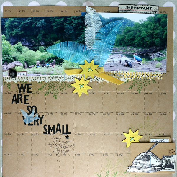
We Are So Very Small by Doris Sander | Supplies: patterned paper, perforated paper, wire feathers, chipboard quilt stars, letter stickers, rhinestone brad, folder, stamps, label stickers, rhinestone star – Jenni Bowlin Studio, punches – Fiskars and Jenni Bowlin for Fiskars, paint and ink – Jenni Bowlin for Ranger, paper clip – Tim Holtz, mist – Maya Road, ribbon – vintage
Chris Asbury’s photo from Yosemite shows her son in the midst of the grand nature scene. There’s a large rock between him and the photographer (and the page viewer) and much larger rocks and beautiful waterfalls behind him.
Chris Asbury says, “This is a photo of our son, many years ago, standing at the base of Bridal Veil Falls in Yosemite. He looks so tiny against the huge rocks and massive waterfall. The sunlight played beautifully with the colors around him, but I helped nature a bit by adding some Warm and Cool Glows by Anna Aspnes.”
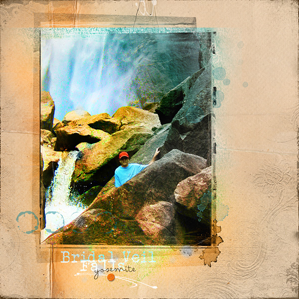
Bridal Veil Falls by Chris Asbury | Supplies by Anna Aspnes Designs:
ArtPlay Palette Easter Chicks (bg paper), WarmGlows No.1, WarmGlows No.3, CoolGlows No.1, ArtPlay Palette SaltyLiving (transfer), ArtPlay Palette Seafoam (brush), Original FotoBlendz No.13, MagicSprinklez No.1, DrippedStains No.5, TexturedOverlays No.7, 12×12 EdgeOverlays No.6, Different Strokes No.8, ArtPlay Palette No.1 (button); Fonts: Veteran’s Typewriter, Arsenale White
Deborah Wagner and her niece and were watching the clouds move through the mountains surrounding Machu Picchu. Deborah says, “It’s hard to capture the stunning beauty.” Here, as on Doris’ page, the subjects have their backs to the viewer. While Doris’ subjects were bent down immersed in nature activities, Deborah’s are set back, admiring it, taking in the beautiful landscape. She used a sketch and watercolor tutorial to digitally alter the people in her photo while leaving the mountains in their natural glory.
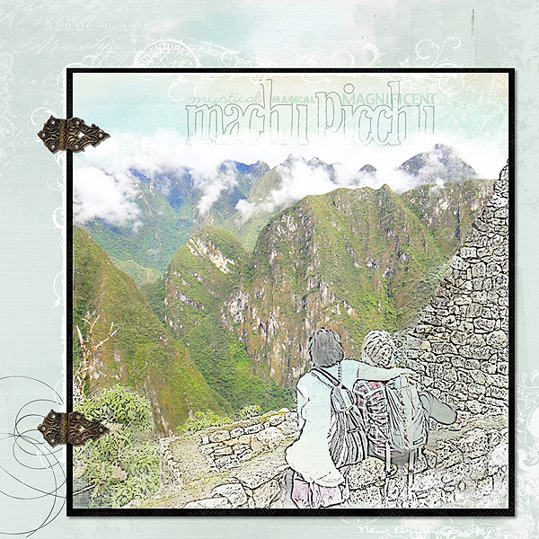
Mystical Magical Machu Picchu by Deborah Wagner | Supplies: Katie Pertiet – Letter Box Simplicity, Ledger Grid Overlays No. 1, Letter Box Corners No. 1, Colorful Edgers No. 2, Hinge Pack, Roughly Outlined Font, Editorial Inspiration 7-9-11; Lynn Grieveson – Summer Sunset, Late Summer Mini Kit; Michelle Martin – Bergen Paper Pack; Anna Aspnes – Art Play Palette Find My Way
Dina Wakley has composed her photo of nature with people in yet another way: her subjects are close in to the camera and looking into it with the mountains looming behind them. “Amazing” is a fitting title for the page.
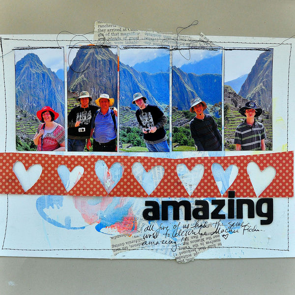
Amazing by Dina Wakley | Supplies: Cardstock: Bazzill, Alphabet: Thickers by American Crafts, Paper: Unknown, vintage book paper. Inspiration Source: Vintage Helvetica ad
Adriana Puckett pieced together multiple photos of a nature scene taken on a hike to create a panorama. She says, “It was fun to puzzle out how they would fit together. I arranged them diagonally to reinforce the “flowing water” theme. I misted the scalloped trim and then stitched them down. I also stitched under the word “peace” to emphasize it.”
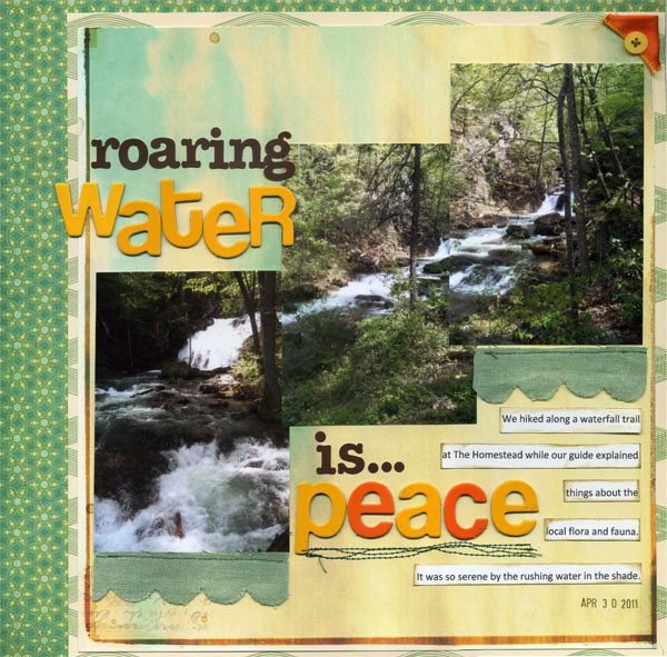
Roaring Water is Peace by Adriana Puckett | Supplies – Sassafras Enlighten; other assorted papers from Studio Calico Boardwalk kit, Pink Paislee Mistables; Mister Huey Lunch Tray mist; K & Co. Chipboard Alphabet; Jillibean Soup Cardstock Stickers; Godiva ribbon; button; Calibri font
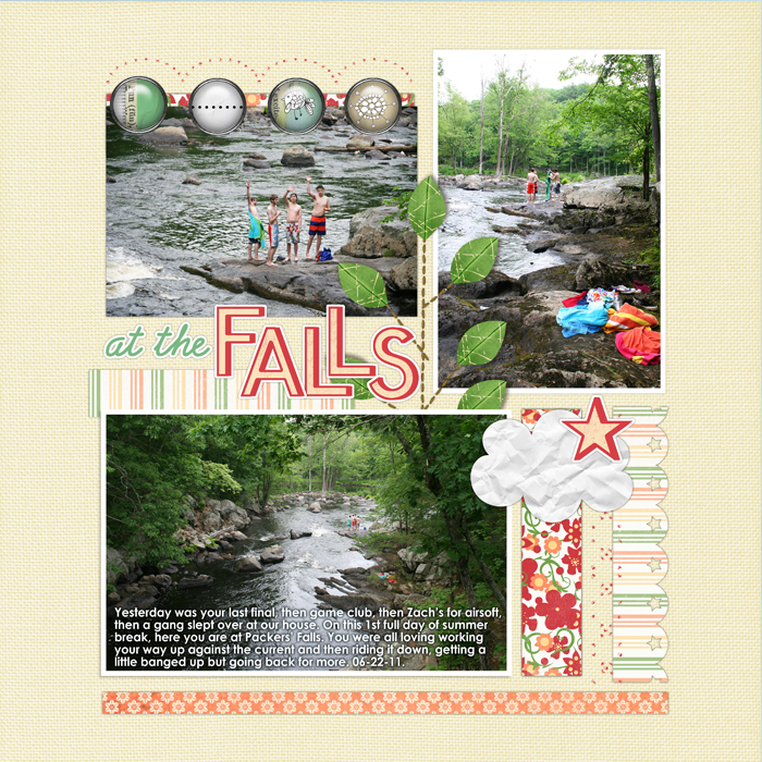
Debbie Hodge’s human subjects on “At the Falls” are small against the riverscape. The photos were taken from above the boys, on a bridge. In one shot they are waving which emphasizes their distance and size even more.
Capture activities
The outdoor adventures you go on present the opportunity for interesting activities. When you’re photographing your outdoor travels, remember to capture the things you do and then, when you’re scrapbooking, put them on the page.
Michelle Houghton got several photos of her daughters playing in the stick teepee they built with their grandparents while visiting an aunt.
Michelle says, “This summer the girls and I visited my sister in-law in Salida, Colorado. Salida is a very small mountain town with a lot of beautiful outdoors to explore. The girls spent a majority of their time with Grandma and Grandpa, who were also visiting, exploring and playing outside. Never a dull moment when these four put their heads together and on this particular outing constructed a tee-pee.”
“For outdoor layouts, I like using papers that reinforce the colors and rustic feel of the outdoors. The green and teal of these papers look slightly distressed and aged and match perfectly with the water and greenery in my photos. “Outdoor adventure” photos usually have a lot of detail so I keep my embellishments simple. The single band of ribbon and twine, individual buttons, and one small cluster keep the look clean while adding just enough detail.”
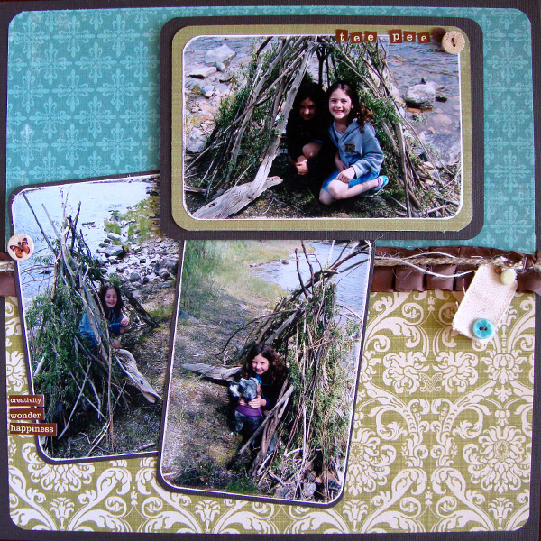
Tee Pee by Michelle Houghton | Supplies: Cardstock – American Crafts, Patterned paper – Teresa Collins, Twine – American Crafts and Simplicity, Buttons – Crate Paper, Lettering – Cosmo Cricket, Canvas tag – Maya Road, Brads – Making Memories and Pink Paislee
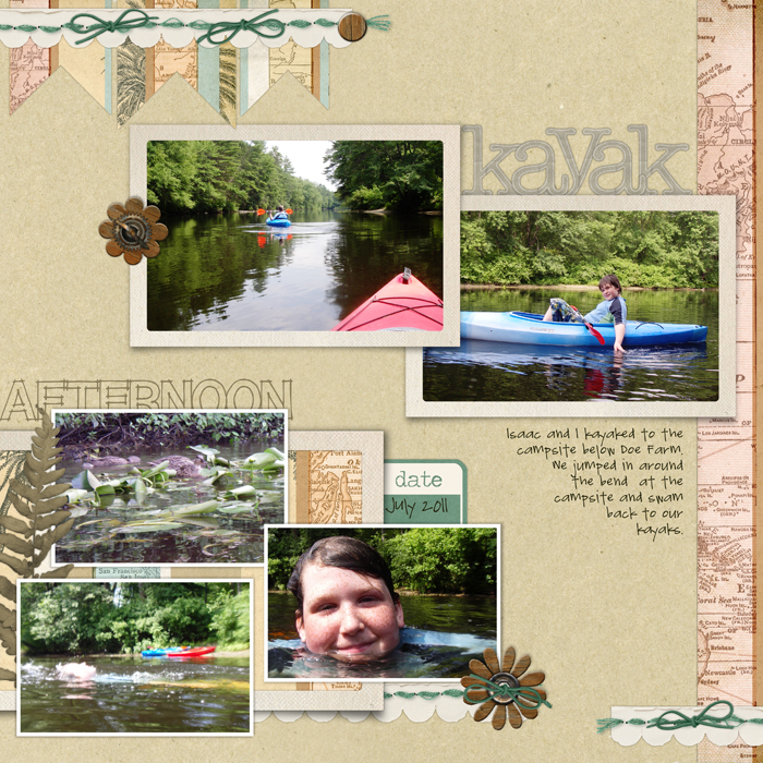
Debbie Hodge took her small waterproof camera on a kayak paddle with her son and got photos from a perspective that’s eye-level with the river — the one of her son swimming she took while she was swimming, and the perspective is unusual and really puts the viewer into the action. So , too, does the shot of the bow of the kayak she’s paddling in since the photo was taken from her seat in the kayak out on the river.
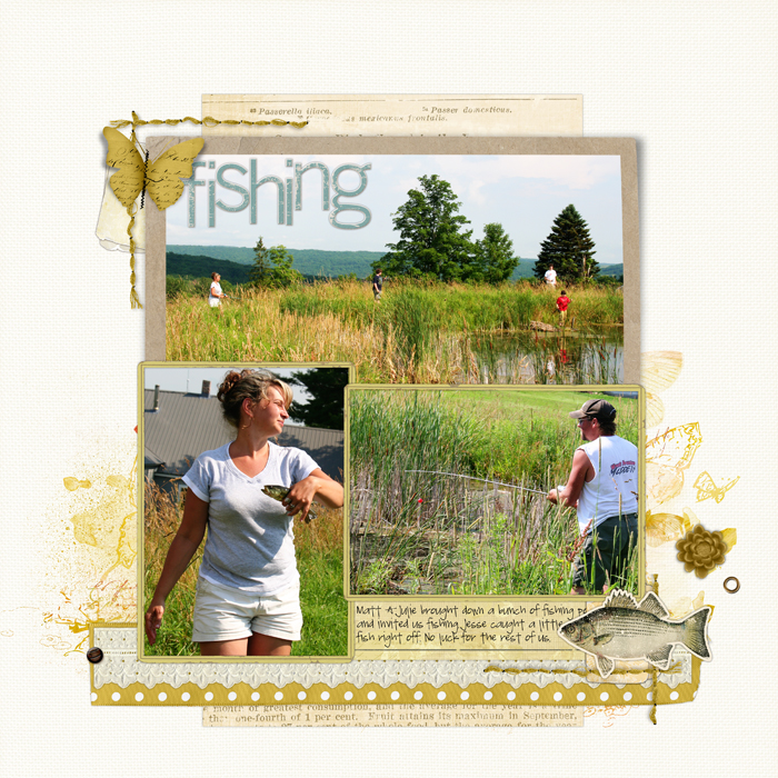
Debbie Hodge captured the activities from an afternoon of fishing from both a distance and close up. The photo of the pond bank shows the fishermen arranged around it. You might not know they are fishing though without the shots of her brother fishing and his girlfriend about to throw a fish back in.
Tell stories
When you’re in new places, unexpected, remarkable, and just simple delightful things will happen. You can tell these stories in your journaling or simply with the right photos.
Katie Scott had a funny story to go with her outdoor photos and she told it with journaling and a series of photos. She placed an embellishing arrow on one of the photos to draw the eye to the moose.
Katie said, “This layout is about a super funny time when my friends and I were headed back from Orono (a college town) to Bangor, where we lived and went to high school. My friend Katie and I (yes 2 Katies) were super silly and we’d usually sit in the back seat and giggle the whole way and Amy and Nancy would sit up front and Nancy would drive. So Katie and I were in the backseat being silly and Amy and Nancy were rolling their eyes at us and I screamed “2 Naked Men!” I seriously thought that there were 2 college guys playing a prank and running across the snowy highway – but it was actually a moose!”
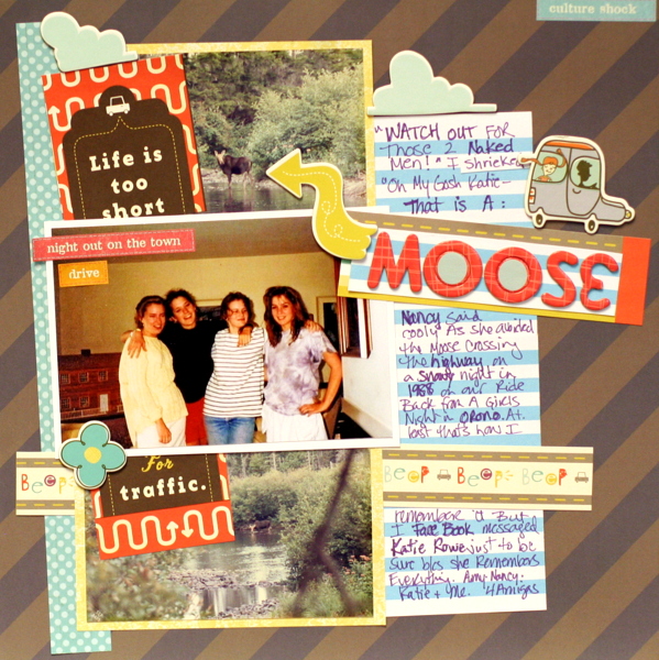
Moose by Katie Scott | Supplies: American crafts paper, Cosmo Cricket Joy Ride Embellishments, Index Card, Sharpie.
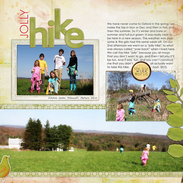
Taking a hike isn’t a remarkable event in and of itself — but when you get the details around the hike down, you can trigger more specific memories later on. Debbie Hodge scrapbooked a hike with her sons and nieces calling it a “jolly hike” sarcastically since none of the kids were convinced it would be all that jolly when they started out. The photos tell the story as much as the words: a posed group shot, a shot of the kids playing on a fallen tree, and a landscape shot of them running over the hill at hike end combine to tell the viewer a story.
Focus on the details
Getting in close to capture the sights on your outings is a great record of the place and your days.
Lisa Dickinson collected detail shots from a hike at Bear Lake in an unexpected grid. Lisa says, “I think this type of grid design works well with my page theme – Go See Do – because it’s not contained within the page. The eye can easily see how the pattern would repeat beyond the borders – much like the photos show my kids exploring and expanding their discoveries beyond their everyday parameters.”
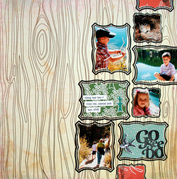
Go See Do by Lisa Dickinson | Supplies: patterned paper, (Pink Paislee, Studio Calico, October Afternoon) + stamps (Studio Calico) + ink (Stampin’ up) + font (Typist)
Vivian Masket says, “A key challenge I faced in creating this layout was how to take six different supporting photos and make them hold together. I had landscape photos, a detailed shot of wildflowers, and portraits of animals. By placing my supporting photos in a chipboard film strip, I instantly unified those six photos by making them part of a single collage.”
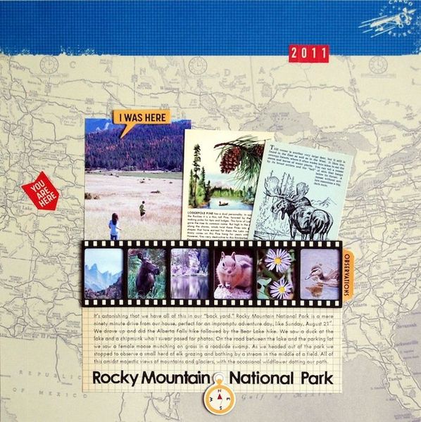
Rocky Mountain National Park by Vivian Masket | Supplies: Patterned Paper:American Crafts (map), October Afternoon (grid); Chipboard: October Afternoon; Stickers: Basic Grey (letters), October Afternoon (arrow, label, numbers); Wild Cards: October Afternoon; Font: AL Uncle Charles
Terry Billman says, “I wanted to focus on the story of where and when we saw different animals at Yellowstone. To showcase each story, I used journaling tags for each animal with the photo behind the journaling, lowering the opacity of the photo.”
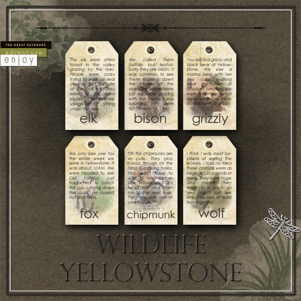
Wildlife Yellowstone by Terry Billman | Supplies: Anna Aspnes:
Art Play Great Outdoors, Canvas Textures 1, Fotoblendz Clipping Mask 1; Katie Pertiet: Vintage Blendables No. 9, Letterbox Naturalist Tag, Hinge Pack; Jesse Edwards: Title Lines 6.
Record the event
The who, what, where, and why are the kinds of details your viewers now and in later years love to know about. Convey these with photos and words.
Doris Sander says, “This is a typical event layout – it contains the place, the boy, and the friends. This information is basic who, what, when, where, and why. The previous layout I posted, “We Are So Very Small” is about my impressions of the place we hiked, and the layout, “You Worked So Hard to Get Here,” on Easy Scrapbook Pages is about my son struggling to conquer his fear of heights so he could rock hop with the other boys. What I love about scrapbooking is that you can take one event like this and get so much out of it. While it’s nice to record “what” you did, it’s really nice to dig deeper to get out the thoughts and feelings from the trip.”
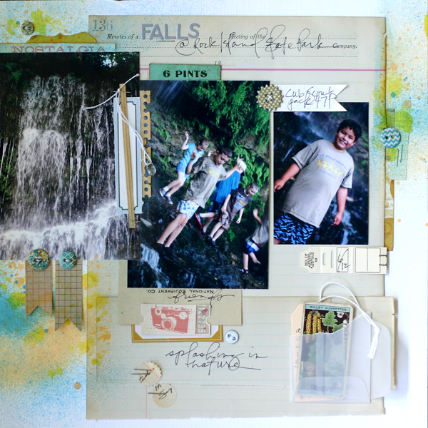
Falls at Rock Island by Doris Sander | Supplies – patterned paper, stickers – Cosmo Cricket, buttons – My Mind’s Eye, crystal charm – 7 Gypsies, vellum envelope, alphabet stickers – Jillibean Soup, flags – Maya Road, label – Ormolu, tag – Avery, ephemera – vintage, mist – Maya Road
Stefanie Semple recorded a whale watching event, conveying the details with a combination of title, journaling, and photos.
Stefanie says, “We took a trip to Hermanus to see the whales. The children loved sitting on the rocks watching the waves and it was only when we got home and I checked my photos that I saw I had actually captured some whales breeching and exhaling. They were a little too far out to see with the natural eye.”
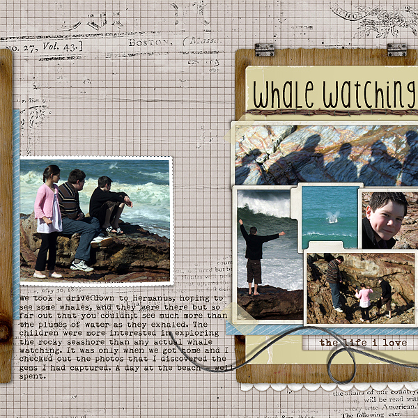
Whale Watching by Stefanie Semple | Studio Double D’s Layer works #56, and Mye De Leon’s kit Down by the River.
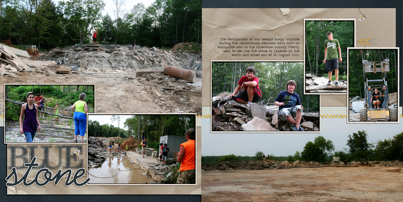
Debbie Hodge used a combination of “scene” and “activity” photos along with journaling that tells the story on “Blue Stone” to create the story of an extended-family outing to a spot several acres inside family farmland.

