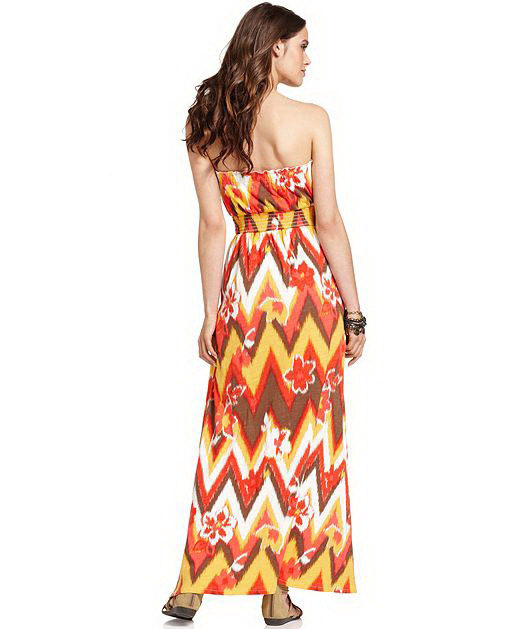
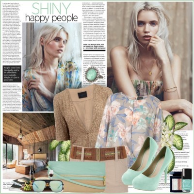
 The lines, colors, and detailing on clothing are just a few of the details that can give you ideas for your scrapbook pages.
Find inspiration from the clothing in your closet, from clothing you see on the streets of your town, and from fashion magazines and fashion websites. See just how effective this approach is for getting original looks when you check out the layouts from our team.
And get started with your own fashion-inspired page using one of the inspiration pieces on our Pinterest Fashion Inspiration Board.
Neon colorblocking
Katie Scott‘s “Firework” was inspired by the Summer 2012 Fashion Trend of neon colorblocking. Katie says, “I dug through my scraps for Office Depot neon cardstocks and some seriously old patterned paper (craft store circa 1998). I also came across the aqua cameras and the purple sunglasses. These bright photos of my daughter were perfect. She was feeling super-stylish in her Barbie lifejacket, which is neon pick and orange. Such a little trendsetter–she was a year ahead of the neon trend!”
“It was easy to color block the neon papers on white cardstock. Then I found random letters in bright colors and borrowed the Katy Perry Fireworks lyrics for the journaling.”
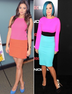
Neon color blocking. Source.
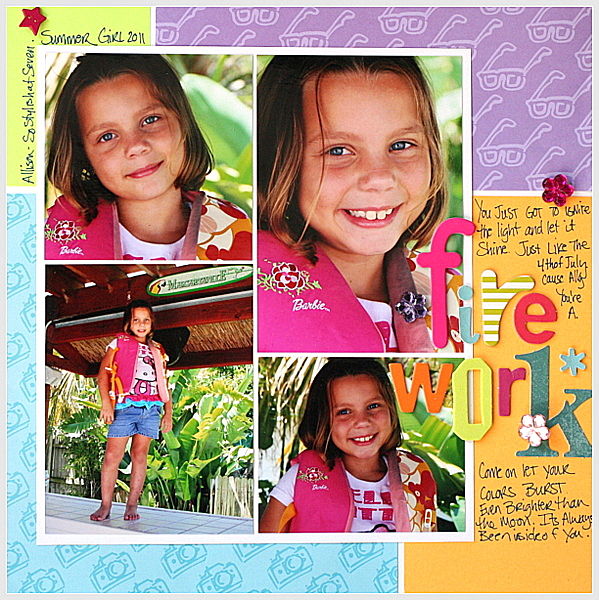
Fireworks by Kate Scott | Supplies: neon patterned papers and cardstock; random letters, glue dots; rhinestone do-dads, sharpie pen.
Geometrics
Leah Farquharson took the title for “Fashion Forward” from the title of the board that she keeps on Pinterest to track fun fashion ideas!
Leah says, “Lately, I’ve noticed a strong geometric trend in fashion, and, though I’m not to keen to grab a skirt or sweater with those fun triangles, I’m more than happy to add them to a scrapbook layout!
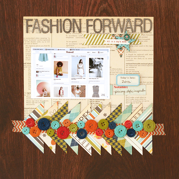
Fashion Forward by Leah Farquharson | Supplies: patterned paper, buttons, stickers, brad: October Afternoon. Chipboard letters: American Crafts. Ink: Ranger
The words of Coco Chanel
Chris Asbury titled her page with a quote by fashion icon Coco Chanel: “In order to be irreplaceable one must always be different.” Chris says, “I love this outfit my granddaughter put together one day. She said she had to wear the scarf with the hat because that’s what Gwen Stefani would do.”
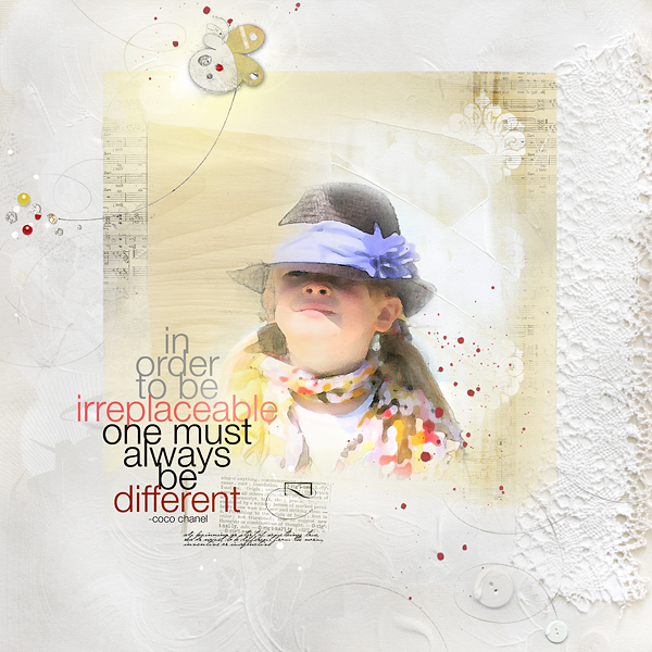
Fashion by Chris Asbury | Supplies by Anna Aspnes Designs: ArtPlay Palette Genuine (Paper1, Paper5, button), FotoBlendz Overlays No.1, ArtPlay Concerto (paper clipped to mask), Genuine WordTransfers No.1, WarmGlows No.3, SprayPaint No.2, Magic Sprinklez No.1, Magic Sprinklez No.4, ArtsyFlutterBys No.1; Font: Helvetica Neue Light
Chevron print
“I have been inspired by all of the chevrons in fashion and home patterns lately,” says Adriana Puckett. “When I saw Nettio Designs‘ new “Paper Loving” templates that were a part of the July 2012 Digi Files, I jumped to use the chevron pattern for my page background. The wide spaces allowed me to play with color and patterns and still keep the geometric repetition.”
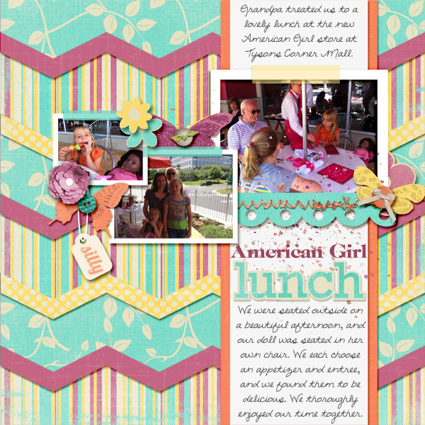
An American Girl Lunch by Adriana Puckett | Supplies: Template – Paper Loving Template by Nettio Designs (July 2012 Daily Digi); Paper, alphabet and embellishments – Limerick kit by Piccolina Designs (May 2012 Daily Digi); font is DJB Digi Tara (Sweet Shoppe).
Rows of lace and ribbon
Amy Kingsford was inspired by the colors, textures and motifs in this Anthropologie outfit. Amy says, “I love the texture and rows of ribbon on the skirt and used a lace paper background on the right side of my layout to create the same dramatic effect. The colors and theme for my layout were drawn from the blouse, whose farm-animal motif and colors really grabbed my attention and even prompted me to think of a specific kit that I could use.”
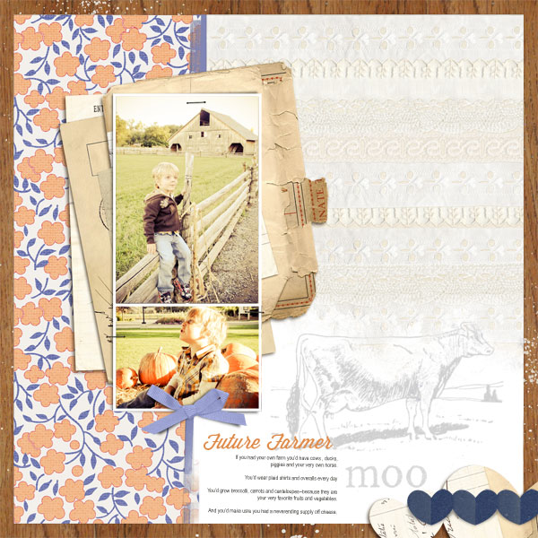
Future Farmer by Amy Kingsford | Supplies: Farmer’s Wife Collection by Jenni Bowlin Studios @ Jessica Sprague, Artsy Template No. 53, Blossom Art Play Palette by Anna Aspnes; A Wonderful Day Papers, Ephemera Stacks by Sahlin Studio; Wisdom Script Font.
Outfit combinations
Christy Strickler says, “I like to use polyvore.com for fashion inspiration. Sets of clothing are paired with inspirational images.”
“This is a page about my son’s kitten. She has a tendency to play so hard that she falls asleep wherever she is. She was flopped over playing on my scrap desk and then stopped and went to sleep.”
“I chose clothing with a soft color palette and feminine accents to compliment the story. I pulled ideas from each part of the outfit.”
- I used a soft floral print like the blouse for my base paper.
- I built up on that with a circle cut my son’s old Khaki shorts, machine stitching the circle to the paper. It blended into the background too much, so I used a leaf print stencil and white acrylic paint to make it pop.
- I liked the texture of the belt in the outfit. I found an old belt and cut it apart to use as trim on my page.
- I made two stick pins using glass beads and quilt pins. I then embellished around the belt.
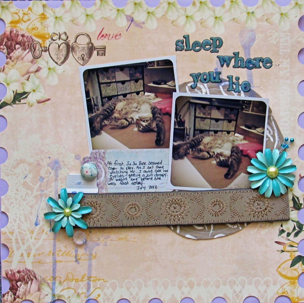
Sleep Where You Lie by Christy Strickler | Supplies: patterned paper, alphas, button: Webster’s Pages; flowers: Sassafrass; metal office tab: Making Memories; mist: Tattered Angels;brad: K and Company; tag: Fancy Pants; other: glass beads, quilt pins, old belt, khaki shorts, acrylic paint, stencil.
Ombre
Katie Scott says, “Ombre has been a recent trend in fashion and hair color and home decorating. In this context ‘ombre’ can be defined as a graduation of color from light to dark. Inspired to create an ombre look on my page, I dug into my stash and used pink in a variety of shades — from light to dark.”
“I pulled out an old box of random pink embellishments and used the paint chip in the center of the page as the basis for the ombre pink. I created the whole pink ombre cluster and decided to make a page with small photos so that my embellishments would still shine. Thus the subject: ’42 Things I Love.'”
“I don’t always use a lot of embellishments, but working with one color family made it easier. Using the ombre technique of going from light to dark sped up my decision-making process of where to put the random things, and so the page went together quickly.”
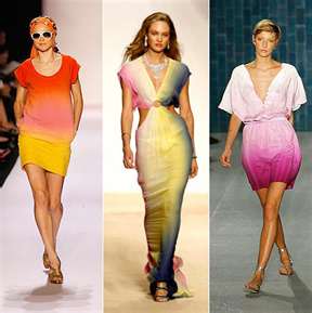
Ombre. Source.
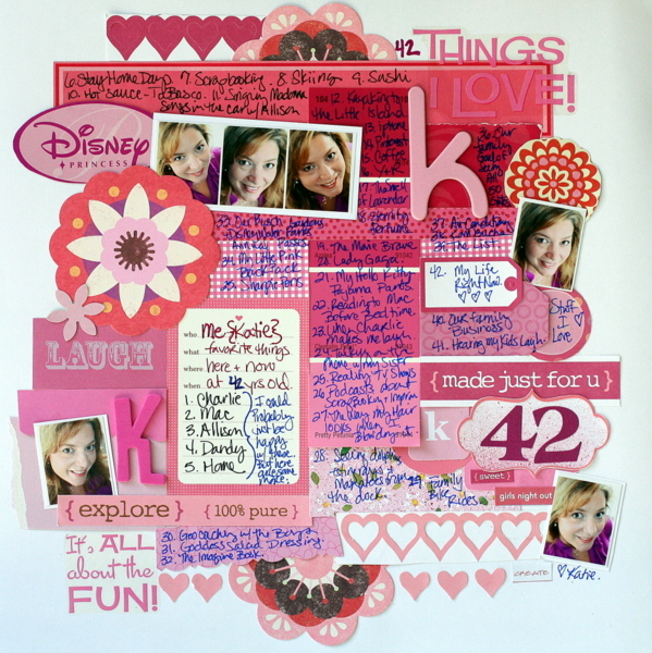
42 Things I Love by Katie Scott | Supplies: A bunch of super old embellishments & papers some of which I recognize as KI Memories, Martha Stewart, Colorbok, and Crate Paper.
1920s Jazz era fashion
Chris Asbury‘s “Bohemian Rhapsody” is inspired by the pretty and feminine fashions of the 1920s Jazz Age that are evident in the TV series Boardwalk Empire.

From the TV show “Boardwalk Empire.” Source.
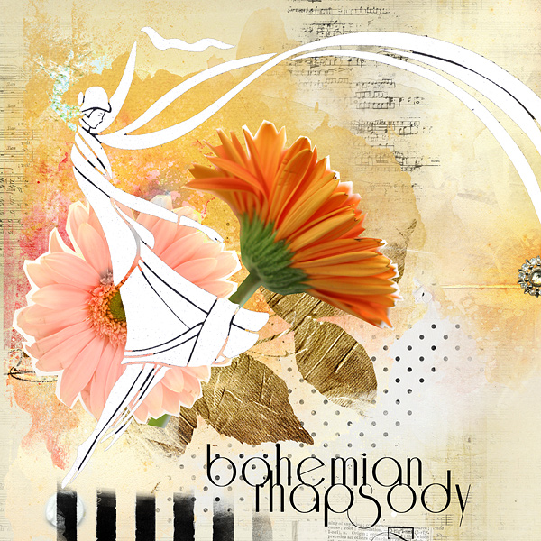
Bohemian Rhapsody by Chris Asbury | Supplies by Anna Aspnes Designs: ArtPlay Palette Bask (paper, sparkle button), ArtPlay Palette Concerto, ArtPlay Palette FindMyWay (lady), Music Notes No.1, WaterColor FotoBlendz No.1, GoldLeaves No.2, Sheared Blooms No.1, ArtPlay Palette Genuine (button), ArtPlay Palette Special One (transfer), WarmGlows No.1; Font: Reisling
Your own clothing choices
Audrey Tan says, “I love images of vintage ladies so when I came across a set of papers featuring them, I had to use it as a base for my page.”
“I sometimes think I should have been born in another era when it comes to clothes, as I don’t follow the latest trends. Clothes doesn’t interest me, and I rarely shop for them. I’m more of a shoes-and-handbag person. Once in a while, though, I will indulge. Recently I came across an online site that sold lovely dresses. I chose a few and narrowed down to just 4. Hence, my page show my choices. I even included a photo of me trying on a dress that I bought. The only problem buying online is hoping that the dress I’ve chosen fits me perfectly. Otherwise it’s back to the store!”
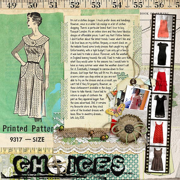
Choices by Audrey Tan | Supplies: Jodie Lee: Home Sewn Papers; Juliana Kniepp: Butterfly Fly Away, Cluster Tags; Anna Aspnes: ArtPlay Palette Bask, ArtPlay Palette Globe Trotter, ArtPlay Palette Authentic, ArtPlay Palette Special One; One Little Bird: Making A List; Val C. Designs & Sue Cummings: Focused & Photographed; Val C. Designs: Secret; Fonts: Snuff & KG Sweet N Sassy
What have you seen lately in fashion that you could translate to your scrapbook page designs? Looking for fashion inspiration to get started? Check out our Fashion Inspiration Pinterest Board.
[getinspired]

