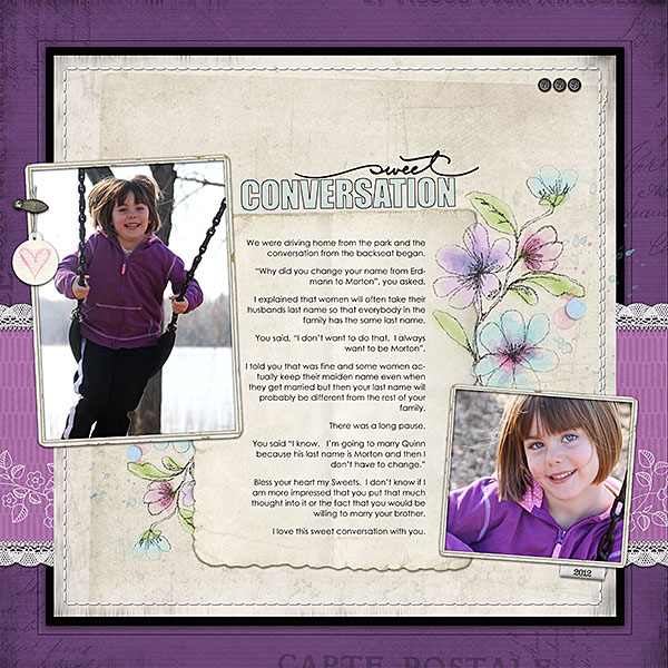
 When you’re making a page with two photos, your photo sizes and crops as well as the orientation of your photos will impact how your arrange elements on the canvas.
See how the pages below work with a variety of cropping and orientation choices. See, also, how to begin with the same crops over and over and get different looks.
Crop, size and orientation
Crop proportions. Will each of the photos be cropped to the same “width to height” ratio? In a 5″ x 7″ portrait crop, the height is about 1.4 times the width. So a 5″ x 7″ photo and a 2.5″ x 3.5″ photo both have the same proportions of width to height. Change one of those photos to a square, though, and you’re working with different crop proportions. Neither of these scenarios are better. Rather, they each lead to different compositional choices when you combine the photos on a canvas.
Photo sizes. Will the photos both be the same size or differing sizes? If they are the same size, how will you create a focal point?
Crop orientation. Will your photos both be oriented portrait or landscape, or will you mix the two orientations — or will you, perhaps, throw in a square crop?
Same size and stacked
Amy Kingsford stacked two same-sized, landscape-oriented photos, separating them with journaling and titlework. Amy says, “This tidy configuration draws attention to my story and still lets me have fun with colors, patterns, and elements without the page becoming chaotic.”
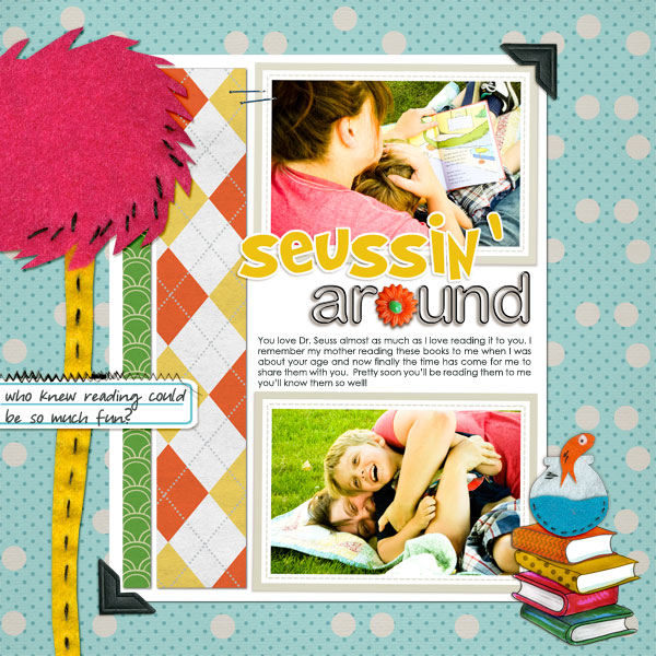
Seussin’ Around by Amy Kingsford | Supplies: Template from Simple Scrapper’s Premium Collection (Jun 2012), Thingville Felties by Valerie Wibbens, Between the Pages by Kaye Winiecki, A Wonderful Day by Sahlin Studios, Vintage Vogue Elements by Sahlin Studio, Vintage Vogue Papers by Sahlin Studio, Sunshine and Daffodils Papers by Sahlin Studios, Black Rimmed Plastic Alpha by Sahlin Studio.
Tara McKernin says, “This is a layout about my dog Cali. She’s turning 14 this year. Yes, 14. It’s crazy. I wanted to keep this layout focused on her photos so I limited my embellishments and kept it and simple.”
See the similarities and differences with Amy’s layout above. Again, there are two landscape-oriented photos stacked vertically, but Tara has placed the photos abutting one another while Amy separated hers with titlework and journaling. Tara notes that she could have easily separated these photos but says, “I liked the editorial feel it has with the journalling and the images stacked.” The journaling and title sit beneath the photo grouping.
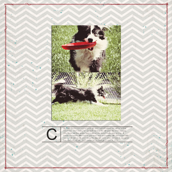
Cali by Tara McKernin | Supplies: Template (altered) by Sahlin Studio – June template, Font: District Thin, Paper: Sweet Caroline Studio Chevron by Celeste Knight, Splatters: Paislee Press Pressplate no.28
Debbie Hodge stacked two same-sized, landscape-oriented photo on “Last Leg” and placed the two at tilts and to overlap.
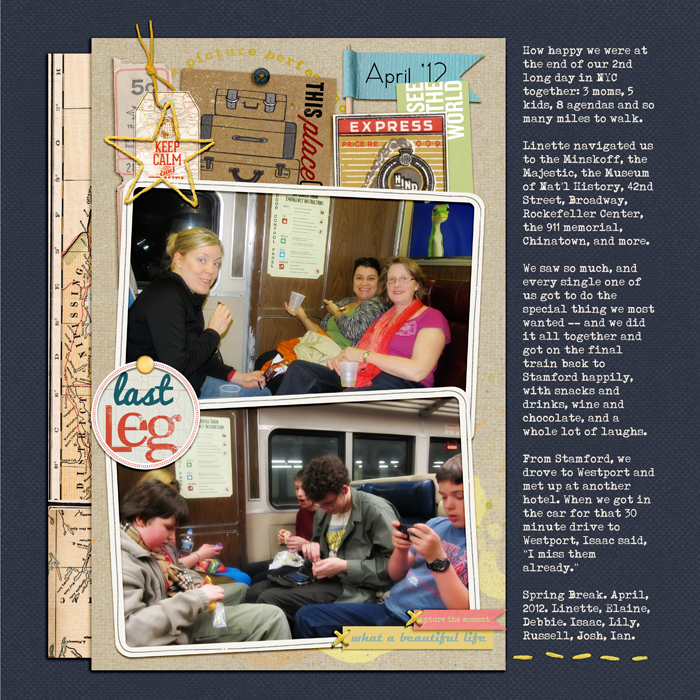
Last Leg by Debbie Hodge | Supplies: Vagabond, MeadowLark by One Little Bird; Mixed Up Alpha by Lisa Sisneros; Brad Bonanza by Pattie Knox; Flossy Stitches Yellow, Krafty Canvas 1, Classic Cardstock Winter by Katie Pertiet; Photobooth, Presslines No 4 by Paislee Press; Wesley by Ardent Sparrow; Stringbats by Kim Jensen; A Spring Day by Sahlin Studios; So Far Away by Little Butterfly Wings; Far Away from Here by Juliana Kneipp
On Barb Brookbank‘s “Your Smile,” we see, again, two stacked photos. The differences here are that the photos are square, each is framed and tilted, and the grouping sits to the left of horizontal center on a foundation alongside other elements to create a cluster.
Barb says, “I chose two similar photos and cropped them so that my sweet grandson’s face is the same size (same proportion) as the other one. I used brown tones to match with the brown tones in his sweater. I added the blue border/mat to contain everything and to add interest.”
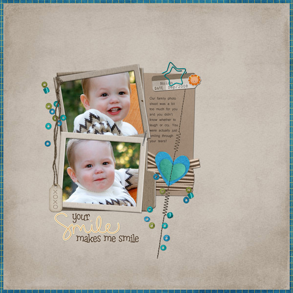
Your Smile by Barb Brookbank | Supplies: Kit: Alphabet Soup by Christine Mortimer – Digilicious Designs, Font: Microsoft Yi Baiti, Leftovers.
Same sized and side-by-side
Sue Althouse placed her two landscape-oriented photos to form a band across the page. Sue says, “One of my favorite techniques for choosing two photos is that of contrast and comparison. These pictures of the interiors of my husband’s and my cars not only provides visual evidence of our preferences, but allows an opportunity to journal about our cars and driving habits.”
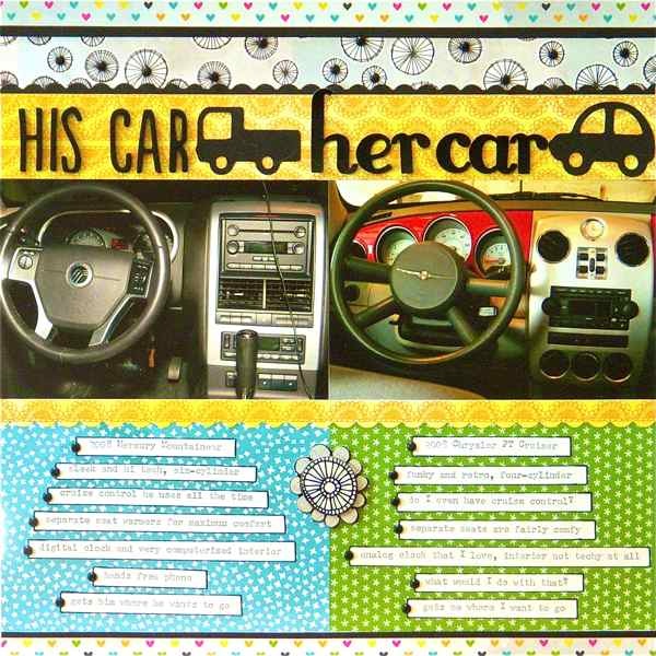
His Car, Her Car by Sue Althouse | Supplies: Cardstock: Bazzill; Patterned Paper, Stickers, Alphabets: American Crafts; Tools: Fiskars Border Punch, Making Memories Slice Elite, Applique Basics Design Card
Brenda Becknell chose these two photos of her granddaughter with a brand new baby brother, because she loved the way her granddaughter was smiling at the camera in one photo, and then looking at the baby in the other photo. The square cropped shots are placed next to each other and to the right of horizontal center. A shelf of paper and lace sits below them.
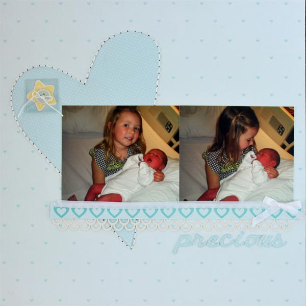
Precious by Brenda Becknell | Supplies: PP: Bella Boulevard, star sticker: Pebbles Inc, Cardstock: Hobby Lobby, Border punch: Martha Stewart, Cricut cartridges: Cursive 101 (title) and George (heart), Misc: white crochet thread and button
Katie Scott used two square photos of the same size on this page about her daughter’s Barbie world. Katie says, “She spends more time arranging and set designing the Barbie houses and accessories than having the Barbies play and interact. One photo focuses on her and the other on her surroundings.”
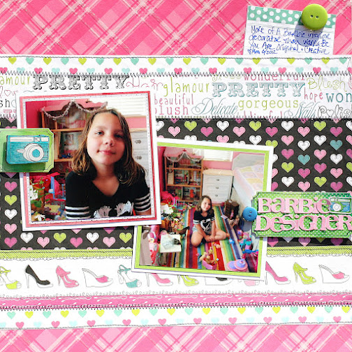
Barbie Designer by Katie Scott | Supplies: Amy Tan embellishments and papers, Die Cuts With a View paper, Basic Grey letter stickers, Sharpie markers and colored pencils, October Afternoon buttons, sewing machine (stitching). Recollections “All Girl” paper.
Same sized and staggered
Debbie Hodge placed two 4″ x 6″ portraits of her son in diagonal corners on “J.” The page is divided into two columns with differing paper bases.

J by Debbie Hodge | Supplies: Findings by Jenn Allyson; Petals by Sara Gleason; Alpha Set 5, Burlap Scraps, ArtPlay Snow Fun by Anna Aspnes; Chasing Fireflies by Paislee Press; Bollywood Dreams by ViVa Artistry
Lisa Dickinson’s photos on “She Makes It Look Easy” are of the same size and both have a narrow white mat. The photos sit in diagonal quadrants of a 2 by 2 grid.

Easy | supplies: cardstock (Bazzill Basics) + patterned paper, chipboard shapes, stickers (Lily Bee Design) + chipboard letters (Basic Grey) + punches (EK Success, Creative Memories) + twine (Bazzill Basics) + misc. buttons + Courier font + machine stitching
Emily Pitts place two-landscape-oriented photos with white mats in diagonal corners on “Who Could Blame Me?” While a grid isn’t explicitly defined, Emily filled the areas on the canvas based upon an underlying grid organization.
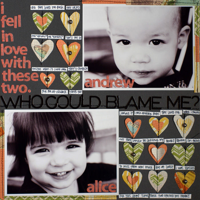
Who Could Blame Me by Debbie Hodge | Supplies: Cardstock: Bazzill Basics. Patterned Papers: Studio Calico, Pebbles. Alphabets: American Crafts, Sassafras. Metal stickers: 7 Gypsies. Fabrips: Studio Calico. Pen: Micron.
Two sizes, same orientation
Meghann Andrew varied photo sizes on this page about a day that she spent at her local museum of natural history and I found out just how much her husband knew about the periodic table.
Meghann says, “I wanted to use two photos on this layout because I loved the closeup of his face with the periodic table in the background, but I also wanted to get the ‘bigger picture’ shot on the layout, so that you could see the awesome wall that he was examining. The wood veneer star embellishment are placed in a downward diagonal line that guides the eye from top left through the photos and down to the titlework.”
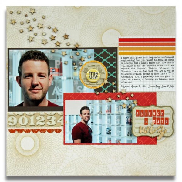
Math & Science Wiz by Meghann Andrew | Supplies: Cardstock: Bazzill Basics, Patterned paper: Studio Calico (numbers & red banners), Echo Park (circles), Lily Bee (yellow dot), Transparency: Hambly Studios, Die cut stickers: Studio Calico (scallop border, title block & red alphas), Chipboard: American Crafts (woodgrain alphas), Wood veneer: Studio Calico (stars), Badge: Evalicious for Elle’s Studio, Journaling tag: Elle’s Studio, Font: American Typewriter
Tiffany Tillman clustered her portrait-oriented photos and cropped one just a bit smaller. This difference, along with the tilted placement gives the page a casual look — as legos scattered across the table would have.
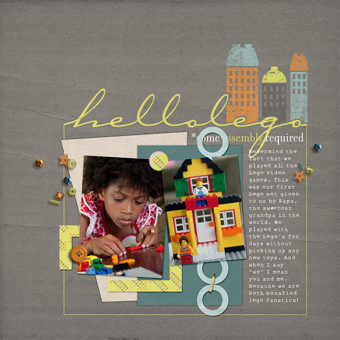
Hello Lego by Tiffany Tillman | Supplies: Digital Goodies: Creator by One Little Bird Designs. Page Template: Stuffy no. 1 by Simply Tiffany Studios.
Different orientations
When your photos are of different orientations but close in size, the challenge is to balance around a “T” or “L” shape. Debbie Hodge “blocked” around the two photos creating a rectangular cluster. She added strong lines below the cluster (including a patterned paper strip, stitching and journaling block) to support the weight of the grouping.
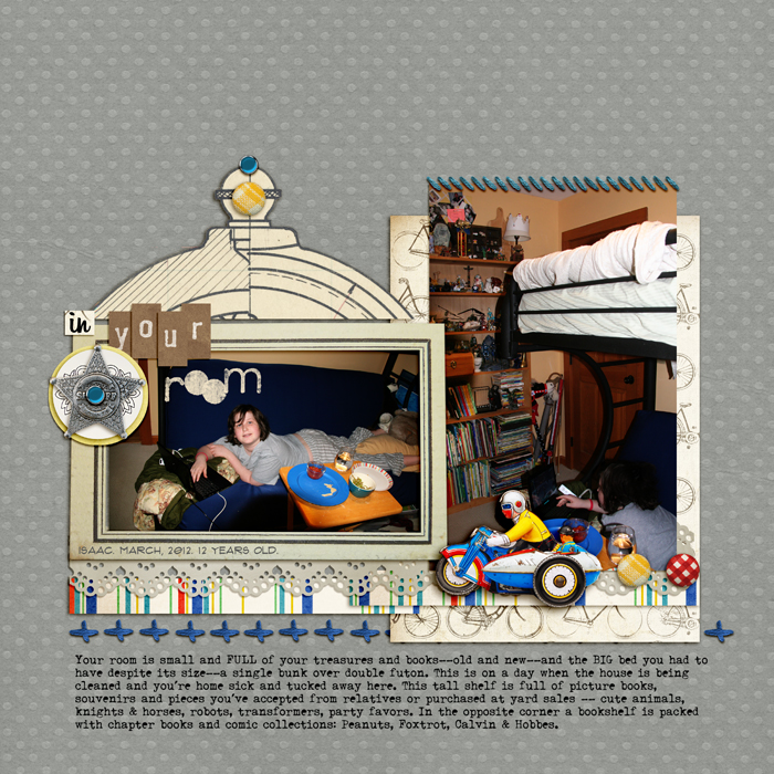
Nuts N Bolts by Maya de Groot; Child Play by ViVa Artistry and Paula Kesselring; Meadowlark, Tidbits by One Little Bird; Stitch Medley by Quirky Twerp; Also a Very Small Alpha by Allyson Pennington; Brad Bonanza No 2; Triumph Tippa, Billabong, Flux fonts.
Debbie Hodge united the two photos in the “T” configuration on “Spring Fever” with a layered foundation beneath the two photos and, again, the strong lines of a solid block of journaling spanning the width of the grouping.
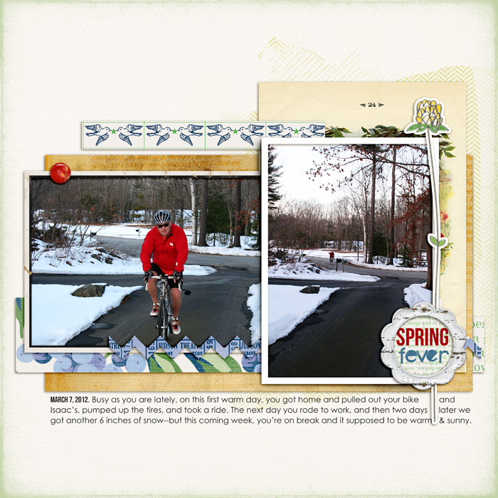
Spring Fever by Debbie Hodge | Supplies: Varsity Collection by Jenni Bowlin; Scissored Chevron, Mod Grunge FotoBlendz, Artplay Chevron Girl Craze by Anna Aspnes; She’s a Doll by Vinnie Pearce; Bookworm by Little Butterfly Wings; Juan Carlos and Fifi by Creashens; Also a Very Small Alpha by Allyson Pennington; Bebas Neue, Century Gothic fonts
Rectangle with square
Jana Morton says, “The most important aspect of this page is my journaling because I wanted to record this conversation with my daughter. I journaled on a deckled card mounted at page center, and then I anchored the journaling card with two photos, tilted, and framing the journaling at diagonal corners. When the journaling is framed this way it becomes a more important part of the page.”

Sweet Conversation by Jana Morton | Supplies: All Designer Digitals: Katie Pertiet: Home and Garden Kit, Edge Overlays No. 3, Classic Cardstock: Into the Night, Sweet St. Nicholas Kit, Messy Stitched Borders No. 1, Email Inspiration, Deckled Edge Journal Spots No. 4, Artistry de Azul, Loosely Labeled Dates No. 4, Hinge Pack, Yesteryear Kit, Embroidery Accents No. 1, Letterbox Overlays No. 4; Andrea Victoria: Subtle Plum Paper, Simple Girl;
Lynn Grieveson: Pamela Kit; A. Edwards: Word Art
Debbie Hodge used two photos with substantial contrast in size on “Easy to Tickle.” A smaller square photo plays a supporting role to the larger landscape-oriented portrait. The two photos are arranged as a part of a downward diagonal line that begins with paper clips and journaling at top left and flowing down to bottom right.
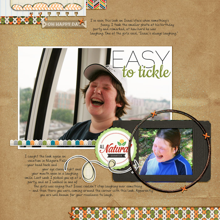
Easy to Tickle by Debbie Hodge | Supplies: Fresh by Sahlin Studio and One Little Bird; Traveler by River Rose; Flossy Stitches by Katie Pertiet; Cookie, Raleway, Andrea Upright Script fonts
The next time you know you’ll be using two photos on your page, consider your cropping possibilities and the resulting starting places for page composition.
[designclass]

