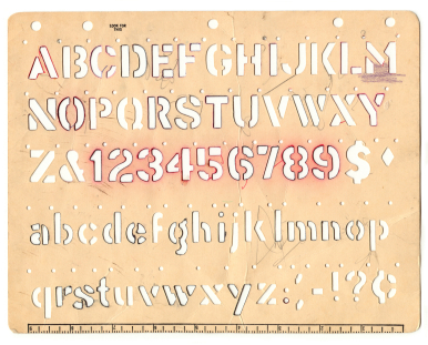
 If you love using paints, inks, mists, modeling clay or other messy mediums, then stencils and masks are the tools for you. Understand the difference between the two and check out ideas for using each of these individually or even in combination.
Stencil: A stencil is a thin sheet of cardboard, metal, or other material from which figures or letters have been cut out. Rub, brush,or press a coloring and/or texture medium like ink, mist, or paint over the sheet so it passes through the perforations and onto the surface.
Thus, you are making a positive image–unless you use one of Dina Wakley’s favorite approaches of flipping a used stencil to rub that excess ink off on a new project.
Mask: A mask is a cover or shield used to protect the surface beneath it from the mediums being applied. Spray or brush or paint over the mask, then remove it to reveal an untouched area surrounded by color and texture. Thus, you are making an image in negative space.
Stencils
Adriana Puckett says, “I loved playing with Julie Balzar’s ‘Blazonry’ stencil together with inks and mist. I inked Ranger’s ‘Broken China’ blue distress ink on one part of the pad and the ‘Seedless Preserves’ purple on the other part, and then pressed it on the stencil, creating a variegated look.”
I also made a mist with purple Perfect Pearls and water in my Mini Mister and misted the page around the stenciled pattern to create a more blended look. It’s possible to create really neat designs with the stencil – I can’t wait to play with it more on tags and cards as well as layouts.”

The Cutest Pout by Adriana Puckett | Supplies: Paper – Julie Fei-Fan Balzer Blazonry 6 x 6 stencil; Basic Grey (dot/photo mat); We R Memory Keepers White cardstock; “take the cake” sticker – Echo Park; buttons – My Mind’s Eye Lost & Found; Title – AC Thickers “Cutest”; ScrapWorks letter stickers (Pout); AC Chalk Label; Uniball Signo White Pen; Distress Inks; Perfect Pearls
[hr]
Katie Scott says, “I used the ‘Mini Sunburst’ stencil from Crafter’s Workshop with a Stampin’ Up yellow ink pad on plain white paper. I wasn’t sure what I was going to do with the paper while I was making it, but as it came together I thought I’d use it for the background of a page about the Artist/Nun Corita Kent.”
“I found images of the Boston gas tanks that she painted in 1971 on the internet (photo credits: Photo by Derek Johnson / Drawing by Captain Parker). I also found information and other images by Corita Kent online, including the heart with Love (which was later adapted to a postage stamp). I handpainted the heart and love with a paintbrush and acrylic paint. I used the leftover red and black paint to create a painted mat for my photo. I used a medium black Sharpie to do the journaling.”
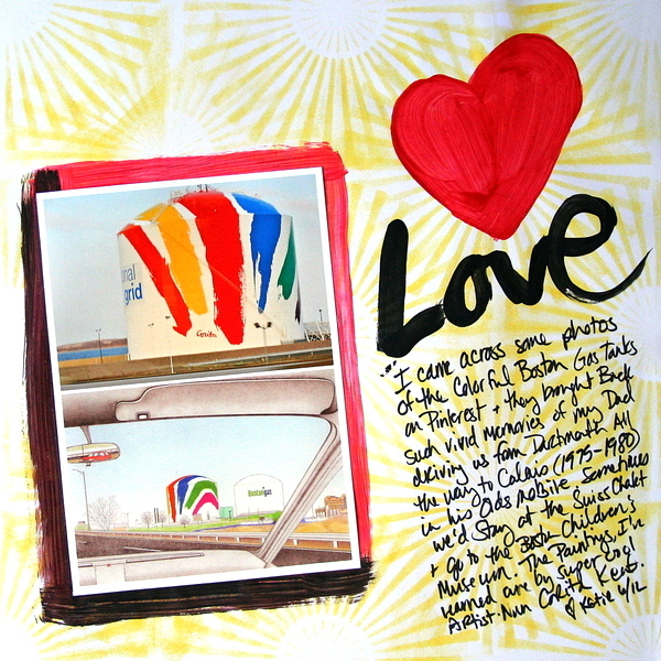
Love by Katie Scott | Supplies: Mini Starburst by Crafter’s Workshop, Stampin’ Up Ink Pad, White Cardstock (Unknown), Acrylic Paint and paint Brush, Black Sharpie. Photo credits: Photo by Derek Johnson / Drawing by Captain Parker)
[hr]
Paula Gilarde created a dimensional background using modeling paste mixed with paint. Her stencil was the packaging from a set of chipboard letters. Paula says, “I wanted to convey my daughter’s interest in words and spelling using letters for my background. The end result adds a lot of dimension to the layout. I added a shipping tag, decorated with some punchinella and inks, finished off with my photo and quote.”
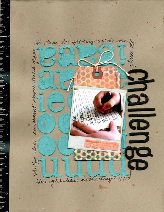
Challenge by Paula Gilarde | Supplies: Cardstock – Stampin’ Up, Shipping Tag – Avery, Digital Instamtic Frame No. 3 – Katie Pertiet, Alpha – American Crafts, Border Sticker – Collage Press, Ephemera – Fancy Pants, modeling paste, paint, ink, punchinella.
[hr]
Dina Wakley says, “I have a serious addiction to modeling paste. It adds amazing texture and dimension. For this layout, she started out with an “inky stencil blot.” In other words, she used a stencil on one project, and then, once she lifted the stencil up, she flipped it and pressed it onto another piece of paper.
Dina says, “After than I added modeling paste over the ink. I also painted through a stencil. All of those elements combine to give lots of visual texture.”
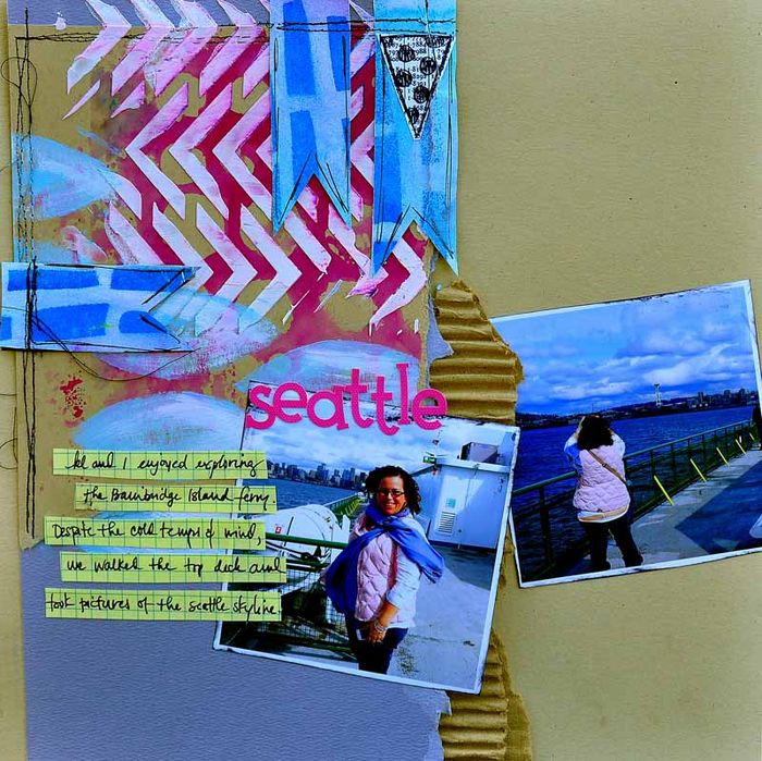
Seattle by Dina Wakley | Supplies: Cardstock: Bazzill, Ink: Dylusions by Ranger, Stencil: Crafter’s Workshop, Stamp: Dylusions by Ranger, Paint: Liquitex, Cardboard: shipping supply from PaperMart, Alphabet: Doodlebug, Graph Paper: from office supply store, Pen: Fude Ball, Ink Pad: Ranger Black Archival
[hr]
Tami Taylor took photos of her sons jumping on an outing to the Valley of Fire State Park. Tami says, “Because this particular image has no story, I scrapbooked the trip separately. I was left with an amazing photo and no journaling. When journaling isn’t needed, I will often use this as a time to ‘play’ on my layout. I’m free to try stencils, sewing, using songs as titles. I feel a little more free because I don’t need to worry whether I’m getting the story or the feel across to my viewer.”
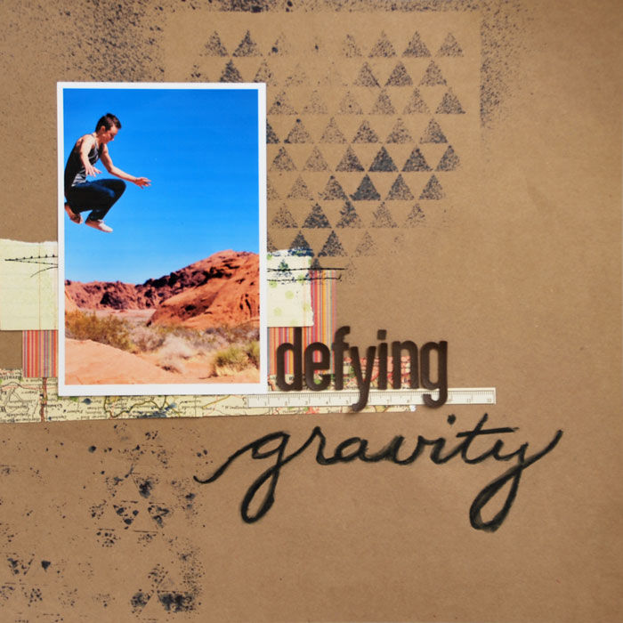
Defying Gravity by Tami Taylor | Supplies: Paper – Kraft cardstock, Making Memories, Basic Grey, Unknown. Alphas – American Crafts. Stencil – Crafters Workshop. Other – Stabilo Pencil.
Debbie Hodge used a digital stencil and misting brush by Nisa Fiins on “Museum of Natural History.” She applied the mist heavier at top left and at bottom right to create a downward diagonal flow on the page. To get this effect, she kept the opacity of her brushwork low and went over the corner areas extra times.
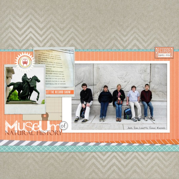
Museum of Natural History by Debbie Hodge | Supplies: For the Record, Vagabond by One Little Bird; Knock Out Chevron by Splendid Fiins; Krafty Canvas No 1 by Katie Pertiet; In A Word by Pattie Knox; Frame Rub-ons by Jenni Bowlin; Instamatic Frames, Instamatic Frames No 3 by Katie Pertiet; A Simple Mixup Alpha by Lisa Sisneros; Felix Titling, Andrea II Script fonts.
Masks
Ashley Horton says, “I thought the Mister Huey’s ‘Bubbles’ mask was perfect for creating a fun background for a sports-themed page. I placed the mask on my cardstock and used a fine tip Sharpie to trace around some of the circles. Once I finished tracing, I placed the mask back in place and used ‘Smooch Spritz’ from Clear Snap to mist over the mask. I removed the mask and sprayed Tattered Angels mist to create mist drops on my page, by removing the nozzle and tapping it over my background paper.”
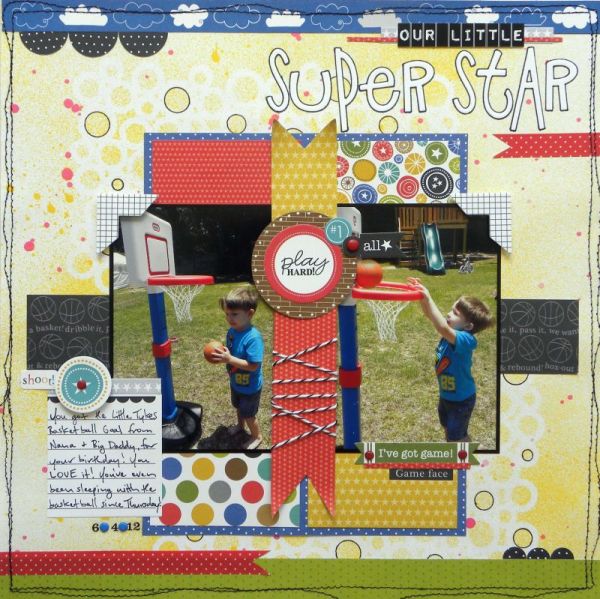
Super Star by Ashley Horton | Supplies: Patterned Paper, Stickers, Alpahs, Washi Tape: Bella Blvd., Cardstock & Brads: The Paper Studio, Smooch Spritz: Clear Snap; Spray Mist: Tattered Angels; MIster Huey’s Mask: Studio Calico; Font: Impact Label; Punch: Marvy; Stitching: Singer; Baker’s Twine: The Twinery; Pen: Sharpie
[hr]
Amy Kingsford used a digital product from Sahlin Studio that did the masking for her. The png file is of sprayed mist around a butterfly shape, and Amy changed the Blending Mode to Overlay on this misted layer to get a realistic look.
The masked floral piece behind her photo was made by cutting a shape from the existing mist. Amy says, “I positioned the leafy flower behind my photo, selected the area it filled (by control-clicking on the layer thumbnail) and then I selected the misty butterly layer and deleted the selected area. I hid the leafy flower stamp layer, and: voila!
I used a similar mask from the same misted butterfly set on my journaling tag and re-colored it to recreate a popular art journaling trend (altered tags) on my digital scrapbook page.
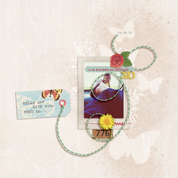
Relax by Amy Kingsford | Supplies: Butterflies Drawn and Spritzed Bundle by Sahlin Studio, Key to My Heart Elements by Sahlin Studio, Country Fair Picnic Elements by Sahlin Studio, Kitschy Christmas Collab by Sahlin Studio and Jenn Barrette and Interlude by One Little Bird Designs.
[hr]
Meghann Andrew used a chevron mask to add an interesting pattern behind her photos.
Meghann says, “Once the mist dried, I used Versamark pen to ‘color’ in the white lines. I added clear embossing powder to the Versamark ink and then heat-set it. The resulting negative space has a glossy, wet look, which adds a different texture.”
“I selected two different patterned papers that would not compete with the large-scale mask and funky embellishments that add to the fun feel of this layout.”
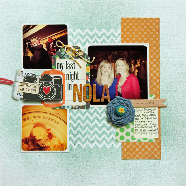
Last Night in NOLA by Meghann Andrew | Supplies: Cardstock- Bazzill; Patterned paper- Crate Paper (orange & green dot); Tag: Crate Paper; Die-cut sticker: Studio Calico (orange); Die-cut shapes: American Crafts (camera); Paper clip: Studio Calico; Brad: Crate Paper; Flower: Maya Road; Wood pennant : My Mind’s Eye; Baker’s twine: My Mind’s Eye; Pen: Stampin’ Up!, Versamark; Alphas: American Crafts for Studio Calico, Lily Bee; Journaling & date tags: Elle’s Studio; Mask: Studio Calico; Mist: Studio Calico
Embossing powder: Ranger.
Lisa Dickinson masked off a grid of circles on “My Boy.” The white circles became homes for smaller patterned paper circles and embellishments.
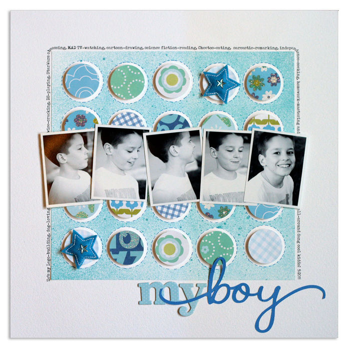
My Boy | supplies: Bazzill cardstock (White, Mediterranean) + KI Memories patterned paper, chipboard letters, and star Puffies + Creative Memories circle punch + Studio Calico mist + Silhouette die cut machine + Creative Memories pen + Typenoksidi font
Kelly Purkey used punched butterflies to mask off butterflies on American Crafts “ruffle paper.” The masking is less precise on this heavily textured page.
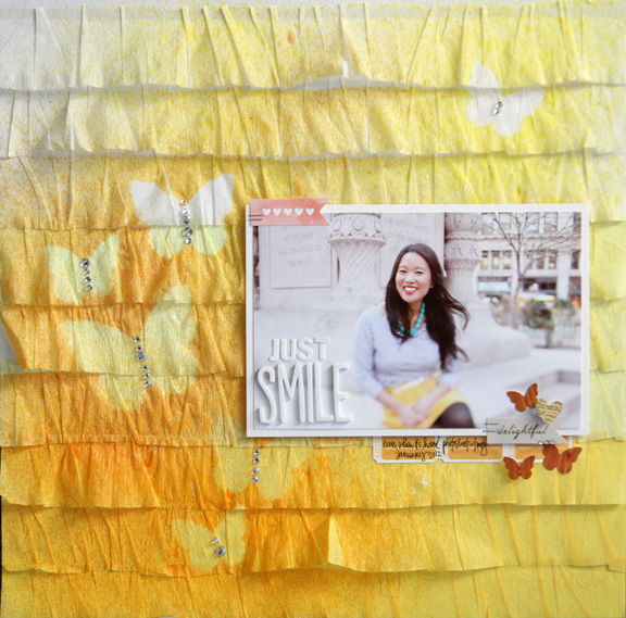
Just Smile by Kelly Purkey | Supplies: Ruffle Paper: American Crafts Stickers: American Crafts, Studio Calico, Bazzill Masks: Studio Calico; Mist: Studio Calico; Jewels: Hero Arts; Stapler: Tim Holtz for Ranger
[hr]
The beauty of digital stencil is that it’s easily turned into a mask. Select the openings for applying brushwork and you’ve got a stencil. Select the inverse of those openings and you’ve got a mask. When making the background on “Peace, Love & Ice Cream” Debbie Hodge used a burst stencil by Audrey Neal, selecting the area surrounding the openings rather than the openings and applying digital “mist” to that surrounding area.
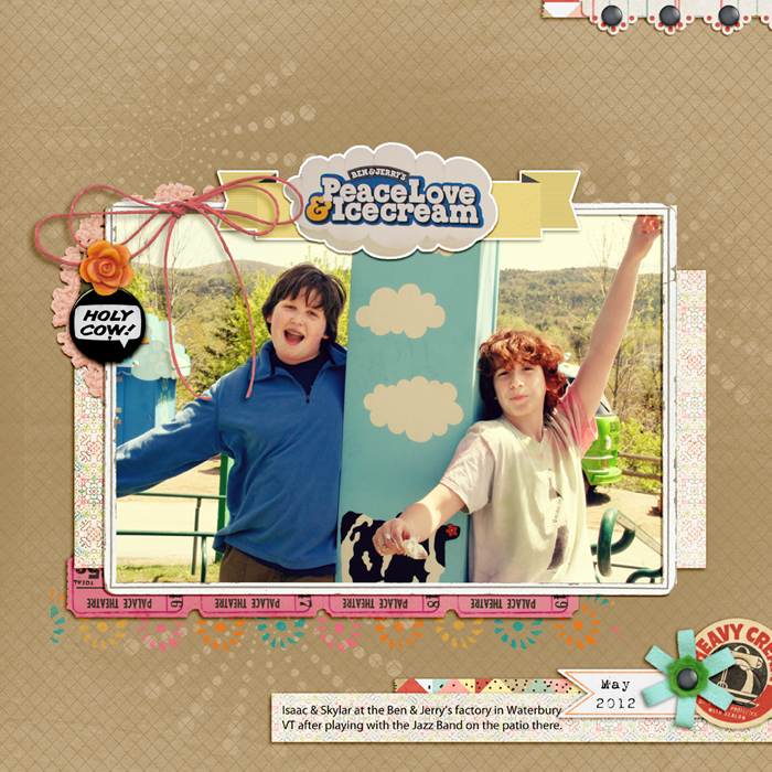
Peace Love & Ice Cream by Debbie Hodge | Supplies: Love You More than Ice Cream by Jenn Barrette; Flair Box 3 by Paula Kesselring; Brad Bonanza 3 by Pattie Knox; Retro Spring by Reverie Atelier; Artistry de Blanco by Katie Pertiet; Ancienne Vivid by Quirky Twerp; Chevron Knockout by Splendid Fins (mist brush only); Seethroughs No 2 by Audrey Neal (burst stencil) Myriad Pro, 1942 Report fonts.
[current]

