Use trees to represent the literal trees in your photo or story or to support themes like life, growth, and strength.
Use trees on your scrapbook pages to set the scene for your story, to reinforce your page’s theme, and even to convey meaning.
A little bit about trees
- Trees are the longest living organisms on Earth.
- The tallest tree in the country lives in the Redwood National Forest; it is 369 feet tall and over 2000 years old.
- A single tree produces enough oxygen to sustain a family of four over a year’s time.
- An Ada tree growing in Australia has a root system that spans more than an acre.
- Tree rings are used to calculate the age of trees, but also offer scientists important information about volcanic eruptions and other natural disasters throughout history.
- The seeds from the Cottonwood tree can stay in flight for several days.
- 30-35 million real Christmas trees are sold in the United States each year.
- The height of a tree is recorded by climbing it and measuring from its spire to the ground.
- Depending on species and age a healthy tree can have upwards of 200,000 leaves.
Ideas for using trees on your scrapbook pages
Extend the tree-filled scene in your photo onto the canvas.
Sara Gleason constructed the perfect backdrop for the story behind her page “Tree Lined Memories” using a variety of tree and nature-inspired elements. Her embellishments extend the details in the photos onto the surrounding canvas. And arranging them in a tight focal cluster pulls the viewer into the scene.
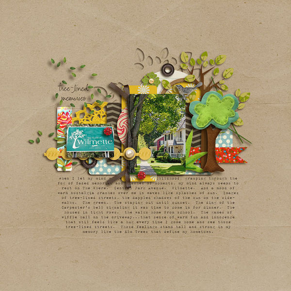
Tree Lined by Sara Gleason | Supplies used: Grandma’s Dresser and Whispers: Nature by Sahlin Studio; Build Your Own Tree by Amy Wolff; Walk With Me by Kaye Winiecki; fonts: 1942 Report and CK Ali’s Hand
Use a tree-patterned paper.
Anna Aspnes shows you how to embrace the idea of a busy tree patterned paper in “The Tree” by using it as the background for a nearly-photo-filled page. Anna chose a pattern with low density which makes it feel lighter on the page. The silhouette of the tree in the patterned paper is the same as that in her photos which adds unity.
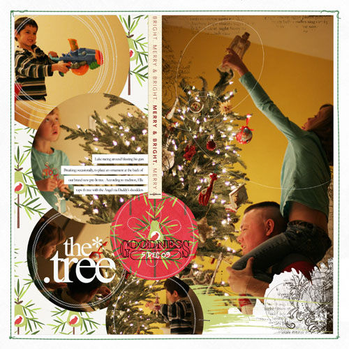
The Tree by Anna Aspnes | Supplies: Supplies: Pattie Knox: SpeedByte Layered Template No. 146 (rotated 90 degrees and switched up a bit); Andrea Victoria: Joyeaux Noel Solids (white background), Pear Tree Paper Pack; Anna Aspnes: Xmas WordART No. 4, 12X12 Xmas ScriptTease Overlays No. 1, Stitched by Anna Borders Evergreen No. 1, Different Strokes No. 3 BrushSet, LoopDaLoop ArtStrokes No. 2 BrushSet; Ali Edwards: Christmas Twill Strips; Katie Pertiet: Ledger Holidays Brushes and Stamps
Render your journaling in the shape of a tree.
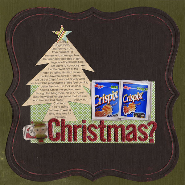
Paula Gilarde establishes a clear sense of theme in her page “Christmas?” by using Photoshop to create a tree-shaped text path for her journaling. This fun effect complements the colors and other themed elements on the page perfectly while adding just the right amount of novelty to the funny story Paula tells.
Use a stamped tree as your foundation.
On “Olive You” an over-sized digital tree stamp is the first layer and starting point for my page. The tree motif not only reinforces the fall theme of my page but also establishes a vertical shelf for showcasing my photo and embellishments.
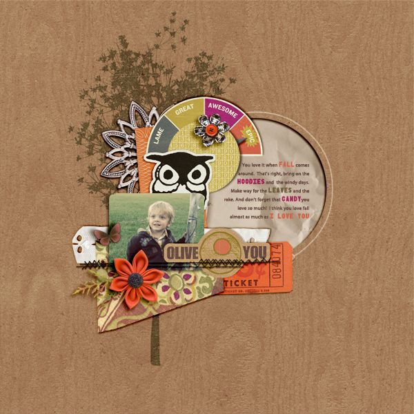
Olive You by Amy Kingsford | Supplies: Autumn Moon by Krista Sahlin, Fallish by Aja Abney, Epic by OLB, Biograffiti and Paislee Press, Westover by One Little Bird and Forget Me Not by Anna Aspnes.
Reinforce a visual triangle with subtle tree stamps.
Debbie Hodge stamped the same tree in three spots on “It’s Either Badminton or Tree Felling” to back up the three points of the visual triangle framing her page elements. The motif supports and adds repetitions to the funny story she tells.
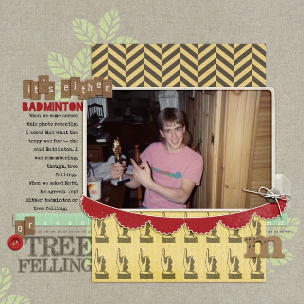
It’s Either Badminton or Tree Felling by Debbie Hodge | Supplies: This Is My Story by Little Butterfly Wings; Daydreamer by Mari Kogelenberg; Storyteller Alpha by Amanda Heimann; Vintage Frames 26, Vintage Charm Chipboard Stickers, New Growth 5, Out of a Box ALpha, Academic Sanded Alpha by Katie Pertiet; Tidbits alpha by One Little Bird; Blackout font
Make a mixed-media tree.
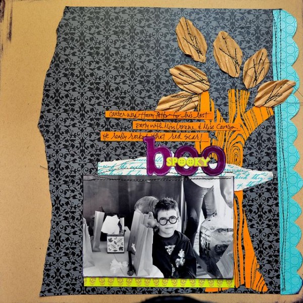
Dina Wakley adds to the bold and funky vibe of “Spooky Boo” with a mixed-media tree. She cut the trunk from a wood grain overlay and the leaves from corrugated cardboard . The stitching replicates branches while contributing to the tree’s already rich texture.
Add a “tree-lined” border.
Kayleigh Wiles used a collection of whimsical tree stamps to add a watermarked border along the bottom of “Three Months.” The border adds to the soft, springtime feel of the layout. The trees represent the idea of growth rather than repeating any explicit trees in the photos or story.

Three Months by Kayleigh Wiles | Supplies: Katie Pertiet: New Growth Brushes No. 5, File Cards No. 02, These Legs Layered Template (altered), Postage Strip Words No. 01, Basic Gingham Ribbons, No. 01 Cut-Ups: Baby Collection (re-coloured), Little Round Tabs Assorted, Tapes No. 03, Splatters No. 02 Brushes and Stamps; Michelle Martin: Colbie Solids Paper Pack; Andrea Victoria: Ghouls Night Out Paper Pack; Rob and Bob Studios: Modern Nature: Butterfly Rub Ons; Ali Edwards: Pregnancy Hand Drawn Brushes; Anna Aspnes: Stitched by Anna White No. 02, Complete Stitched Alpha Collection No. 01, CurvyCorner Stitched Blocks No. 02; Lynn Grieveson: Worn Page Edges
Frame your page with “fussy-cut” tree branches.
Michelle Houghton framed both her photo and this page with two clusters of tree branches cut from patterned paper with a craft knife. When used in small doses, busy tree-patterned paper can add just the right touch.
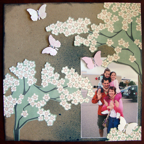
Family Photo by Michelle Houghton | Supplies: Ink – Tsukineko Spray Ink – Tattered Angles Butterflies – Jenni Bowlin Studio Cardstock – Kraft, Patterned Paper (Unknown).
Make a scrapbook page all about trees.
Melanie Grimes pays homage to the tree in every aspect of her design on “Go Climb a Tree.” From the wood-grain background to the beautiful photo, word-art title, border, and, finally, realistic tree accents, every detail here taps into our associations with trees.
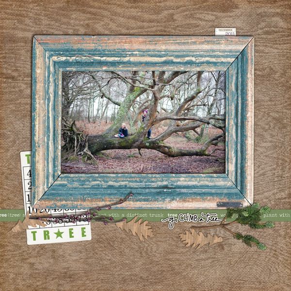
Go Climb a Tree by Melanie Grimes | Supplies: Katie Pertiet -Square date spots date spots No. 1, krafty cuts leaves, twill definitions No. 3, Christmas memories Kit branch {recoloured} Santa land kit fir branch, Game cards holiday, working woods papers, weathered wood word strips No. 1, My baby kit frame, Ali edwards ‘go outside’ word art
[akingsford]
[designclass]

