by Debbie Hodge
Most of my 4×6 photos straight out of the envelope can be—and even need to be–cropped. To get clean designs that go together quickly, I always look for uniform cropping opportunities.
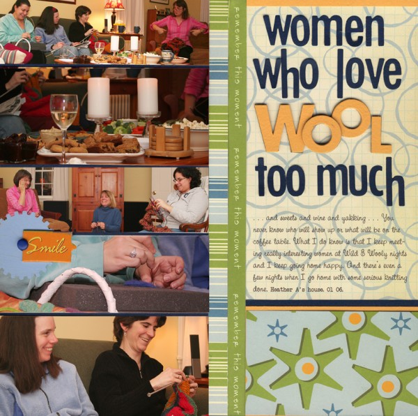
Crop for Columns: “Women Who Love Wool too Much”
The photos I took from this evening of knitting all had a landscape orientation, and they had background that didn’t add interesting detail. I kept the 6″ width of the photos, and trimmed them to varying heights so they could be mounted in a tidy column that left room for a fun title and journaling on the other side of the page.

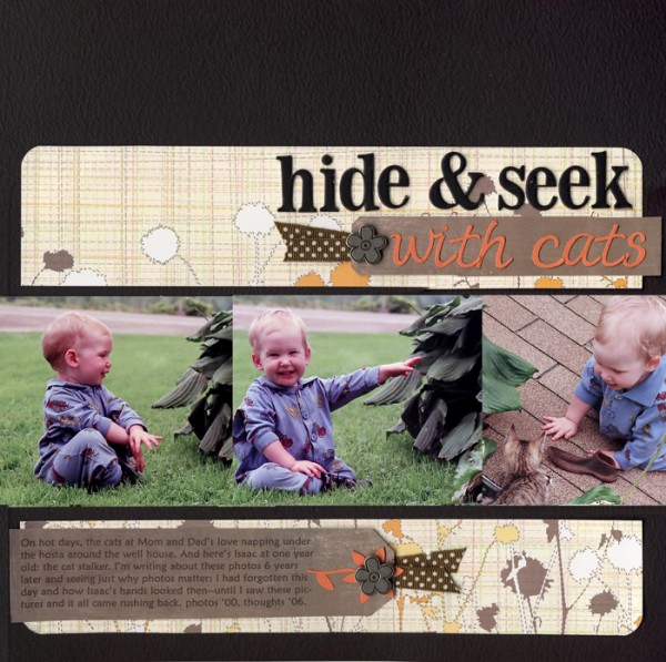
Crop for Rows: “Hide & Seek with Cats”
The 4″ height of the three photos in this layout works well. I trimmed away width so that they would fit in one row that echoes the story’s chronology of events. The photos abut each other and bleed off each side.

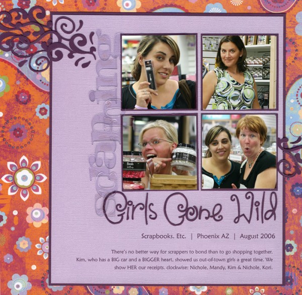
Punch out Squares: “Scrapping Girls Gone Wild”
When I looked through the photos from this shopping trip, I discovered that my friends’ faces were what I really wanted to emphasize. A square punch was the perfect way to get close-up and uniformly-cropped photos. Cropping away so much of a 4×6 photo seems a bit drastic, but there are times it results in photos with the perfect focus.


