by Debbie Hodge
Memory keeping is about preserving and presenting photos in ways that tell your stories. When you can do that clearly and with appeal you’ve got a page to love.
Challenge yourself to tell a story by blurring the line between where the photo ends and canvas begins.
Here are 5 ways to create this kind of page.
(Note: all of these layouts have been a part of past or current issues of Masterful Scrapbook Design, a membership series in which scrapbook page designers show you their tried techniques so you can apply them to your pages.)
1. Extend an element from the photo to the canvas
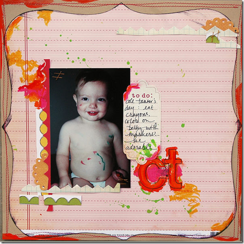
Dina Wakley scrapbooked this early photo of her son (who had drawn on himself with colored markers) by using markers, herself. She colored a descending diagonal of orange, pink, and yellow moving into the top left corner of the photo and then out at bottom right. (Dina talked about making this page and several others in a recent interview for the June, 2011 issue of Masterful Scrapbook Design now available in video and audio recordings.)
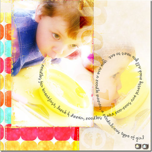
Anna Aspnes scrapbooked her son’s love of noodles with a noodle-inspired loop of journaling that begins on the photo and then continues out onto the canvas. The low contrast between her background canvas and photo contribute to the feeling that photo and canvas are one. (Anna talked about finding inspiration from everyday shapes – like the loop of a noodle – in the April, 2011 issue of Masterful Scrapbook Design.)
2. Layer contextual embellishments with your photo
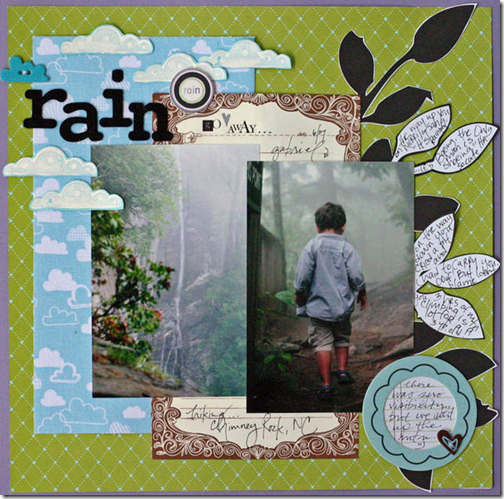
Doris Sander’s layering on “Rain” results in a page that is a masterful evocation of a rainy forest hike. The layering of the two photos creates a dimensional scene. Placing clouds on top of the photos and cut-out leaves beneath contribute to the sense of canvas, photos, and page elements as one rainy scene. (This layout was a part of Doris’ contribution to the February, 2011 issue of Masterful Scrapbook Design.)
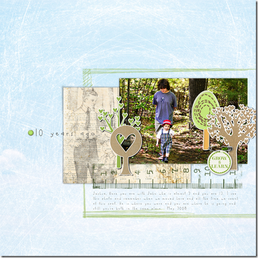
This layout, “10 years ago” that I made several years ago continues to be one of my favorites. I layered whimiscal tree embellishments onto a photo of my son and our neighbor, 10 years younger, walking together in the woods. They not only evoke the scene they represent growth and continuity.
3. Choose or create a canvas that supports photo context
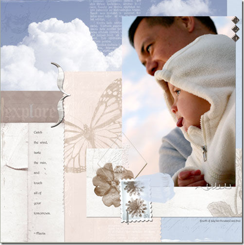
Several elements contribute to the sense of the photo on this page by Anna Aspnes merging with her canvas. The angle of the photo, its crop, and its placement begin this feeling. Its placement on a canvas of blue clouds solidifies the feeling, merging the blue, cloud-filled sky in Anna’s photo with the blue-sky, cloud-filled page canvas.
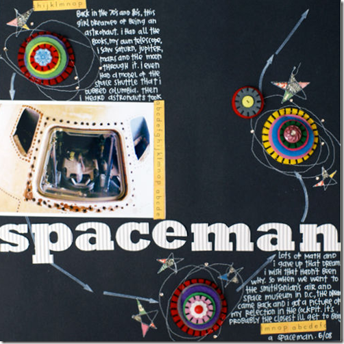
Emily Pitts showcased her photo from the Smithosonian’s Air and Space museum on a black canvas turned into outer-space scene by adding stitching, doodling, and felt-flowers stacked and turned into planets. (Emily shared this page in the May, 2011 issue of Masterful Scrapbook Design on “stash-busting,” noting that flowers can be turned into something completely different when presented in the right context.)
4. Layer the same photo at differing opacities
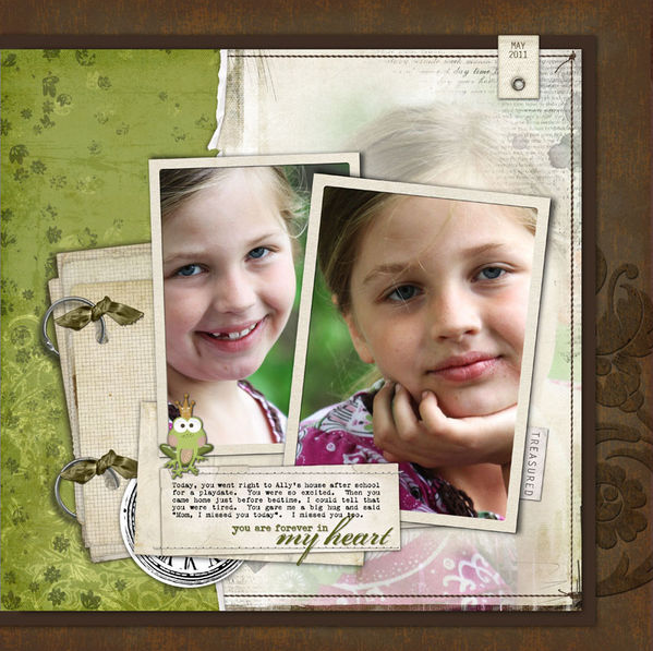
Jana Morton used a technique she calls “spilling” on “My Heart.” She’s framed a close-up photo of her daughter and tilted the frame. Notice, though, that backing up this photo is the same photo, uncropped and, thus, “spilling” over. This photo is blended with other elements and presented in a lower opacity. (Jana shared this layout in the June issue of Masterful Scrapbook Design – and we’ll be talking about the specifics of technique next week in a live webinar.)
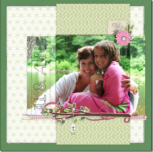
To make “Jill and Anna,” I selected a portion of my photo and layered a copy of this selection on top of the entire photo. I added drop shadows to the top photo and lowered the opacity of the lower photo.
5. Continue lines into or out of your photo
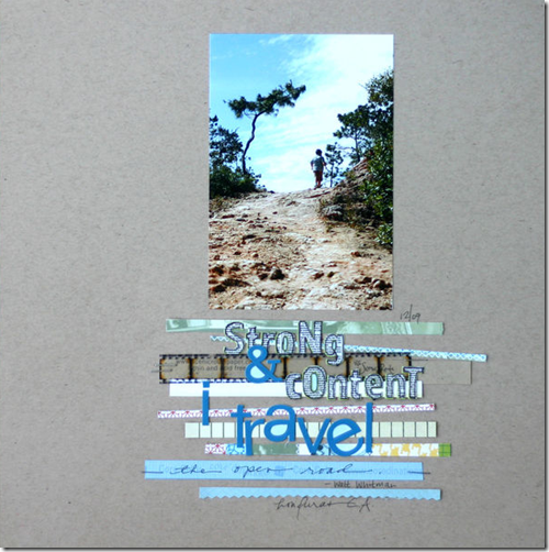
Take a look at Doris Sander’s “Strong & Content” and think about what is drawing you in to the photo. She has positioned staggered strips and title work beneath her portrait-oriented photo, and they echo the uphill winding path, guiding the eye deeper into the photo’s scene.
So what do you think? Might it be that a technique that blends canvas and photo could have a place on one or two of your scrapbook pages? Let us know if you’ve already done this or if you try it in the future. Link us up in the comments!
In-depth seminars, focused lessons, live webinars (with video & audio recordings), and annotated galleries make membership at Masterful Scrapbook Design an inspiring and instructional value. Join now and grab a discounted bundle of archived issues.

