By Dina Wakley
 I always say that one of the reasons I love art journaling is that there are no rules. Anything goes. You can do what you want. The process of putting paint on the page is more important than the finished outcome.
So, why care about composition?
I firmly believe there’s value and beauty in every art journal page. Every. Single. One.
But…knowing the “ rules” allows you to put an extra “oomph” into your work. When you understand composition principles, you have power over them…power to arrange them, power to twist them, power to make them do what you want to convey your meaning and intent.
The principle of proximity
Let’s look at the principle of proximity to understand this. Have you ever created a page and something is just “off”? You’ve got text and images and collage, but the page doesn’t seem to be saying what you want it to say? I would put money on the idea that your “off” page may have a proximity flaw.
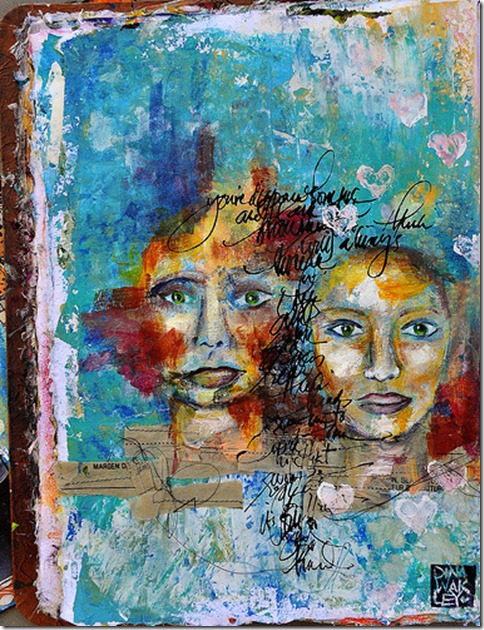
Proximity means that items that are grouped together will be perceived as belonging to each other, or as relating to each other. When elements are close to each other on a page, that closeness implies a relationship. Proximity is important because it helps us understand what we’re seeing. If the proximity is unclear, then we get confused.
Proximity is important in art journaling. By being aware of how you are placing your elements on the page, you can control meaning and better get across your page’s intent. The easiest way to create proximity is to just move your page elements closer together. That’s it. Easy, right?
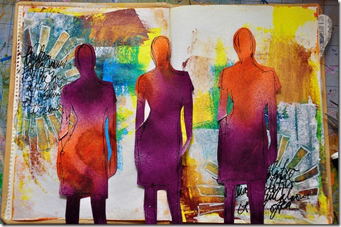
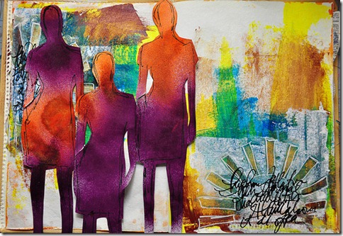
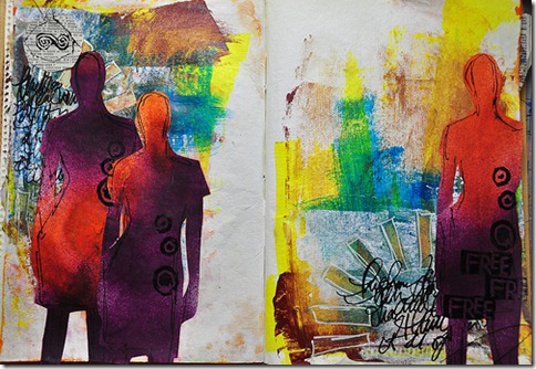
Take a look at these three art journal pages in progress. Each page tells a different story because of the way the silhouettes are grouped. Which page do you prefer? Do you see how the way that you group page element can change the meaning and feel of a page?
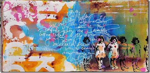
Here is a page from my art journal. I made sure all of the stamped images of the little girl were in close proximity with each other. Because they are close, you automatically infer they have a relationship with each other and you consider them as a group. How different would this page look if the girls were scattered throughout the page? How about if they were about the same place but there were more space in between them?
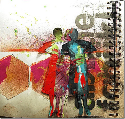
On this page, I used “Betty,” the silhouetted figure that I often teach with and have made many, many pages with. I overlapped the figures tightly and sewed on them to add some texture. The overlapped figures have a strong bond, and they impart meaning to the page because of their close proximity.
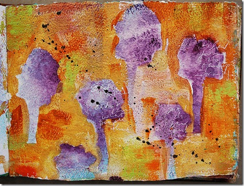
On this page, the trees are scattered almost equally across the page. The page has a feel almost like patterned paper because of the spacing. Imagine if the trees were grouped in a single row at the bottom of the page. What story would the page tell then?
Try playing with proximity on your journal pages. Pay attention to how meaning and feel change depending on how you arrange your page elements. Experiment, play, and most of all…have fun!
[lovejournaling][dwakley]

