By Dina Wakley
Sometimes looking at a blank sheet of cardstock is paralyzing. When I have “scrapbook block,” I love to take a pristine sheet of cardstock and swipe paint or ink on it. I call this paint or ink a “color field.” This color field counts as my starting layer or foundation. I build my layout on the color field, letting bits of the color field peek through and provide visual interest. Here are some examples and things to try:
1. Swipe color in a rectangle in the middle of the page.
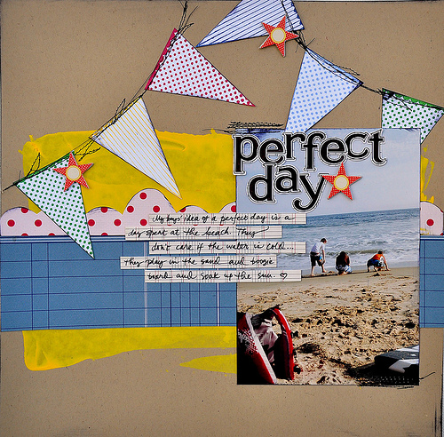
On this layout, I used a palette knife to create a large yellow rectangle of paint, right in the middle of the cardstock. When the paint dried, I layered on the large strips of patterned paper, the photograph, and the banner flags. The yellow paint gives a pop of color and is a good solid foundation for the rest of the page.
2. Use water-soluble spray ink to create a watery background.
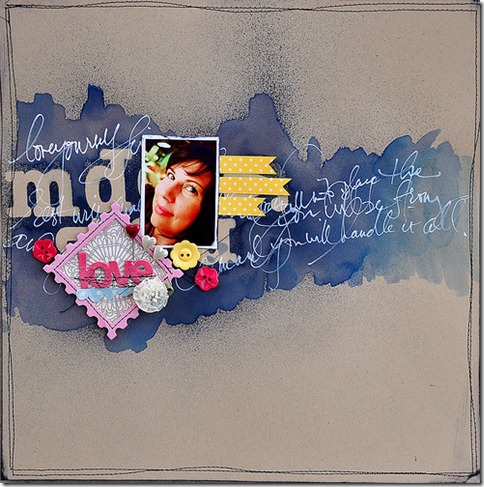 For this page, I put some left-over letter stickers on the cardstock and sprayed over it with water-soluble spray ink (such as Tim Holtz Adirondack Color Wash or Jenni Bowlin reinkers in a Mini Mister). After I sprayed over the letters, I removed them. Then I took a wet paintbrush and ran it over the ink to dissolve it and make it look flowy and watery. I added a photograph and other embellishments, and I was done!
3. Use paint to continue a thematic idea.
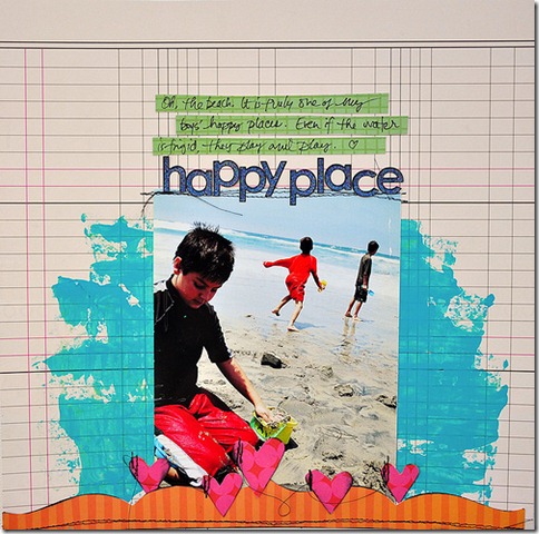 On this beach page, I started with some turquoise paint on the patterned paper. The turquoise paint echoes the idea of water, and even seems to extend the water that is in the photograph. Try using paint to emulate a blue sky, or green grass.
4. Use paint to tone down busy background paper, and as a journaling block.
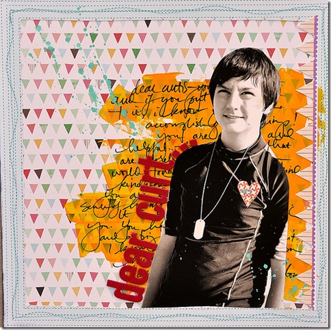 For this page, I used a broad color field of orange paint right on the patterned paper. This solid color field tones down the busy background. I decided to write my journaling right on the dried paint, too. I layered my photo over the journaling. The result is an art-journaling look, and it’s super simple to create.
5. Paint over page elements.
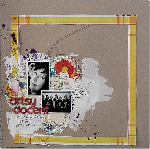 For this page, I started with the large frame, circular paper accents, and stitching. Then I took a palette knife and some white gesso and wiped some gesso right onto the page. I made sure not to completely cover the patterned paper and the stitching, but I did want it to be partially covered. When the paint dried, I added my photos and title.
6. Create an interesting inky texture.
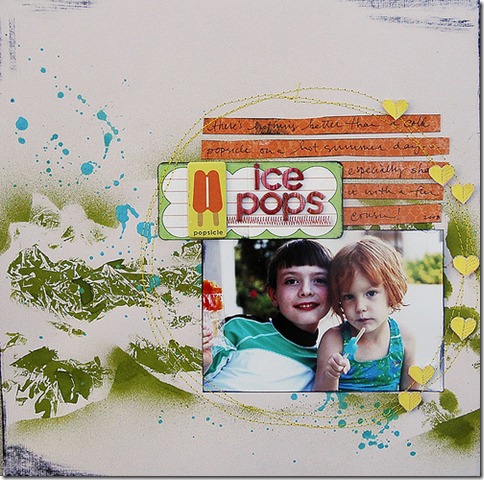 For this page, I created an interesting background texture with Lettuce Adirondack ink and regular white tissue paper. I crumpled the tissue and saturated it with ink. I pressed the tissue into the cardstock and then removed it. The result is an fun texture that reminded me a bit of the pattern on my niece’s swimsuit. The texture is quite bold, so I added a strong photo and contrasting journaling strips. The layout didn’t need much else.
When you’re stuck on how to begin a layout, try starting with an inky or a painted color field. I think you’ll love the results!
[dwakley]

