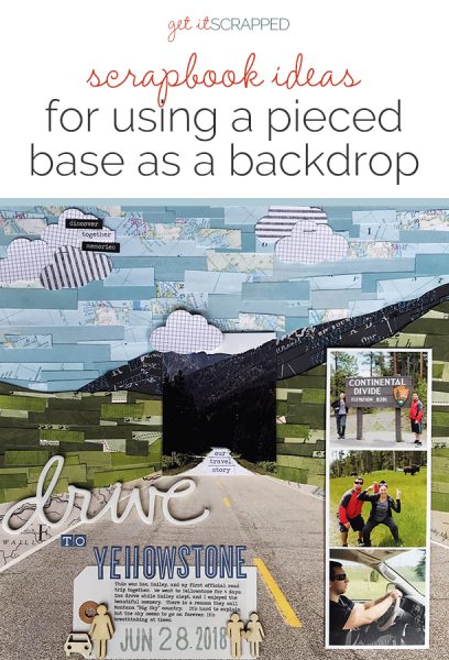
 Your scrapbook page canvas doesn’t have to be one solid piece. You can build your page’s base with blocks or strips of different papers to add instant appeal and charm.
What’s more, these blocks and strips don’t have to be used as compartments to house your page parts, instead, they can be used as a backdrop for presenting your page’s key elements.
See how our Creative Team made pages with pieced backgrounds.
[hr]
Lynn Grieveson says, “This is my daughter and my husband exploring the famous graffiti-strewn “laneways” of Melbourne, Australia.”
“I created a background of patchwork type shapes plus a torn section. It suited the page and it recreated the graffiti and layers of old posters on all the walls of the laneways and the general visual overload!”
“I chose mismatched papers in a variety of contrasting colors for that reason. Deep in the laneways, the poor light and the crowds in the narrow lanes made capturing it in photos difficult but this captures the feel of them. The cream section leaves space for both title and journaling but also breathing space.”
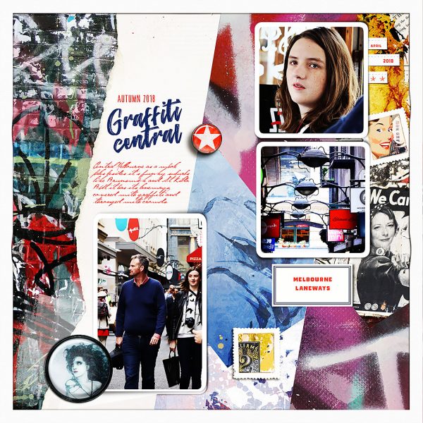
Grafitti Central by Lynn Grieveson | Supplies: Totally Trashed and Vandalised papers, Metro Spring papers, Valencia Kit, Brand New Day elements and Midnight Brooms kit from Lynn Grieveson Designs at The Lilypad. Fonts: The Conquer and Jellyka Gare de Chambord.
Shanna Hystad says, “The story of this page is about a recent road trip to Yellowstone National Park.”
“I have created a background canvas using scrapbook paper with maps printed on them. I also selected other coordinating colors and designs. The paper was cut into strips and layered on top of a large photo. I printed a duplicate of the photo and cut the center out to layer on top of the background. It was like layering on top of layers. I had a lot of fun with this technique. It did take quite a bit of time, but the results were worth the effort. I would use this approach again for special photos or stories I want to document.”
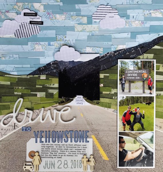
Drive to Yellowstone by Shanna Hystad | Supplies: Acrylic Title: Ali Edwards, Paper: My Mind’s Eye-By the Sea, Ella & Viv-Cobalt Blue, Carta Bella-Cowboy Country & Practically Perfect, Simple Stores-You Are Here, Reminisce-Fly Fishing, October Afternoon-True North, Letter Stickers: October Afternoon, Ink: Jenni Bowlin, Word Stickers: Tim Holtz, big date stamp: Studio Calico, wood veneer pieces
Jill Sprott says, “In creating a page to celebrate my adventurous dog’s approach to life, I wanted to pull together elements that capture his love of the outdoors, his sense of wonder, and his seemingly endless playful energy. A collage-based foundation featuring earthy colors and textures, assembled in kind of a free-form, organic way, contributes to the tone and theme of the page.”
“To create the background, I went a-hunting through my stash and trimmed paper scraps of varying sizes, using a mix of yellow and green. I placed my photo on the page in its desired location and then began to piece the collage together around that, not adhering anything until everything felt like it clicked. Because there are so many papers here, it helps to reduce the visual noise by working with busier papers in smaller portions, and simpler patterns in larger ones. Keeping colors simple is a good idea: I always take my color cues from the photos and try not to work with too many colors when creating collage-based layouts. It also helps to incorporate neutrals here and there as color “buffers” (note the presence of brown, white, and gray among the bolder yellow and green papers).”
“Once the collage background was assembled, I added accents and the title, keeping the accents to a minimum, and placed the journaling over the page in such a way that it functions as an additional piece of the collage. A little adhesive and a little stitching, and the page was done.”
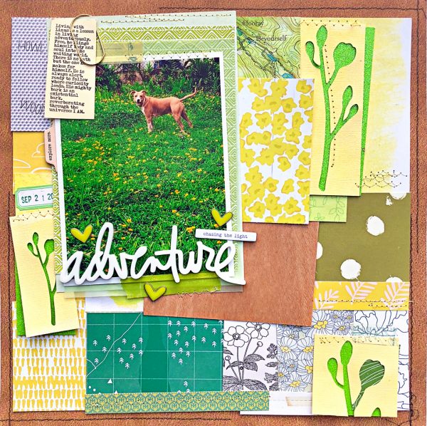
“Adventure” by Jill Sprott | Supplies: Patterned Paper: BasicGrey, Bella Blvd, Crate Paper, Hip Kit Club, KI Memories, October Afternoon, Scraptastic Club, Studio Calico, Studio Tekturek; Specialty Paper: Doodlebug (glitter), Studio Calico (wood veneer); Acrylic Word: Ali Edwards; Chipboard: Ali Edwards; Metal Hearts: Freckled Fawn; Clip: American Crafts; Die Cuts: Hip Kit Club.
Deborah Wagner says, “My sister, niece and I went wedding dress shopping together. To create a soft, romantic backdrop for the photos, I layered brushes, transfers, and overlays. Also, a photo of our champagne was blended into the background.”
“Adding many brush layers keeps the collage background looking delicate and velvety. And to ensure a seamless look, I added a light pink color fill layer to the top of the layers palette and set it to Hard Light at 47% opacity.”
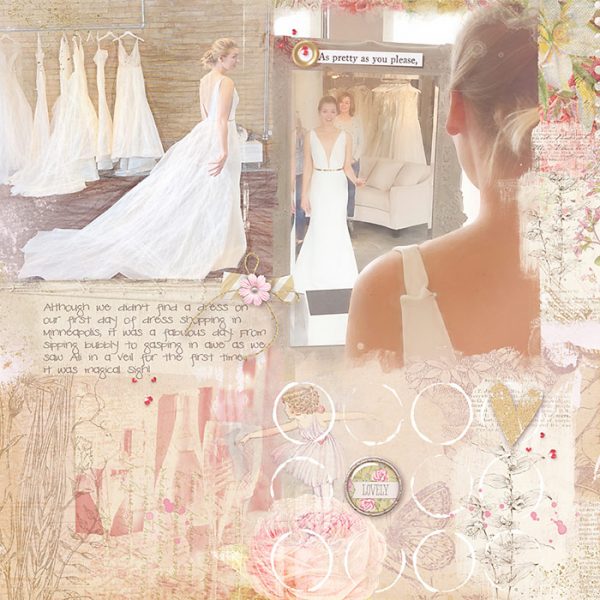
Dress Shopping by Deborah Wagner | Supplies: Katie Pertiet – Blendable Layered Template No. 1, Adventuring Kit, Delmar Shores Kit, Golden Essentials No. 1, Vintage Blendable Fairies No. 1, Blendable Journalers No. 1, Viintage Blendables No 3, No, 21 & No. 23, Leyton Kit, Hidden Meadows Kit, Border Stamps ‘n Layers No. 3, Art Class Brushes, Garden District Kit, Stample Blocks No. 7
Hannah Lemieux says, “The story behind this photo is really about the little things in life. I love to go on photo walks in my yard, around my neighborhood. These shots often are saturated in color and detail: things I enjoy and love to add to my layouts. It is all about the details in life that my days brighter. I love how I can take something I took a picture of that is visually appealing and link it to a story, like spending time with my dog. This photo is of a stump in my yard that I stand on all the time to play with my dog. It’s nothing amazing but I use this stump multiple times a day. In the winter when it’s often really rainy and wet it grows mushrooms. They look cool especially through the lens of my camera.”
“I really wanted to use strips of paper on top of each other. I have done this before but in the middle of the layout. I thought it would be fun to try lining them up on the sides. To help it tie in with my style and my page I picked my photo first. I used colors that were in my photo to pick out the patterned paper strips and mixed media. I added lots of mixed media to help tie them together, which really helps when you use papers from different collections and companies. Because of the size of my photo, the design is a bit unusual. I actually thought about switching to a smaller photo, so it didn’t cover up the strips of paper on the sides. In the end, I choose to use the bigger picture and be OK with it covering some of the strips and let it be a top-heavy design. this allowed me to have lots of open white space on the patterned paper for journaling.”
“There was lots of prep work for this layout. I used gesso on all the strips of patterned paper that I cut into different sizes. I also added paint on them random places. I used colors that were in the photo. I also added a small amount of texture paste with a stencil on the strips. These strips were then sewn onto my background. I added different types of stitching to add texture and uniqueness to my layout. this is the fun part of a collage type of background. it can be all about placing what looks good and unique together. I also added die cuts like tickets and tags among the stripped layers for different lines which create shadows. I used lots of mixed media supplies and my sewing machine made the stitching perfect.”
“I have used this approach of adding pieces of patterned paper to the background many time. It helps to have an idea of your approach first. This collage look could be done in different ways, like a grid style, or something that looks like a quilt pattern, or even strips (like I did). Planning it out first on scratch paper helps when you go to place down your papers especially when you use squares or an actual pattern. This also helps you have an idea of the design you would want to use after you have the pieces placed on the background. Do you want to cover your collage work? Do you want to use it in the overall design? Thinking this through helps so you won’t fight with the collage work you placed down. In the case of my layout, I think I would have actually used a smaller photo (same photo as I actually used) so more of the strips showed, and I could of used my photo at the bottom and left more white space at the top. This collage style is a really fun style to use on the background because all the ways you can use it in.”
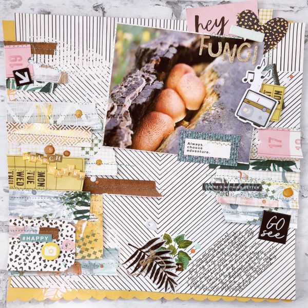
Fungi by Hannah Lemieux | Supplies: White Liquitex Gesso, White Texture Paste, Shimmerz: Sunflower, So Sappy, When Skies are Grey, Dazzlerz- leafy Greens and Pasteez-Salt to the Earth, Felicity Jane Colored Patterned Paper, Henley epoxy dots and Summer themed chipboard Stickers, Crate Paper Wild Heart-Patterned Paper, stickers, diecuts, Maggie Holmes Flourish- Block alpha stickers, patterned paper, Crate Paper Here and There puffy stickers, One Canoe Two Twilight- patterned paper and diecuts, Twine, and thread.

