 During the summer, chances are you’re going to attend a party or two.
Whether it’s a family reunion or a pool party, a big 4th of July barbecue or even a wedding party, you may be leaving these events with plenty of photos of people, food, decorations, activities–and so many stories to tell.
Let’s commit to capturing the essence of a party on the page. Our team’s pages here give you a route to that creativity.
Shanna Hystad says, “This page is about the back-yard luau we threw for my Dad last summer. Since we knew we couldn’t get him to Hawaii, we decided to bring Hawaii to him.”
“For this story, the party preparations were just as important as the party itself. I had so many photos that I wanted to include and needed to come up with a creative way to fit them on the page. Believe it or not, I was able to fit 21 photos on this page by making two mini flip albums. I carried the Hawaiian theme on the page layout by including tropical papers and embellishments.”
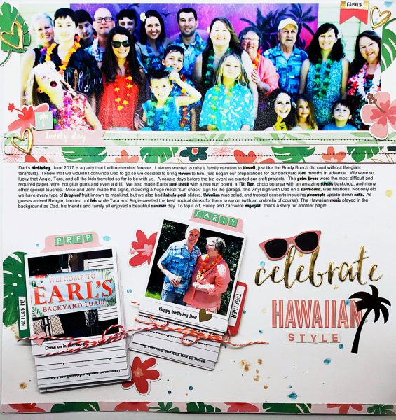
Celebrate Hawaiian Style by Shanna Hystad | Supplies: Paper: My Minds Eye, Gold Word: Crate Paper, Pink Letters: October Afternoon, Green Letters: Websters Pages, Small Words: Jasmine Jones, Embellishments: My Minds Eye, Mists & Distress Ink:Ranger
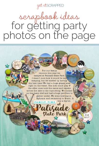
Lynnette Wilkins says, “This page documents a summer family reunion: three days spent camping and playing together at a local state park. My big family gets together every summer, and it’s always a highlight for everyone. The kids have lots of cousins to play with and we always make a lot of memories.”
“I knew I wanted to showcase a lot of photos from the event, and normally my go-to approach for that is to make pocket pages. But for this, I stepped outside my usual and opted for a design that’s quite the opposite: circles. Since I wanted to also include journaling and a title, I made a large circle in the middle for all my words and laid my photos around it. The circle design works well to represent family relationships that extend on and on through generations.”
“I added mostly circular elements to go along with the overall circular design. Several items reflect the outdoor aspect of this event including wood slices, oars, mountains, and camping word art.”
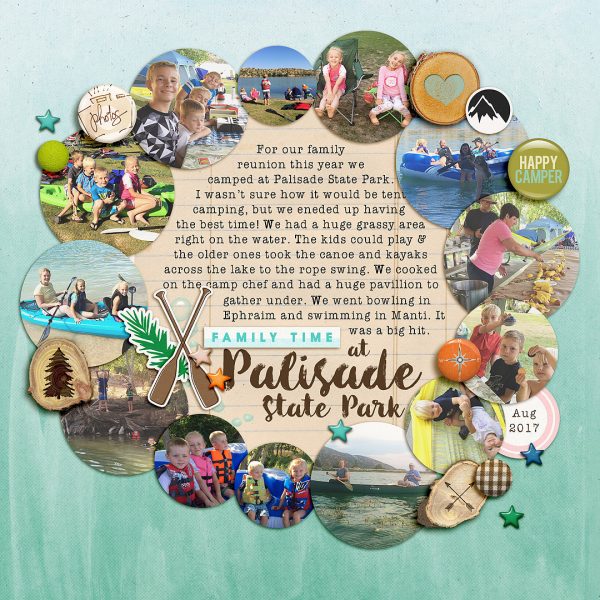
Family Time at the Palisade State Park by Lynnette Wilkins | Supplies: Real Life In Pockets: Summer Camp collection by Just Jaimee and Mommyish; Changes kit by Gennifer Bursett; Flock Together papers by Gennifer Bursett; Storyteller 2017 August – The Collection by Just Jaimee; Outdoor Adventures kit by Magical Scraps Galore; #Moments: Adventure kit by Amber Shaw
Debbie Hodge says, “One of my dearest friends had a party to celebrate her daughters and grandchildren being in town for a visit. It was a lovely summer event held in the community room of the mill building where they live.”
“I chose colors, papers and embellishments to reflect the pretty and stylish mood of the event: yellow and pink, florals and watercolor treatments. I love the watercolor flower layered behind journaling and title.”
“When it came to filling the space of the page I turned to my favorite approach for getting lots of photos onto the page: same-sized crops and themed groupings. At bottom left are three vertical portraits. At bottom right is a block of four shots of the ‘crowd.” Just above are four small squares, each featuring two people together. Notice how the one super-big full-width photo provides welcome contrast to all of these busy groupings.”
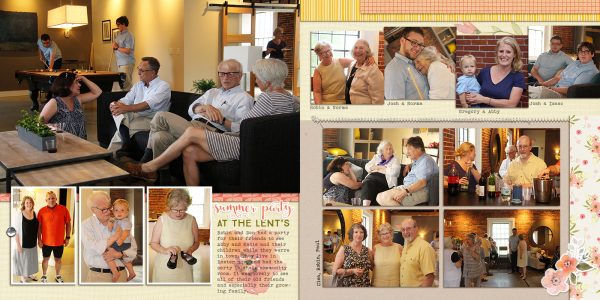
Summer Party at the Lents by Debbie Hodge | Supplies: Anita Designs; Just Linens 1 by Michelle Martin; Stitched by Anna White by Anna Aspnes; Safina Script, True North, Bohemian Typewriter fonts
Cara Vincens says, “My son’s birthday falls on Canada Day, and last year we celebrated 150 years! We had a Canada-lumberjack theme for his big party, complete with a black-and-red checkered stump cake and decorations that took me weeks to prepare. The party was really fun and went off without a hitch . . . almost. We were so excited to cut into the checkered cake that we forgot to sing Happy Birthday first. Don’t worry we did it after we cut into it.”
“There were lots of great little stories like this one and I peppered the journaling around the page to show how full and fun the day was. There’s not too much white space on the page, and that also helps reinforce the full awesomeness of the day: there wasn’t a lot of empty space in the day.”
“I still had the maple leaf garland that I made, so I trimmed off a bit and added that to my page. I also had lumberjack and birch tree papers so I punched them in circles to mimic one of the other garlands. These alone looked festive enough, but were quite dark and didn’t quite represent the sparkly happiness of the day. I added sequins and glittery enamel dots to brighten things up. Along with other gold elements, thread bunches, and twirly baker’s twine, the page really has a lot more of the energy from the day.”
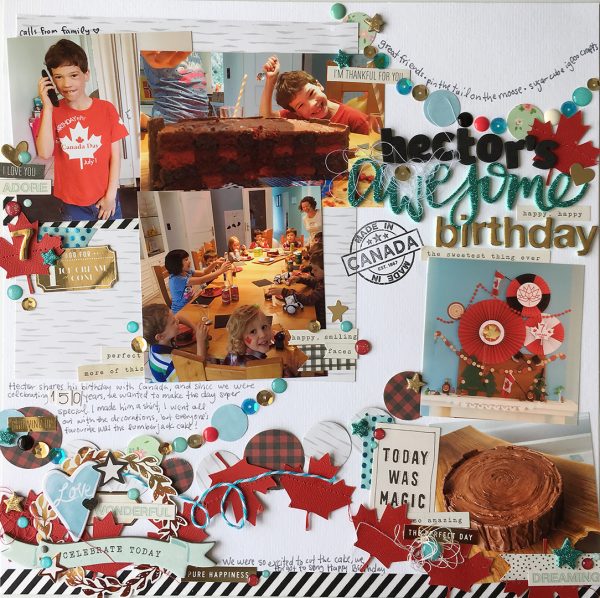
Hector’s Awesome Birthday by Cara Vincens | Supplies: cardstock-Bazzil; patterned papers-Simple Stories,Hip Kit Club, Crate Paper; stamp-Scrapbook and Cards Today; stickers and chipboard-Maggie Holmes for Crate Paper; Letter stickers and phrase-Thickers; enamel dots-Doodlebug; sequins-Pink Paislee; washi-MT
Ronnie Crowley says, “My daughter recently got married, and these are photos from her bachelorette party. Although I didn’t get to go to the party, I had a hand in arranging it for them, so it was enjoyable to see the pictures of them all having fun.”
“Both my daughter and her maid of honor are big list writers, so I went with lists to tell the story of some of the preparations that went into making it a great night. As the party had a Fiesta theme, I wanted the layout to be fun and bright to match. The addition of bright floral and paint elements pulled the page together and gave me the young high energy feel I was looking for.”
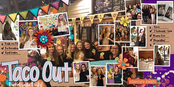
Taco Out by Ronnie Crowley | Supplies: Ronnie Crowley: Party Supplies; Bella Gypsy Designs: Dream Big; Yin Template – 531
Devra Hunt says, “My son graduated High School last week. We celebrated with a casual brunch party. This is a life-changing event for him as well as us, and it is an event to always remember.”
“Whenever we have a family party, my Dad and sister manage to capture the best candid photos. Each of our expressions is unique to our personality and are evident in each photo. I used bright summery colors with icons that indicate summer as well as photos such as the camera, the banner, and sunglasses.”
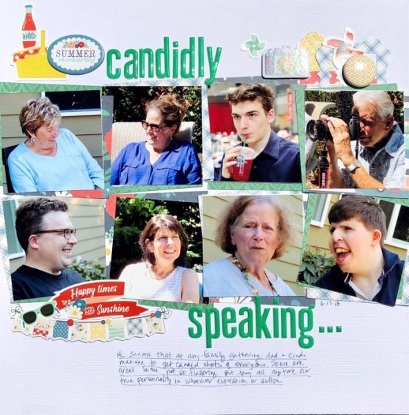
Candidly Speaking by Devra Hunt | Supplies: cardstock & alpha-American Crafts, Patterned paper, stickers, die cuts and chipboard-Echo Park, Flair-A Flair for Buttons, pen-Tombow
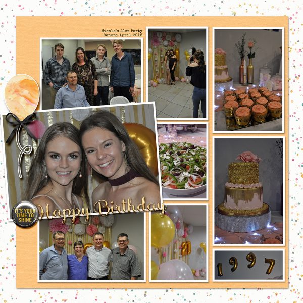
Stefanie Semple says, “When our niece turned 21, we were there to celebrate with the rest of the family. There are few occasions now that the family flies up-country to be together, this was the first occasion since Grandad Jack passed away that we had all been together.”
“I filled the background with photos and used a photo matting that matched Nicole’s rose gold theme. I added a gold and black flair for the drama and to visually anchor the focal photo, as well as adding a fun balloon to highlight the party feeling.”
Debbie Hodge says “Two days before my son’s senior year started, he had an ‘End-of-Summer Party’ that went on and on and on. His friends came and went and came and went, showing up at noon the first day and staying overnight and then through the next day right through dinner. We were so low on food by the end, they were eating all the cereal and soups and granola bars in the panty.”
“To represent the ongoing nature of the party, I arranged the photos moving horizontally across the page–and then stamped clocks along the top to suggest the passage of time. While I usually organize photos in rows and columns, grouping them by activity, this time I layered them and used a variety of sizes. Giving a few of them white mats, gave definition when one is layered on another.”
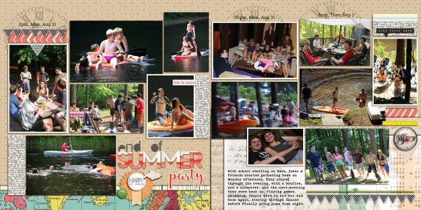
End of Summer Party by Debbie Hodge | Supplies: Happy Place by Deanna Rutter; Seize Alpha by Allison Pennington; Ordinary Special by Kaye Winiecki; Vintage Papers by Paula Kesselring; Equinox, Big Ideas, Artisan Vellum by One Little Bird; Jade by Becky Higgens; Also a Small Alpha by Allison Pennington; The Good Stuff by Amber Labau; Hello Summer by Amy WOlff; Artplay Palette Ex Libris, Stitching Lime by Anna Aspnes; Bohemian Typewriter, Roboto Slab, Safina Script fonts

