 The “dipped” look is currently popular in home décor, fashion and even in scrapbook supplies. It’s a look in which half of an item is colored differently from the other half in a way that looks like that item were half-way dipped into paint.
Dipped elements on the scrapbook page are a great tool for adding charm and contrast. See how our Creative Team put dipped elements to work on their pages–to add a whole lot of charm.
[hr]
Cara Vincens says, “I grew up in Nova Scotia, Canada,, which means New Scotland in Latin. We have a lot of Scottish traditions and cultures. It’s always been a dream of mine to visit Scotland, and-even with terrible weather-the trip we made was utterly amazing.”
“I opted for a faux dipped look, using washi tape to mask off alpha and elements tops before painting the bottom bits of my ‘dream’ letters and butterflies. I used acrylic paint and I mixed in white to get a trendy pastel look even though I had no pastel paint on hand. I used a washi that’s not too sticky so it wouldn’t tear the surface of my Thickers. You can also put the washi on your skin first to take away some of the stickiness.”
“I love this trend, it’s so sophisticated. Even though Scotland is more rugged and enchanting, the sophisticated, polished dipped look really reflects the amazing, incomparable natural beauty of Scotland.”
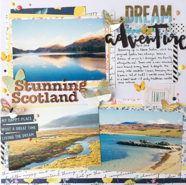
Stunning Scotland by Cara Vincens | Supplies: cardstock: Bazzill; patterned paper: Maggie Holmes for Crate Paper, Pink Fresh, Paige Evans for Pink Paislee; letter stickers and phrases: American Crafts; stickers: Paper House Productions; enamel dots: Simple Stories; die cuts and acrylic butterflies: Jen Hadfield for Pebbles Inc.; paints: Pébéo and Rayher
Hannah Lemieux says, “This picture is one I took for an inspiration piece. My paint and supplies always inspire me, and I thought it would be fun to document that. I love making layouts where I share the things that I love and enjoy doing, things that are a part of who I am, and in a pretty way. Which is why this concept of Dipped art or decor is a great one for this photo and story. Me, sharing this creative journey I am on. I love how my supplies and space really inspire me to be creative too.”
“This dipped look can be done in so many different ways, but I didn’t want to approach it in the same way I have done it before. For the main dipped part. I wanted my paint to look like it was dripping from the dipped area. I ended up having to do it twice to get the look I wanted. I took my cardstock and painted just the corner. I spritzed my painted area with water and tilted my paper and let the loose paint drip. I only wanted a few drips and still wanted the brush strokes to show, which is why I only added water. I also didn’t gesso the card stock first so the paint didn’t spread too much. I placed lots of layered embellishments along the dipped line to really showcase the two sections. I also dipped my Thickers for my title so that I have one than one type of dipped look throughout my layout.”
“To get this dipped look that looks crafty and creative I only used a paintbrush with a wider bristle. I like this homemade look with the texture in the paint. I also like to use the paintbrush so I can get a more exact and precise look because I can put the paint where I want it to go. If I dipped my paper in paint it would drip in a whole different way.”
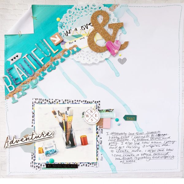
Beautiful Inspiration by Hannah Lemieux | Supplies: Acrylic paint (assorted), white card stock, Maggie Holmes Flourish Aviary Patterned Paper, Washi Tape and Thickers, Crate Paper Here and There 6×6 patterned paper pieces, puffy stickers, rub ons, chipboard stickers, and die cuts, Crate Paper Good Vibes die cuts, Larkindesign April Sweet Chicks Digital patterned paper pieces, Dear Lizzy Stay Colorful 6×6 patterned paper, Dear Lizzy Thickers, Pink Paislee Paige Evans 6×6 paper pad, SpiegelMom Scraps doily, Spiegelmom Scraps cork ampersand, My Mind’s Eye Good Vibes enamel dots, Clique Kits matte enamel dots, AC Mini gold staples.
Cynthia T. says, “This page is about the last time we decorated and the longing for my health to improve so we can do it again.”
“In digital, it is quite easy to achieve this look. I used mist-sprayed paint for the bottom of the background and some paint circles. For the light green on top of the background, I layered .png brushes. One of them is like the dripping deep green one, but I tuned it so the drip wasn’t showing on it, so it could give more emphasis to the part dripping into the title.”
“I love the dipped effect in general but it applies perfectly here as the main subject is painting. It gives the subject emphasis from the start and compliments the themed elements used.”
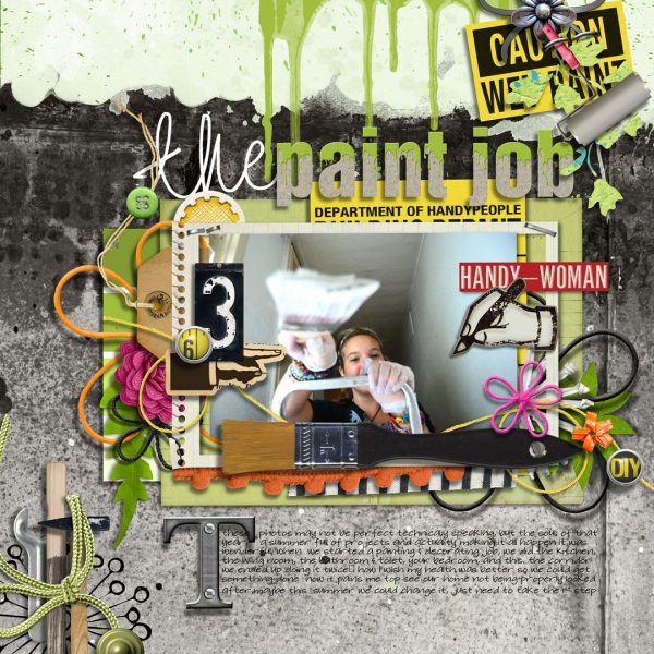
Paint Job by Cynthia T. | Supplies: Pink Reptile Designs collab with Paula Kesselring : We Are Moving, Little Butterfly Wings: Moving Time- Kim Jensen : Daisies & Dandelions, Quirky Heart : Moody Blues & Always Remember, Pink Reptile Designs : Today Elements & Do It Myself, ViVa Artistry: Drippy Paints & DIY Tags. Journaling font : SF Jubilee.
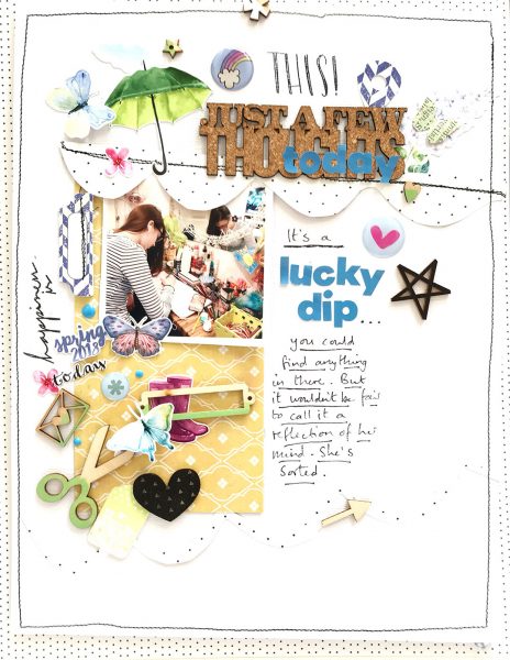
Sian Fair played with the idea of dipping into a young girl’s cluttered collection of treasures in her subject, title, and “dipped” design. The title and journaling together explain that it’s a ‘lucky dip’ into this collection where you’ll find most anything. She assures us, though, that it doesn’t reflect her mind.
To go with the dipped story, Sian has dipped three woodgrain elements into green paint. Those pieces–scissors, bookplate, and envelope–are clustered together for dipped impact. They combine with two other green spots on the page to create a visual triangle framing the photo.
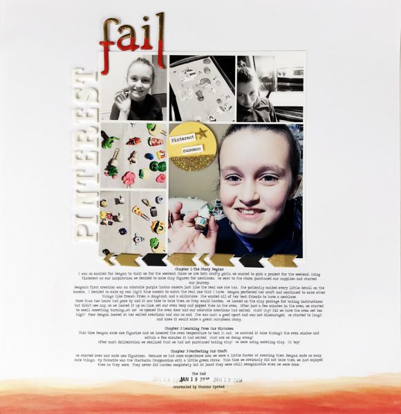
Shanna Hystad says, “This page is about a weekend crafting experiment gone wrong. I tried several dipping techniques for this layout and had my own set of ‘Pinterest fails.'”
“The first technique I tried was to dip my cardstock into orange colored water made with watercolor paint. I watched a few videos where people used fabric dye or even kool-aid (without sugar) to dye the paper. I didn’t use paper made specifically for watercolors, and my paper was too warped. In the end, I used very little water and brushed the watercolor paint on with a slightly wet brush to achieve a dipped look.”
“My next dipping method involved the gold Thickers that you see in my title. I masked off a line with painter’s tape, then embossed the bottom half of the letters.”
“Lastly, I used an embellishment and alphas dipped in gold. I made my own circle embellishment by masking off the bottom section with tape again and using glitter as the dipping medium. This dipping technique fit in perfectly with the photos I chose because they are also about learning a new crafty technique. I used black and white photos on the top with colored photos on the bottom of the layout to carry through my dipped design.”

