 In a symmetrically balanced visual design, elements on either side of a central axis (vertical or horizontal or both) mirror one another. That mirroring may be exact but can also be approximate.
Using this type of balance on a scrapbook page can strengthen a focal point placed at page center.
In the pages here our creative team members show you their use of symmetry around a focal point.
Megan Blethen says, “My youngest son and I are a lot alike. The result is we tend to butt heads a lot. I wanted this page to show that we can also have fun together and talk about the good times.”
“The focus of this layout is a cluster of two selfies we took on his school field trip last year. I started off with a scrap piece of paper and tissue paper behind the photo. To make sure the black-and-white photos to pop off the page, backed them up with colorful flowers and patterned papers that contast strongly. I don’t normally use symmetry in my layouts, and it was fun to play with this design aspect and make it work.”
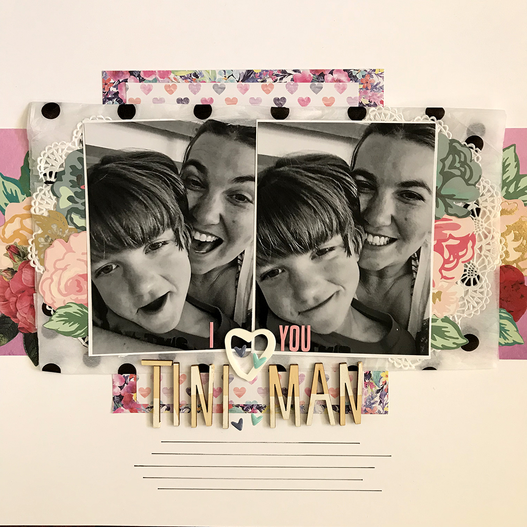
I Love You… by Meggan Blethen | Supplies: Papers: Cocoa Vanilla ‘Bohemian Dream’ Dreamer, Gypsy Heart, and Abundant, Close to my Hear White Cardstock. Embellishments: American Crafts Thickers ‘Joy’, Amy Tangerine Thickers ‘Today’, Lawn Fawn Oh Deer Me Mini Alphabet Stickers, Maggie Holmes Open Book Florals, White Doily, Polka Dot Tissue Paper.
Ronnie Crowley says, “I don’t often scrapbook pictures of myself but my husband took these during a walk that broke up a long drive. I chose two favorites and placed them to symmetrically balance each other. The large scipt words layered over each photo increase the mirroring.
“Symmetry can be hard to use but I do like its results. Remember that the symmetry doesn’t have to be perfect as long as the elements have similar visual weight.”
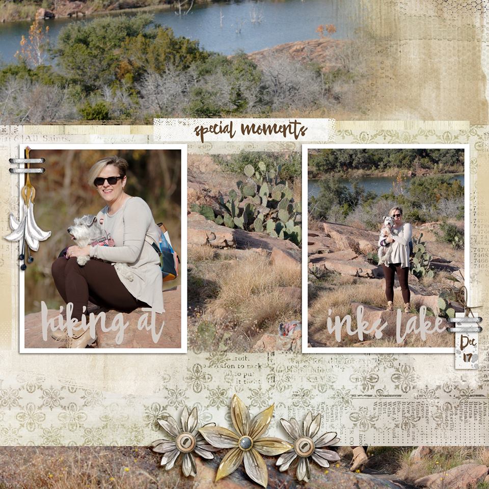
Hiking at Inks Lake by Ronnie Crowley | Supplies: Dawn Inskip – Little Things Matter and Roots; Lynn Grieveson – Woodville Album
Kelly Sroka says, “Every year, our town has a spring music festival, and these photos are from it. The band of three photographs are a focal point cluster of my page. They are placed in the middle of the page. Journaling and title are on either side. This symmetry places emphasis on the focal photos and gives the eye a place to rest around busy pictures.”
“I love symmetrical designs. I scrapbook mostly 12″ x 12″ pages because I much prefer to work within the symmetrical square design of this page size. When I design pages, I often balance several elements symmetrically then place a few items asymmetrically to give the page interest.”
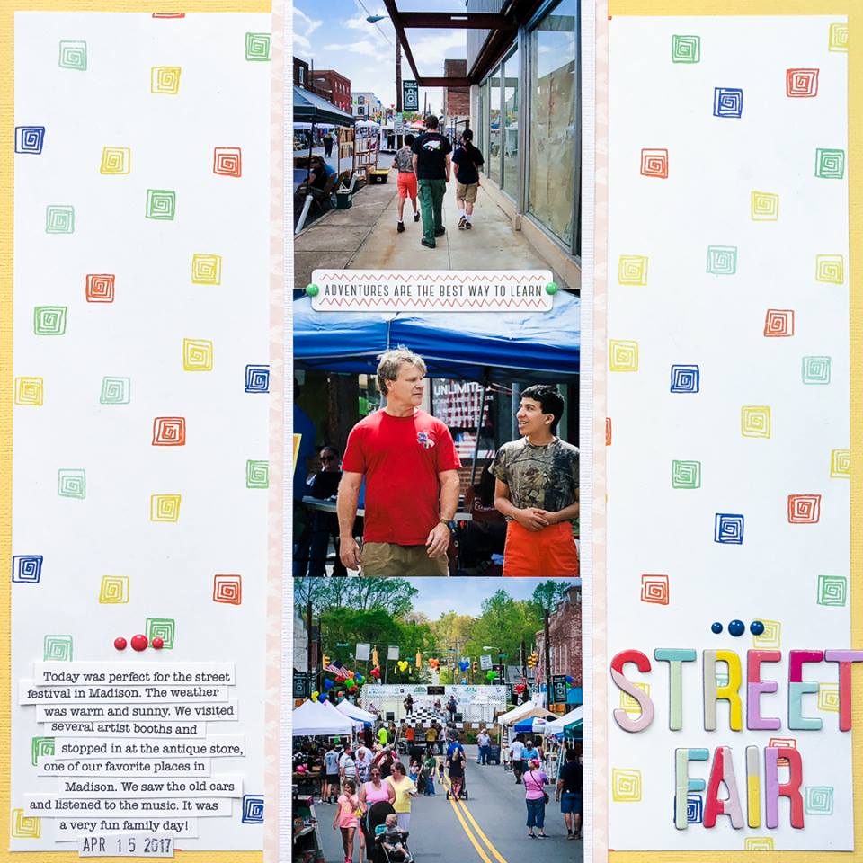
Street Fair by Kelly Sroka | Supplies: Cardstock: Bazzill, American Crafts; Patterned papers: Photo Play, Jen Hadfield; Die cut: Pinkfresh Studio; Enamel dots: Basic Grey; Letter stickers: American Crafts
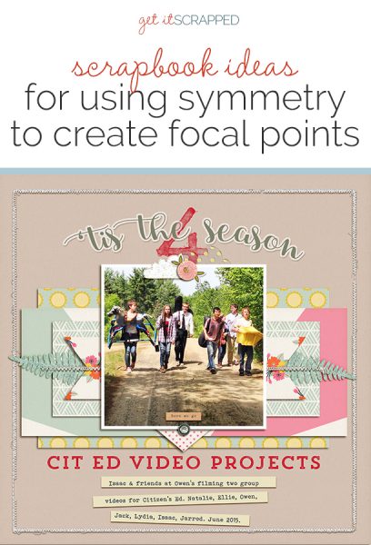
Debbie Hodge says, “This single, low-quality photo was one I took of my son and friends working on video projects all sophomores complete at the end of the school year. While the quality wasn’t great, I loved the photo and the milestone it marks. To give the page appeal, I wanted an eye-catching design, and this fun symmetrical design gave it that.”
“The design has vertical symmetry (meaning it’s mirrored on left and right sides of a central vertical line). It also tends twoard a horizontal, imperfect symmetry.”
“This is a fun way to play with papers, embellishments and type:
- Let’s start with the type: while the words and characters within them cannot have perfect symmetry, using a script font and putting the type on a curve helps.
- The vertical axis here can be unseen–or you can help it along as I’ve done with the large centered ‘4’ and the centered embellishment clusters placed above and below the photo.
- Each of the patterned papers in the layered stak are plced for both horizontal and vertical symmetry. Cutting the topmost layer to sideways banner shapes emphasizes this symmetry.
- The cut fern leaves within the layer break the symmetry purposefully. While I could have place them both curling upward, I wanted just a bit of imperfection in the mirroring.
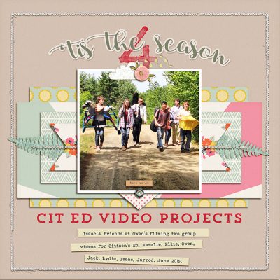
Tis the Season 4 Cit Ed Video Projects by Debbie Hodge | Supplies: Shine, Today’s Story by Laurie Ann; Journalign Strips by Katie Pertiet; Stitched by Anna Cream, Stitched Borders 2 by Ann Aspnes; Craft Market by Crate Paper; Messy Slab Alpha by Cathy Zielske; Trend Rough Slab, Bohemian Typewriter font
Marcia Fortunato says, “My layout is about a sign-making workshop that I went to with my son and daughter-in-law – a Christmas gift from them to me.”
“My focal point is the large photo in the center of my page, a posed photo with our finished signs, it worked well as the focal photo. The smaller pictures on either side of this show details of the process, supporting the center photo both physically and figuratively. I added strips along each side as a foundation for the photo block, and the title rests centered along the top of the block.”
“I don’t often use strict symmetry in my designs, but I feel that it works best with posed photos that already have some symmetry or on pages with several same-sized photos.”
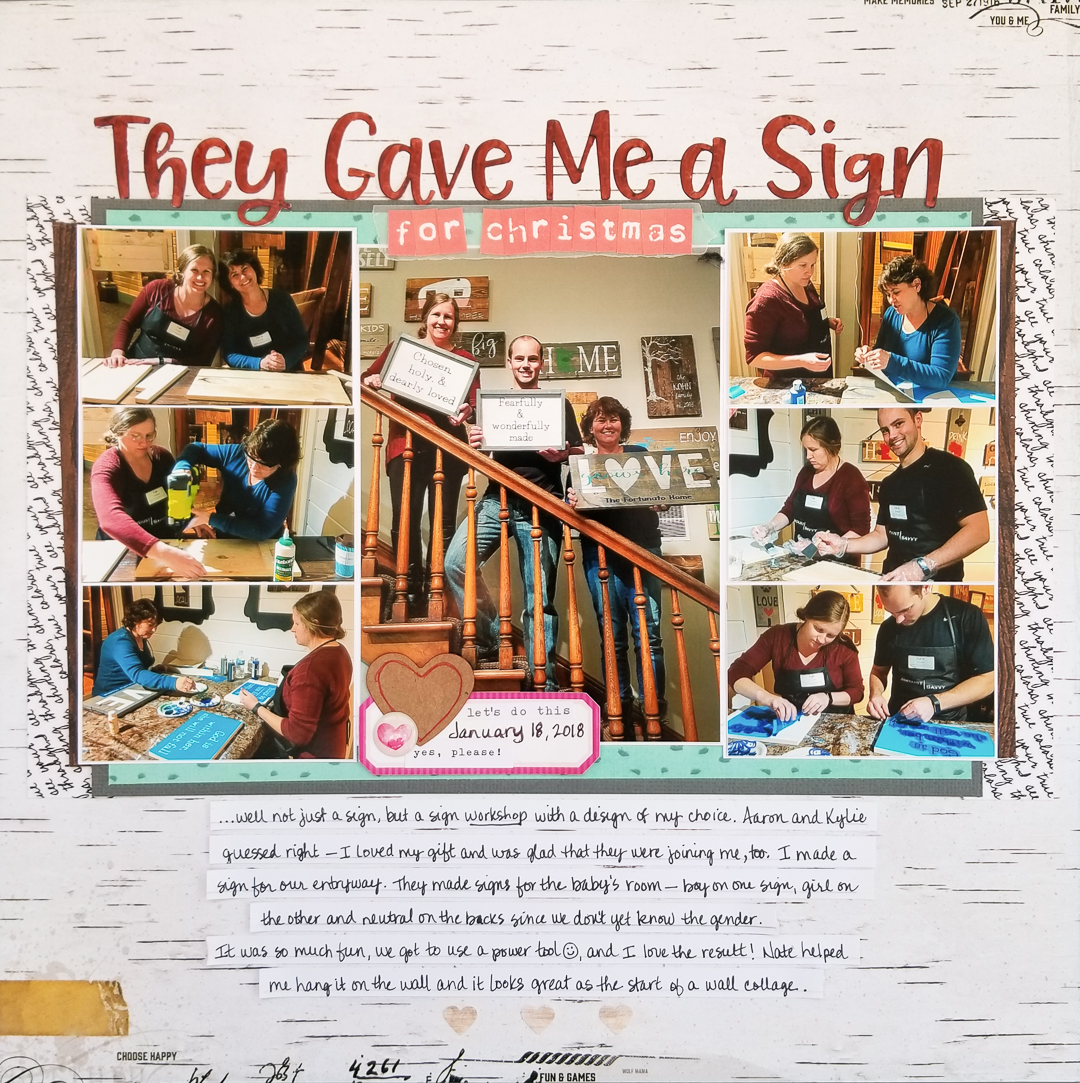
They Gave Me a Sign by Marcia Fortunato | Supplies: Patterned Paper: Heidi Swapp for American Crafts, Little Butterfly Wings and Just Jaimee for Cocoa Daisy, Echo Park; Cardstock: American Crafts, ms. Sparkle & co.; Title: Doodlebug Design, Pretty Little Studio; Embellishments: Cocoa Daisy; Pens: Sharpie pen and marker; Punches: American Crafts, Momenta.
Lynn Grieveson says, “This is the story of twelve hours spent visiting family in Cambridge, from when my daughter woke us up at the crack of dawn until when she fell asleep in the car driving home.”
“The focal point is the full-color, centrally-placed photo of my daughter exploring the very quirky garden of my mother’s neighbors. As well as keeping that photo in color, I added a heart on overly to keep the focus here. I pulled the color from the photo for the ‘6am’ and the bird glass button. I added the other photos of the garden around her, then framed it all with the two big photos on torn paper.”
“I don’t usually use symmetry, as I like the energy that comes from a slightly unexpected design, so I will often balance a large element or photo with an eye-catching but much smaller element. However, I like the energy and balance in this page, from the two-time titles, the balancing of the title with the banner, and the line of color that goes from the 6am, through the focal photo and down to the glass button.”
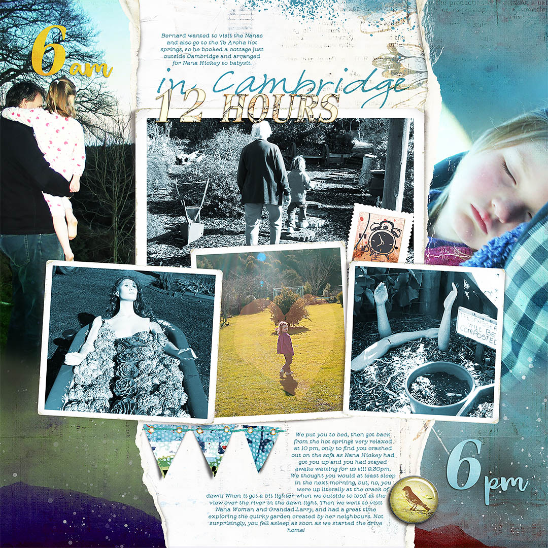
12 Hours in Cambridge by Lynn Grieveson | Supplies: Quiet Life Kit, And Now mini-kit and Big Rips all from Lynn Grieveson Designs at The Lilypad.
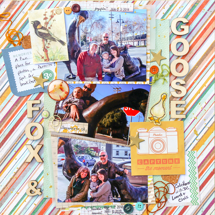
Karen Poirier-Brode says, ” My page is about hanging out by the statues in front of the Fox and Goose Pub in Sacramento where we had enjoyed an English breakfast brunch. We may live in the same town as our kids but do not see them often enough. It’s a good reason to linger a bit after the meal, and the statues are fun for my grandson.”
“The photos are the focal point of the page. I used diagonal symmetry inplacing the woodgrain alphas and large embellishment clusters on either side of the band of photos.”
“Symmetrical designs can be formal, but I wasn’t going there with the mood on this page. Repetition with variety, use of angles, and changes in layers created a sense of fun and whimsy. Sometimes the repetition is the number of elements, not the exact size and shape. I have used symmetrical designs in the past, but it isn’t an everyday go-to in my compositions. I had a lot of fun with this page and can see using this approach more often in the future.”

