 Line is a fundamental element of visual design.
Lines can be straight, curved, thick, thin, vertical, horizontal, diagonal, solid or broken.
The rendering of a line can imply a mood or tone. Soft and curving lines signal tranquility. Jagged diagonals evoke a more jarring tone.
On the scrapbook page, you can use lines alone or together. Use them to define shapes, create texture, organize elements, and guide the eye.
When you’re looking for fresh ways to approach the scrapbook page, you can look at inspiration for specific design elements–like line or space or color or shape. Our creative team members went looking for inspiraiton in their world, took photos and then applied that inspiration on the scrapbook page.
[hr]
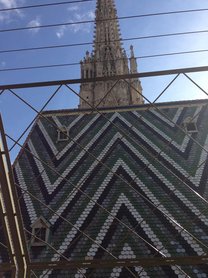
Shanna Hystad says, “My inspiration came from a photo I took a few years ago in Austria at the top of St. Stephen’s Cathedral. The rooftop had a unique zigzag pattern that was absolutely breathtaking. When I looked at the photo it also looked like arrows that repeated, which is what I wanted to use on my layout which is about my daughter’s recent “girls’ trip to Arizona.”
“I began sifting through my supplies looking for arrows or zigzags and was amazed at how much I found. The challenging part was deciding how to incorporate my journaling into the design. I used my line inspiration many times on the page including the page border, and several embellishments.”
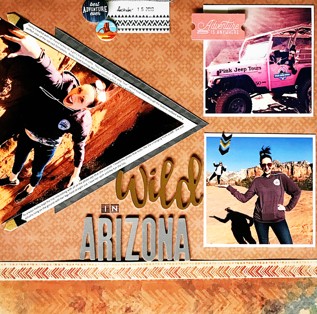
Wild in Arizona by Shanna Hystad | Supplies: Paper: Best Creation & Kaisercraft, Puffy Stickers: Crate Paper, Brads: Carta Bella, Flair: My Mind’s Eye, Tags: October Afternoon & Pink Paislee, Foam Letters: We R Memory Keepers & American Crafts
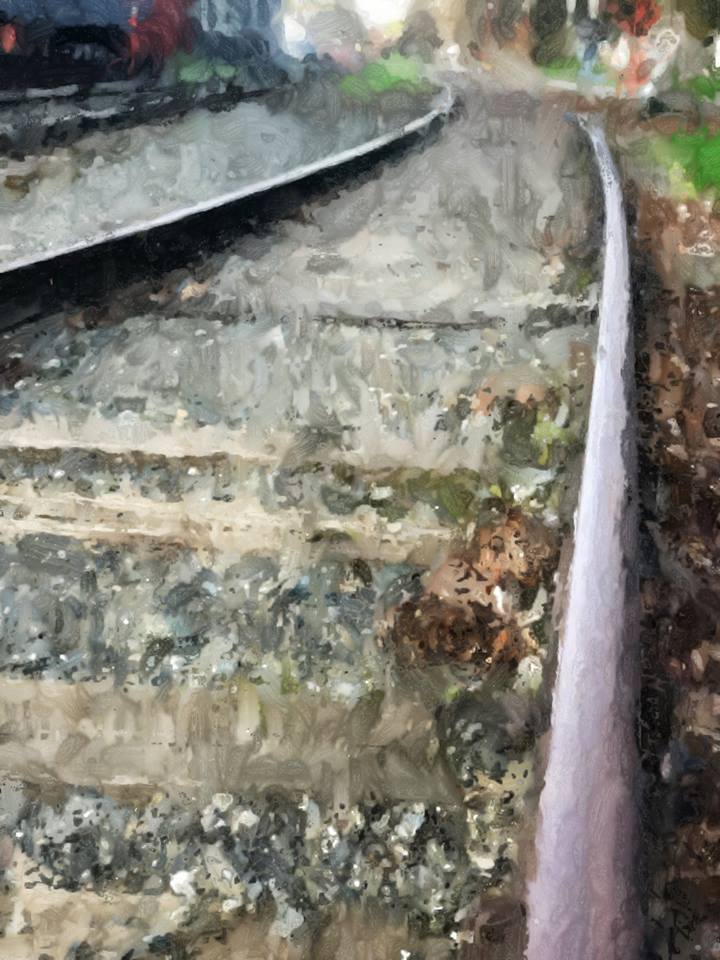
Jana Oliveira says, “I live close to old train station I love seeing when we go for a walk. I like to take pictures of the track. It’s peaceful to me. I edited my inspiration photo with Photoshop to give it an artsy look.”
“Train tracks remind me of lines going forward. I used the photo I took right on my page. The lines of track help to divide the page into three columns. The tracks are in the middle, and I put embellishments on both sides.”
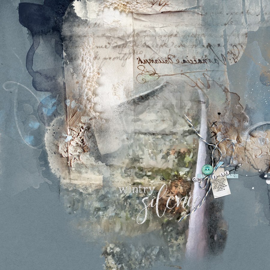
Wintery Silence by Jana Oliveira | Supplies: Anna Aspnes: Artsy palette Brumal, Brumal Photoblendz,winter word art mix 2, handstitchez1.
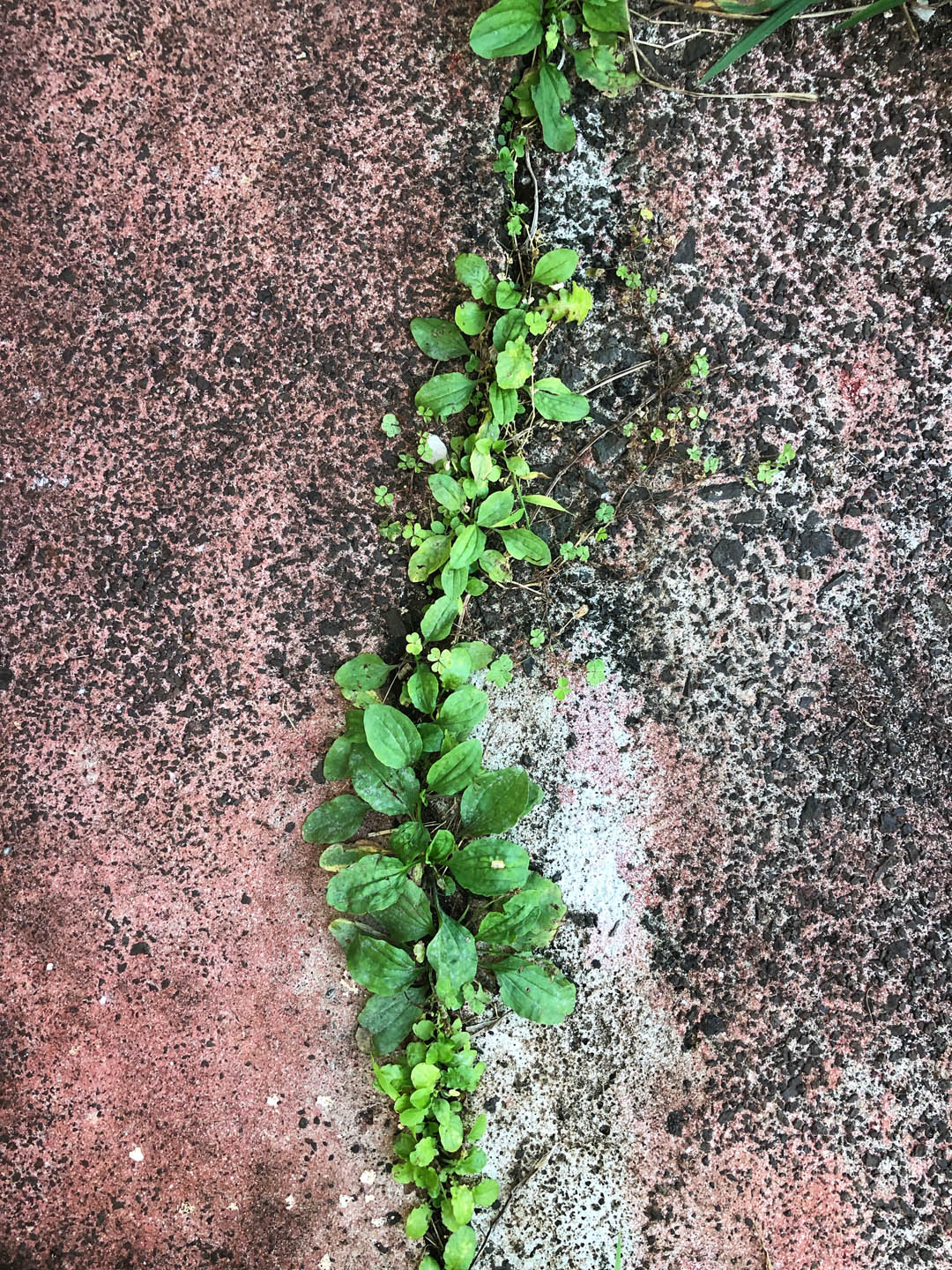
Jill Sprott says, “The design inspiration for this page came from the sight of a line of plants sprouting through a break in the concrete, filling the gap (and thriving in it). I imagined a similar approach on the page — a line formed by papers converging, and at the point of convergence, a series of accents emerging from the gap in the papers.”
“The image also guided my decision to create a layout about how a ‘break’ in life–the loss of a loved one–can unexpectedly give rise to a legacy of a life well lived. This might very well be the oddest funeral layout ever made, I know, but it captures the spirit of ‘Joe’s Party’ and the way that he would like to be remembered: a Hawai’i boy through and through, making us laugh through tears, the most colorful of personalities, embarking on his latest (and perhaps greatest) adventure.”

Unconventional Funeral by Jill Sprott | Supplies: Patterned Paper: American Crafts/Shimelle, Crate Paper, Freckled Fawn, Heidi Grace, KI Memories, October Afternoon, Sassafras, Studio Calico, Studio Tekturek; Chipboard: Elle’s Studio, October Afternoon; Vellum Die-Cuts: Scraptastic Club; Labels: Ali Edwards, October Afternoon, Studio Calico, Tags: Ashley Calder/Things That Shine, JBS; Stamps: Elle’s Studio; Ink: Ranger; Acrylic: Ali Edwards, Freckled Fawn; Journaling Card: October Afternoon; Clip: Freckled Fawn
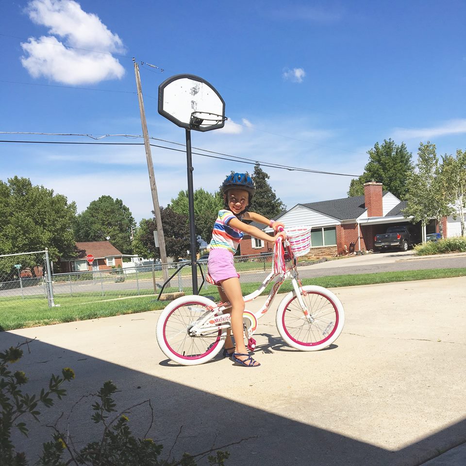
Lynnette Wilkins says, “This page is about my daughter, and how she is always making something! She just loves to create!”
“I was really drawn to the diagonal lines in this photo- the shadows along the bottom, the line of the grass, and the power lines.”
“I mimicked the diagonal lines by placing several different pattern papers on my canvas at different angles. This makes a really fun and energetic base on which to build the rest of my page. I decided to keep the focus of my page–the title and photos–straight in order to contrast with the diagonal lines.”
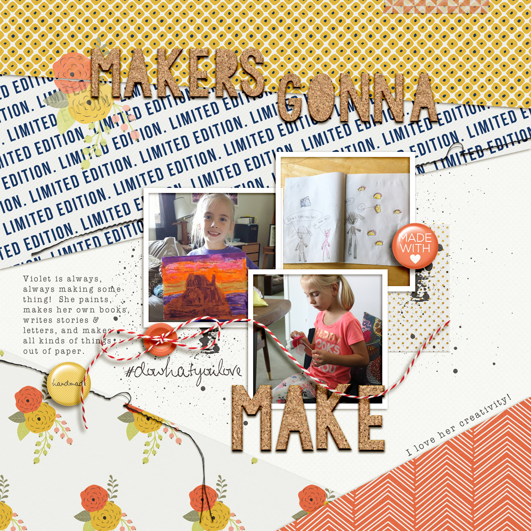
Makers Gonna Make by Lynnetee Wilkins | Supplies: Limited Edition papers and elements by Sabrina’s Creations; Storyteller 2017 May – Alphas by Just Jaimee
Megan Blethen says, “In this layout my I caught a cute photo of my son getting ready to go down a slide. I was inspired by the photo and the circular lines at the top of the slide.”
“The placement of the lines in the photo bring your eye to my sons face. I used the circles and an embellishment cluster in each area on the layout to get my triangle, but it also helps the eye travel around the page landing back on the photo.”
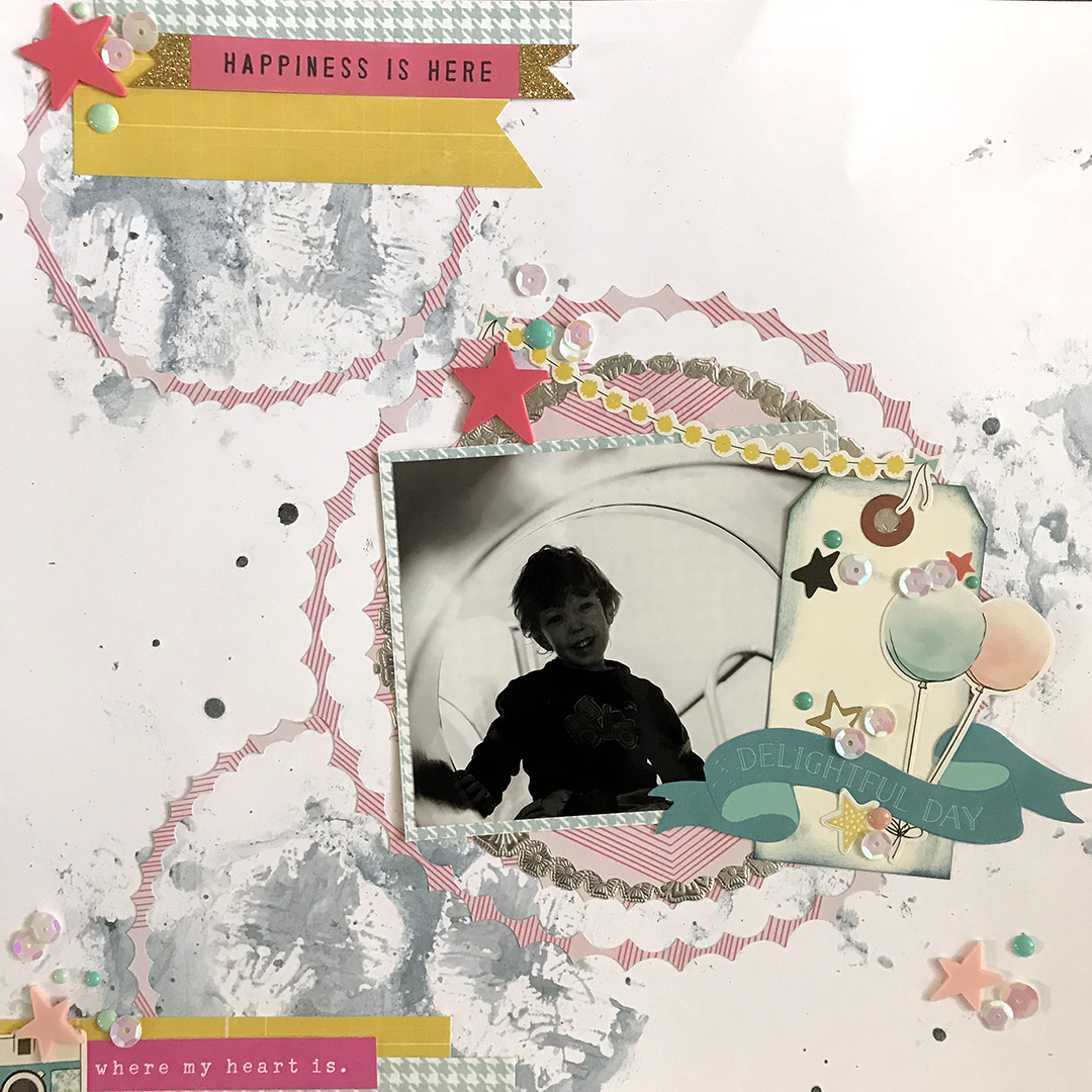
Happiness is Here by Megan Blethen | Supplies: Patterned Paper ~ Crate Paper ‘Wonder’ Embellishments ~ Off white shipping tag, Maggie Holmes ‘Carousel’ ephemera, star rubber charms, enamel dots, white sequins, silver doily, Liquitex clear gesso, Shimmerz Paints Don’tRain on my Parad.
Nicole Mackin says, “This layout is documenting a couple selfies I took with each of my daughters prior to their Christmas concerts.”
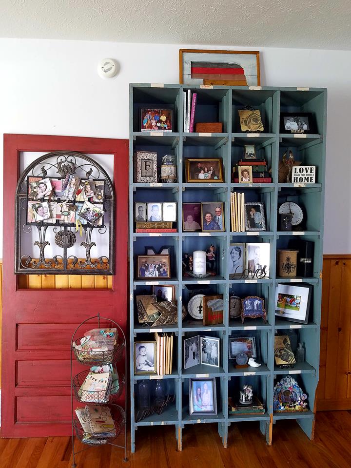
“The inspiration I used for the design of this page came from a home decor grouping I have in my home. The door on the left is a bit shorter and a bold red color which automatically attracts the eye to the left. The piece on top of the blue shelf also has red in it, therefore it guides the eye to the right, and then the final resting place is on the little bin of mini albums that is snuggled between the two pieces. The line becomes a triangle, which is always a good design to get the eyes to make their way across the page (or grouping of decorations).”
“While making the layout, I placed the small cluster of embellishments on the bottom left and then created the same feel of the tall shelf with the bands of patterned paper on the right. I used colors and textures to tie them together and to provide cohesiveness. On this layout I did not provide a 3rd line to form the complete triangle as I thought it would make the layout too busy, but that could have easily been done if desired.”

