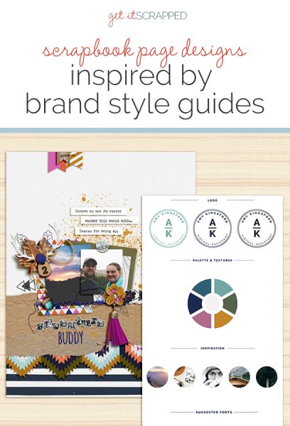
To get a consistent look across their web, print, social media, and marketing materials, businesses use something called a “brand style guide.”
This guide is the collection of colors, fonts, images, textures and patterns that they’re using. Take a look at a collection of style guides on this Style Guide Pinterest Board we’ve built for you.
In this post, our Creative Team shows us how to use a style guide for scrapbook page inspiration.
Marie-Pierre Capistran says, “This page tells the story of my daughter getting her guinea pig. I chose a style guide with colors that spoke to me. I loved the pale pink and the natural and neutral tones of green and beige for documenting the story of this new friendship between my daughter and her little animal.”
“I followed the color scheme pretty closely, adding lots of pretty embellishments in the colors suggested by the guide. I swapped the soft beige for a muted yellow to give my layout a little more punch. And I used the dark grey instead of black when printing my title on the background.”
“The title was inspired by the style guide logo. Although I didn’t use exactly the same fonts, I did use a handwritten font on the first line and an uppercase sans serif font for the second line of the title. I didn’t use patterned paper on this layout, but we can see a little bit of the suggested pattern on the green frame. The frame is more of a watercolor texture, which is pretty close to the marble look that was suggested by the guide.”
“I am pretty pleased by the final result of the page and I think that the soft and classy feeling I had when I saw the guide is well carried over onto my layout. Having a guide to start with was a great experience and really helped me focus on just a handful of elements which, in the end, tied everything together. I’ll definitely try this approach again.”
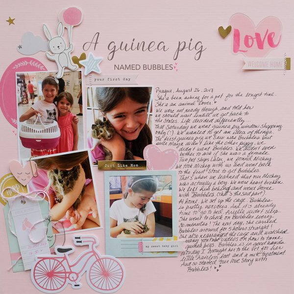
A Guinea Pig Named Bubbles by Marie-Pierre Capistran | Supplies: Cardstock: Stampin’UP!; Die Cuts: Crate Paper, Dear Lizzy; Stickers: Crate Paper; Font: Angelline, Bebas; Others: baker’s twine, paper clip.
Hannah Lemieux says, “This layout is about a train ride we took for the Train Museum in Elbe, Washington. I was drawn to the style guide I used for its triangle shapes and the outdoor feeling. ”
“I used the triangle pattern as a cut file, which I sketched onto my layout with the Silhouette sketch feature. I stitched the pattern as well. I used the style guide colors to pick out the papers and I also used the overall outdoors theme in picking out my pictures and story. I cut out leaves with my silhouette to help with the outdoors theme. On my photo I added an extra title in Photoshop with the style guide colors and in a similar font.”
“I think using the style guide helped me plan a lot of the cool elements of my layout before I actually sat down at my desk. In the end I am not sure it really made my work faster.”
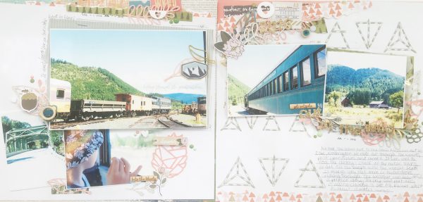
Train Ride by Hannah Lemieux | Supplies: AC smooth white cardstock, Silhouette copper metallic sketch pen, Pink Paislee C’est Le Vie 03, Simple Stories So rad Chillen, Teresa Collins Nine & Co Ombre, Maggie Holmes Gold Foil Vellum, Maggie Holmes Carousel Foil Cardstock, One Canoe Two Creekside Itinerant, Fancy Pants Designs Grey Coragated Paper, Basic Grey Urban Lux Literae, We R Memory Keepers mini staples gold, Color Cast acrylic and wood shapes, Freckled Fawn Enamal dew drops, Shimelle Glitter Girl wood buttons and enamel shapes, Fancy Pants Designs Good Fellows puffy dot stickers, One Canoe Two Creekside die cut embellishments, AC Thickers “Happy” gold glitter, metal leaf clips Oct 2016 Clique Kits, Clique Kits Wreath Cut File, Green embrodery thread, Tombow Mono lique glue, Le pen Grey Pen, One Canoe Two Black dye ink, One Canoe Two datestamp.
Marcia Fortunato says, “This layout is about the little home my son moved into and the changes he faced as he started a seasonal job this summer.”
“When starting making this page I used the style guide as inspiration. I felt that the natural colors and font would work well with my story which was set in the woods. I stuck pretty closely to the colors in the style guide with shades of green predominating. Accents of dark mustard gave pops of color and added interest to the monochromatic scheme. I liked the hand-lettered look of the primary logo and tried to replicate it. I also liked the outline used in the secondary mark and found it useful as the finishing touch on my title card as well as for tying together the title, journaling, and stamped cards.”
“Overall I was happy with the outcome of my page. Did it speed up the process? Well, yes and no. It gave me a good framework for choosing colors and narrowing my choices. Because I’m a paper scrapbooker I wasn’t always able to get the exact shades shown, but I was able to try a few different papers. I also wanted to use the logo typeface shown and chose to hand paint it since I couldn’t find letters that were similar. This took a bit of time and experimenting, especially since I didn’t have a large space to work with. It also took me a while to notice the border around the secondary mark in the guide, but this became the key addition to the title, adding the touch that was needed to finish the card.”
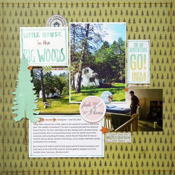
Little House in the Big Woods by Marcia Fortunato | Supplies: Patterned Paper: One Canoe Two by American Crafts, Simple Stories; Cardstock: American Crafts; Watercolor Paper: Strathmore; Watercolor Paints: Royal Langnickel; Tree die cut: Silhouette Design Store; Stamps: Cocoa Daisy, Studio Calico; Inks: Recollections, Distress Markers by Tim Holtz/Ranger; Embellishments: Echo Park, Pink Paislee, We R Memory Keepers.
Amy Kingsford says, “I took color and theme inspiration from my own personal brand’s style guide on this page about the adventurous journey my husband and I are taking through life. It seemed appropriate to draw inspiration from my own style guide when scrapbooking about myself because my personal brand’s styling is just that–a reflection of me and the lifestyle I subscribe to. Bottom line I knew I’d come away with a page I loved!
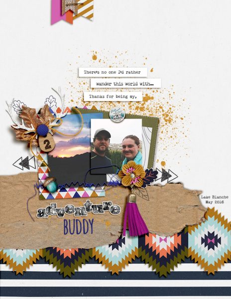
Adventure Buddy by Amy Kingsford | Supplies: Allison Pennington: Wild Papers and Elements and My Diary Pockets; Mommyish: Warm and Cozy Elements.
Christy Strickler says, “I love watching my kitten, Pixie, sleep. I chose the photos before I chose the style guide that I used for inspiration and supplies.The photos led me to choose a softer color scheme.”
“I started with color, focusing mainly on the pink, blue and gold from the palette. When I use a style guide, I do better by using it as loose inspiration, meaning I don’t get caught up on exact color, patterns or motif.”
“The colors used on the page are similar to those from the style guide. I used florals, though not the exact style of flower. I generally don’t use the fonts in a style guide as it can be difficult to find the right letter sticker and I am often too lazy to find the font for creating a hybrid title. The marbled pattern is a subtle part of the pink chipboard piece on the upper left of the page. Overall, I am happy with the result. Using a style guide helps me create a kit quickly as long as I don’t focus too much on having everything exactly the same.”
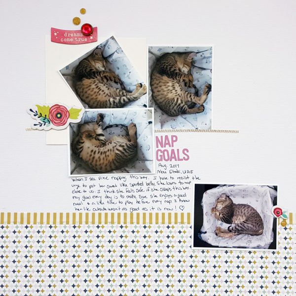
Nap goals by Christy Strickler |Supplies Cardstock: Bazzill; Patterned Paper: Fancy Pants; Chipboard: Shimelle; Letters: Evalicious; Jewels: Freckled Fawn; Tape: Little B, Other
Shanna Hystad says, “With fall officially here, I was inspired to create a page using fall photos. This story is about my daughter and her fiancé Zac taking my niece and nephew to the pumpkin patch last year. The colors are what drew me to the brand style I chose.}
“The gold, blue, and gray all mixed perfectly with my photos. I was so tempted to put orange into the layout but held back and followed the color pallete. I am so glad that I did. I think I found my new favorite fall colors.”
“I used a similar script font for the title and found an exact font match for the journal tag. The tag contains a few of the elements from the brand style guide. The denim background, braided string and gold feather were my interpretation of the photos in the style guide. The paper, including the blue and white pin stripes were also part of the inspiration I drew from the style guide. I will be using this design process in the future. Choosing my paper went much faster and I added design elements that I may have never considered combining before.”
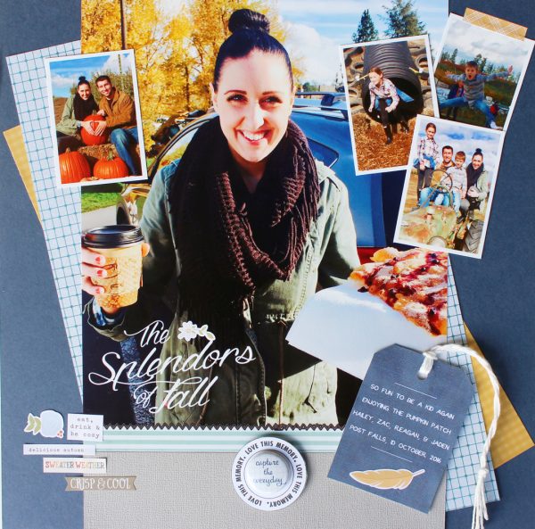
The Splendors of Fall by Shanna Hystad | Supplies: Paper-Bo Bunny (Back to basics), Stickers-Simple Stories (Hello Fall), Metal Badge-October Afternoon, Font-Parker & Dragon is Coming, shipping tag, Digital Elements-StraightLineStitch, Ali Edwards-Life in Circles, paper-LinenBlueShades & KPertiet-CoastalMemories.
Kelly Prang says, “This page showcases one of my favorite photos I captured of my daughter Mollie when she was 2. (10 years ago) I wanted to always remember how precious that little face was!”
“I loved the bright happy colors and the playful feel of this style guide. I used most of the colors from the guide, both a colorful floral and a messy polka dot pattern as well as a mix of script and a sans-serif font. I did switch navy for the black in the guide, as I felt it gave a more feminine feel to the page.”
“I loved starting with a style guide for a page and intend to find other guides to use for future pages. I enjoyed looking for elements and papers that matched the feel of the guide, it really helped me look thru my stash with new eyes.”
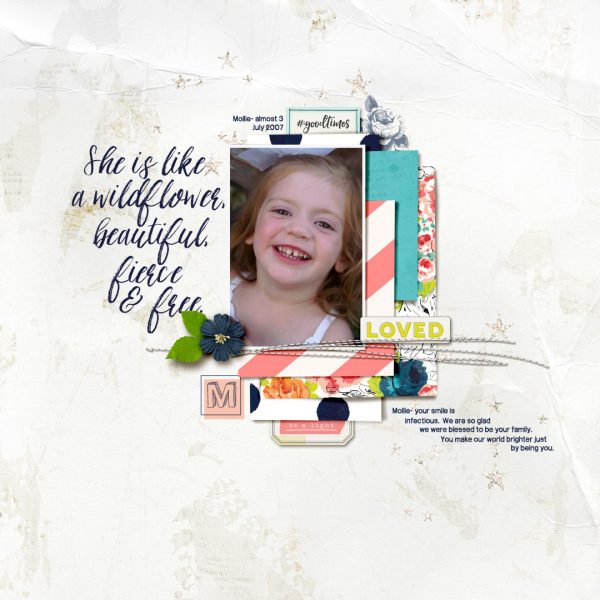
Loved by Kelly Prang | Supplies: Heather Joyce- We are Storytellers- template; Sara Gleason- Sparkle Confetti- crystal stars; Lynne-Marie- Wildflower- wordart; One Little Bird- Love a Little- flower, leaves, Rise and Shine- striped paper; Lynn Grieveson- Birdseed- turquoise and white (background) papers; Allison Pennington- Storytelling- stitching; American Craft Digitals- Heidi Swapp- September Skies- floral paper; American Craft Digitals- Maggie Holmes- Confetti- elements, Gather-elements. Fonts: Artik 3 and PWPerspective

